Design & DevelopmentRecruitment Landing Page
Volunteer Leadership Team
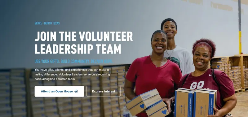
A new landing page recruiting Volunteer Leaders for Children's Hunger Fund's new North Texas facility: the one destination behind every printed flyer, event QR code, and staff conversation, launched ahead of an in-person Open House.
- Client
- Children's Hunger Fund—A Christian Non-Profit Ministry
- Role
- Designer & Developer (sole developer)
- Platform & Tools
- WordPress
PHP, HTML & CSS, WPForms - Deliverables
- Landing page, lead-capture form, event registration hand-off
Overview
Children's Hunger Fund was opening a new facility in North Texas, and it needed people to help lead it: Volunteer Leaders who serve on a recurring basis alongside staff. The constraint was time. A physical Open House set a hard deadline and its flyers were already in production, so the page had to be the one destination behind them. The request came straight from the Executive Director, and I had 19 days from brief to launch.
As the sole developer, I owned the page end to end, from its structure and visual design to the build, the lead-capture form, and launch.
Loading video...
Results & Impact
The page launched on schedule, ahead of the Open House, and became the single digital destination for the recruitment effort: every printed flyer, QR code scan, and staff conversation with a prospective Volunteer Leader pointed to it. Its interest form gave the new facility a structured pipeline for leads from day one.
See the Volunteer Leadership Team page live.
Building the Page
Designed in Code
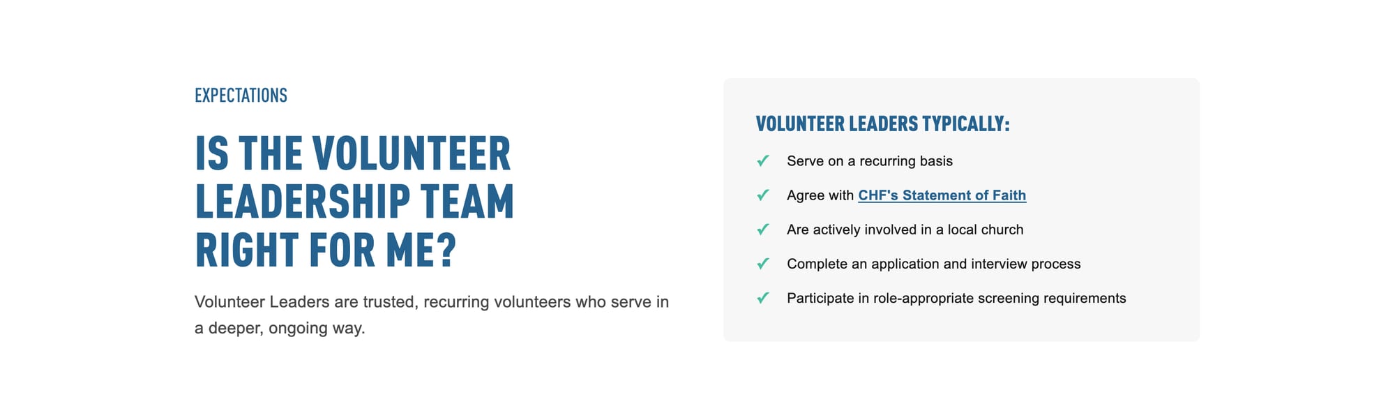
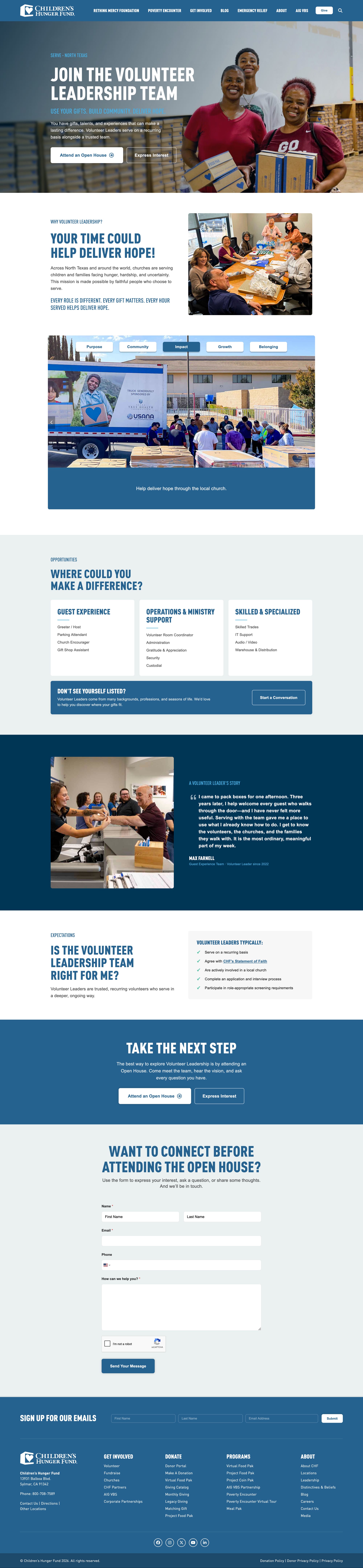
The brief came with content and a page outline, but no design comp, so I designed directly in the browser, building a custom page template out of modular sections: hero, the case for serving, where you could fit, what's expected, next steps, and a form to get in touch.
- A legible hero. Full-bleed photography under a navy-to-transparent gradient. When leadership asked to remove the overlay, I showed that white text wouldn't hold up against the photo without it, and matched the treatment to the Hunger Action Month page instead, so the two campaigns read as one site.
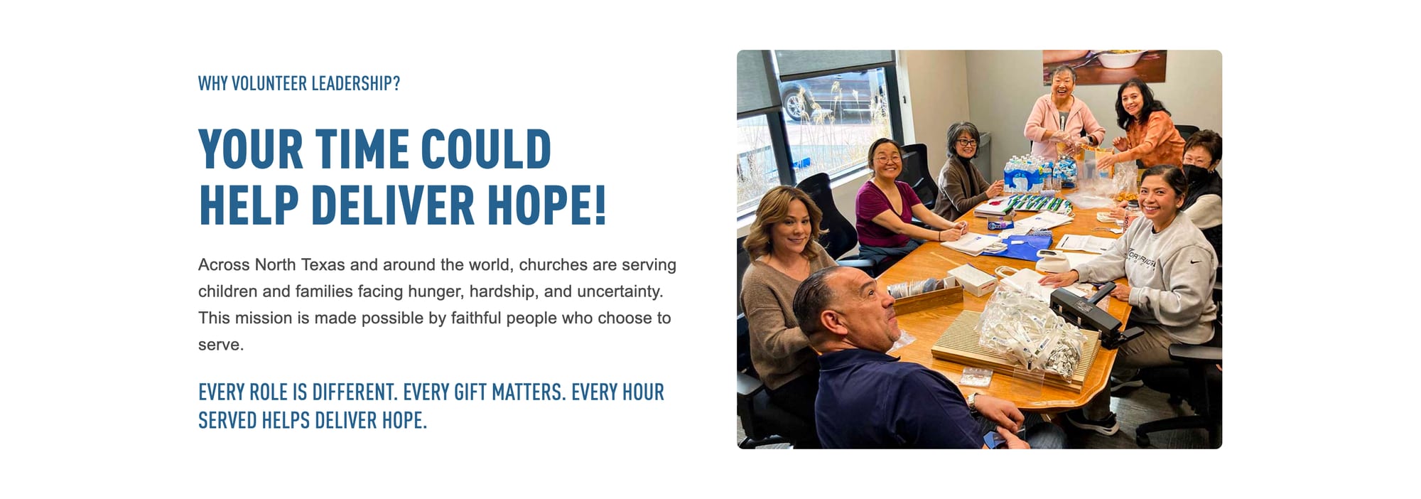
- The case for serving. Mission-focused copy on the role, the commitment, and why it matters, structured from the brief.
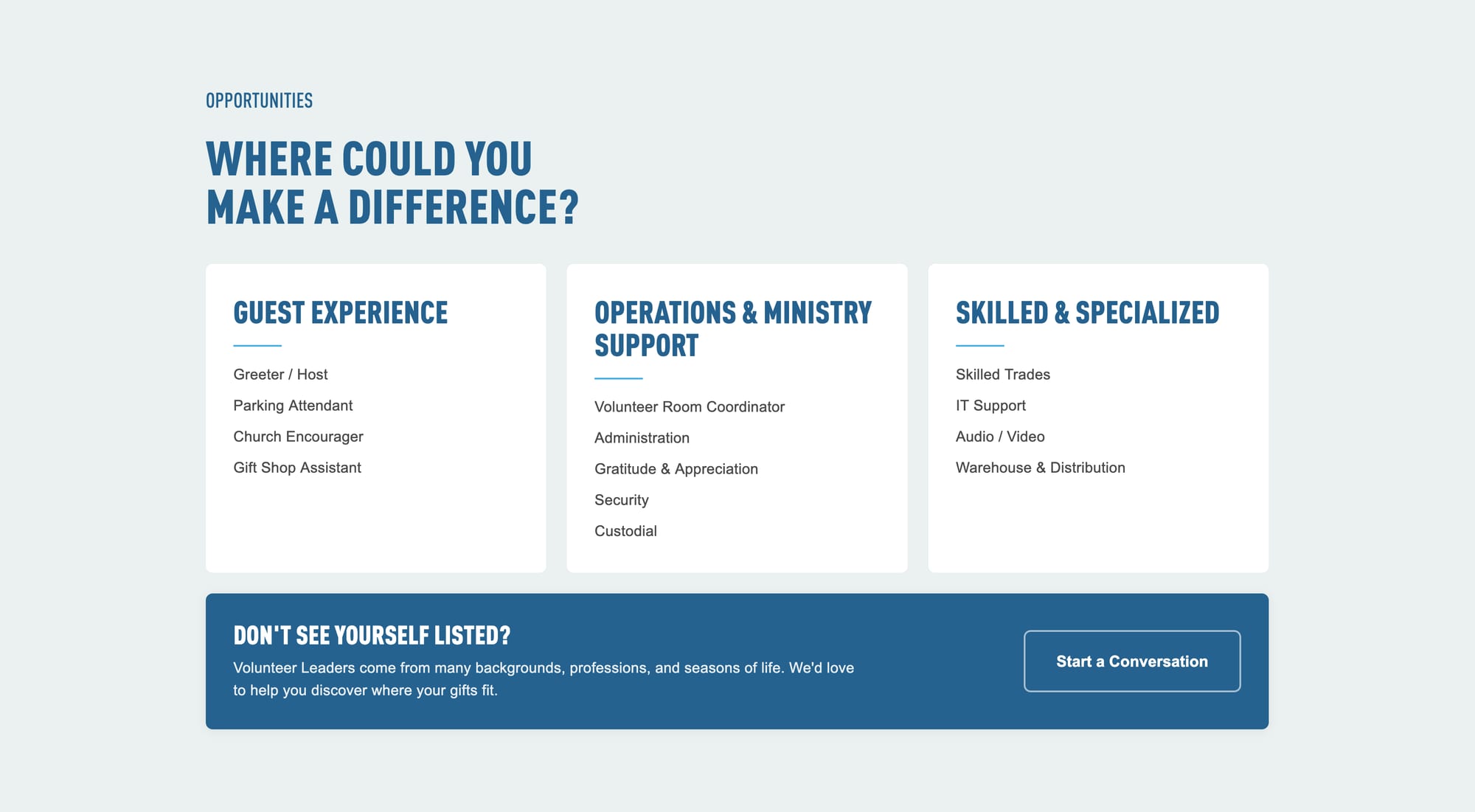
- Room for everyone. Opportunities grouped into guest experience, operations and ministry support, and skilled roles, with an open invitation for anyone who doesn't see themselves listed.
Two Paths In
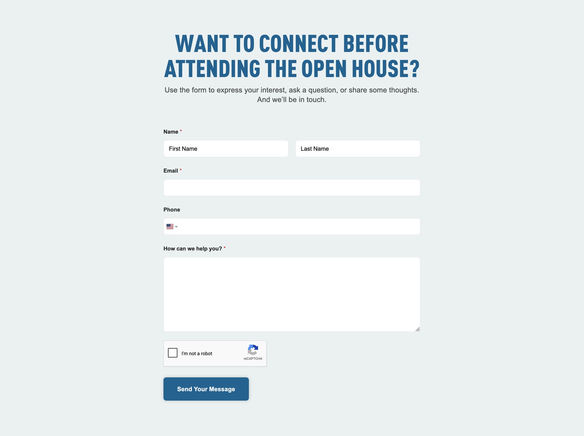
Not every prospective leader is ready to commit on the spot, so the page offers two ways forward, repeated at the top and bottom:
- Attend an Open House. A hand-off to the event's registration, for people who want to meet the team and ask questions in person first.
- Express Interest. A short form that sends each submission straight to the ministry team who follows up, replacing a loose, email-based intake with a structured pipeline.

Built for Its Audience
Many of the people this page was written for are retirees with time and experience to give, so readability came first: the expectations section got larger type, and body text scales comfortably across screen sizes. The page also reuses the button styles and gradient treatment I established on the ministry's giving and campaign pages, so it reads as part of one consistent site.
Designed for Every Screen
With most visitors arriving from a printed flyer's QR code, the page had to work first and best on a phone.


Holding the Deadline
With the flyers already printed, the launch date couldn't move, even as pieces of the project did. Three approvers signed off, and more than 20 review threads were resolved along the way:
- A registration link that didn't exist yet. The brief called for an Open House button, but no registration had been set up. I flagged it early; after a week of cross-team follow-up, the button came off the page—and when the registration went live the next day, I had it back up and linked that same morning.
- Launch now, backfill later. The volunteer story section was built with placeholder content and flagged, so the team could launch on time and add a real story afterward.
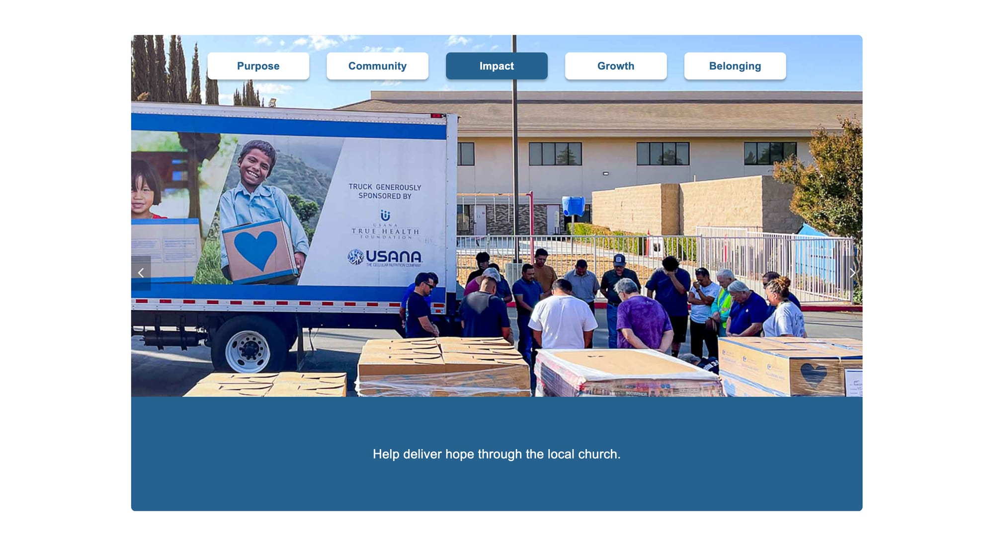
- The right photo. When a reviewer noticed the original hero image prominently showed another organization's branding, I swapped in a photo centered on the ministry's own work.
- Collaboration with conviction. When leadership and the designer felt the page read differently from the rest of the site, I adopted the designer's button styles while keeping the choices I could defend—like the oversized open-quote treatment, a pattern used on well-established sites.
Learning and Reflection
What I learned
- Flagging a dependency early, like the registration link that didn't exist yet, and building the story section as flagged placeholder content let the launch date hold while other pieces moved.
- When leadership asked to remove the hero overlay, showing that white text wouldn't hold up without it was how I made the case for keeping it.
- Reusing button styles and the gradient treatment from the ministry's other pages made the new page read as part of one site.
Reflection
Three approvers, twenty-plus comment threads, and one date that never moved: the project was as much about managing the review as building the page. Flagging dependencies early, making the case for the choices I could stand behind, and building on the ministry's existing button styles and gradient treatment kept the page on schedule and looking like part of one site.


[ Let's connect ]
Let's work together
Have a project, a role, or an idea in mind? I'd love to hear about it.