Branding, Design, & DevelopmentPodcast Brand & Website
Truth Matters Podcast
Creating the brand, UX/UI design, and website for Grace to You's Truth Matters Podcast—a digital experience as grounded and compelling as the content itself.
- Client
- Grace to You—A Christian Media Organization
- Role
- Product Designer & Web Developer
- Website
- truthmatterspodcast.gty.org
- Platform & Tools
- WordPress
Overview
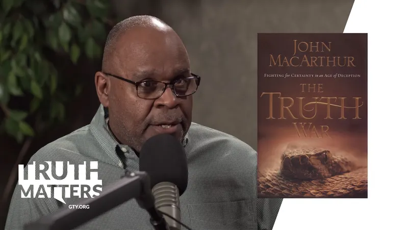
The Truth Matters Podcast is a media production by Grace to You. In each episode, host Darrell Harrison welcomes a guest to explore a featured resource from the Grace to You collection—whether it's a book, sermon, or blog series by John MacArthur—and why it still matters for the church today.
The show needed a digital experience as grounded and compelling as the content itself, with every touchpoint—from the logo to the episode pages—telling a consistent story. As the Product Designer and Developer, I brought together three roles I love: branding, UX/UI design, and front-end development.
Results & Impact
The result is a brand and website that feel as grounded as the content: a minimal, strong logo with a muted palette, and a clean, content-first WordPress site built with SEO and accessibility in mind. A global media player keeps playback uninterrupted while visitors browse, with clear “Listen/Play,” “Share,” and “Subscribe” calls to action and a responsive layout for listeners on the go.
Brand Identity
Concept
I wanted the branding to echo the tone of the podcast—casual, yet theologically serious and grounded in biblical truth. The logo is minimal yet strong, reflecting the clarity and conviction you would expect from Grace to You: no hype, just truth.

Logo Suite
The logo is a speech bubble with the name cut out of it: a conversation about the truth. It comes as the logo itself, a wide podcast lockup, and a two-letter icon for small spaces.
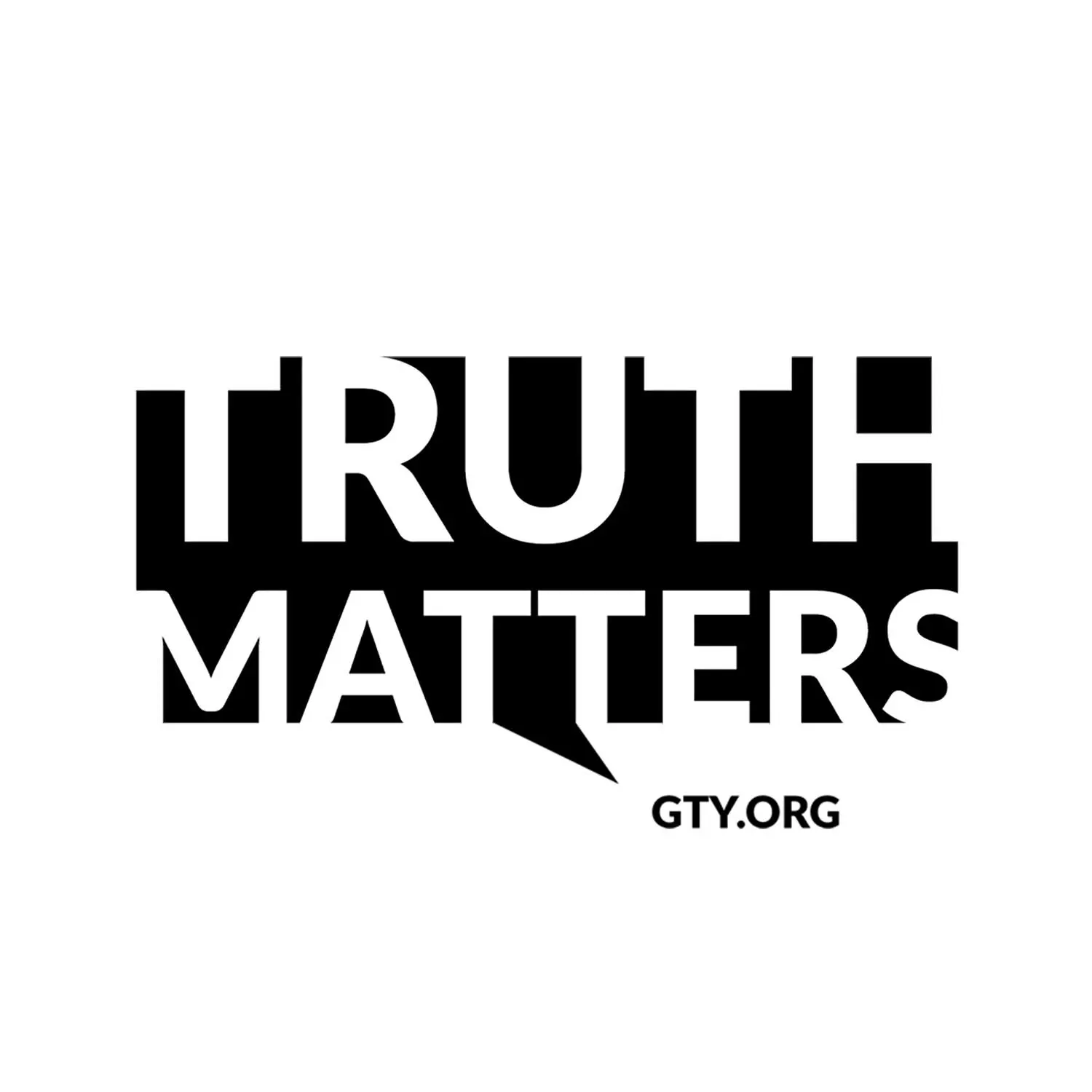
Logo
- Ground
- White
- Use for
- The default: episode pages, merchandise and anywhere the show is named on its own.
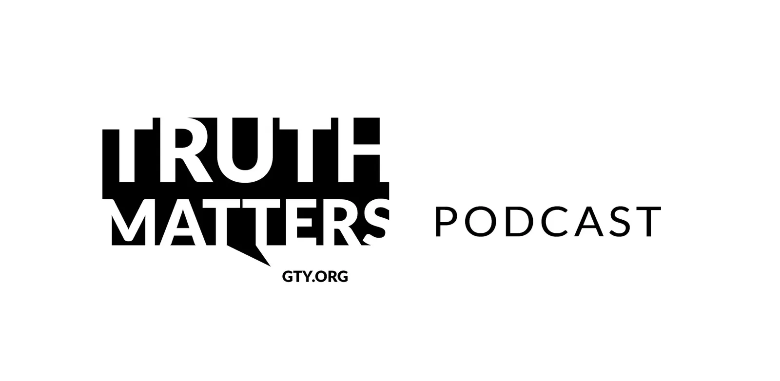
Podcast Lockup
- Ground
- White
- Use for
- Wide spaces that need to say what the show is: banners, headers and directory listings.

Icon
- Ground
- White
- Use for
- Small, square spaces such as the favicon, app and social avatars.
Clear Space & Size
The cut-out letters need room around the block to read as a shape, and enough size for the gaps between them to stay open.
- Clear space
- One eighth of the logo’s width (x) on every side, measured from the block’s edge.
- Minimum size
- Logo 120px wide on screen, 1 in (25 mm) in print. Below that, use the icon, down to 32px.
- Over photos
- Use the white version on a darker, even area, so the photo shows through the letters.
Color
A muted, sophisticated palette of deep charcoal and soft neutrals. Color comes from the episode photography, never from the brand itself.
Black
- Hex
- #000000
- RGB
- 0 0 0
The logo’s speech-bubble block, with the letters cut out of it.
Deep Charcoal
- Hex
- #111618
- RGB
- 17 22 24
The deepest UI color: the site footer and dark bands.
Charcoal
- Hex
- #3A3A3A
- RGB
- 58 58 58
The global media player and dark overlays; 11.4:1 with white text.
Soft Grey
- Hex
- #999999
- RGB
- 153 153 153
Secondary buttons and dividers. Too light for text on white (2.85:1).
Soft Neutral
- Hex
- #F6F6F6
- RGB
- 246 246 246
Quiet section backgrounds that separate content without lines.
White
- Hex
- #FFFFFF
- RGB
- 255 255 255
The page ground, and the letters of the logo over photos.
Typography
Consistent with Grace to You's style: sharp, readable fonts that convey authority without being loud.
“Truth Matters” — Heavy
Heavy capitals cut out of a solid block, so the name reads as one strong statement: clarity and conviction.
“Podcast” — Light
A light, widely tracked weight beside the logo that names the format without competing with it.
“GTY.ORG” — Bold
Small bold capitals under the speech-bubble tail, tying the show back to Grace to You.
Usage
A few rules keep the logo clear across episode artwork, thumbnails, the website and merchandise.
Merchandise
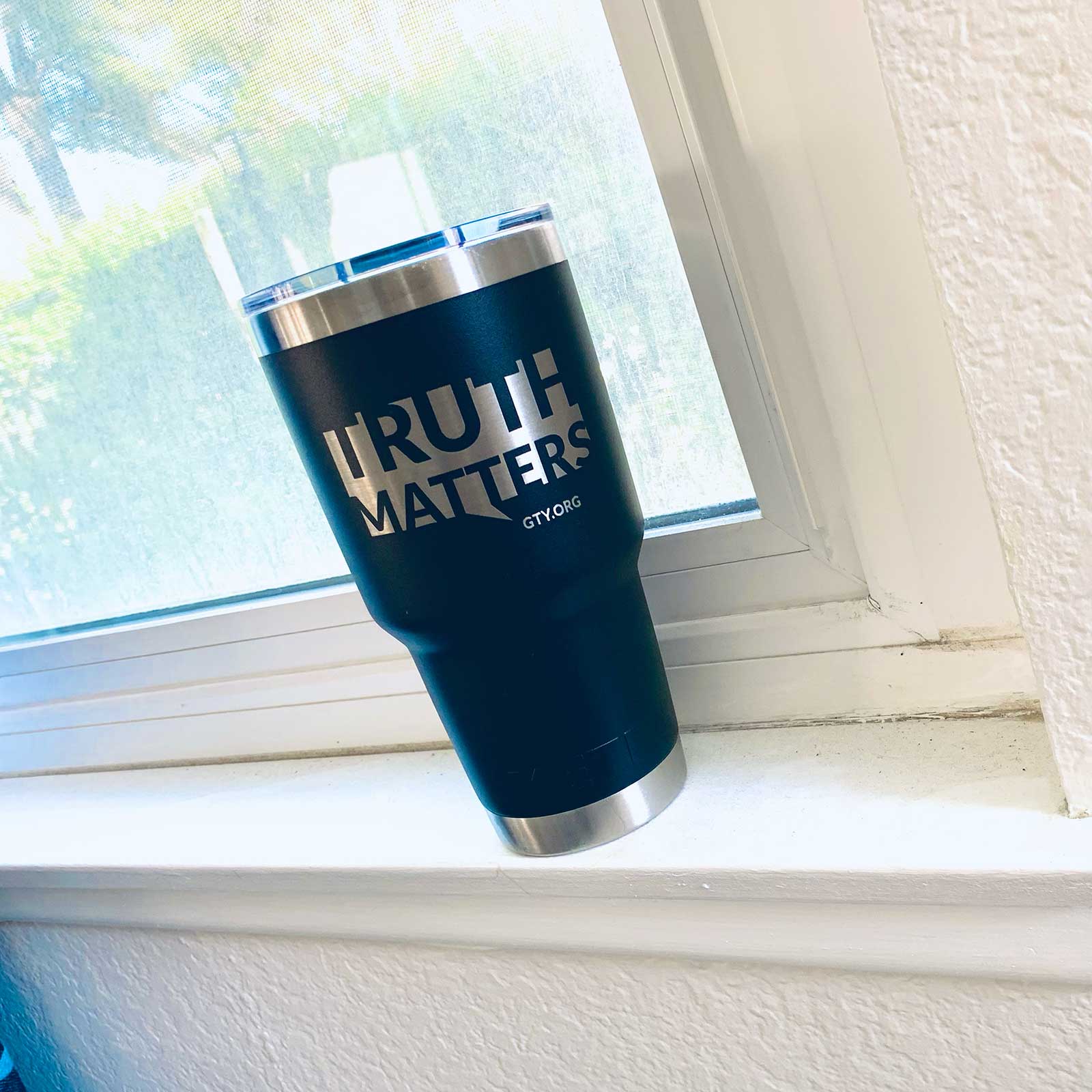
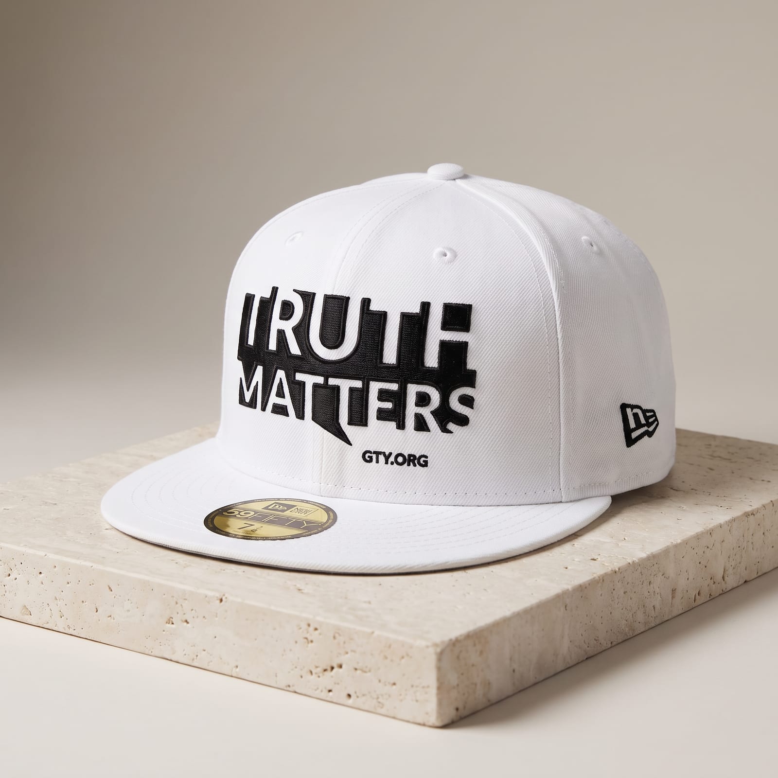
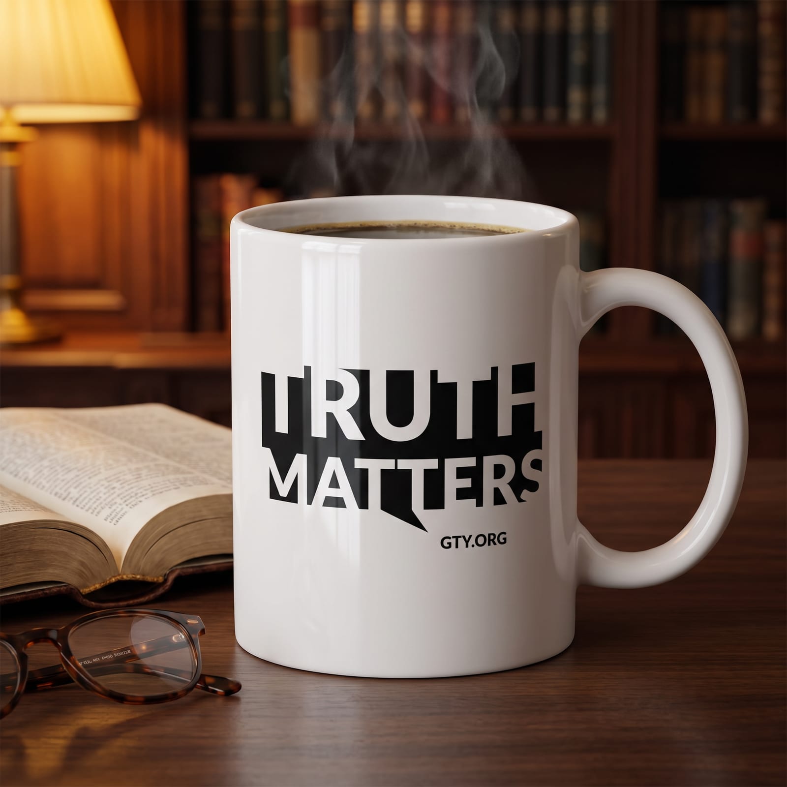
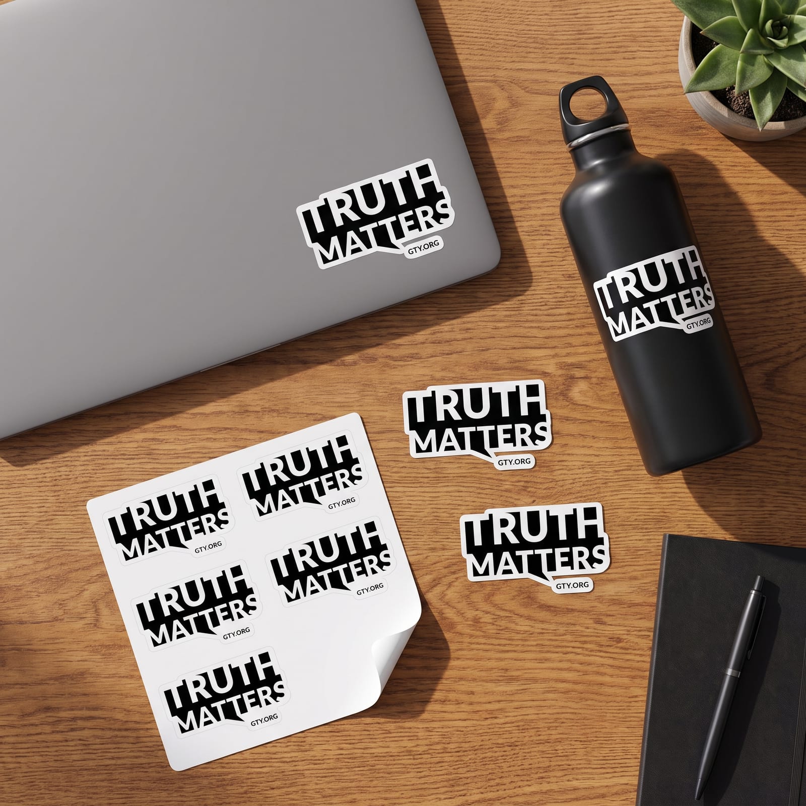
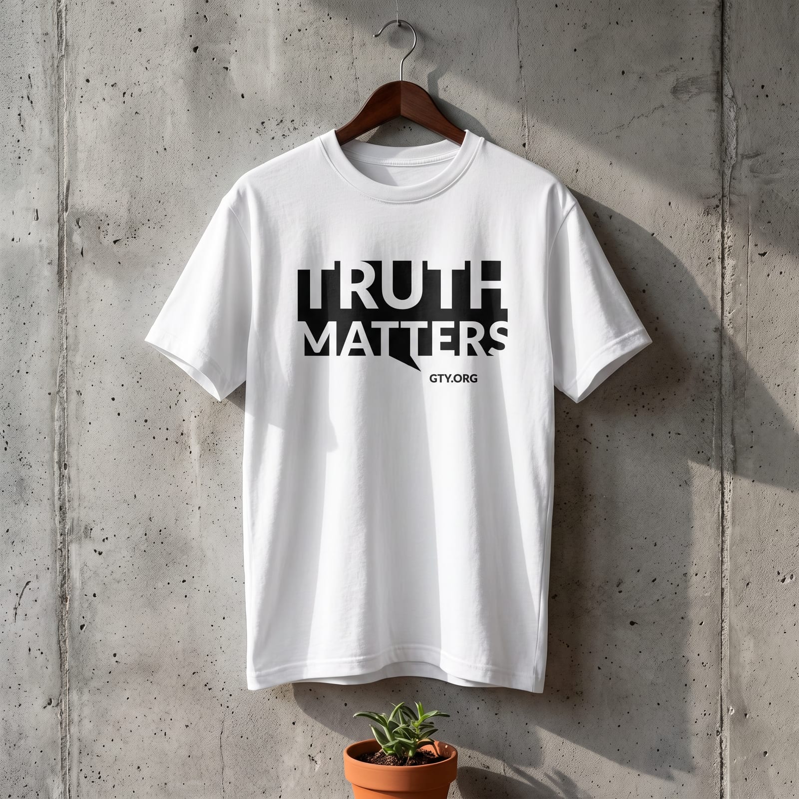
A speech bubble with the name cut out of it is built to be worn and shared, so I carried the identity onto merchandise concepts: a cap, a mug, stickers, and a T-shirt. The solid black mark prints cleanly at any size and reads instantly as the show.
Graphics & Supporting Media
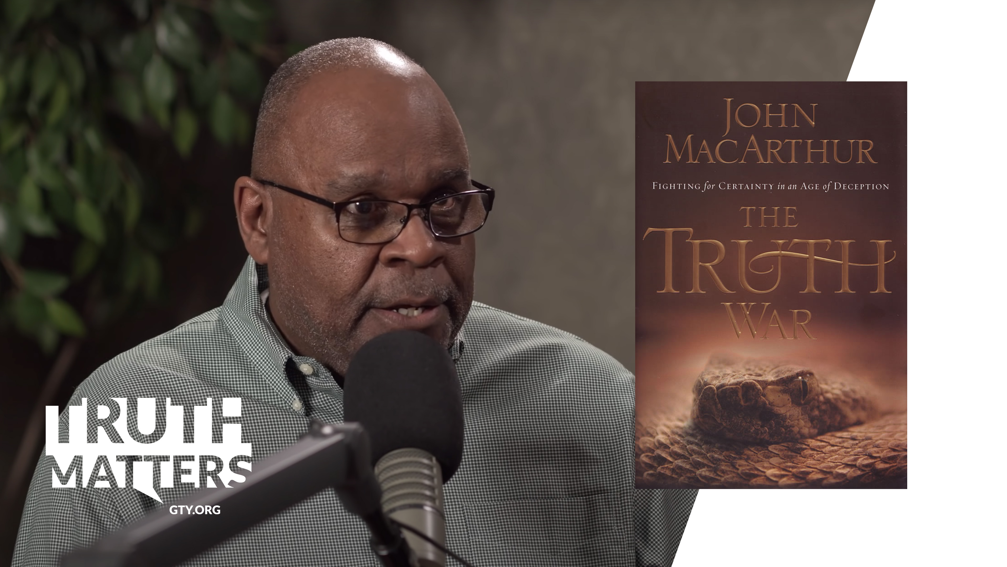
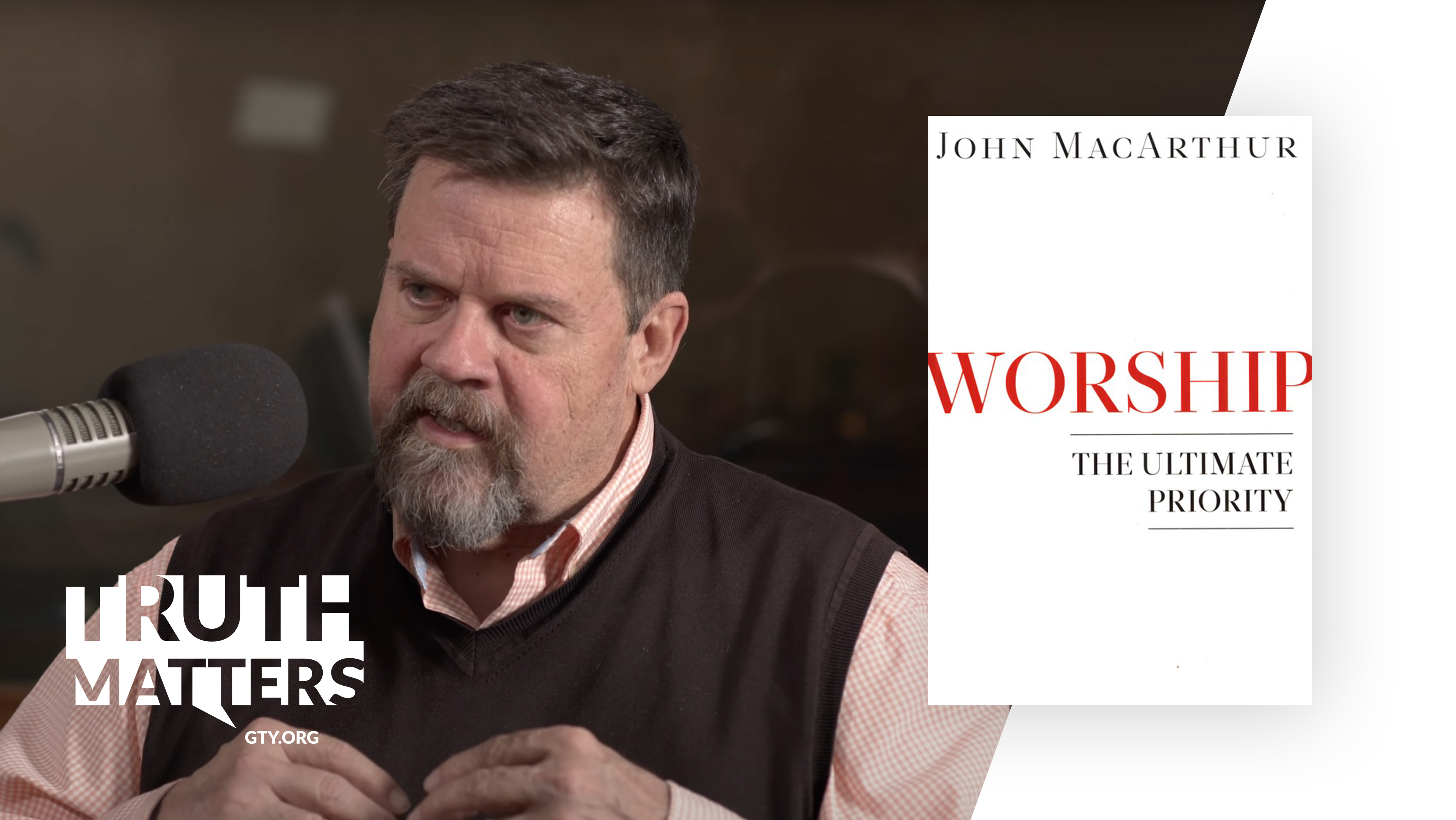
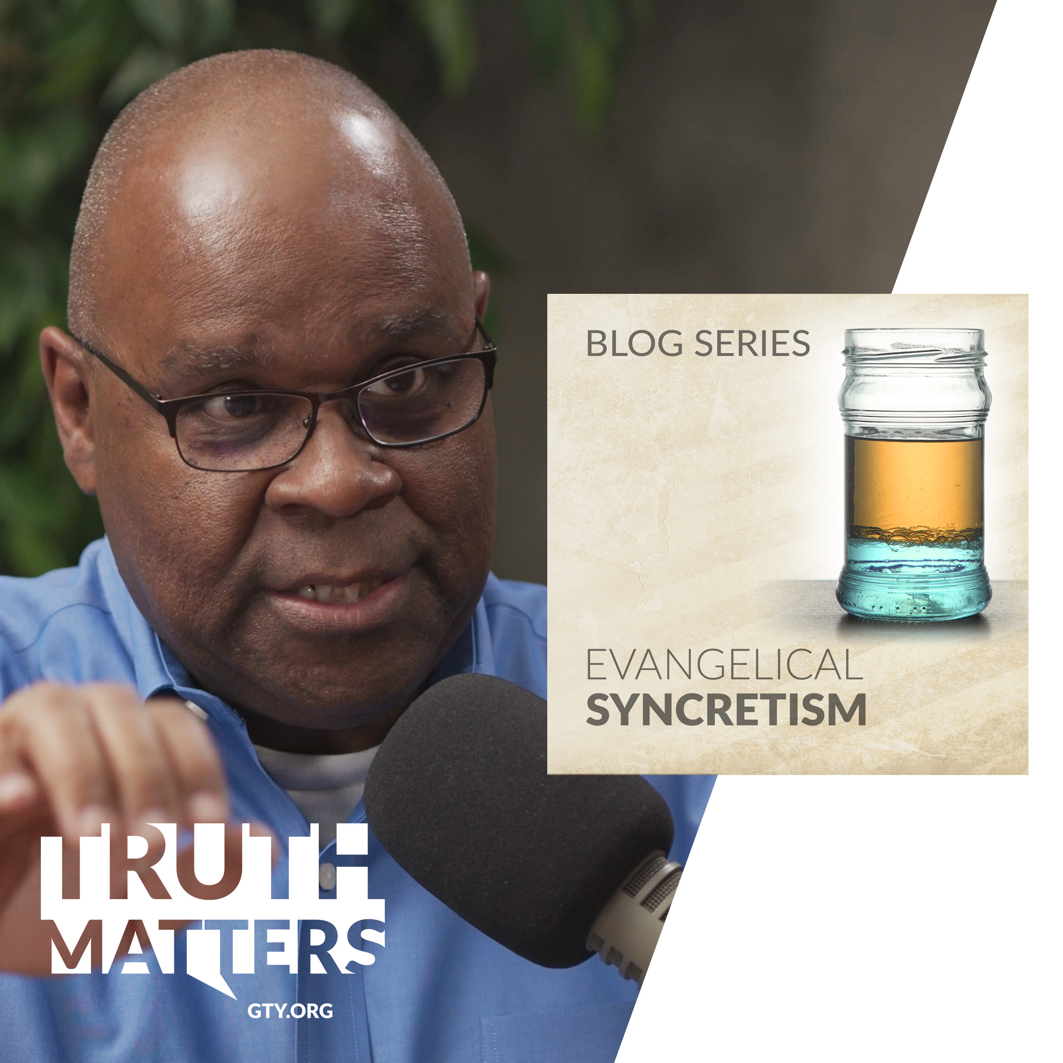
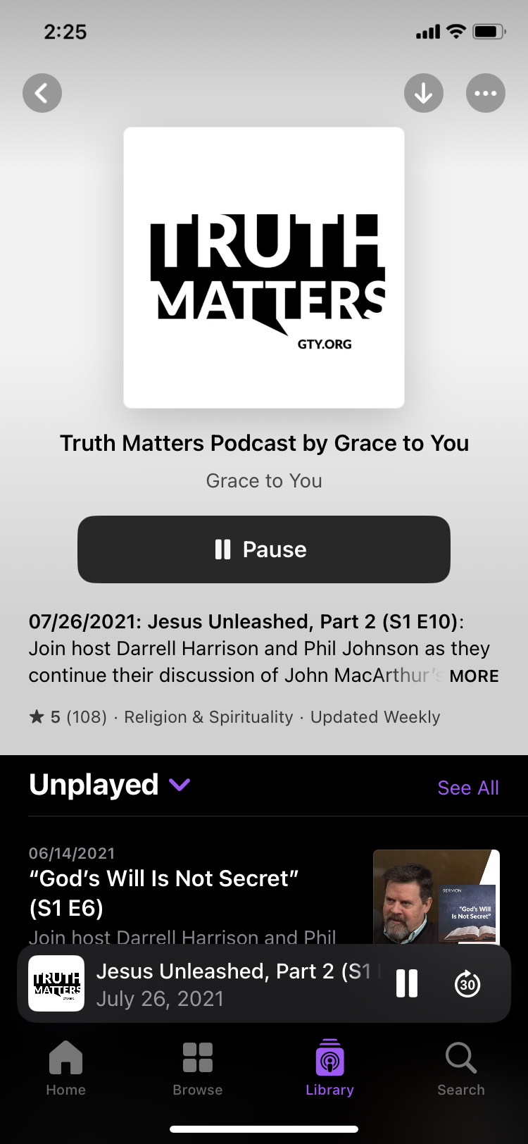
Each episode has its own hero imagery and thematic layout, reflecting the subject matter while staying true to the brand system. I created all the assets in-house, including episode thumbnails, podcast artwork, website banners, and social share images, cohesive yet distinctive for each episode.

UX, Web & Podcast Integration
With leadership from the Digital Platforms Director and collaboration with the Senior Software Architect, I developed the site on WordPress for practical content publication and management. It is clean, minimal, content-first, and easy to navigate, built with a focus on SEO and accessibility so the podcast is easily discoverable, playable, and engaging for all audiences. Visitors can leave a comment or share an episode on social media, and the fully responsive experience works seamlessly on mobile—because I knew a lot of listeners would be discovering it on the go.
The homepage showcases the most recent episodes with a global media player for immediate listening/watching that is not interrupted while navigating the site, keeping visitors focused on consuming great content. A sidebar menu and clear CTAs (“Listen/Play,” “Share,” and “Subscribe”) give straightforward access to episodes anywhere in the site.

Learning and Reflection
What I learned
- Owning branding, UX/UI design, and front-end development together made it possible to keep every touchpoint, from the logo to the episode pages, telling one consistent story.
- Keeping the global media player uninterrupted while visitors browse showed me how navigation can be designed around the main task of listening and watching.
- Creating episode assets in-house showed me how a brand system can keep episodes cohesive yet distinctive.
Reflection
As the Product Designer & Web Developer behind the Truth Matters Podcast, I embraced the challenge of creating a digital experience that felt as grounded and compelling as the content itself. My goal was to ensure every touchpoint—from the logo to the episode pages—told a consistent story, uniting branding, UX/UI design, and front-end development into a cohesive whole.
[ Let's connect ]
Let's work together
Have a project, a role, or an idea in mind? I'd love to hear about it.