Branding, Design, & DevelopmentConference Brand & Web
Truth Matters Conference
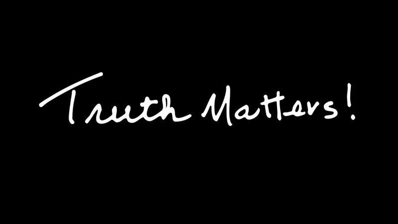
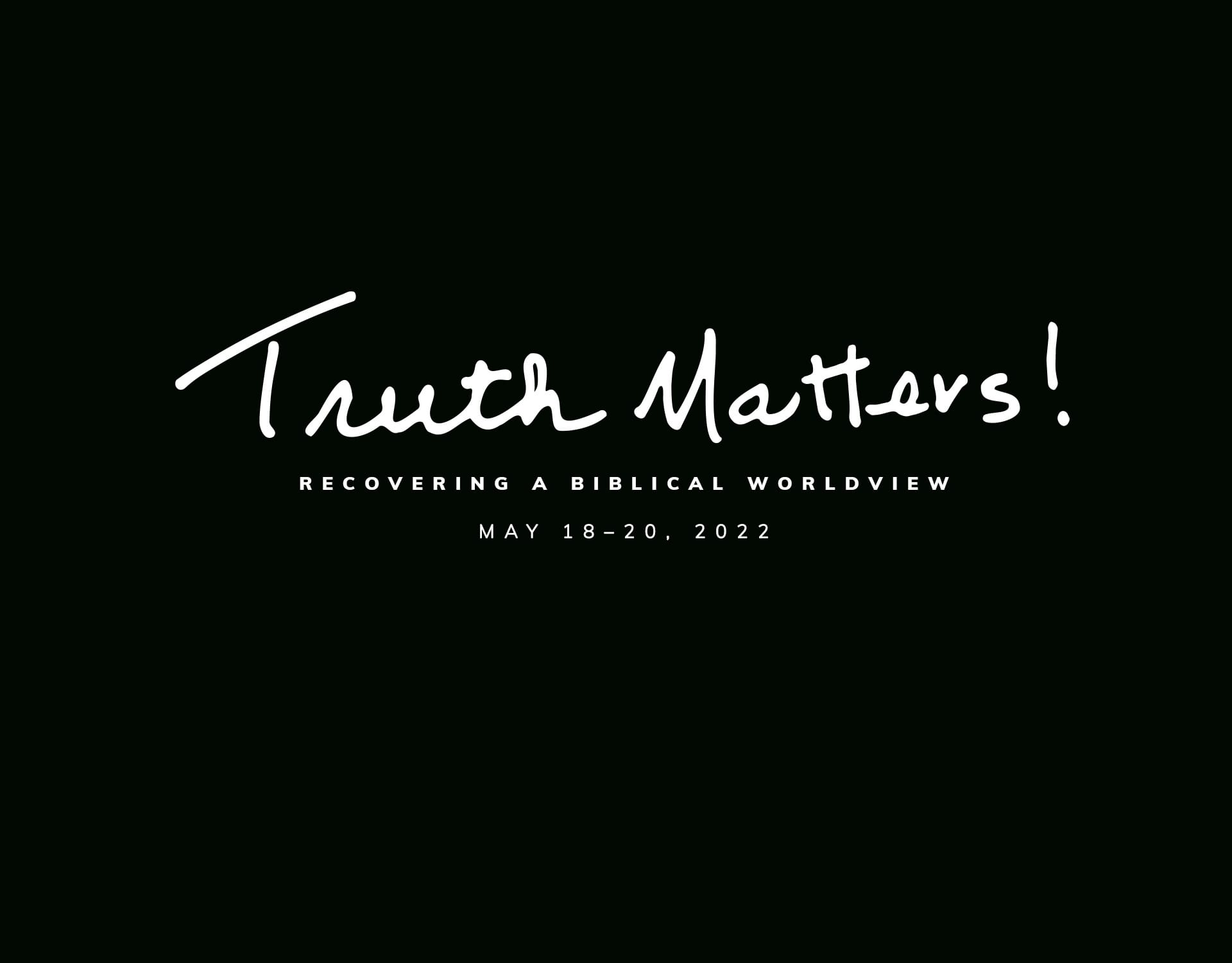
The brand for Grace to You’s Truth Matters conference, built from John MacArthur’s own handwriting and carried from the LED wall and livestream to the conference pages, merch, and stickers.
- Client
- Grace to You—A Christian Media Organization
- Role
- Brand, Motion, and Web Designer & Developer
- Platform & Tools
- Illustrator, Photoshop, After Effects
Overview
Truth Matters is Grace to You's Bible conference. This one, Truth Matters: Recovering a Biblical Worldview, was the first held outside California, at the Answers Center at the Ark Encounter in Williamstown, Kentucky, with John MacArthur and guest speakers over three days of preaching and panel Q&As.
I designed the brand and everything that carried it: the graphic on the LED wall behind the stage, an animated logo, the livestream thumbnails, the website banners, and the shirts, sweatshirts, bags, and stickers. I also designed and built the conference pages on GTY.org.
Results & Impact
One mark ran through the whole conference. The handwriting on the LED wall behind each speaker was the same one on the livestream, the website, the merch table, and the stickers, so the event looked like one thing in the room and online. After the conference, its twelve sessions were published together as a series on GTY.org, under the same mark.
The Handwritten Mark
From Handwriting to Vector
The logo is John MacArthur's own handwriting. I traced it and cleaned it up in Photoshop, then vectorized it in Illustrator, keeping the pen's movement while making the letters even enough to read at any size, from a sticker to the jumbotron.

Animated Logo
In After Effects I gave the mark the effect of being written by hand, stroke by stroke, so it appears the way it began: as someone writing it.
Loading video...
On Stage
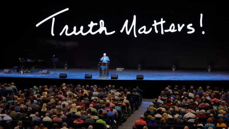
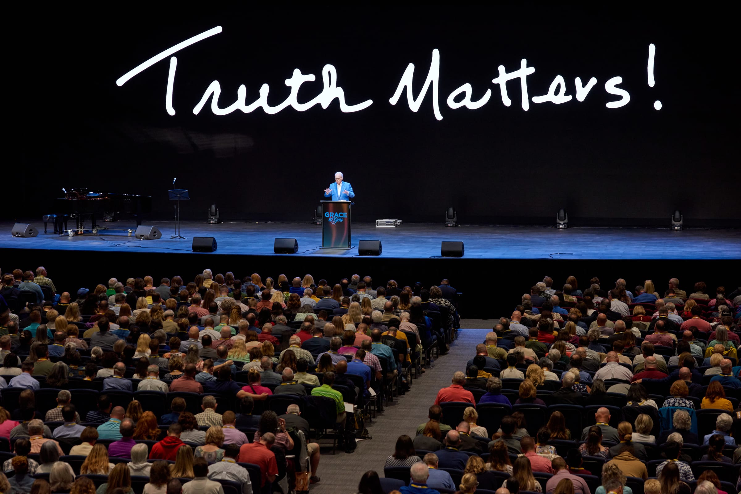
On the LED wall the mark became the backdrop for every session, set high and wide so it framed the speaker at the podium without competing with him.
Livestream & Web
Livestream
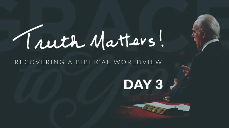
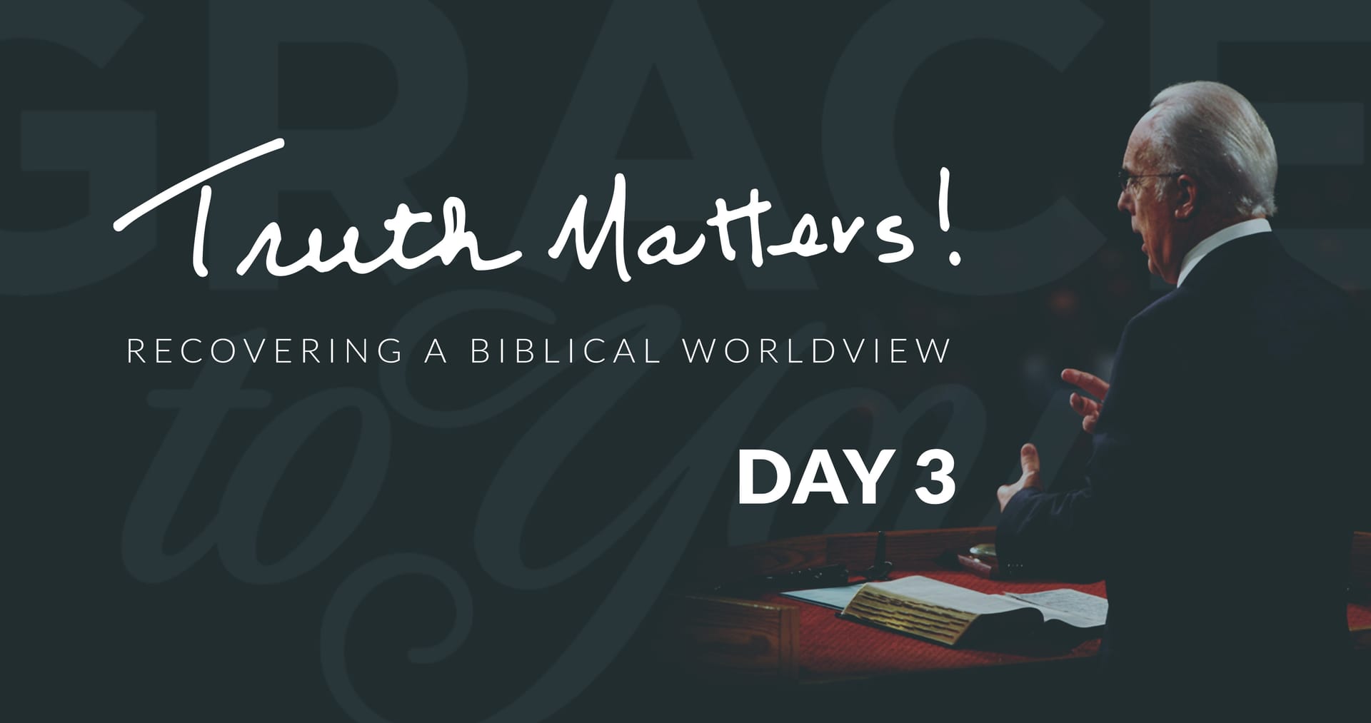
Each day of the conference streamed on YouTube. Standby screens and thumbnails pair the mark with the conference subtitle and the day, over a dark Grace to You ground.
Banners
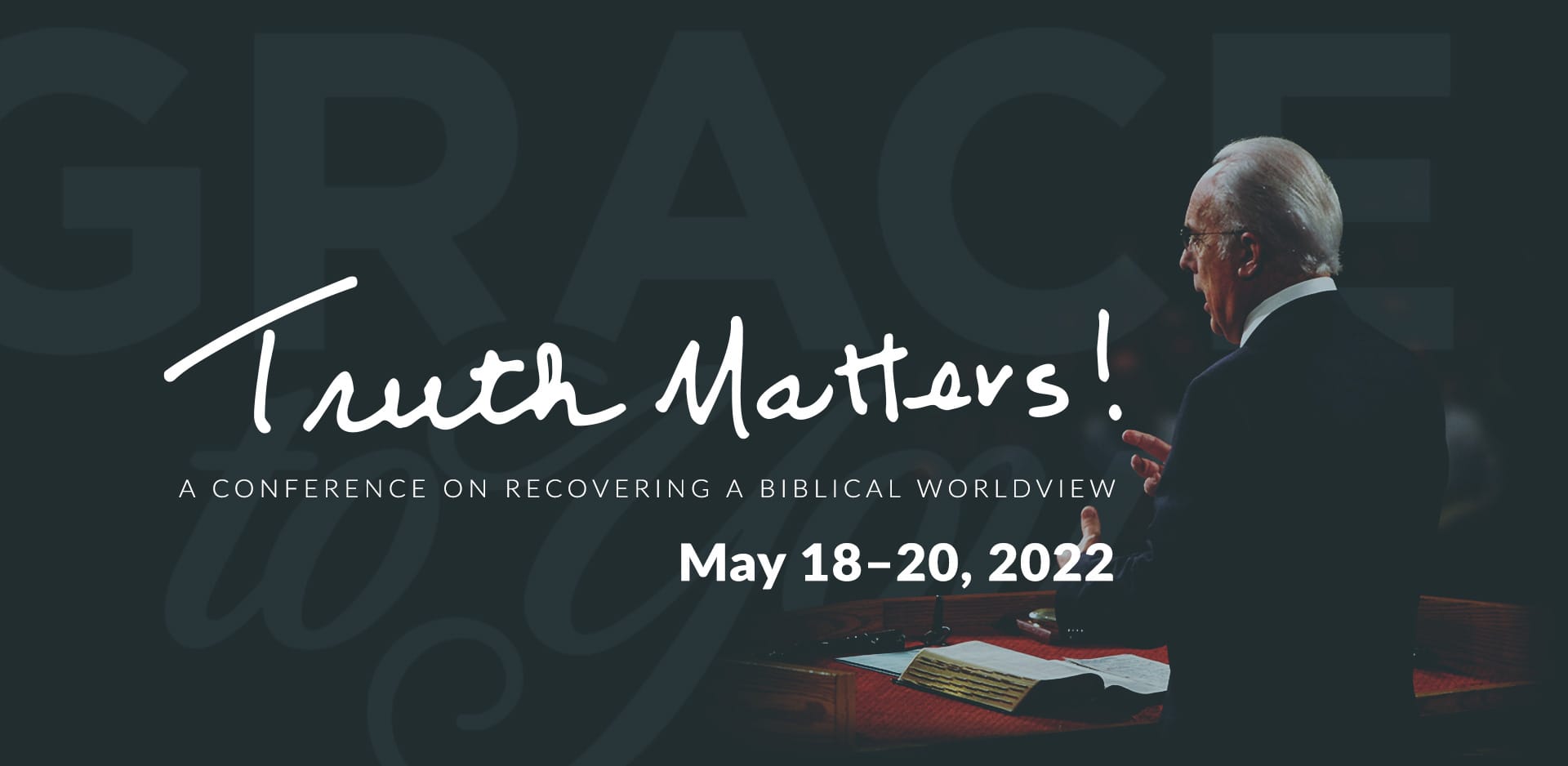
Banners across GTY.org pointed visitors to the conference and its livestream: one on the homepage, and the conference page's header.
Conference Pages
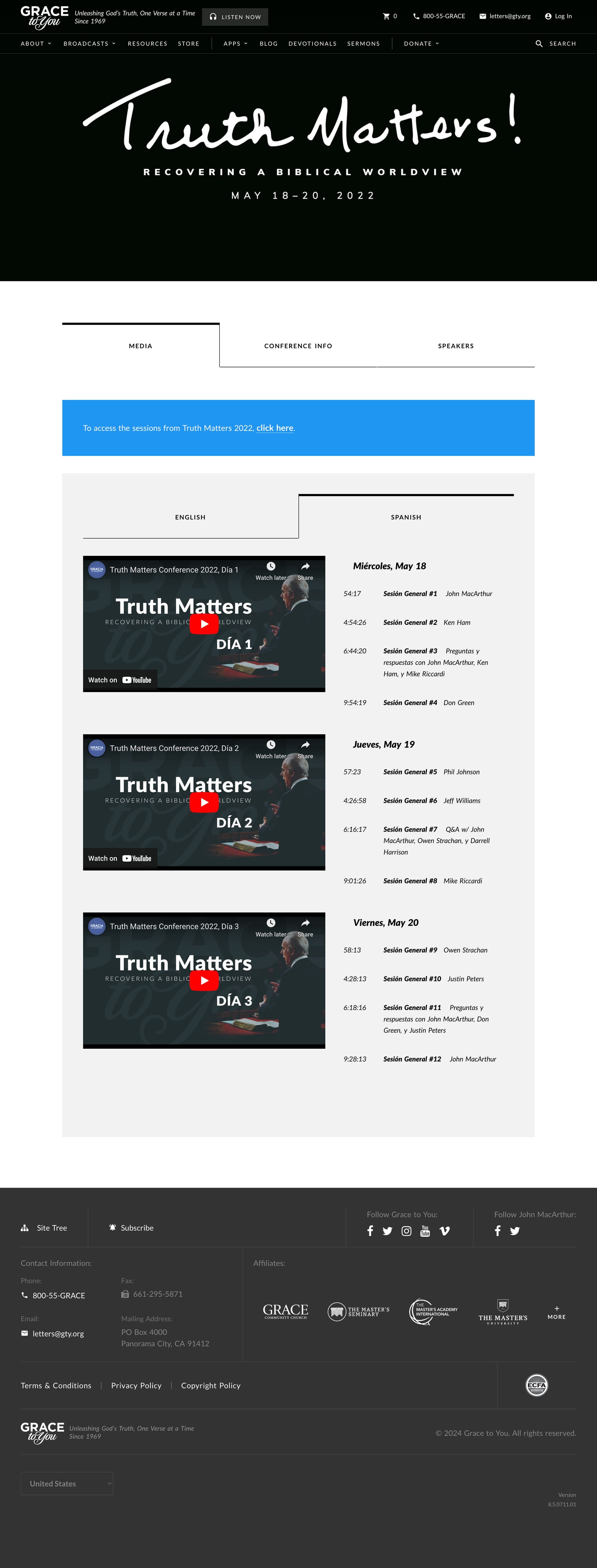
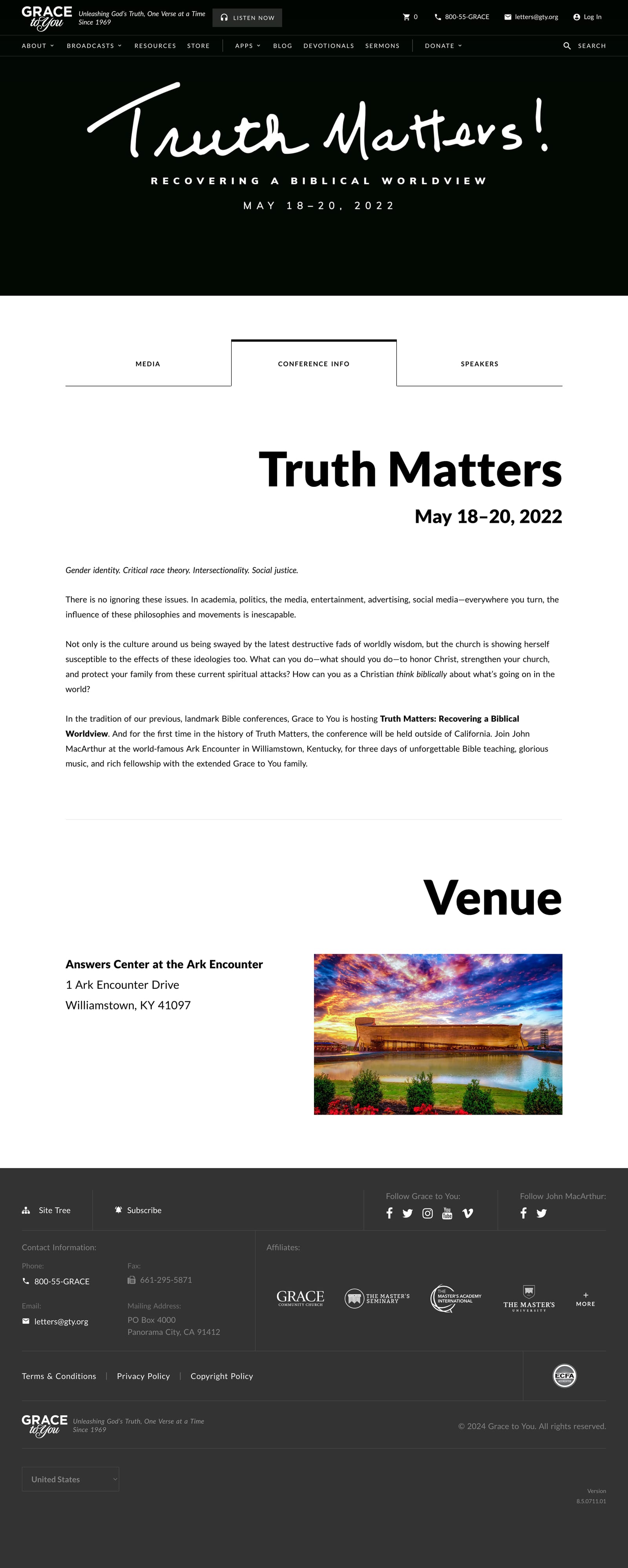
I designed and built the conference page on GTY.org, with three tabs: the session videos by day, the conference details and venue, and the speakers.

After the Conference
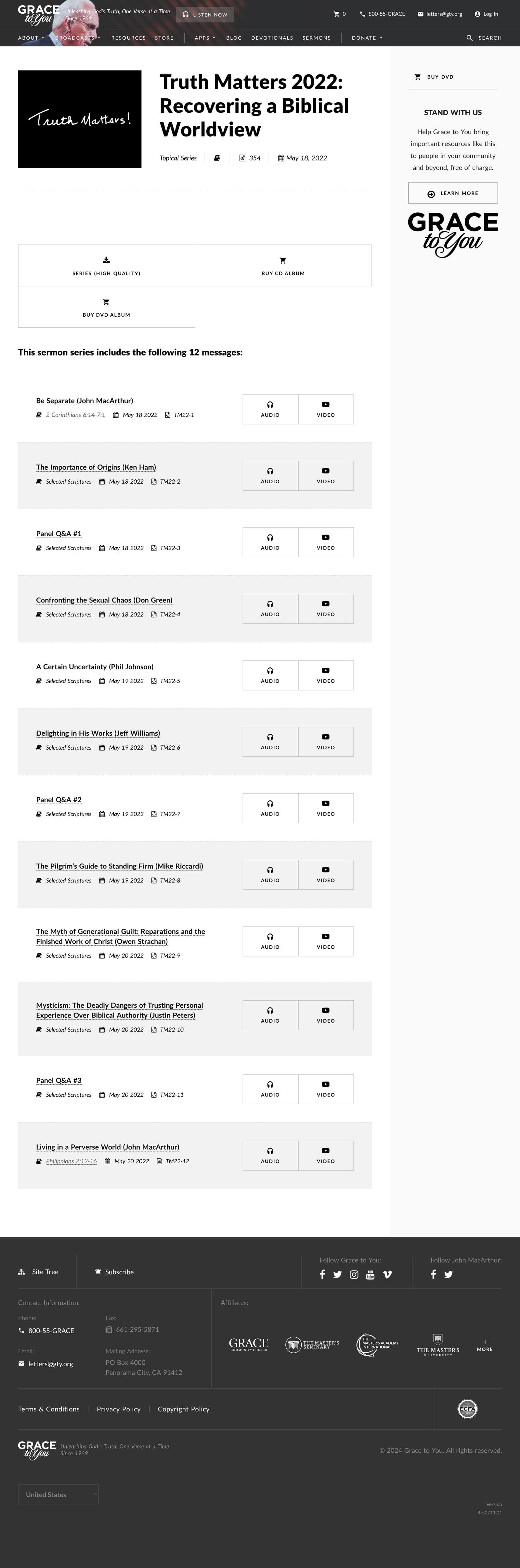
Once the conference ended, its sessions moved to a product page as one series, with video and audio for each message and the option to buy the set on DVD or CD.
Merch & Stickers
Shirts
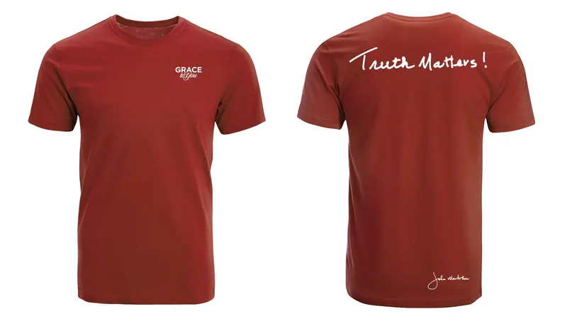
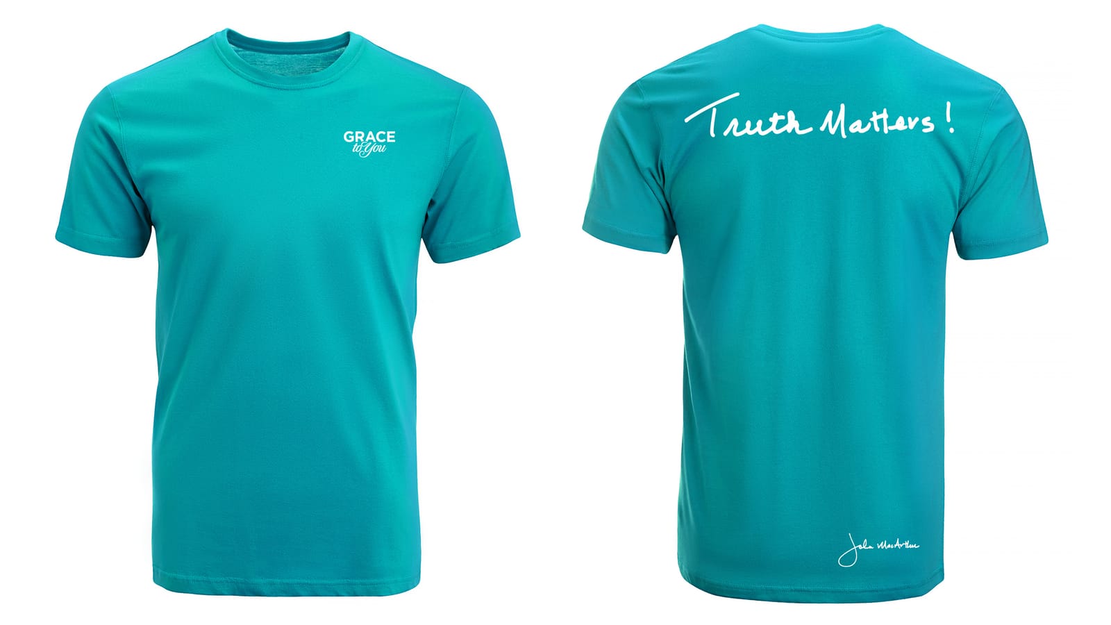
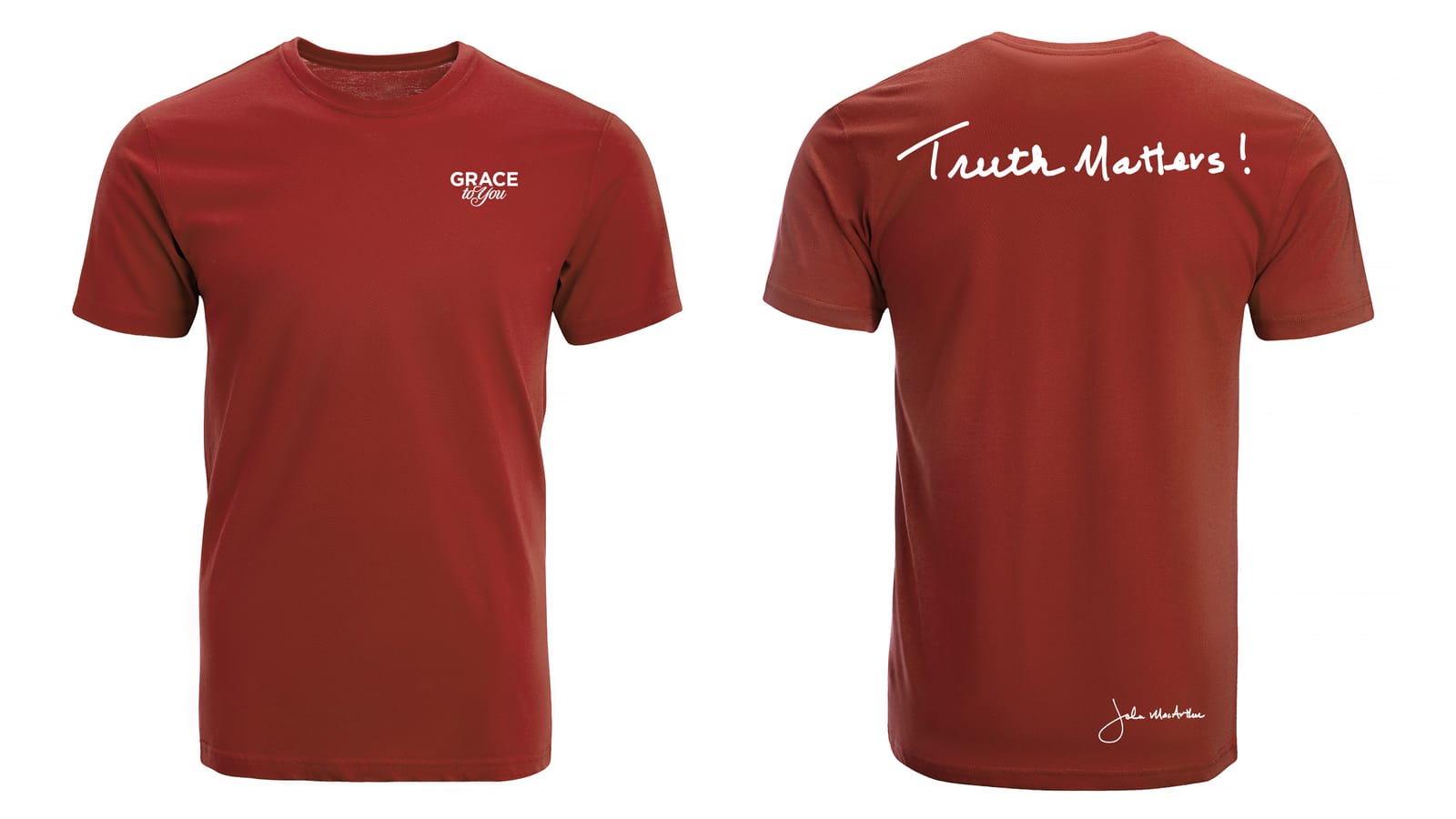
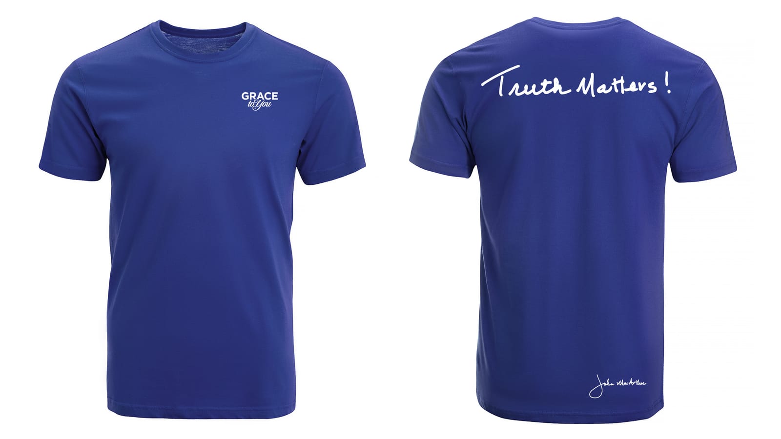
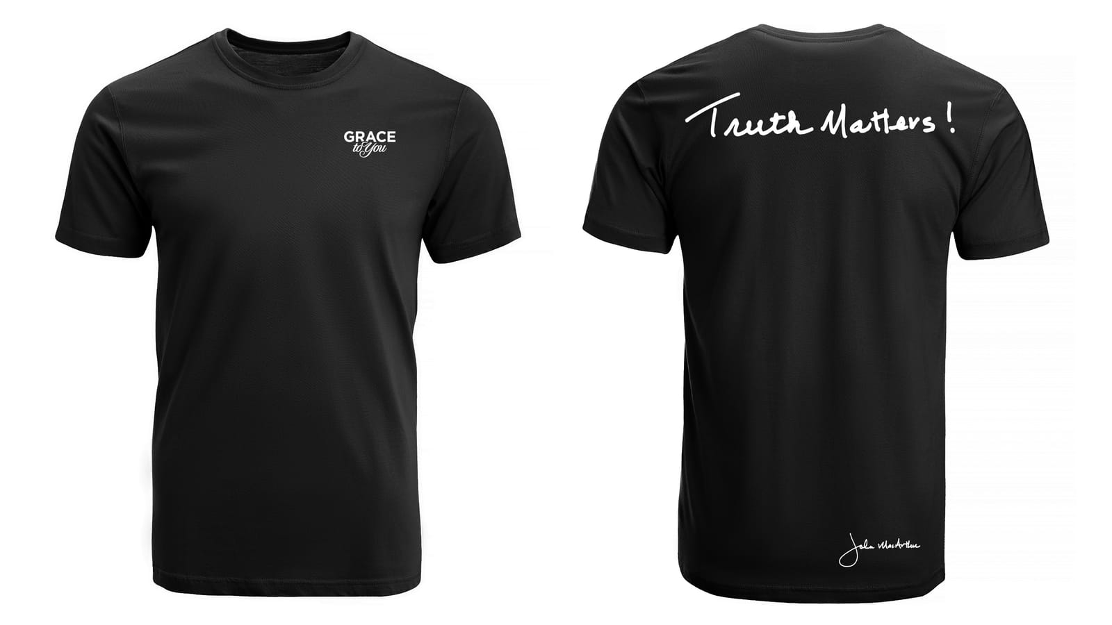
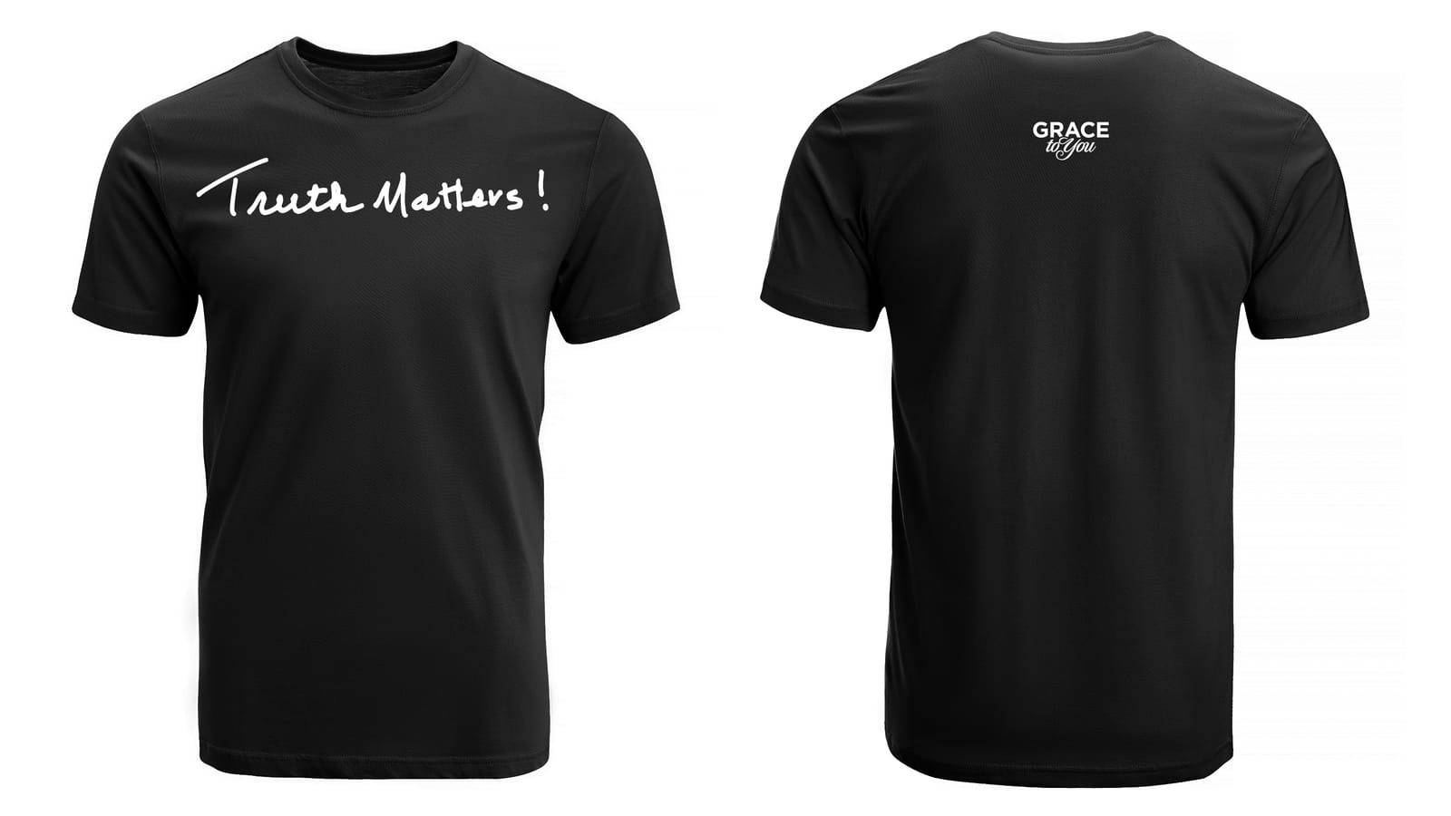
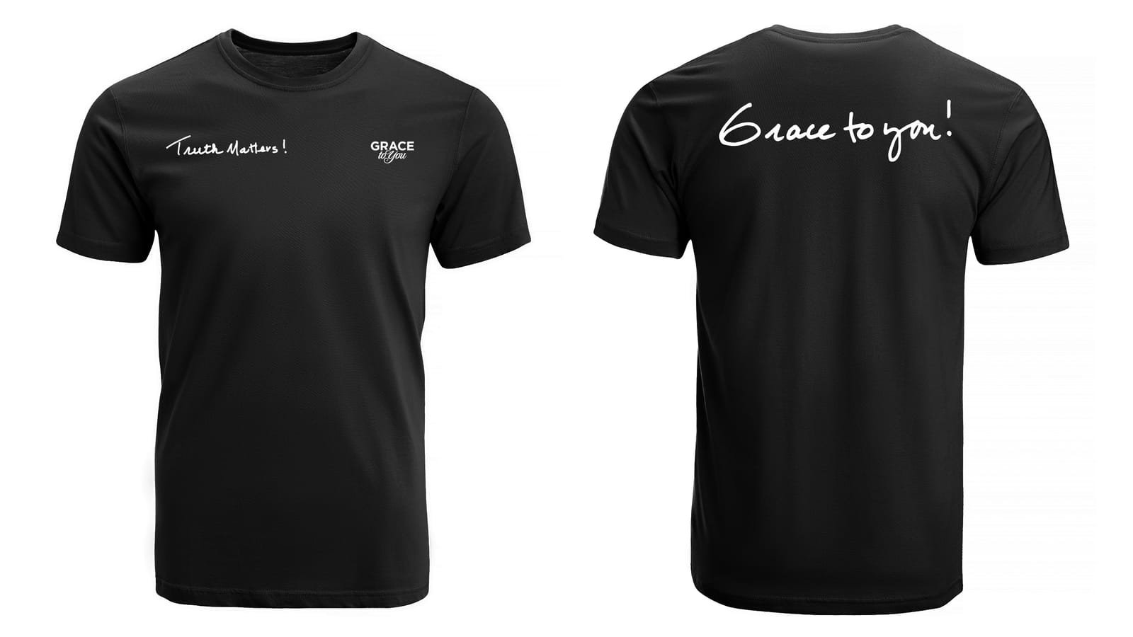
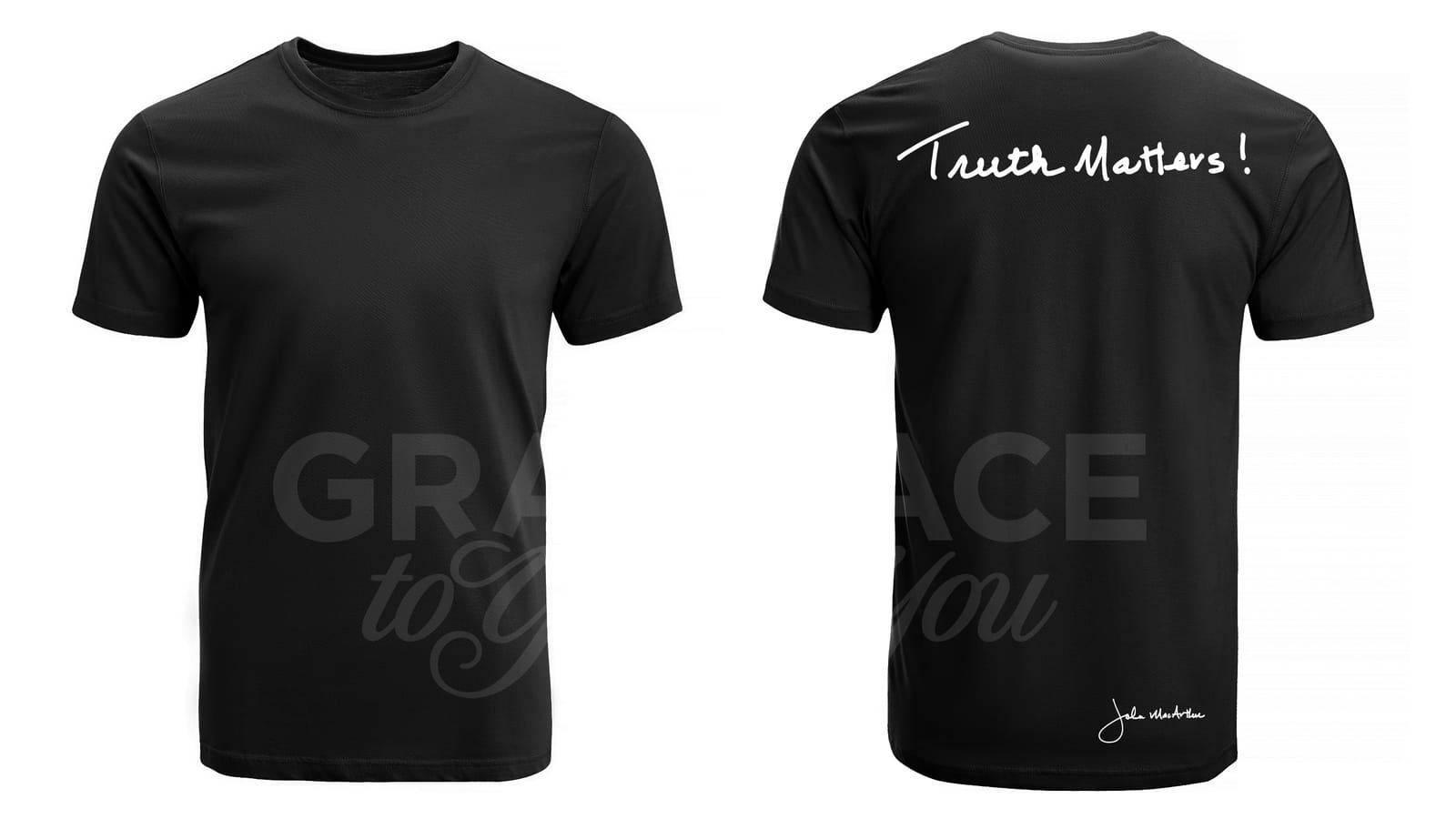
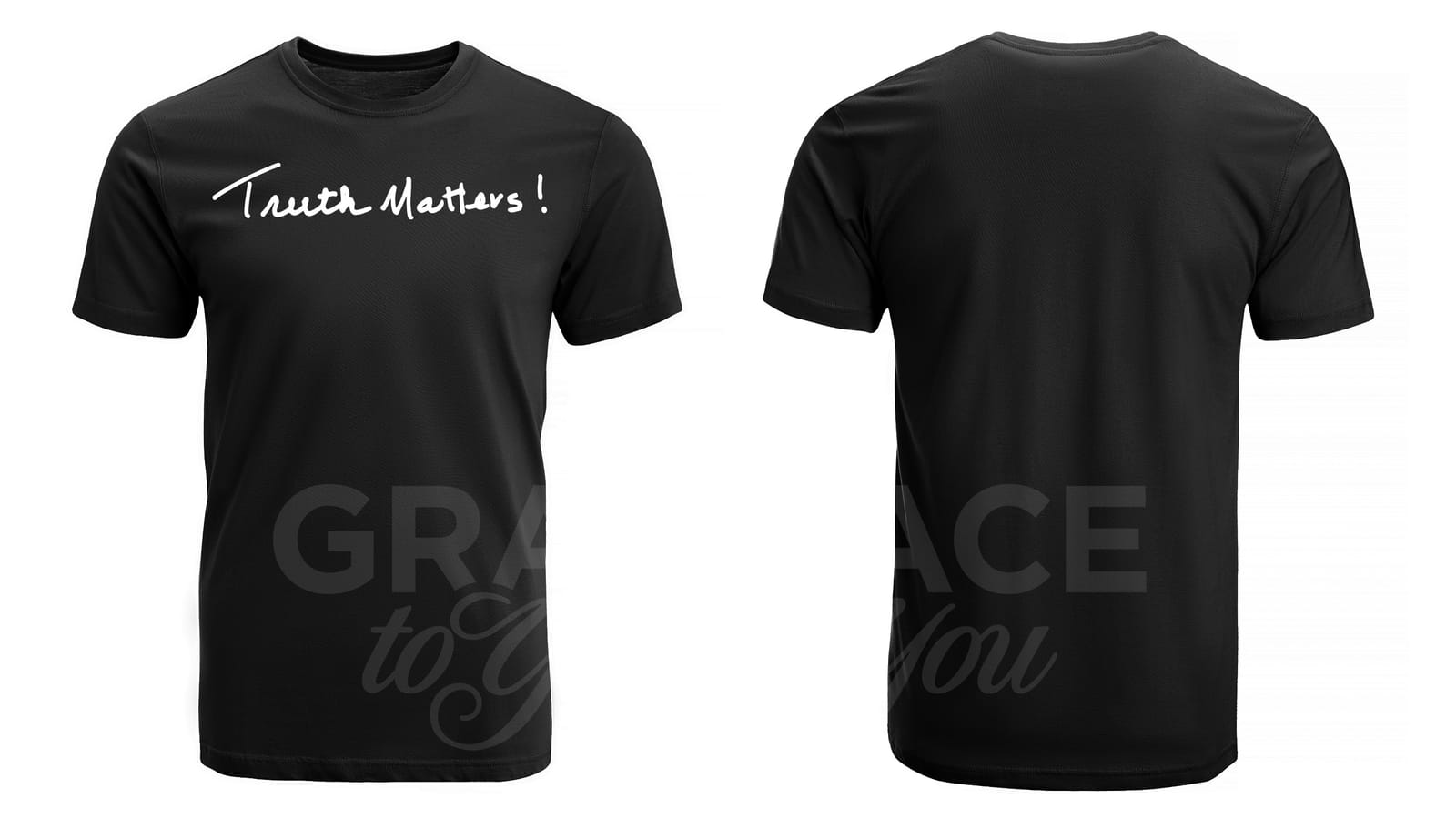
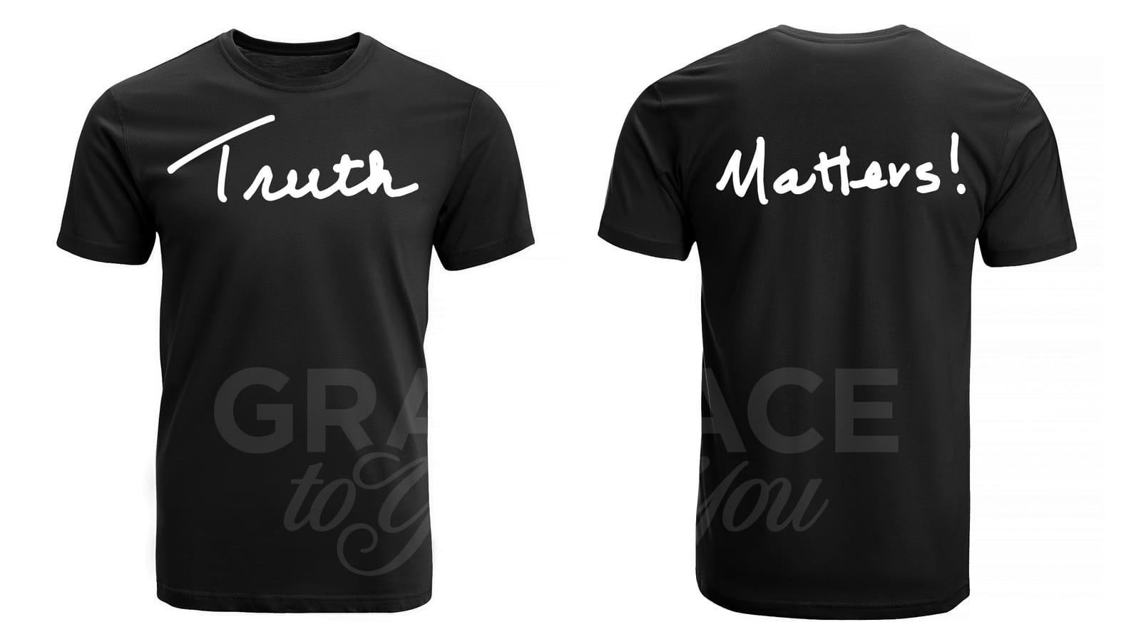
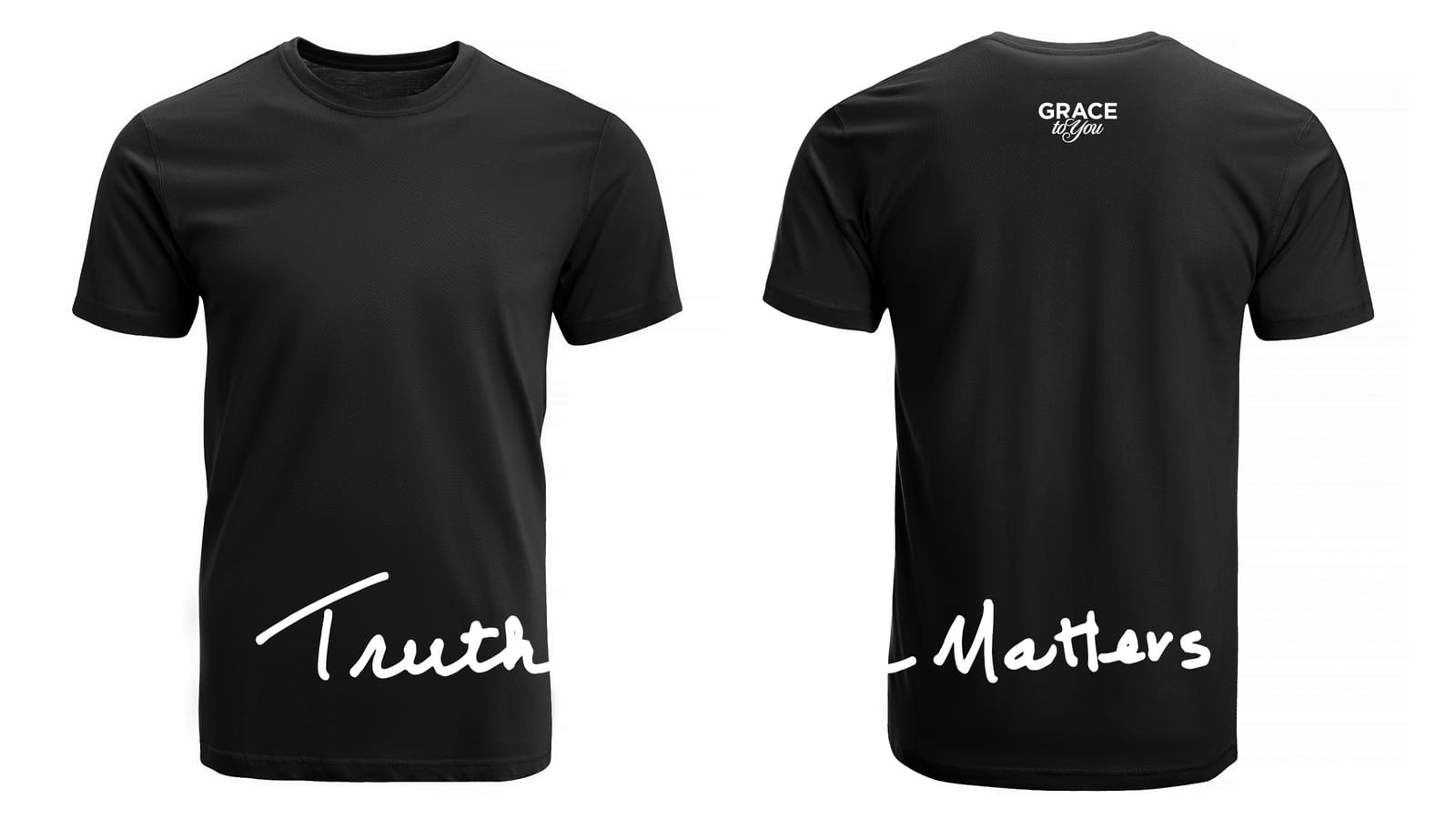
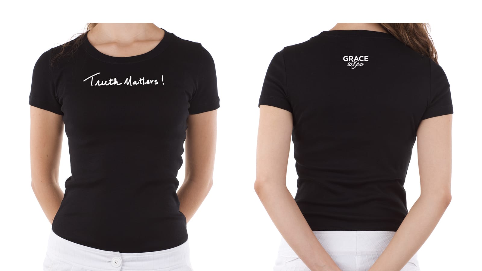
The shirts carry the handwritten mark across the back, with the Grace to You logo on the front and John's signature near the hem. I explored layouts on black before settling the color range.
Sweatshirts & Bag
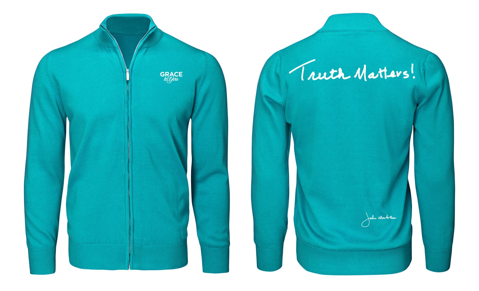
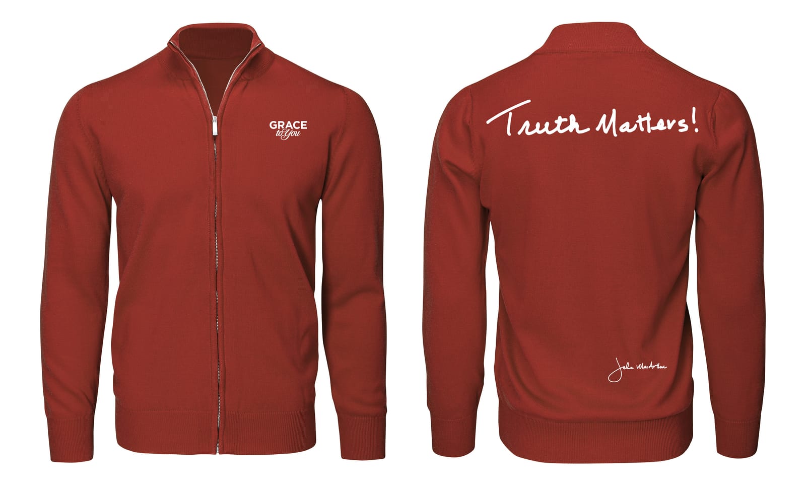
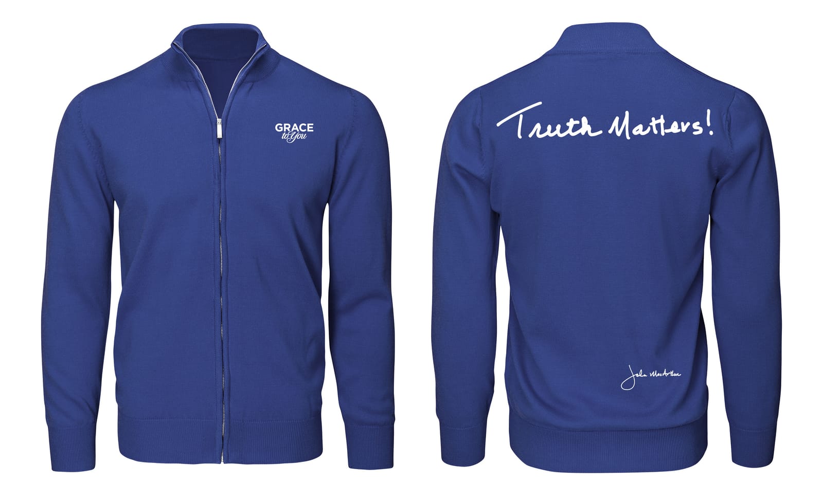
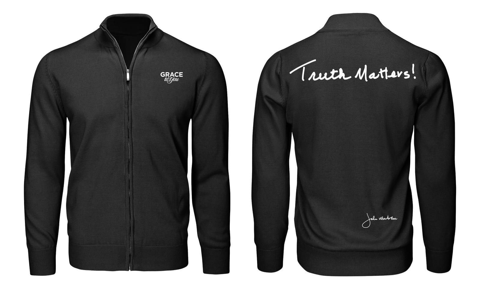
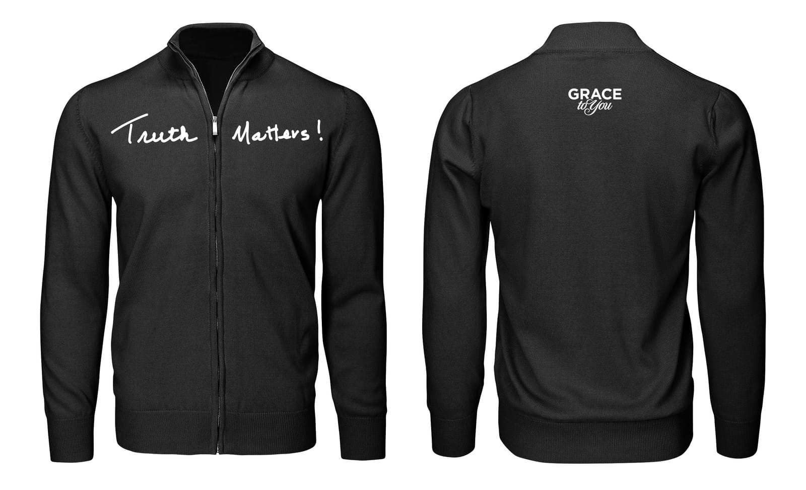
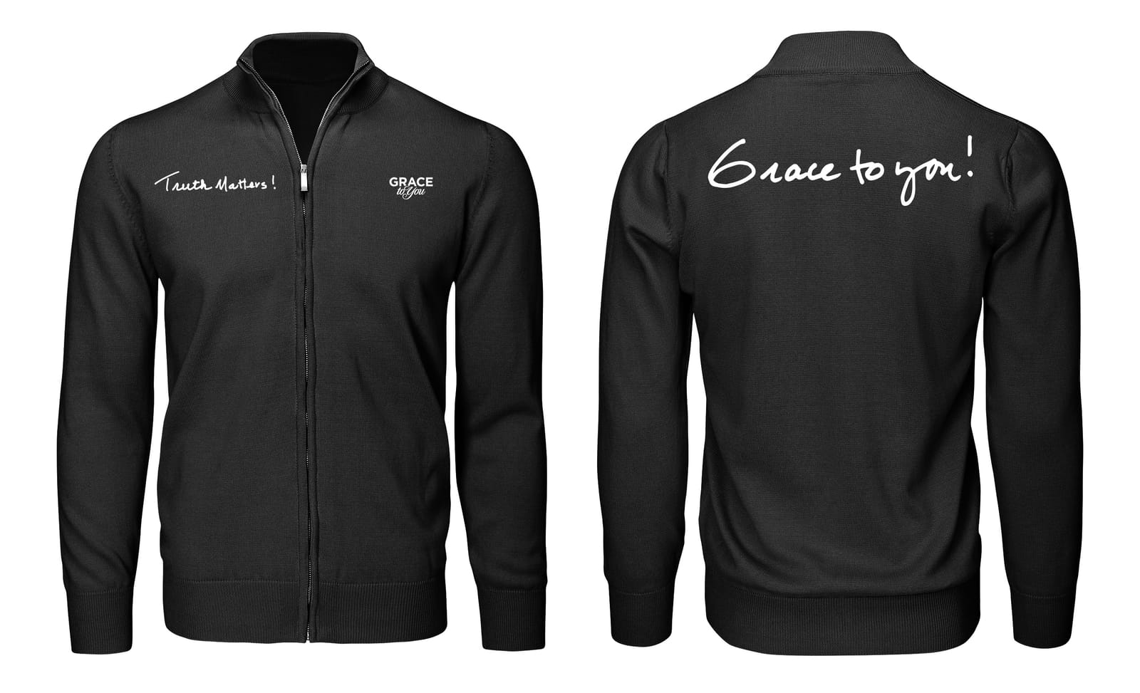
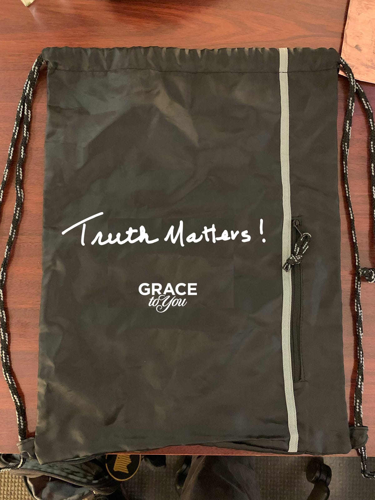
The zip sweatshirts follow the shirts in the same three colors and on black, and a black string bag carries the mark with the Grace to You logo beneath it.
Stickers
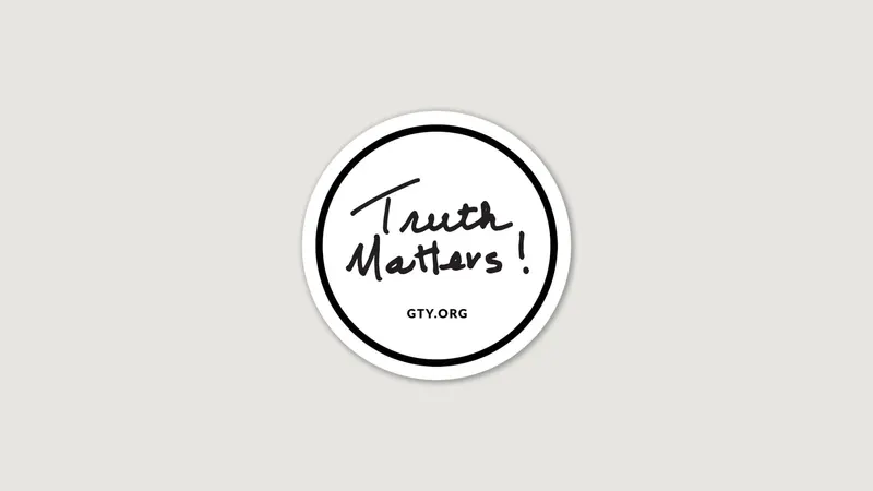
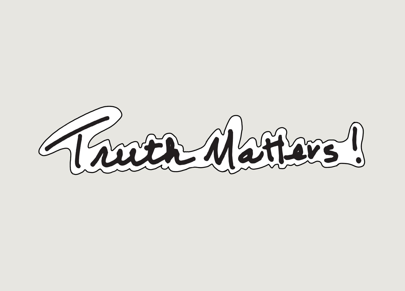
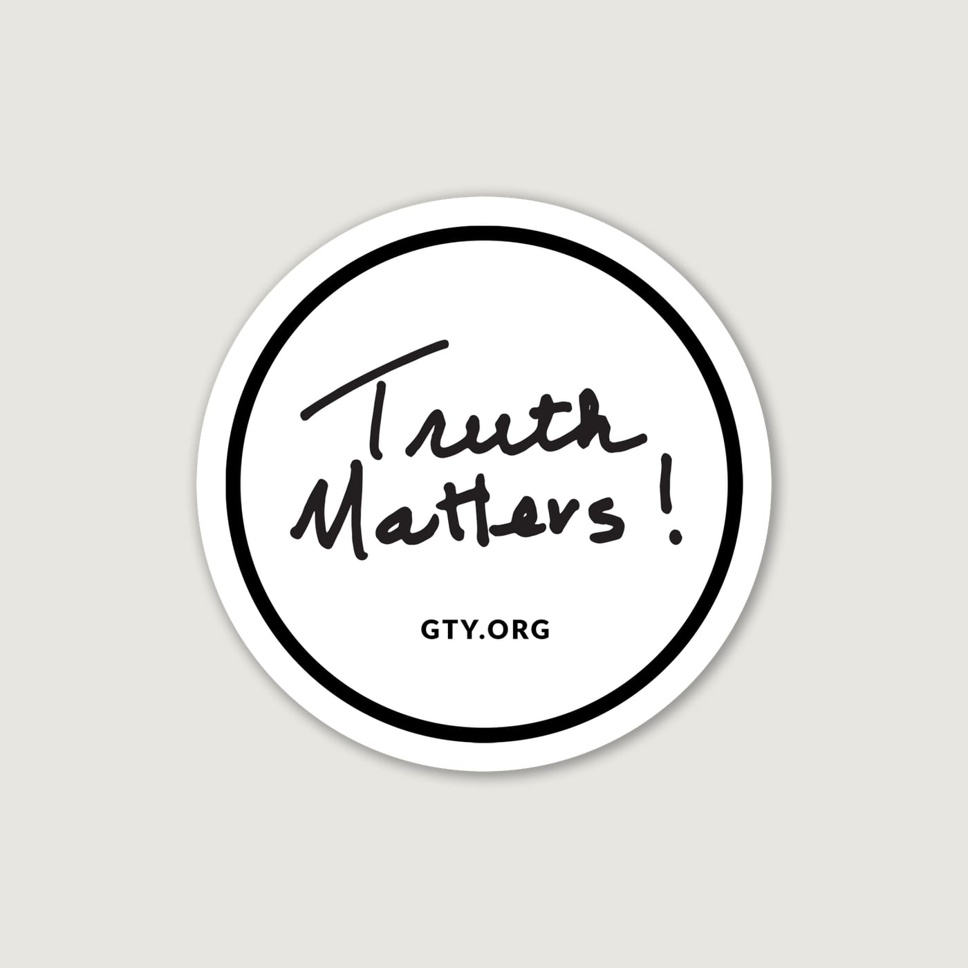
A die-cut sticker of the mark and a round one with GTY.org under it were the conference's branding stickers. Grace to You, as the sponsor, had its own round sticker in black and in white.
Reflection
What I learned
- Building the logo from the speaker’s own handwriting gave the conference a voice no typeface could. The work was keeping it legible as I cleaned it up and turned it into vectors.
- The same mark had to hold up on a stage-sized LED wall and on a sticker, so I checked it at both sizes early instead of designing for one.
- Animating the handwriting stroke by stroke made the mark feel written in the moment, which suited a conference built around live preaching.



[ Let's connect ]
Let's work together
Have a project, a role, or an idea in mind? I'd love to hear about it.