Branding, Design, & Development24/7 Broadcast Platform
Grace Stream
Designing and building Grace to You's 24/7 online broadcasting platform—a digital space where truth can stream 24/7 and people can tune in without distraction.
- Client
- Grace to You—A Christian Media Organization
- Role
- Product Designer & Web Developer
- Website
- gty.org/listen/gracestream
- Platform & Tools
- Radio.co
Overview
Listeners needed uninterrupted access to biblically sound preaching—during a morning commute, throughout a workday, or in quiet evening moments. Grace to You created Grace Stream, a 24/7 online broadcasting platform featuring continuous teaching from John MacArthur's extensive library of sermons, to meet that need.
This project was about building something quietly powerful. Not flashy. Not overdone. Just a digital space where truth can stream 24/7—and people can tune in without distraction. As both the Product Designer and Web Developer, I set out to create an experience that is clean, approachable, and timeless.
Results & Impact
Grace Stream is live as a 24/7 broadcast of John MacArthur's teaching: a looping playlist on Radio.co, a player customized to the GTY design language, and “Now Playing” info that updates dynamically. The ministry chose the Wave logo, which I used for all digital and print assets. Check out how Grace Stream offers continuous, scripture-rich content that's always available.
Brand Identity
Concept
Grace Stream isn't just another media player—it's a 24/7 stream of John MacArthur's verse-by-verse teaching. That clarity and consistency inspired a branding approach that is simple, strong, and steady. The wordmark is intentionally understated: it fits within the larger GTY brand ecosystem but has enough personality to stand on its own, like a “channel” you can always trust. I wanted to capture movement, peace, and spiritual depth, clean and versatile for print and digital, and explored two options.

Logo, version 1 — The Arrows Design: Built around continuous movement, with a digital-forward feel for an app icon or loading screen. The open circle with arrows suggests ongoing flow and content that is never-ending, always accessible, always looping back. It has a more tech-savvy, dynamic energy.
Logo, version 2 — The Wave Design: A circle for wholeness, unity, and continuity, with three flowing wave lines inside to symbolize a stream: not static, but always in motion, always available. A bold sans-serif for “GRACE” gives presence and strength, and a lighter type for “STREAM” complements it. It feels grounded and serene.
Only one would represent the brand, and the ministry decided on the Wave logo. Depending on where Grace Stream shows up—a worship service, the GTY app, a podcast, a digital community, or a conference—the brand shows up consistently but appropriately tailored.

Logo Suite
The Wave logo is one roundel, used in three ways: deep blue on white, and white over photography, with or without a blue overlay.
Deep Blue on White
- Ground
- White
- Use for
- The default: print, the GTY app, podcasts and anywhere on a light background.
White on Blue
- Ground
- Photo with a blue overlay
- Use for
- Social graphics and app artwork, where a photo sits behind the logo.
White on Photography
- Ground
- A calm, dark area of a photo
- Use for
- Website heroes and event screens, with the logo over an even patch of the image.
Clear Space & Size
The circle needs room around it to read as a calm, whole shape, and enough size for the three waves to stay separate.
- Clear space
- One eighth of the circle’s width (x) on every side.
- Minimum size
- 64px wide on screen, 0.75 in (19 mm) in print, so the three waves stay distinct.
- Over photos
- Only on a calm, even area; add the blue overlay when the photo is busy.
Color
A deep blue brings calm and trust and hints at water without being too literal. Over photos, the logo turns white and a blue overlay keeps the image quiet behind it.
Deep Blue
- Hex
- #345171
- RGB
- 52 81 113
The logo on white. Calm and trustworthy, hinting at water and depth; 8.2:1 on white.
Overlay Blue
- Hex
- #1E4181
- RGB
- 30 65 129
The blue laid over photography behind the white logo, shown here at its deepest.
White
- Hex
- #FFFFFF
- RGB
- 255 255 255
The ground for the blue logo, and the logo itself over photos.
Typography
Two weights of one sans-serif make up the name, so it reads as a single, steady channel name.
“Grace” — Bold
A bold sans-serif that gives the name presence and strength.
“Stream” — Light
A lighter, tracked-out weight that complements “Grace” without competing.
Usage
A few rules keep Grace Stream consistent wherever it shows up: a worship service, the GTY app, a podcast or a conference.
Merchandise
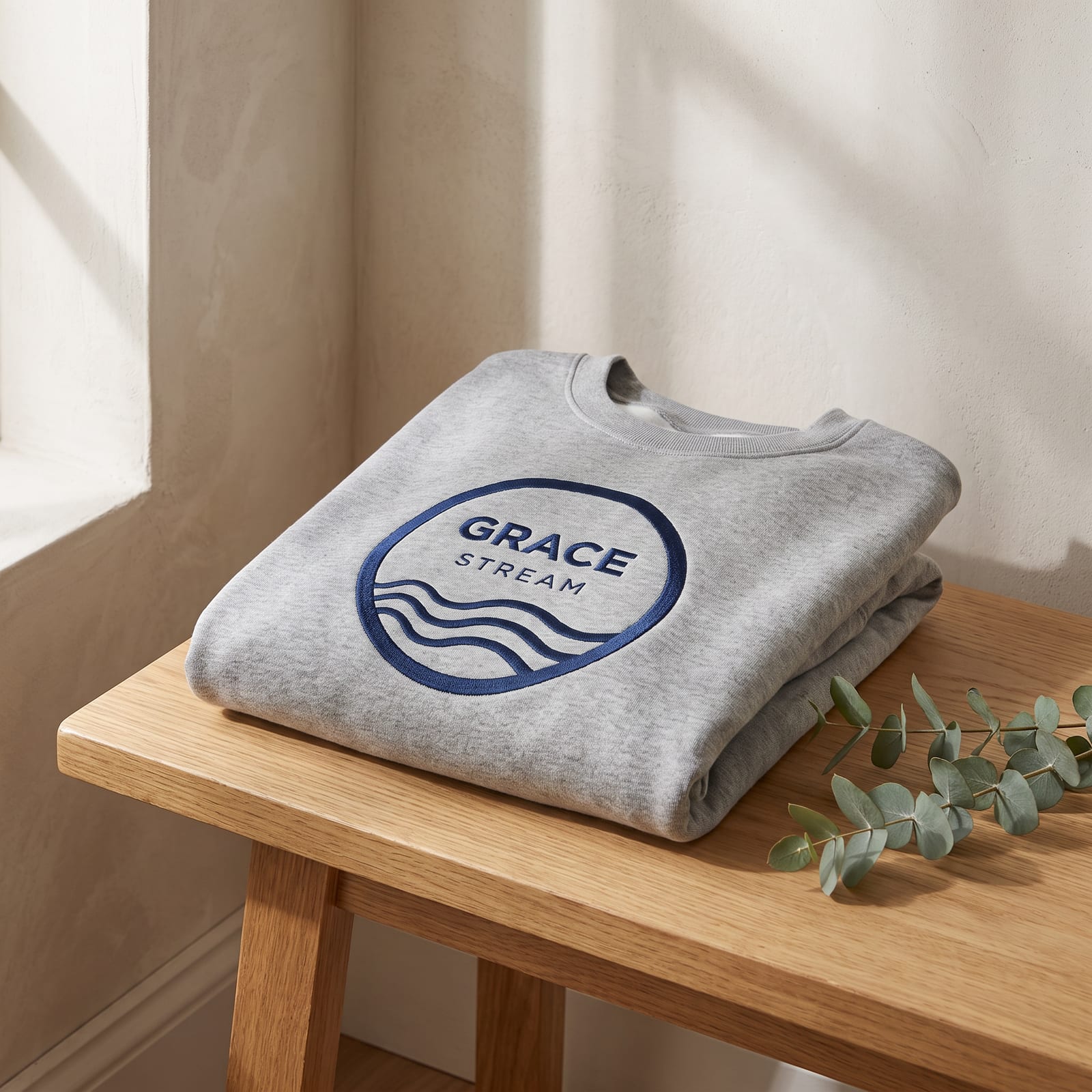
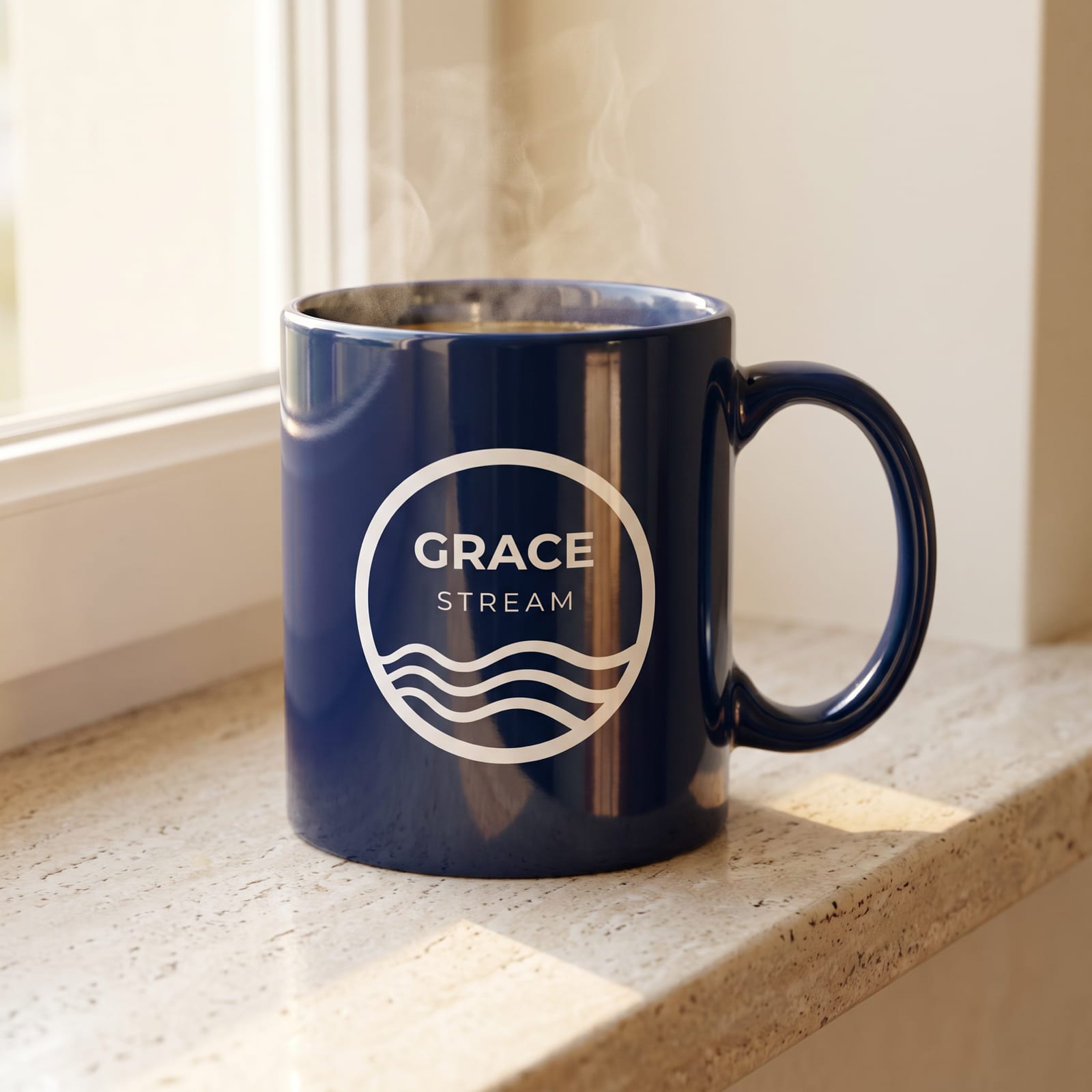
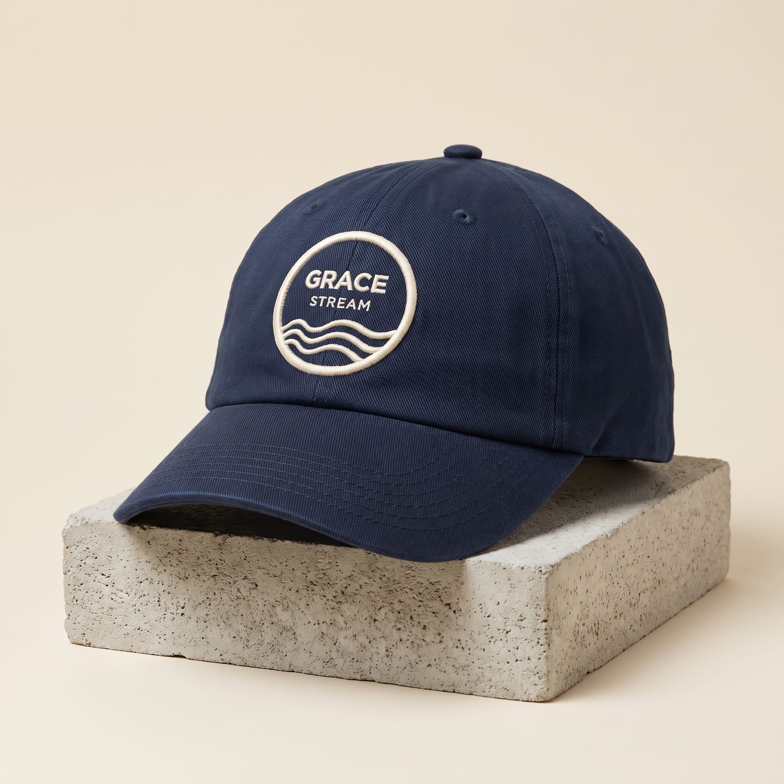
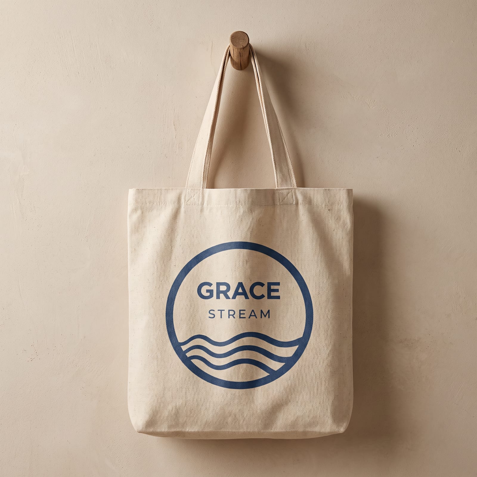
To carry Grace Stream beyond the screen, I extended the identity onto merchandise concepts: a sweatshirt, a mug, a cap, and a tote. The roundel works as a simple print or patch in deep blue on light goods, and reverses to white on dark ones.
Design & Development
UX/UI Design
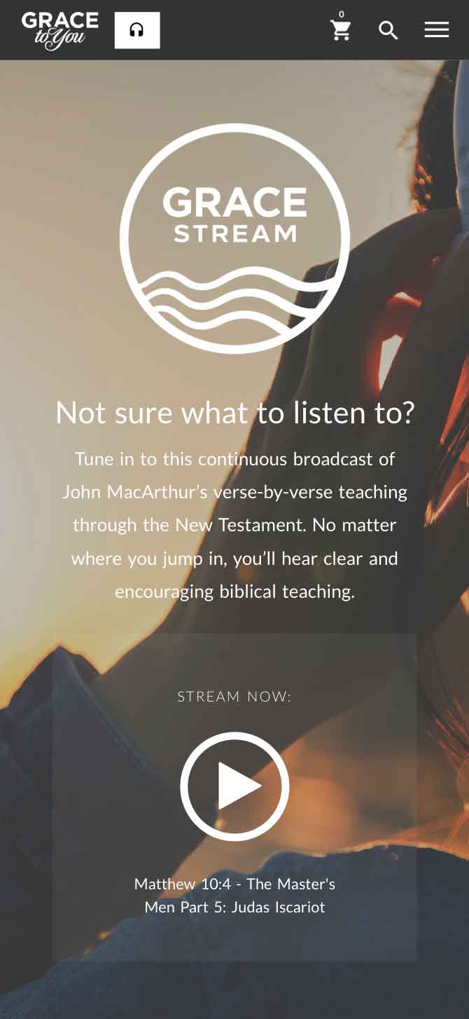
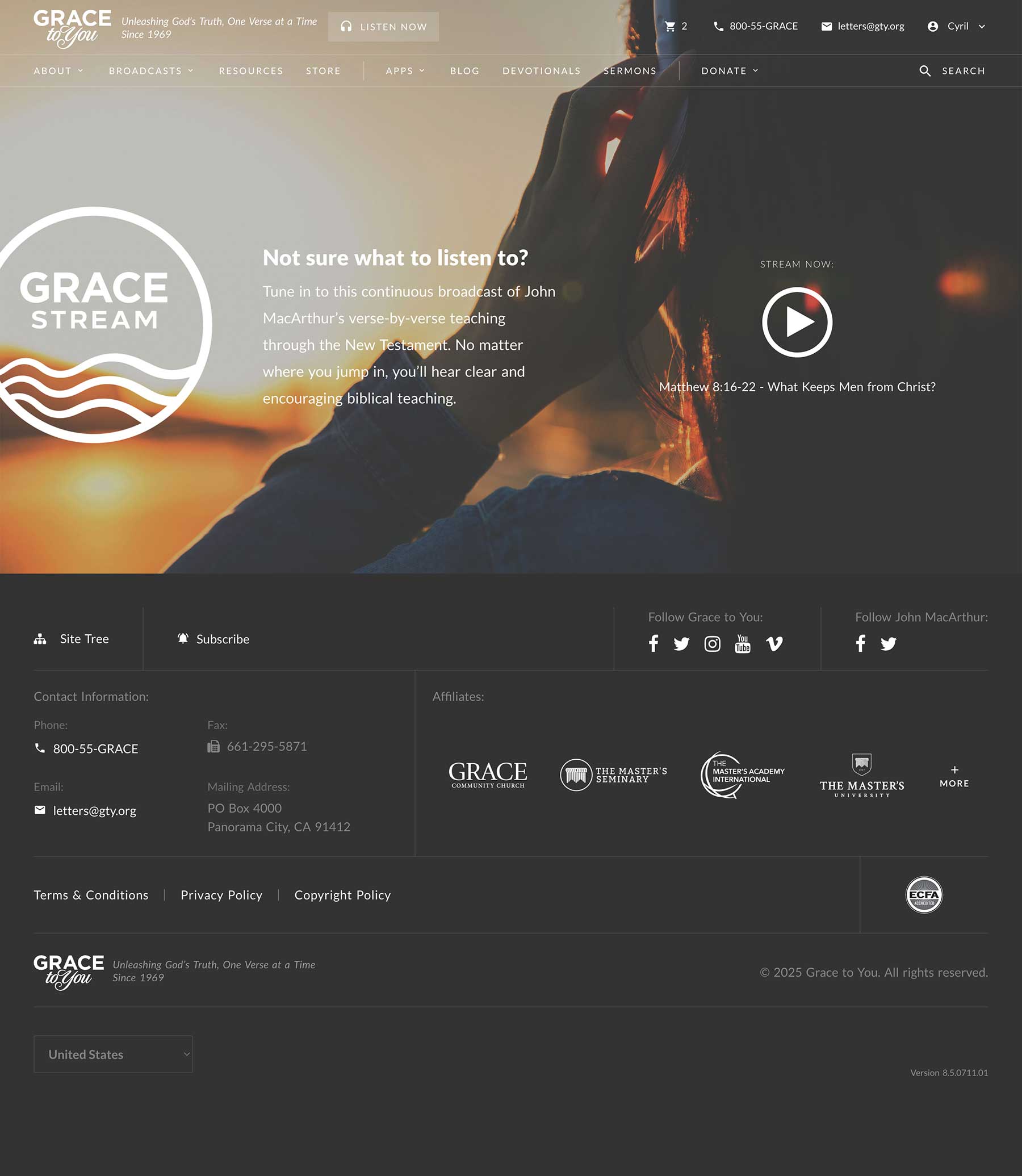
The user experience was all about minimizing friction. Even on a minimal page, every pixel was intentional: the background textures and the soft lighting around the player module reinforce calm, focus, and trust. I leaned into subtle gradients and soft neutrals, avoiding trendy styles so the experience stays classic and enduring, just like the content. This page is about listening, not browsing.
Everything is mobile-first, since many users tune in while driving or working. The interface loads fast and avoids heavy visuals or complex interactions. The “Stream Now” section gives just enough context, and the CTA is always accessible without being pushy.
Development & Integration of the 24/7 Stream
Working with a Back-End Developer, I handled the front-end development, focusing on performance, responsiveness, and real-time functionality, keeping the stream information current and the media player consistent across devices and browsers. Accessibility was a priority—every listener should have access, regardless of how they interact with the page.
The key challenge was delivering a true 24/7 live audio experience that just works, no matter when a listener tunes in. Radio.co provided the backend infrastructure: its reliability, scheduling features, and embeddable player gave us a “set-it-and-forget-it” stream that still offers control over what goes out and when. The Internet Ministry Coordinator, Digital Platforms Director, and I curated a looping playlist of John MacArthur's sermons across a wide range of books and topics, and used Radio.co's scheduling tools so the stream feels like a real-time broadcast rather than a simple playlist.
I then customized the embedded player to match the Grace Stream design system, stripping away anything off-brand or generic, and wrapped it in a custom UI that fetches current track metadata from the Radio.co API to update the “Now Playing” info, so users can see which sermon is airing even if they jump in mid-message.
Because Grace Stream is “always on,” uptime and performance were non-negotiable. The Back-end Engineer and I implemented fallback behaviors for the player and ensured smooth cross-browser playback, even on mobile and lower-powered devices. Press play, and it just works.
Learning and Reflection
What I learned
- Presenting two logo concepts, each with its own rationale, let the ministry choose the direction that would represent the brand.
- Building the broadcast on Radio.co let me put my effort into the player and the listening experience rather than the streaming infrastructure.
- For an always-on product, uptime is a design requirement, which is why the Back-end Engineer and I built fallback behaviors into the player.
Reflection
As the Product Designer & Web Developer for Grace Stream, I embraced the challenge of building a 24/7 online broadcasting platform that feels “quietly powerful”—not flashy or overdone, but a digital space where biblical truth streams without interruption and listeners can tune in without distraction. Working as a cross-functional partner to the Back-End Developer, Internet Ministry Coordinator, and Digital Platforms Director, Grace Stream reinforced that effective product design isn't just about UI polish but about orchestrating technology, content, and mission-aligned strategy to deliver an experience that just works anytime, anywhere.
[ Let's connect ]
Let's work together
Have a project, a role, or an idea in mind? I'd love to hear about it.