Design & DevelopmentTV Dashboard
GTY Dashboard
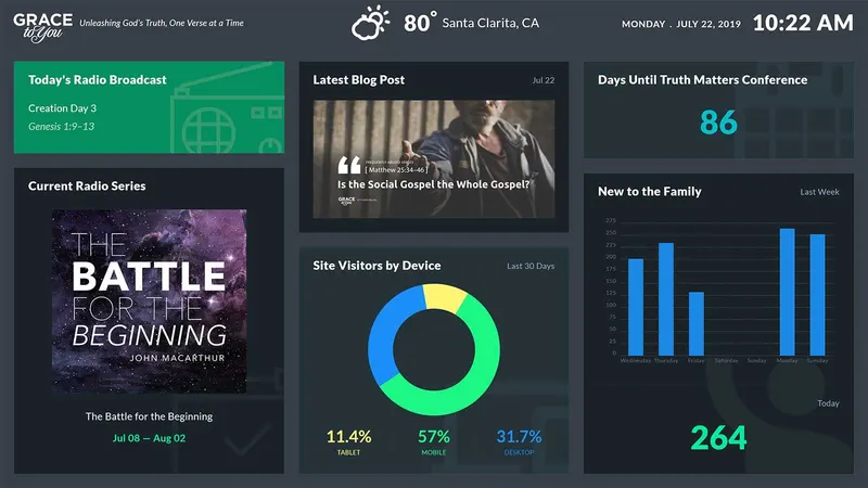
A TV-optimized dashboard interface for the Grace to You office that cycles through weather updates, streaming activity, broadcast schedules, live website stats, global engagement, and ministry activities in a format easy to read from a distance.
- Client
- Grace to You—A Christian Media Organization
- Role
- Web Designer & Developer
- Platform & Tools
- TV — Office Displays
Overview
The Grace to You office had a wide range of ministry activity and website and app usage that staff, volunteers, and visitors had no easy way to see at a glance. As a web designer and developer there, I was commissioned to design and build a TV dashboard for the office: an easy-to-read interface that cycles through weather updates, streaming activity, TV & radio broadcast schedules, live website activity & stats, global engagement, event photos, and ministry activities.
Results & Impact
The TV dashboard is now prominently displayed in the volunteer room and the hallways of the Grace to You office, giving volunteers, staff, and visitors immediate insight into key metrics and activities of the website and apps. It improved internal awareness and coordination during live events and boosted morale by visually reinforcing the ministry's global reach. Team feedback emphasized how easy it was to “just glance at the screen and know what's going on.”
Designing for the Room & Visual Language
Designing for the Room
A dashboard on a wall is a different problem from one on a desk. Nobody sits in front of it or clicks it, and most people only glance at it on their way past. That shaped every decision:
- Readable from across the room: large numerals, short labels and generous spacing, with no small print that matters
- Hands-free: the screens rotate on their own, so there are no menus, filters or hover states to rely on
- Always current: live data for streams, website activity and users, plus the local weather, date and time
- Unmistakably Grace to You: the logo and tagline on every screen, and the ministry's own broadcasts, series and artwork front and center
Visual Language
Every screen shares the same frame. A header bar carries the Grace to You logo and tagline on the left, the current weather in the center, and the date and time on the right, so the dashboard doubles as a clock and a weather station.
Below it, information sits in dark cards on a slate background. Each card follows one pattern: a label in the top-left corner, the time frame or source in the top-right (“So far today,” “Last 30 days,” “GTY.ORG”), and one large figure or image in the middle. Faint line illustrations of a radio, a TV and a calendar sit in the card backgrounds as quiet cues. Color carries meaning rather than decoration: each metric keeps its own color across screens, and the single green card marks what's on air today.
Slate
- Hex
- #383F49
- RGB
- 56 63 73
The screen background behind every card.
Card Charcoal
- Hex
- #2A3137
- RGB
- 42 49 55
Cards, a step darker than the slate so each block of information reads as one unit.
Broadcast Green
- Hex
- #089062
- RGB
- 8 144 98
The one filled card: today’s radio broadcast, the thing most worth knowing right now.
Data Yellow
- Hex
- #FEC037
- RGB
- 254 192 55
Sessions and sessions by country.
Data Blue
- Hex
- #1B8EF7
- RGB
- 27 142 247
Page views, gty.org users and desktop share.
Data Green
- Hex
- #1CF783
- RGB
- 28 247 131
Active users, mobile share and The Study Bible app.
The Screens
Live Weather
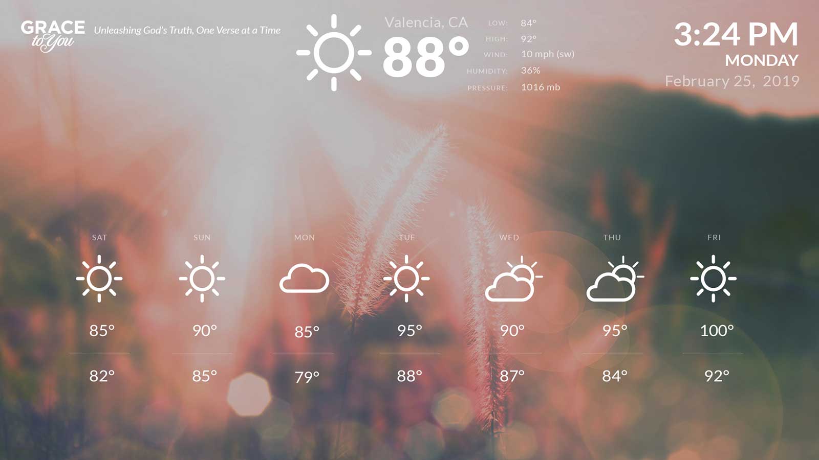
The calmest screen: a full-bleed photograph behind white line icons. It shows the current temperature and conditions for the office's location, with the low, high, wind, humidity and pressure beside it, and a seven-day forecast along the bottom. The time and date sit large in the corner.
Loading video...
Ministry Activities
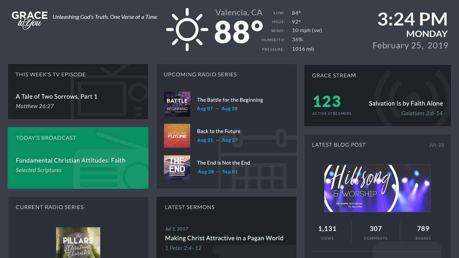
This screen answers “what's going out today?” at a glance. The first version brings together this week's TV episode, today's radio broadcast, the current and upcoming radio series with their artwork and air dates, the latest sermons, the number of people listening to Grace Stream right now alongside the sermon that's playing, and the latest blog post with its views, comments and shares.
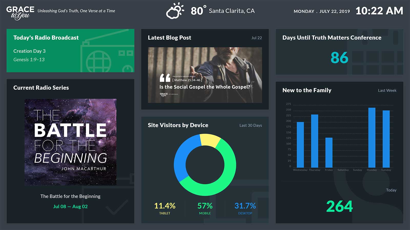
The second version trades some of the schedule for engagement: site visitors by device over the last 30 days, a countdown to the Truth Matters Conference, and “New to the Family,” a weekly bar chart with today's count underneath.
Website Analytics
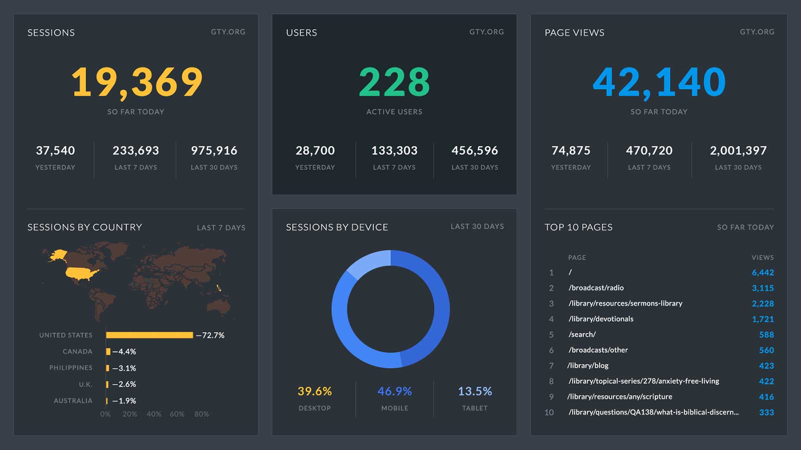
gty.org's traffic becomes three headline numbers: sessions and page views so far today, and active users right now. Under each, yesterday, the last 7 days and the last 30 days give context. The lower row breaks it down by where visitors come from (a map and a ranked list of countries), what they use (desktop, mobile and tablet), and what they read (the day's top 10 pages).
Global Reach
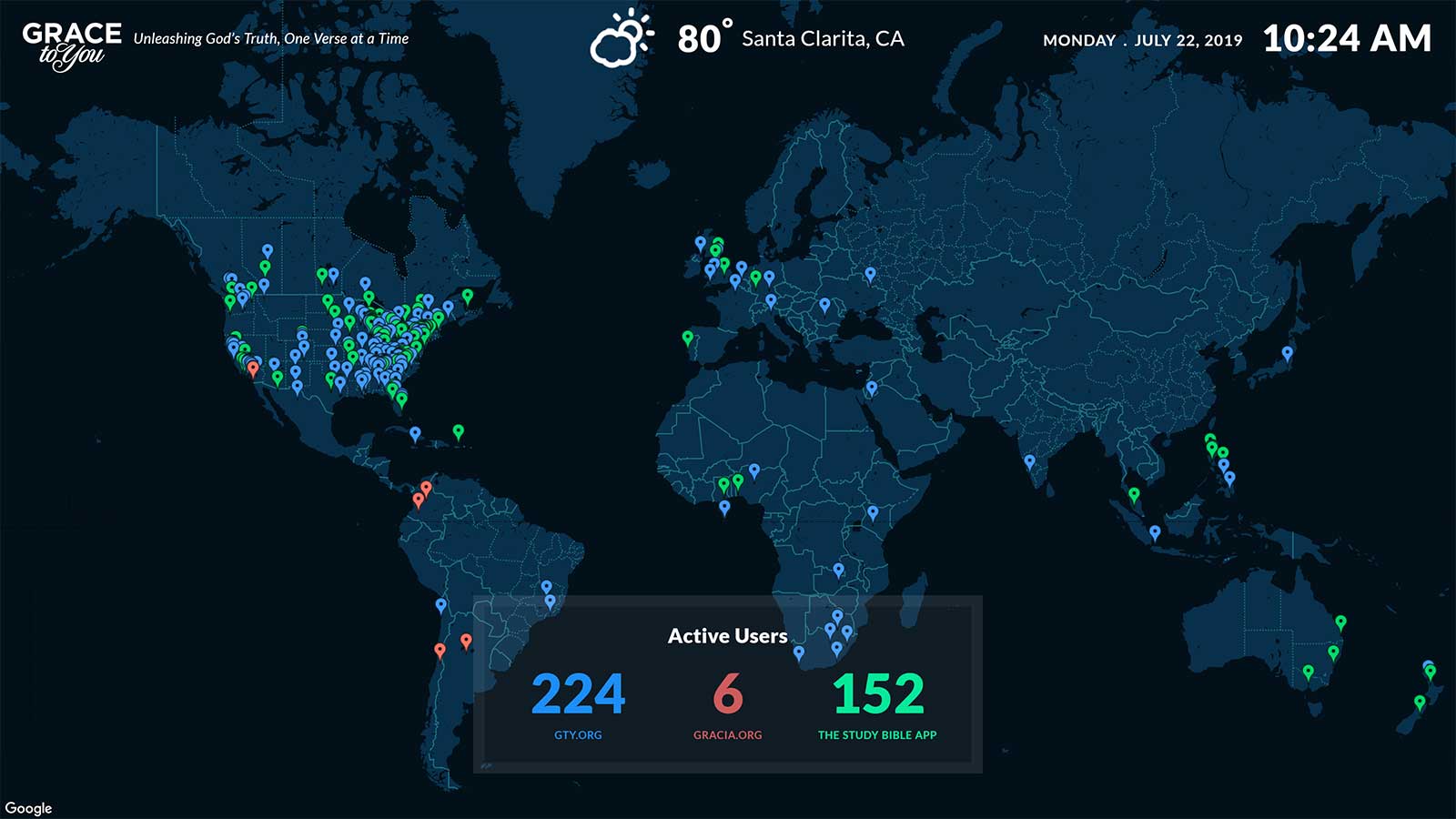
The most striking screen is also the simplest: a dark world map with a pin for every active user. Pins are colored by where people are listening and reading, gty.org, gracia.org or The Study Bible app, and a panel at the bottom gives the live count for each in the same colors. It makes the ministry's reach visible in a way a table of numbers can't.
Ministry Photos
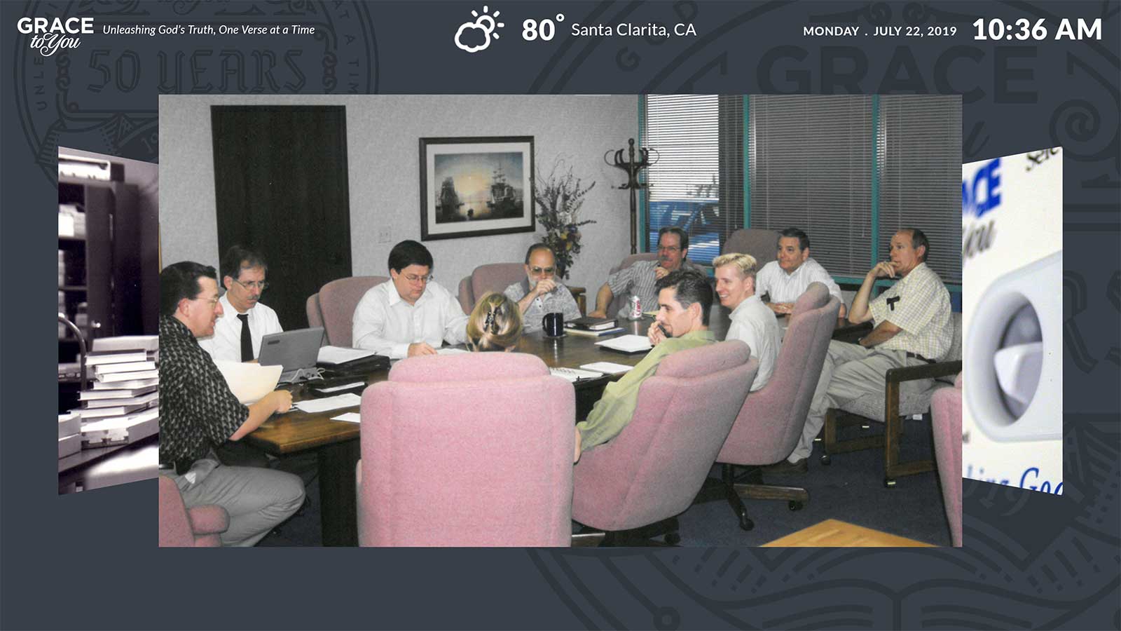
Between the data screens, a photo slideshow brings in the people behind the ministry, rotating over a background seal marking Grace to You's 50 years, a reminder of the history behind the numbers.
Learning and Reflection
What I learned
- Because nobody sits in front of a wall display or clicks it, I learned to design for a glance: large numerals, short labels, and screens that rotate on their own.
- Giving each metric its own color across screens, and reserving the single filled green card for what is on air today, taught me that color should carry meaning rather than decoration.
- Making a second version of the Ministry Activities screen that trades some of the schedule for engagement showed me that limited screen space always forces a choice about what matters most.
Reflection
A dashboard on a wall works when it respects how it is read: from across a room, in a moment, by people who never touch it. Designing for the glance, not for exploration, was the whole job, and the team's own words were the best test of it: they could “just glance at the screen and know what's going on.”
[ Let's connect ]
Let's work together
Have a project, a role, or an idea in mind? I'd love to hear about it.