BrandingVisual Identity
The Study Bible App Logo
Creating a visual identity for The Study Bible app: a simple, versatile logo that communicates usability, clarity, and a sense of illumination.
- Client
- Grace to You—A Christian Media Organization
- Role
- Logo/Brand Designer
- Deliverables
- Logo & Wordmark
Overview
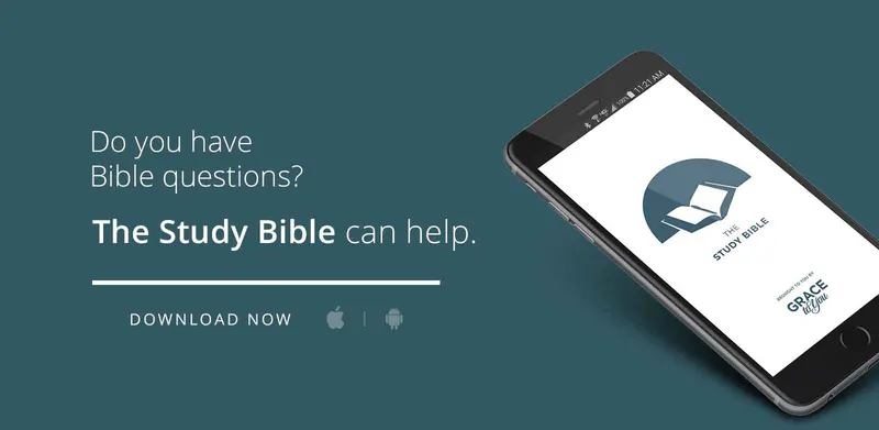
As a designer at Grace to You, I was tasked with creating a visual identity for The Study Bible app. The goal was to design a logo that communicates usability, clarity, and a sense of illumination, while remaining simple and versatile for digital use.
Results & Impact
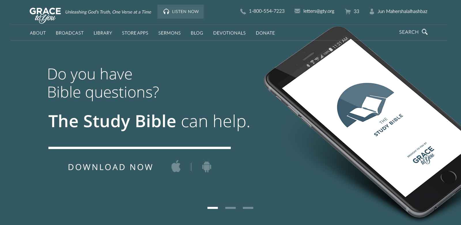
The final logo is simple, memorable, and effective across the mobile platforms. The combination of book, pen, and rising sun encapsulates the app's mission: to encourage a deeper study with the digital version of the MacArthur Bible.
Concept & Design Process
Research & Concept
I began by researching existing Bible and study-related app logos to identify common visual themes—open books, crosses, rays of light, and bookmarks. My aim was a design that felt familiar yet distinct, balancing tradition with modern minimalism.
Ideation & Exploration
I sketched multiple concepts around the core idea of an open book, which universally symbolizes learning and accessibility, and experimented with:
- Rays of light to suggest inspiration and enlightenment
- Crosses to signify faith in Christ
- Bookmarks and pens to represent study and engagement
Design Iterations
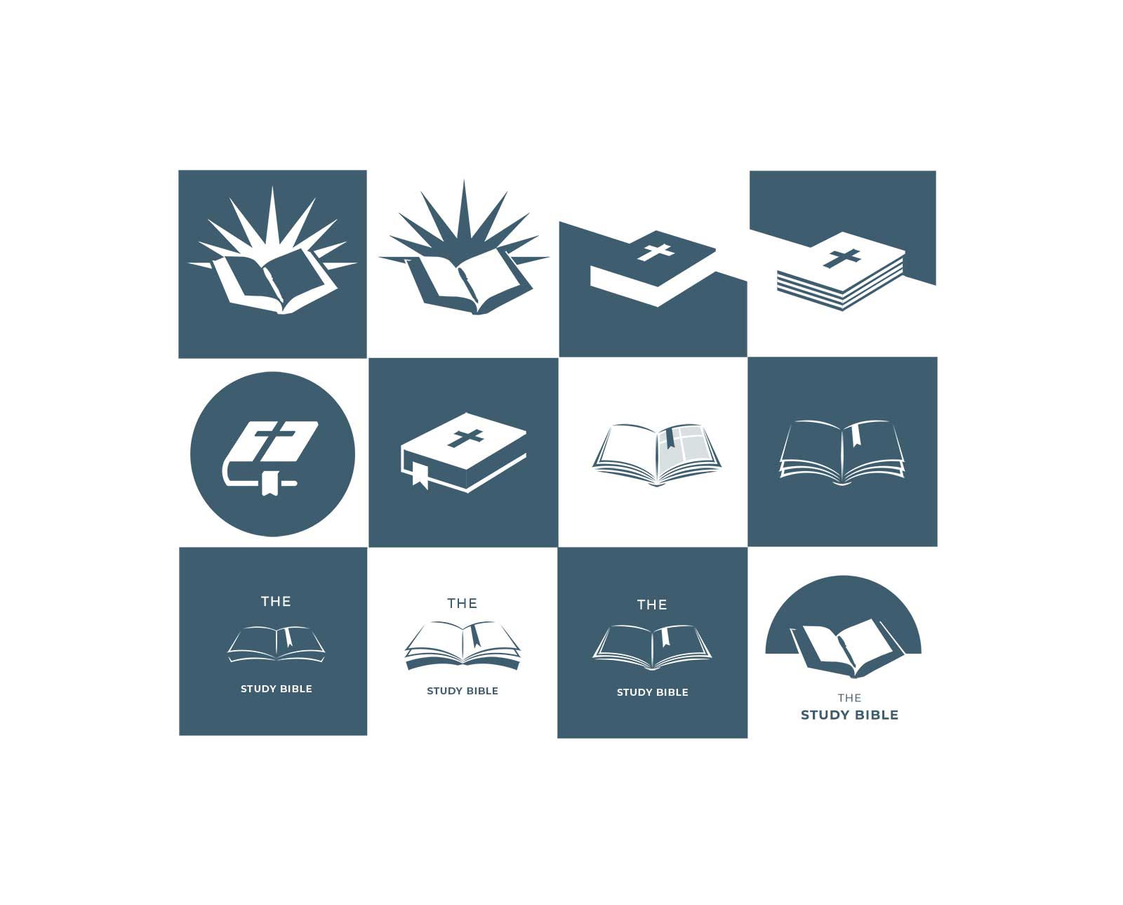
I then developed a grid of logo variations, testing each icon for clarity at small sizes and adaptability across backgrounds. Compositions included:
- Books with radiating lines for a sense of revelation
- Closed and open Bibles to convey both authority and approachability
- Integrated crosses and bookmarks for subtle devotional cues
Final Design Selection
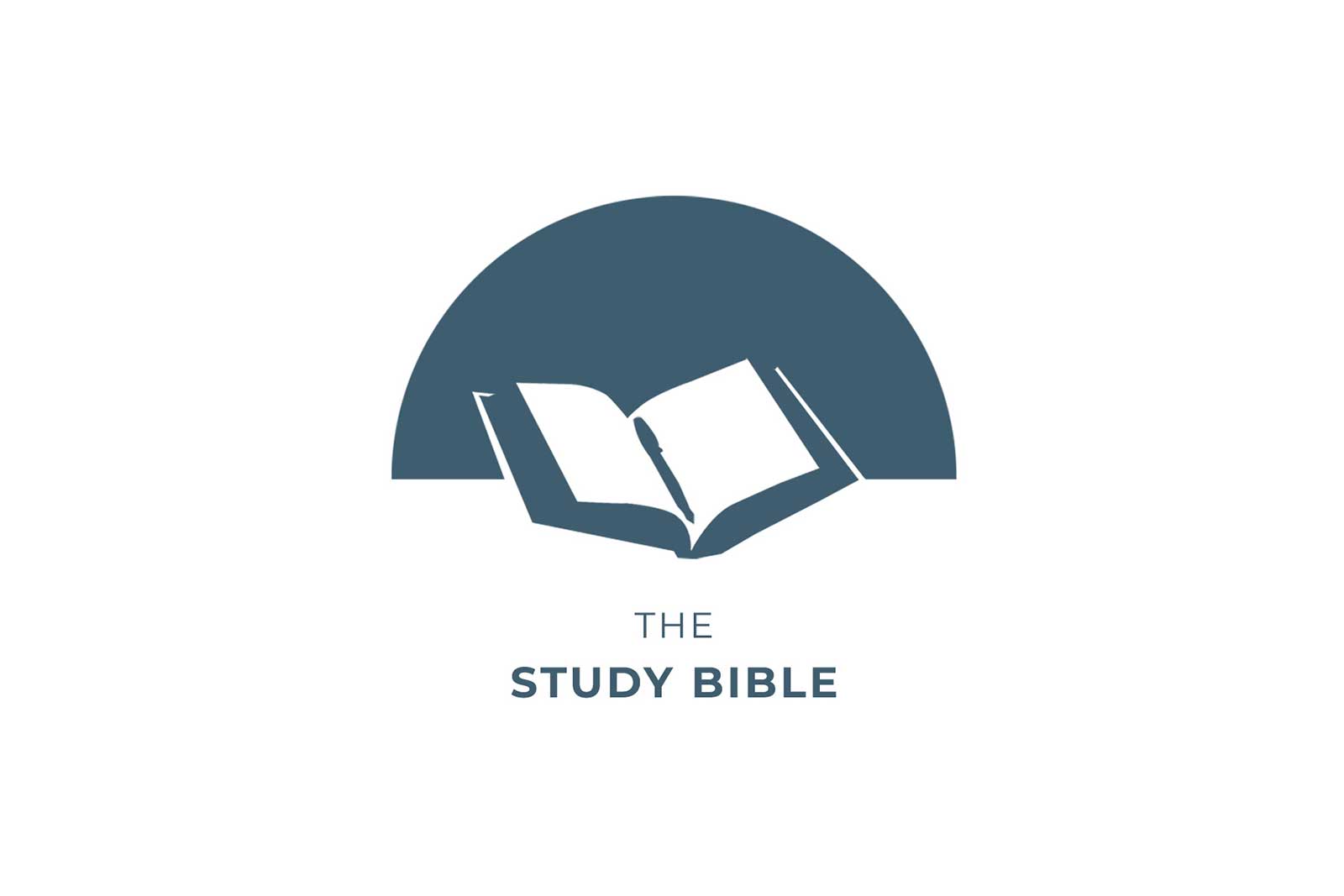
After reviewing the options with the Digital Platforms Coordinator and stakeholders, we agreed on the final design. This logo features:
- The Bible, the source of truth
- A pen in the center, reinforcing the idea of active engagement and personal growth
- A semi-circle backdrop, evoking a rising sun, which suggests light and illumination
Brand Guide
Logo Suite
The logo works as a full lockup, and its two parts can stand alone: the mark for small, square spaces and the wordmark where text leads.
Lockup
- Ground
- White
- Use for
- The default: app store pages, splash screens and announcements.
Mark
- Ground
- White
- Use for
- Small and square spaces where the wordmark can’t be read, like the app icon.
Wordmark
- Ground
- White
- Use for
- Text-led places, such as headers and credits, where the mark already appears nearby.
Clear Space & Size
The sun needs room to rise. Keep the space around it clear, and switch to the mark alone before the wordmark gets too small to read.
- Clear space
- One eighth of the logo’s width (x), about a quarter of the sun’s height, on every side.
- Minimum size
- Lockup 160px wide on screen, 1 in (25 mm) in print. Below that, use the mark alone, down to 32px.
- Placement
- Centered, with the sun resting on its flat edge. Never rotated.
Color
The palette is a muted blue, chosen for its calm, trustworthy, and timeless qualities. It's used as a single flat color, with the book's pages cut out in white.
Muted Blue
- Hex
- #3E5D71
- RGB
- 62 93 113
The mark and the wordmark. Calm, trustworthy and timeless; 6.9:1 on white, so it works for text too.
White
- Hex
- #FFFFFF
- RGB
- 255 255 255
The ground, and the open pages of the book cut out of the sun.
Typography
For the wordmark, I selected a clean, sans-serif font. “STUDY BIBLE” is set in bold, with “THE” in a lighter weight above, ensuring readability and balance.
“The” — Light
A lighter weight, tracked out, set above the name so it reads first but quietly.
“Study Bible” — Bold
The name in bold capitals, carrying the lockup. A clean sans-serif keeps it readable at app sizes.
Usage
A few rules keep the logo clear and consistent across app stores, devices and the GTY website.
Reflection
The iterative process, from broad exploration to focused refinement, ensured that the final mark met both the user's needs and the brand's vision.




[ Let's connect ]
Let's work together
Have a project, a role, or an idea in mind? I'd love to hear about it.