BrandingLogo Design
The Patricia MacArthur Pastoral Care Fund
A logo for the Patricia MacArthur Pastoral Care Fund, designed as a visual identity that feels both personal and nurturing, reflecting the fund's mission.
- Client
- Grace to You—A Christian Media Organization
- Role
- Logo Designer
- Deliverables
- Full-Color, Gold on Black & Portrait Logo Versions
Overview
As a designer at Grace to You, my approach to the Patricia MacArthur Pastoral Care Fund logo was to create a visual identity that feels both personal and nurturing, reflecting the fund's mission.
Results & Impact
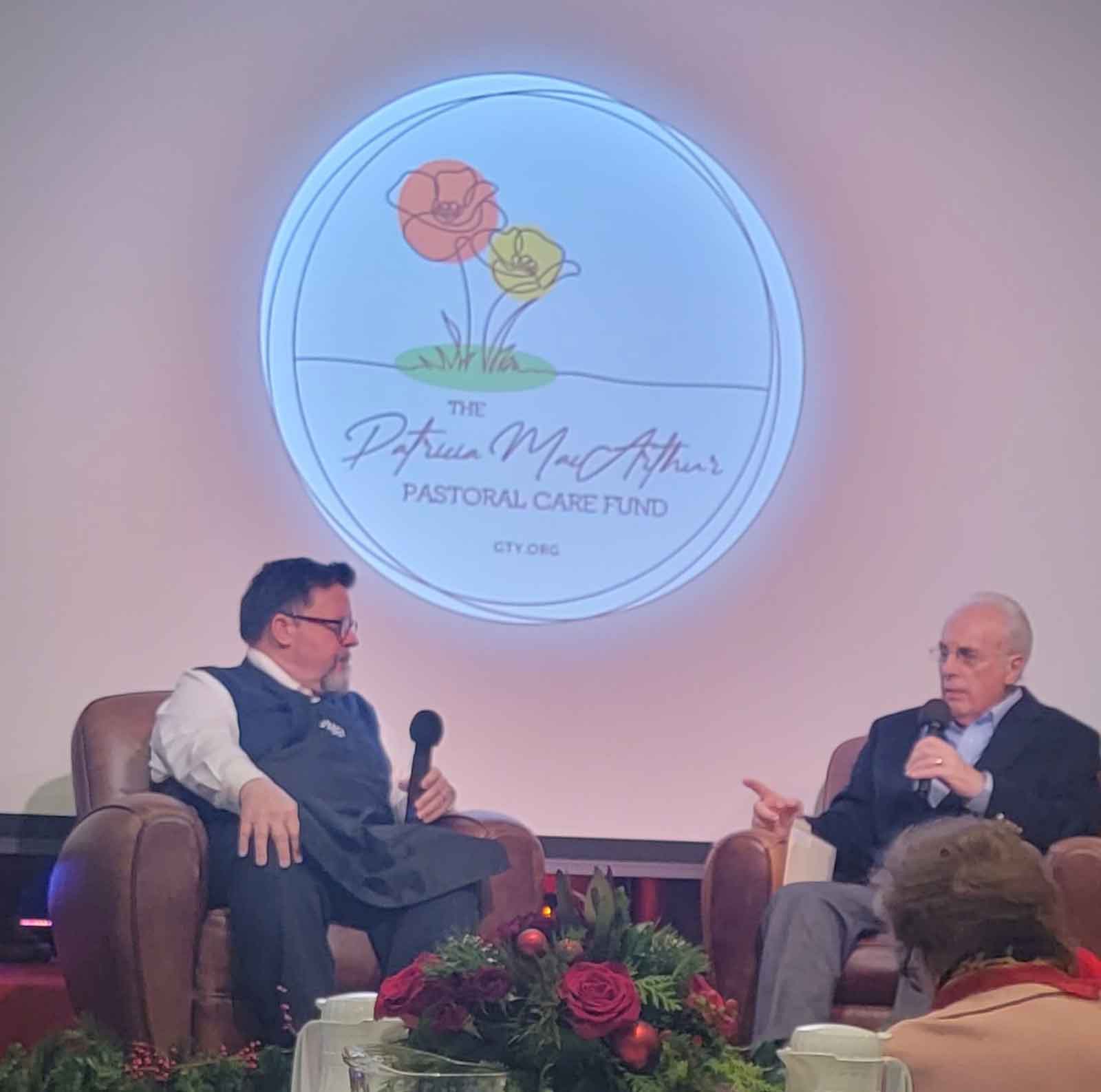
The balance of modern minimalism and classic script ensures the design feels both contemporary and enduring, resonating with a broad audience while conveying stewardship and care. The logo was presented at the GTY Volunteer Appreciation Christmas Party.
Concept & Design Process
Crafting Stewardship & Care
Every element of the mark was chosen to carry part of that mission:
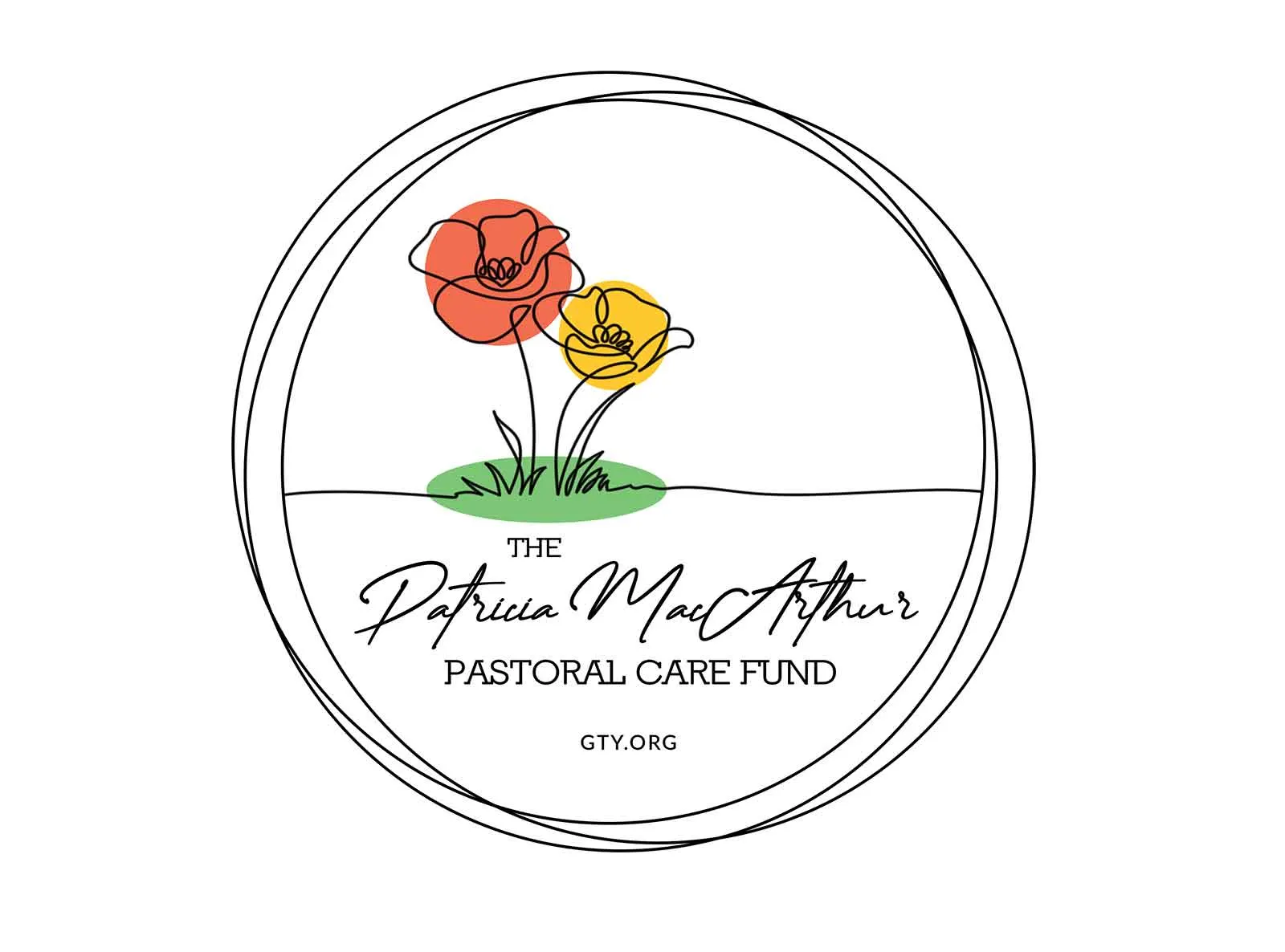
- A pair of poppy flowers as the central motif, for their symbolism of remembrance, care, and gentle strength
- A continuous line drawing style to convey unity and ongoing support
- A circular frame that reinforces a sense of wholeness and protection
- A handwritten script for “Patricia MacArthur” that adds a personal, human touch, making the logo feel approachable and heartfelt
Brand Guide
Logo Versions
The color variations—ranging from soft, natural hues on a white background to elegant gold on black—keep the logo versatile and impactful across different settings and materials, maintaining brand consistency while allowing for contextual flexibility.
The full-color version with red and yellow poppies and a green base is vibrant and uplifting, ideal for print and digital use where warmth and visibility are needed.
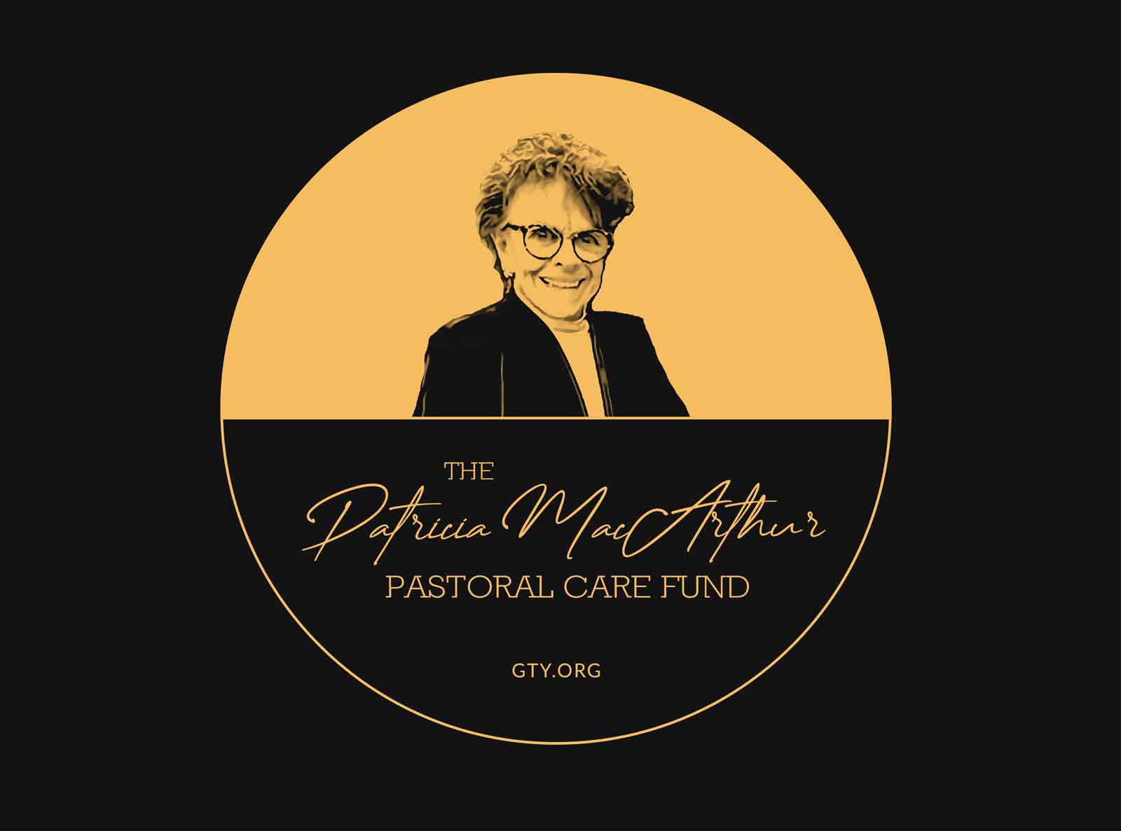
The gold-on-black variant offers a sophisticated, timeless look suitable for formal events or commemorative materials.
Including Patricia MacArthur's portrait in one version personalizes the brand further, honoring her legacy and making the fund's purpose immediately clear.
Clear Space & Size
The emblem works like a seal. It needs room around it, and its finest lines (the script and the web address) set how small it can go.
- Clear space
- One eighth of the emblem’s width (x) on every side.
- Minimum size
- 240px wide on screen, 2 in (51 mm) in print. The script and web address are fine lines.
- Placement
- Centered or on its own, like a seal. One emblem per view.
Color
Color comes from the poppies and the ground they grow from, laid as soft discs behind the line work. On black, everything turns to a single memorial gold.
Poppy Red
- Hex
- #F16E50
- RGB
- 241 110 80
The first poppy. A fill behind the line work, never text.
Poppy Yellow
- Hex
- #FDC82C
- RGB
- 253 200 44
The second poppy, always beside the red.
Meadow Green
- Hex
- #7AC674
- RGB
- 122 198 116
The ground the poppies grow from.
Memorial Gold
- Hex
- #F8BD63
- RGB
- 248 189 99
The single color of both black versions. Only on black.
Ink
- Hex
- #121212
- RGB
- 18 18 18
The continuous line and lettering; the black ground.
Paper
- Hex
- #FFFFFF
- RGB
- 255 255 255
The full-color version's ground.
Lettering
Three voices make up the name, from most personal to most practical. The lockup is fixed artwork: the name is never retyped or rearranged.
Script Name
“Patricia MacArthur” is hand-lettered, the personal touch at the heart of the lockup.
Serif Capitals
“Pastoral Care Fund” in quiet geometric capitals that steady the script.
Sans Address
“GTY.ORG” small and tracked out, tying the fund back to Grace to You.
Usage
A few rules keep the emblem gentle and recognizable wherever it appears.
Stationery & Care Items
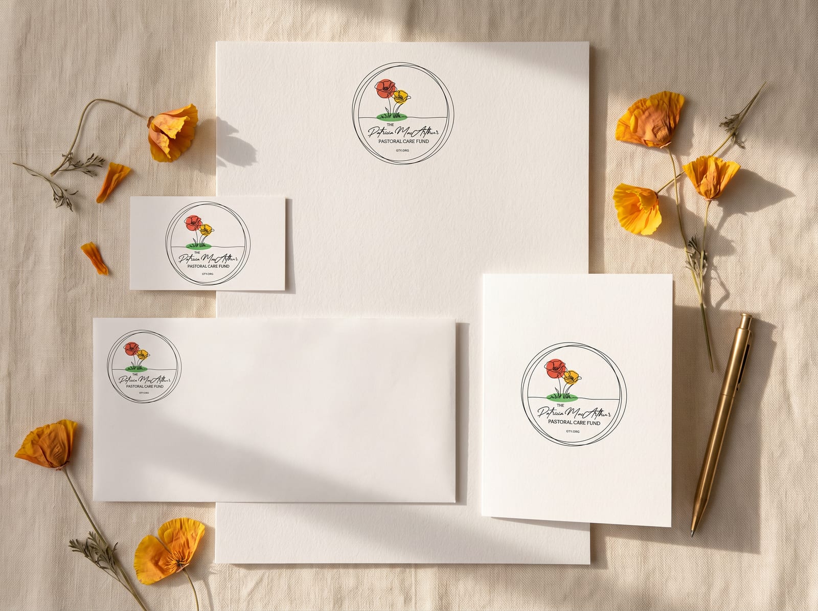
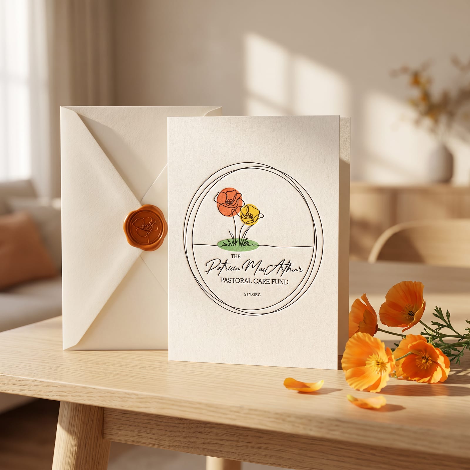
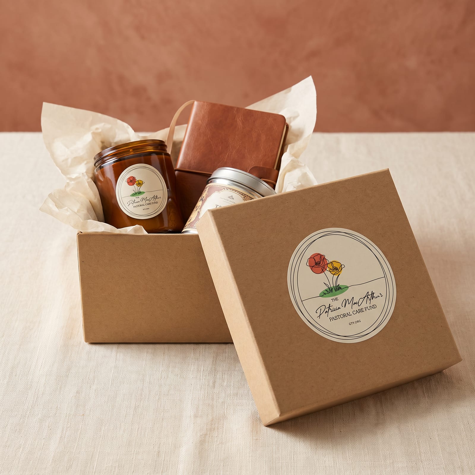
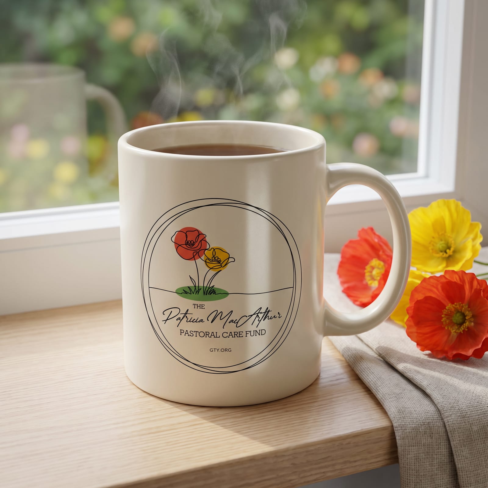
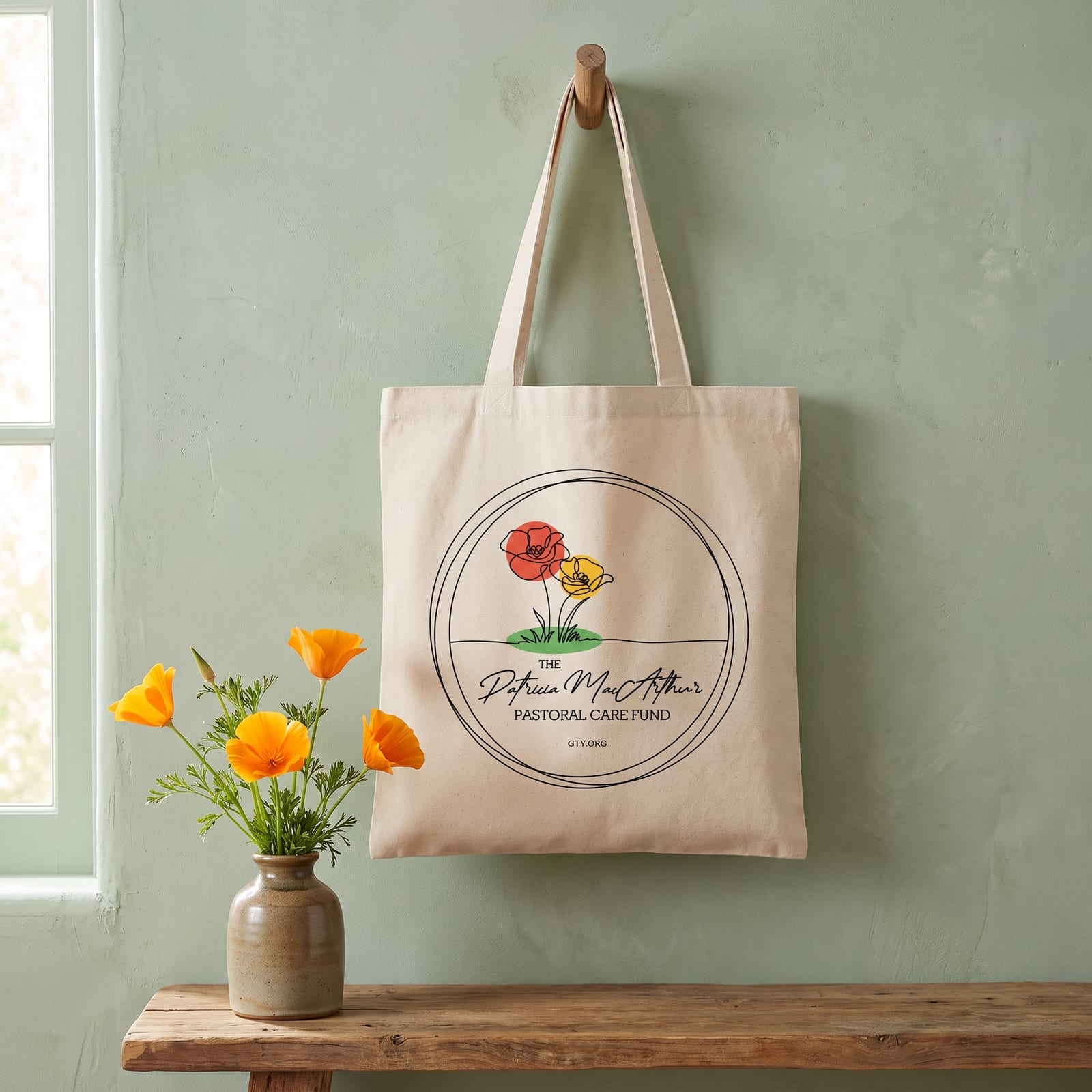
A pastoral care fund is felt most through a note, a gift, or a care package, so I extended the identity onto the pieces that carry that care: note cards sealed in wax, stationery, a care box, a mug, and a tote. These concepts set the full-color emblem on warm paper, kraft, and natural canvas, with the poppies echoed in real flowers, so every piece feels personal, gentle, and handmade.
Reflection
Throughout, the balance of modern minimalism and classic script was the thread, keeping the design contemporary and enduring.

[ Let's connect ]
Let's work together
Have a project, a role, or an idea in mind? I'd love to hear about it.