UX Design & Front-End DevelopmentResponsive Web
Grace to You (v.8)
Enhancing the user experience of GTY.org, the digital home for John MacArthur's teaching ministry, through the UX design and front-end development strategies that shaped version 8 of GTY's website.
+38%Engagement, mobile users
- Client
- Grace to You—A Christian Media Organization
- Role
- UX Designer & Front-End Developer
- Platform & Tools
- Responsive Web — Mobile & Desktop
Visual Studio Code, Google's Material Design System, HandlebarsJS - Team
- Digital Platforms Coordinator, Software Engineer, Software Developer
Overview
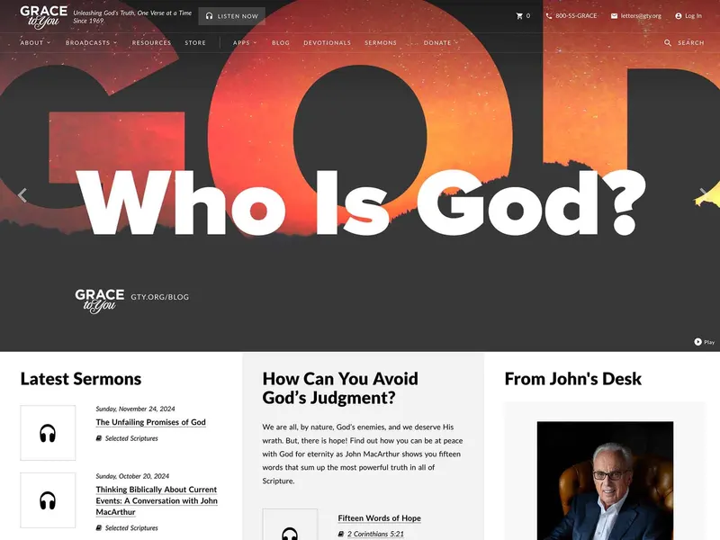
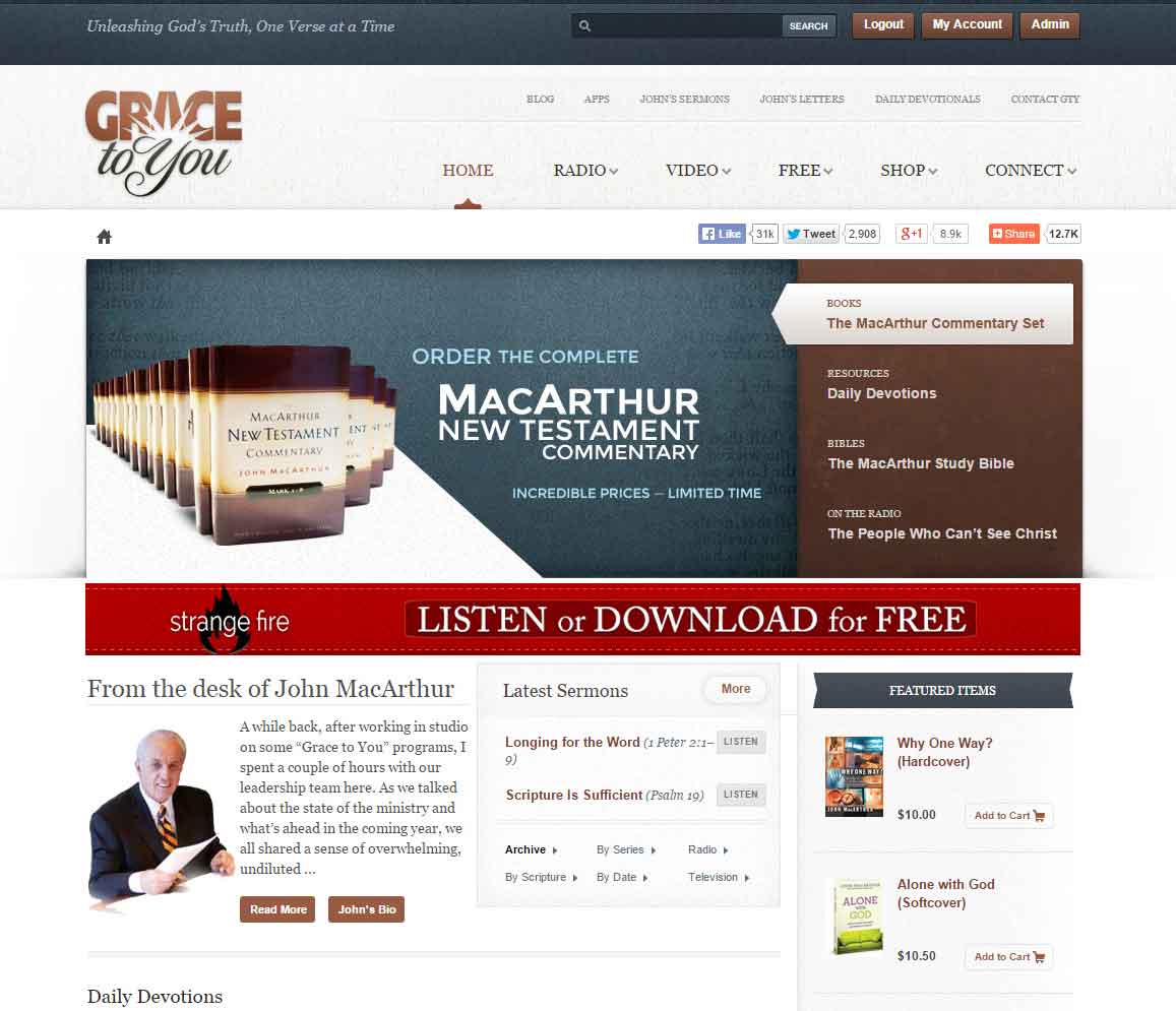
GTY.org (Grace to You) is the digital home for John MacArthur's teaching ministry, which began in 1969 as a small tape ministry and now offers sermons, articles, and resources to a global audience. Its previous site, version 7, had outdated design and UI elements and wasn't mobile-friendly, even though more than 50% of its visitors were on mobile devices.
My role was to enhance the user experience while keeping the trust of long-time users and supporting the ministry's mission of “Unleashing God's Truth, One Verse at a Time.” This case study covers the UX design and front-end development strategies that shaped version 8. The redesign had six challenges:
- A mobile-responsive platform for the majority of visitors on mobile devices
- Better content organization, navigation, and search, including a topical index, so thousands of sermons and resources are discoverable
- A cross-device media player with playlists, replacing an outdated Flash-based system, so listening and watching continue while navigating the site
- 24/7 continuous streaming of John MacArthur's verse-by-verse teaching through the New Testament, to increase usage time and retention
- A frictionless donation and product purchase experience, to increase customer satisfaction and ministry revenue
- Personalized features and account management, to increase engagement and synchronization
Results & Impact
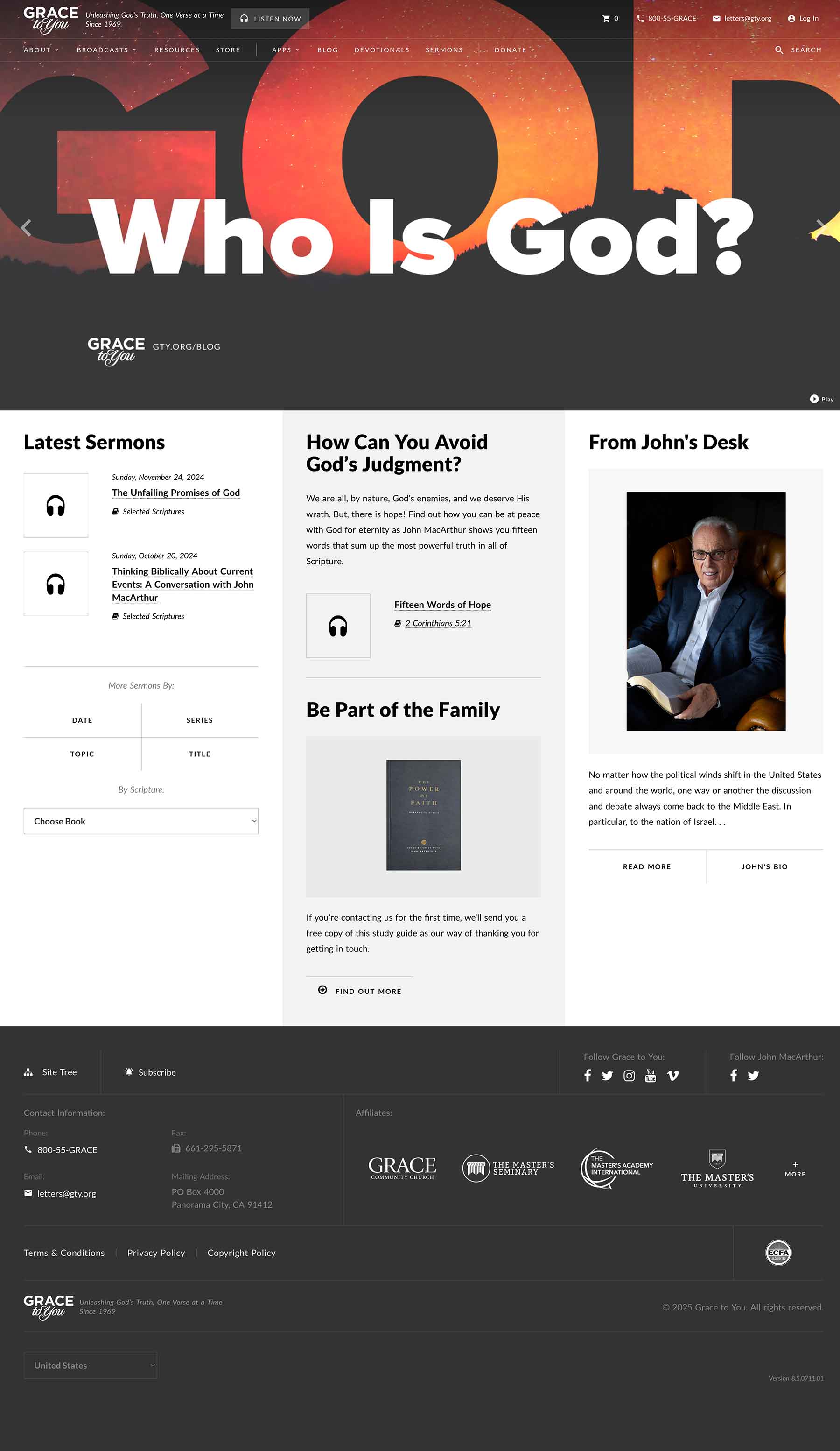
The redesign serves the ministry's loyal and new audience while carrying its 50+ year legacy forward:
- +38%
- Engagement, mobile users
- 50%
- More usage time, desktop
- ~25%
- Monthly lift in sermon plays & downloads
- 27%
- Faster page loads
- Improved engagement across devices: a +38% increase for mobile users and a 50% increase in usage time for desktop users
- A monthly increase of ~25% in sermon plays and downloads through the enhanced media player since its launch
- Greater exposure of promoted and featured content, such as blog posts, free resource offers, and product sales, as shown by Google Analytics and heatmaps
- A better donation and product purchase experience, based on email feedback, calls, and support tickets
- 27% faster page loads across the board
- Significantly improved accessibility, with Lighthouse ratings over 90
More than metrics, the site now reflects the clarity, simplicity, quality, and timelessness of John MacArthur's preaching and teaching.
Research & Information Architecture
Discovery & UX Strategy
Under the leadership of the Digital Platforms Coordinator, I started with a deep dive into user behavior: demographics, traffic sources and patterns, device usage, content consumption, bounce rates, and feedback from the customer service team. GTY has a loyal audience, many of whom aren't tech-savvy, so the new experience needed to feel intuitive, lightweight, and content-focused. I concentrated on four things:
- Accessibility & Responsiveness: The previous experience wasn't WCAG-compliant, especially for elderly users, or mobile-friendly.
- Content Organization and Findability: With decades of sermons and resources, the information architecture needed a major overhaul.
- Aesthetic Sophistication and Simplicity: The brand is built on depth and clarity, and the interface had to match.
- Performance: The previous site was sluggish, making streaming or reading difficult in low-bandwidth areas.
Competitive Analysis
I benchmarked GTY.org against Ligonier.org, DesiringGod.org, TruthForLife.org, and others on content, structure, search, engagement, UX, SEO, and technology stack. To set itself apart, GTY.org needed:
- a single-page app experience
- a mobile-first content presentation and experience
- a persistent media player
- a clean UI design
- an accessible topical index
- a robust search functionality
- and better social media integration
Site Nav
Anchoring my decisions to analytics and user feedback, I worked with key stakeholders and the Digital Platforms Coordinator to define a simplified top-level navigation and content taxonomy: About, Broadcasts, Resources, Store, Apps, Blog, Devotionals, Sermons, and Donate. The blog is one of the most engaging content on the site, devotionals are the source of daily and consistent traffic, sermons are the bread and butter, and Donate makes giving readily accessible, like most ministries do.
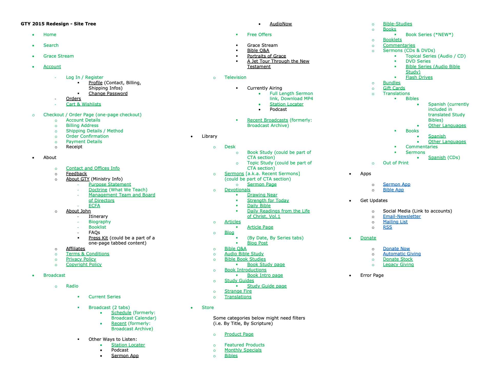
Site Tree
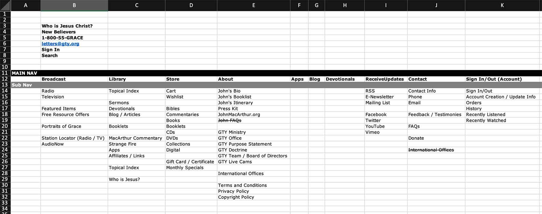
GTY is content-rich, with thousands of sermons, articles, Q&As, devotionals, and books. I treated the site tree as a content strategy blueprint, to make the library intuitive and discoverable, especially for users who don't know exactly what they're looking for.
Design Process
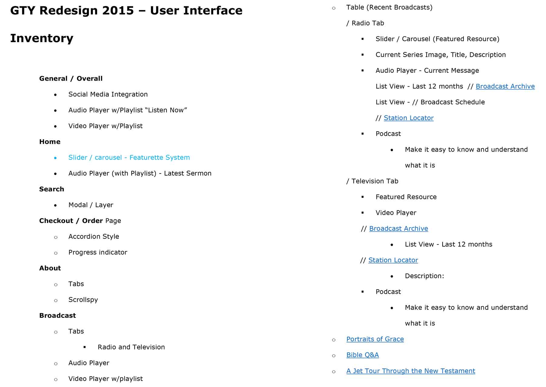
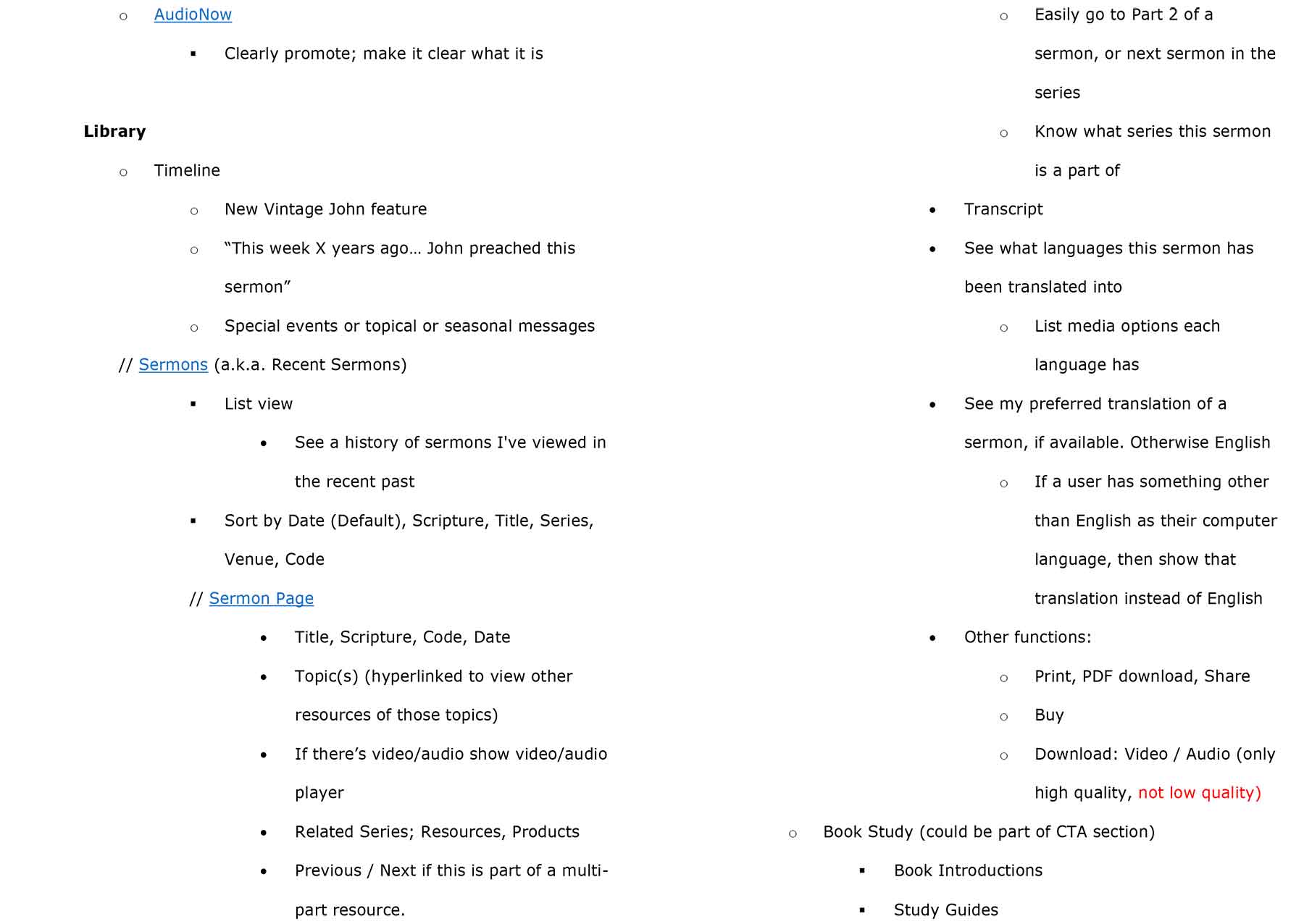
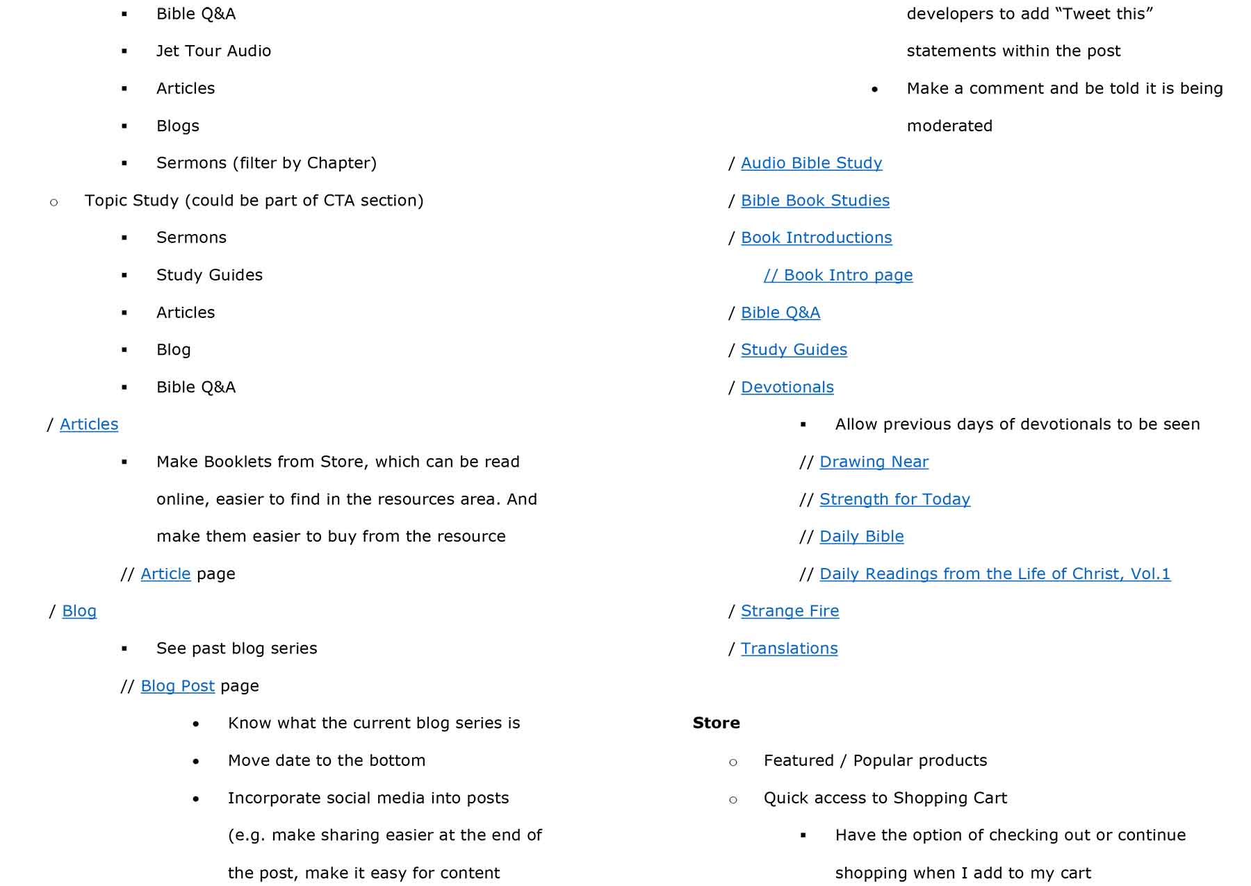
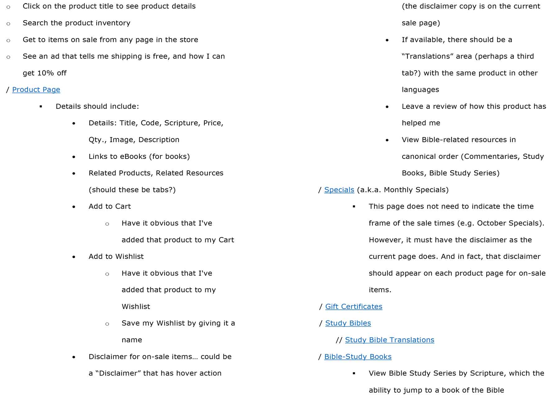
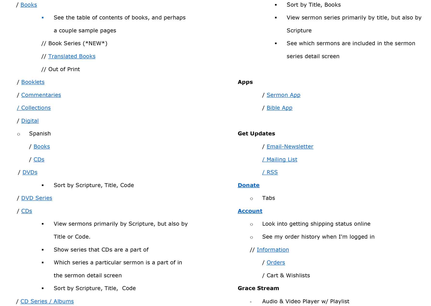
UI Inventory
Based on the Site Nav and the Site Tree, I took stock of every component, interaction, and user-facing feature on the site before any wireframes or visual concepts. GTY had evolved over time with many departments contributing content, and the interface had grown organically, sometimes inconsistently. The inventory exposed the redundancies and aligned the new design system with actual user needs and organizational goals.
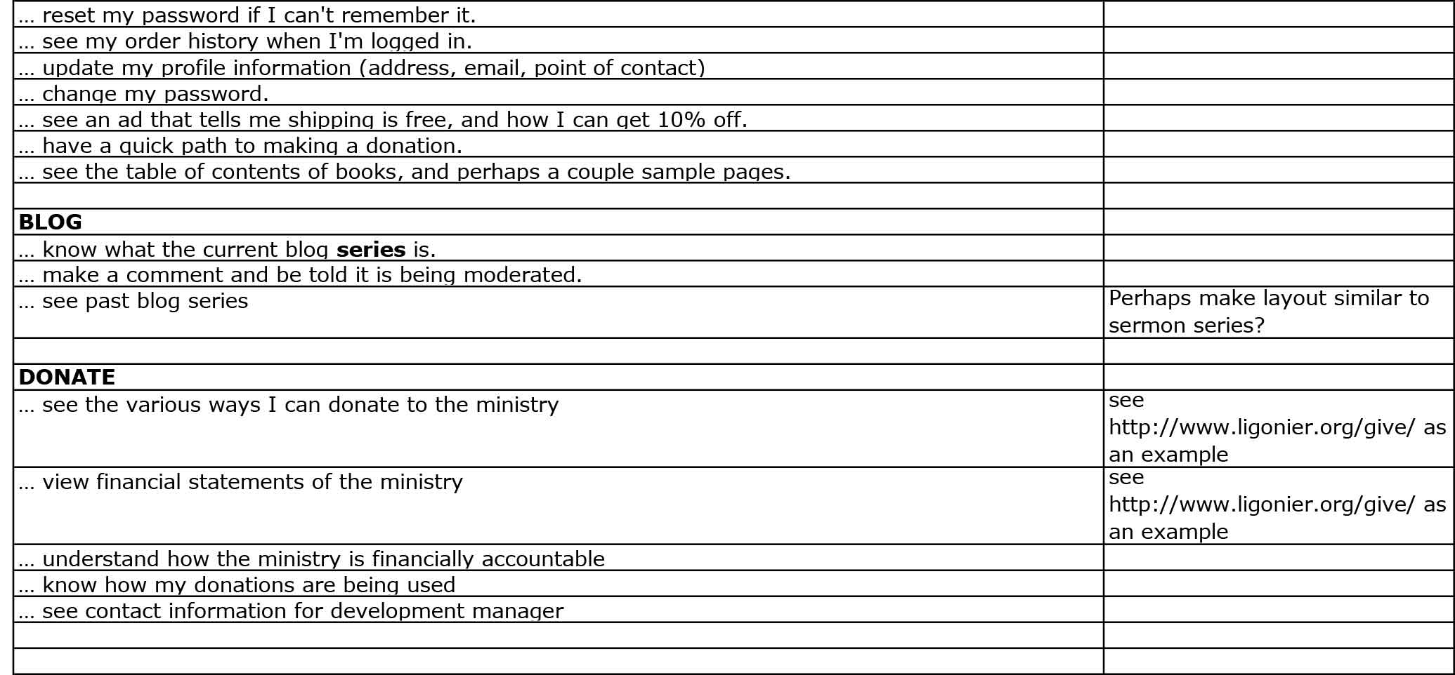
User Stories
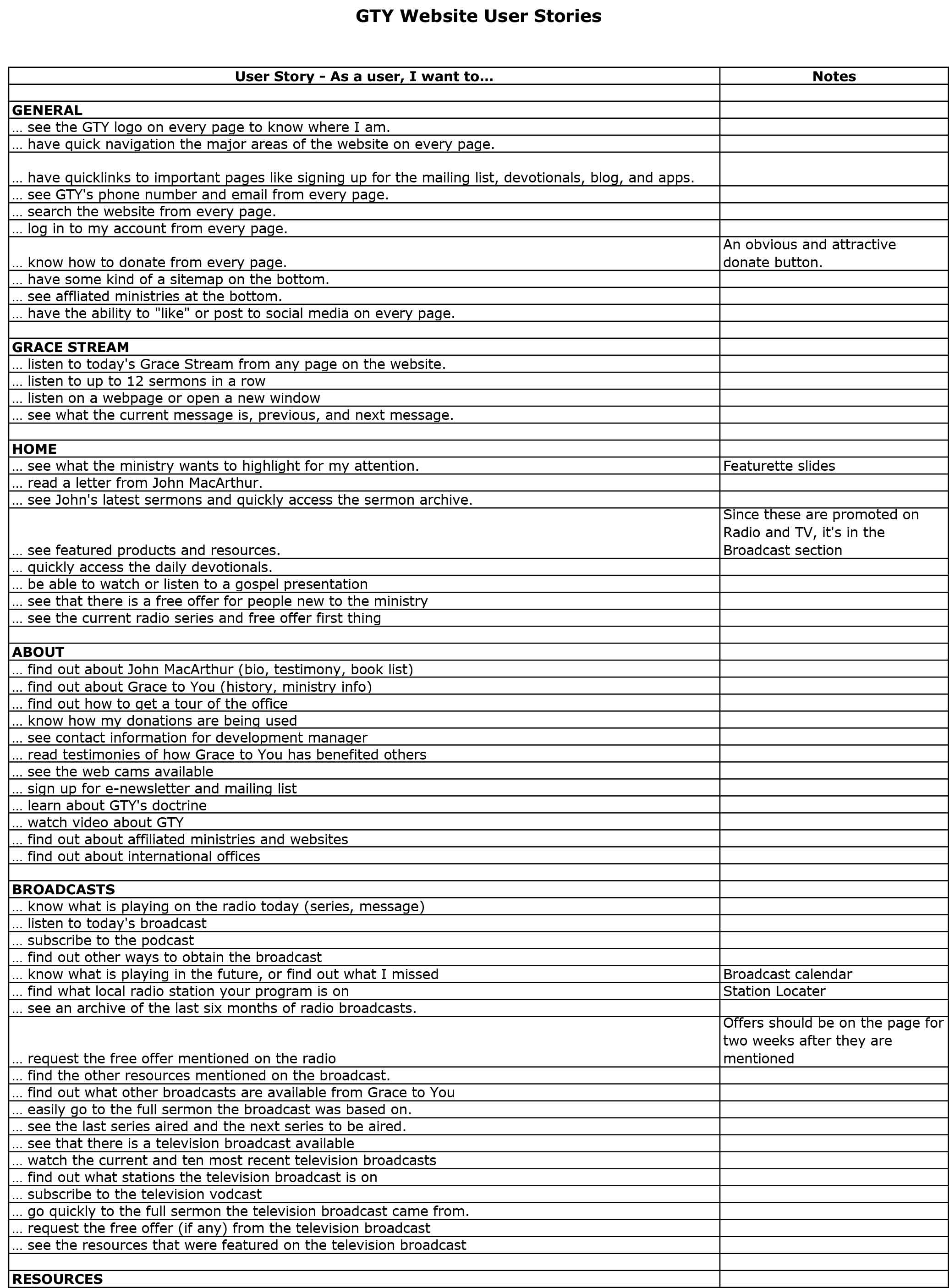
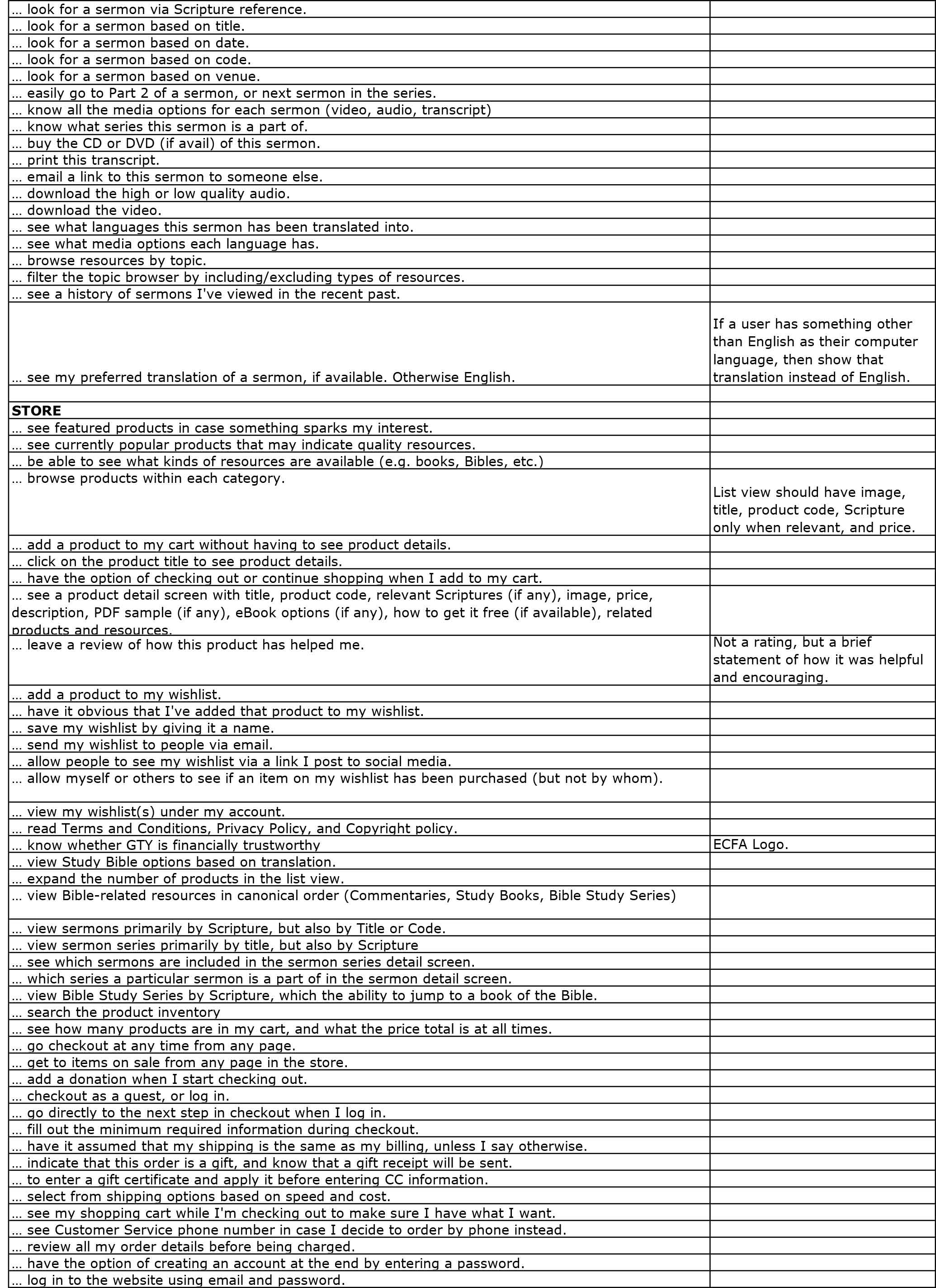
Working with the Digital Platforms Coordinator, I gathered user stories to capture the real-world behaviors, goals, and contexts of GTY's diverse audience: pastors, laypeople, new believers, long-time followers, Spanish speakers, and students. They weren't hypothetical personas but were distilled from actual usage data, support requests, and internal ministry insights, and they guided everything from page layouts to content hierarchy to UI components.
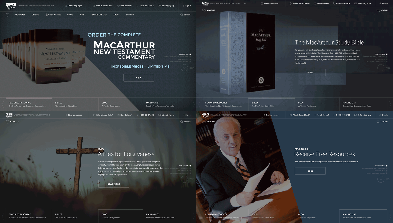
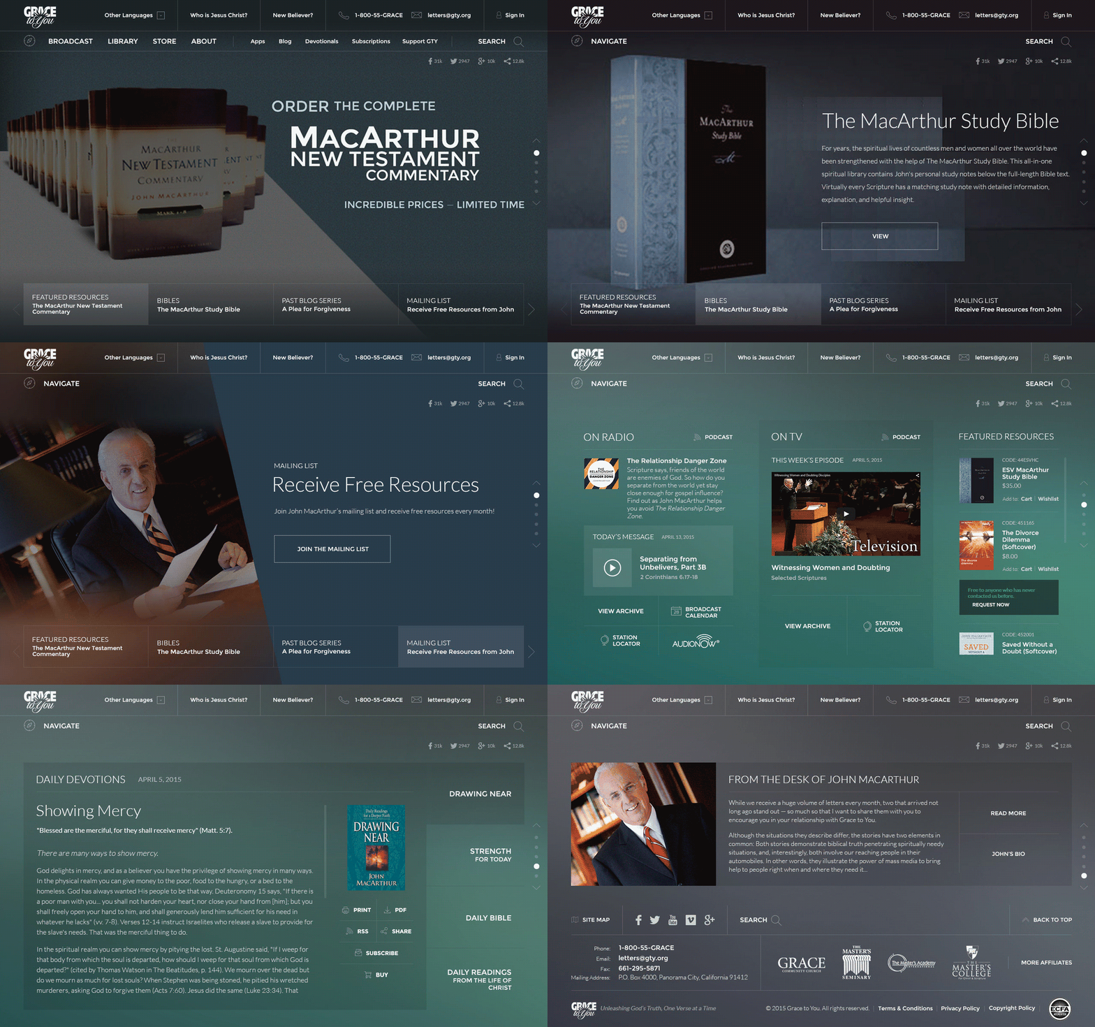
Producing Mockups
Mockups were where the planned ideas began to take visual shape and where design and function started working in harmony. I aimed for two things:
- Project Team and Stakeholder Alignment: With the Digital Platforms Coordinator's supervision, I held collaborative sessions with managers, content creators, and engineers to clarify goals, user needs, and brand voice, which avoided unnecessary revisions later.
- Clean, Minimal, yet Sophisticated Design: I designed the UI to feel intuitive and elegant, with every element having a purpose and no clutter. Minimal, but not bland, so users focus on the content while the layout and navigation subtly guide them.
Loading video...
Loading video...
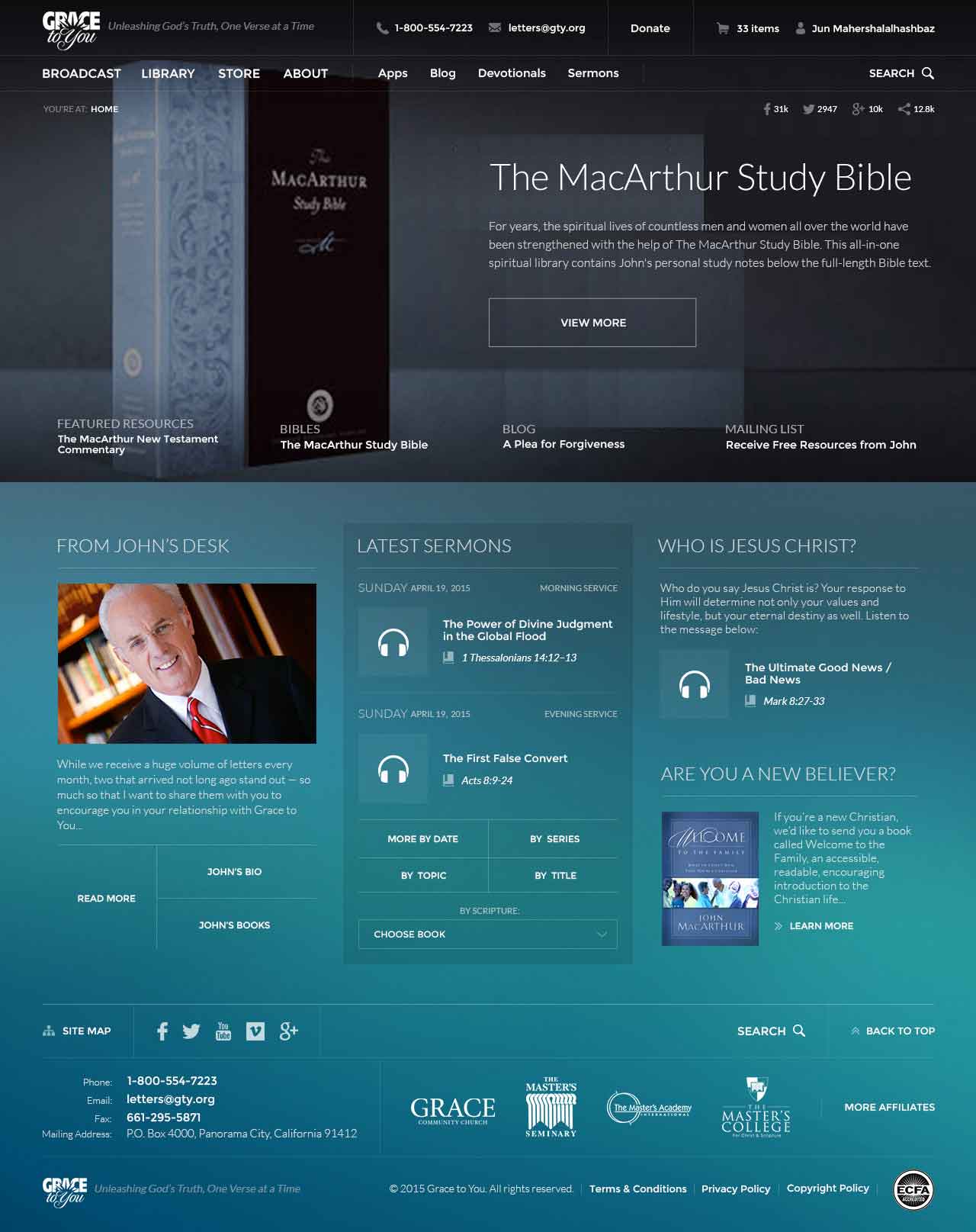
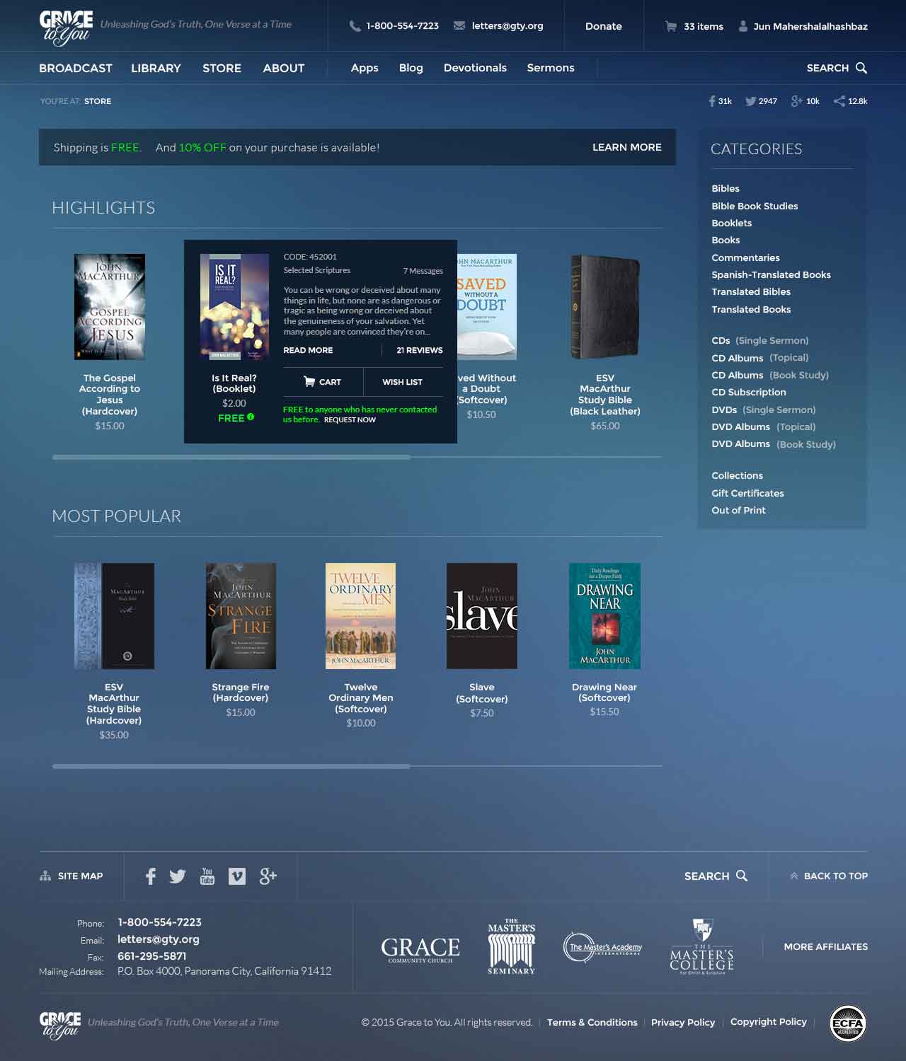
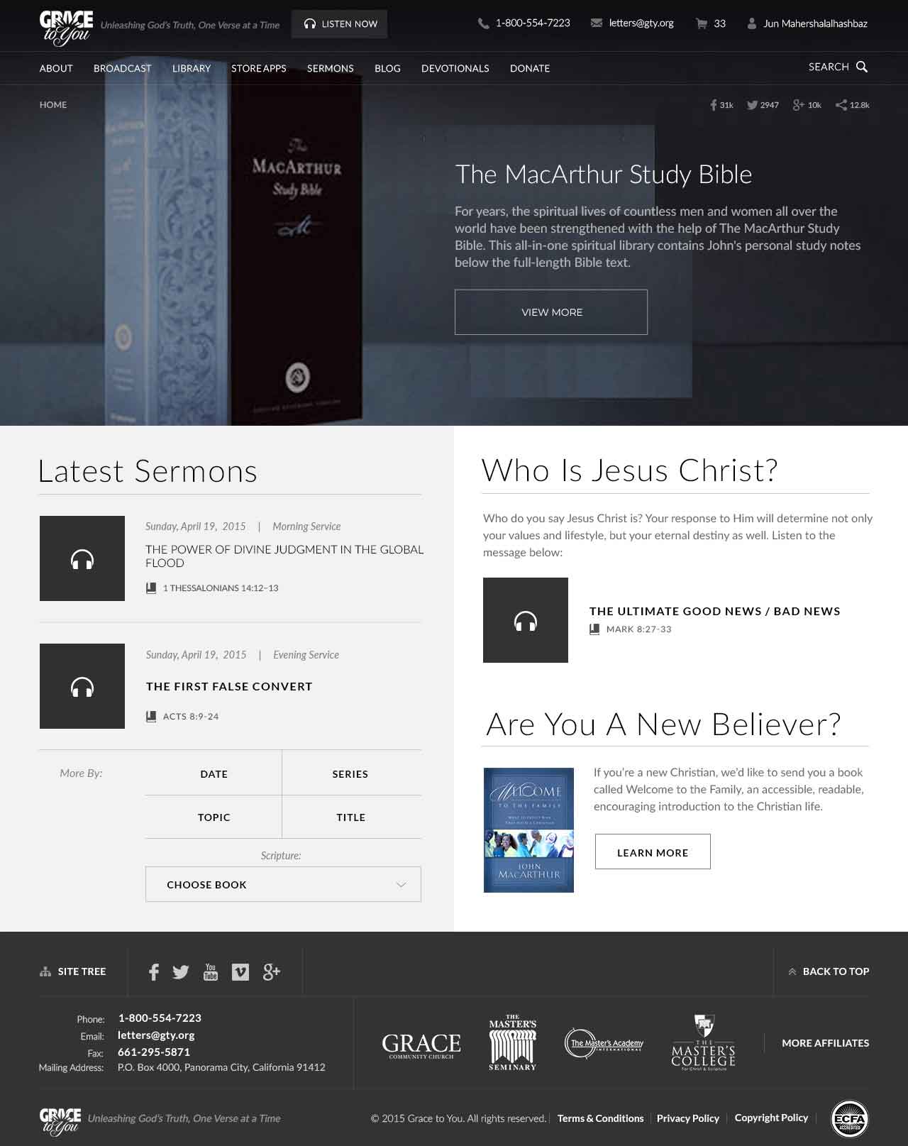
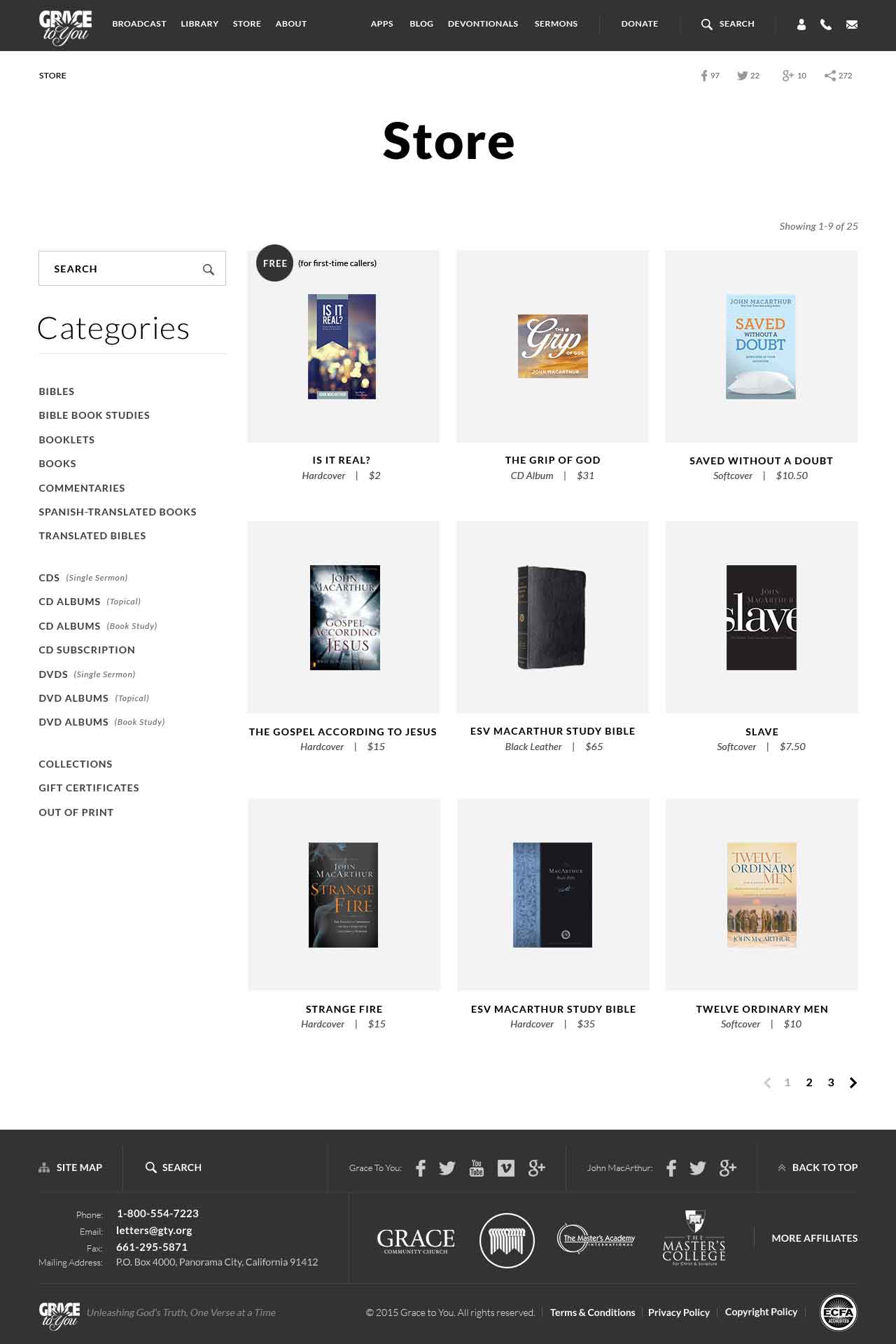
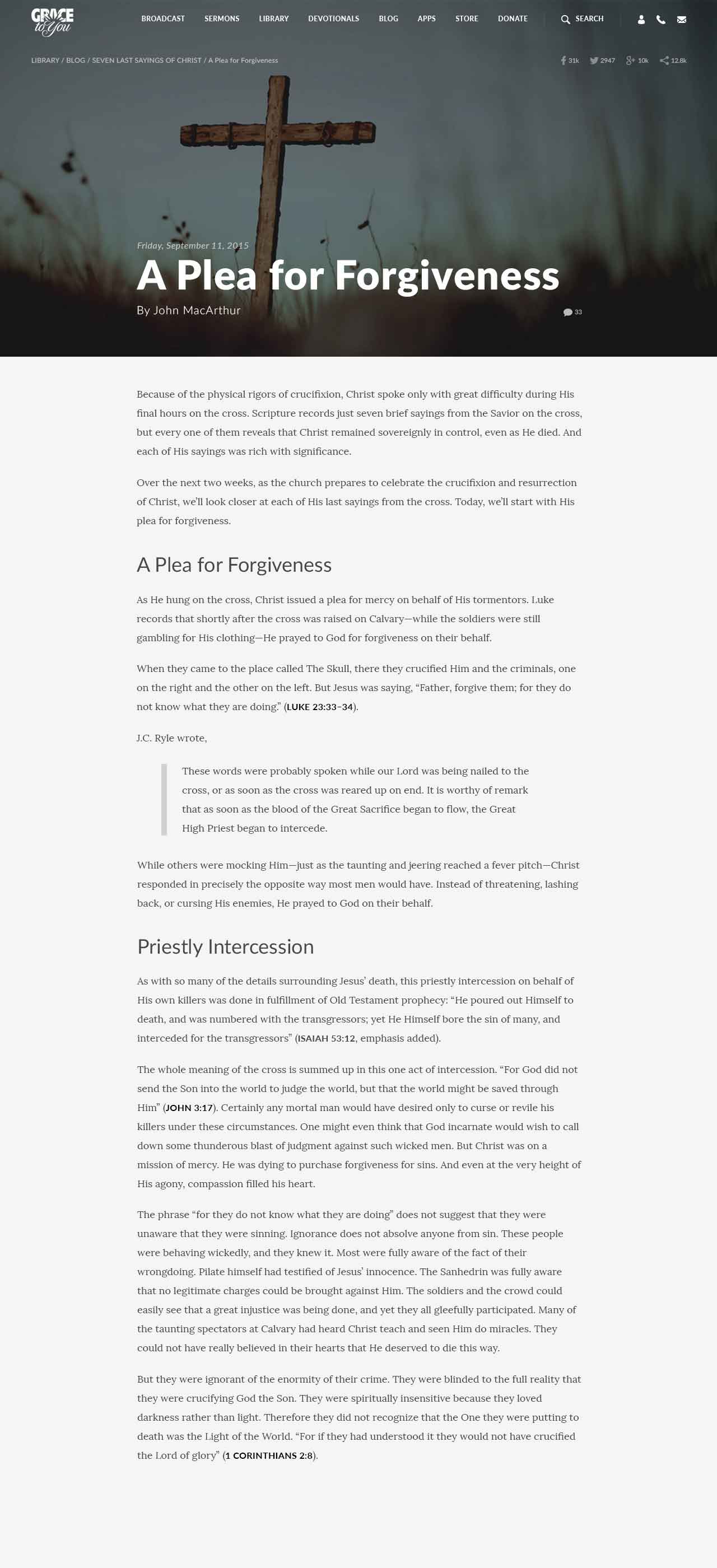
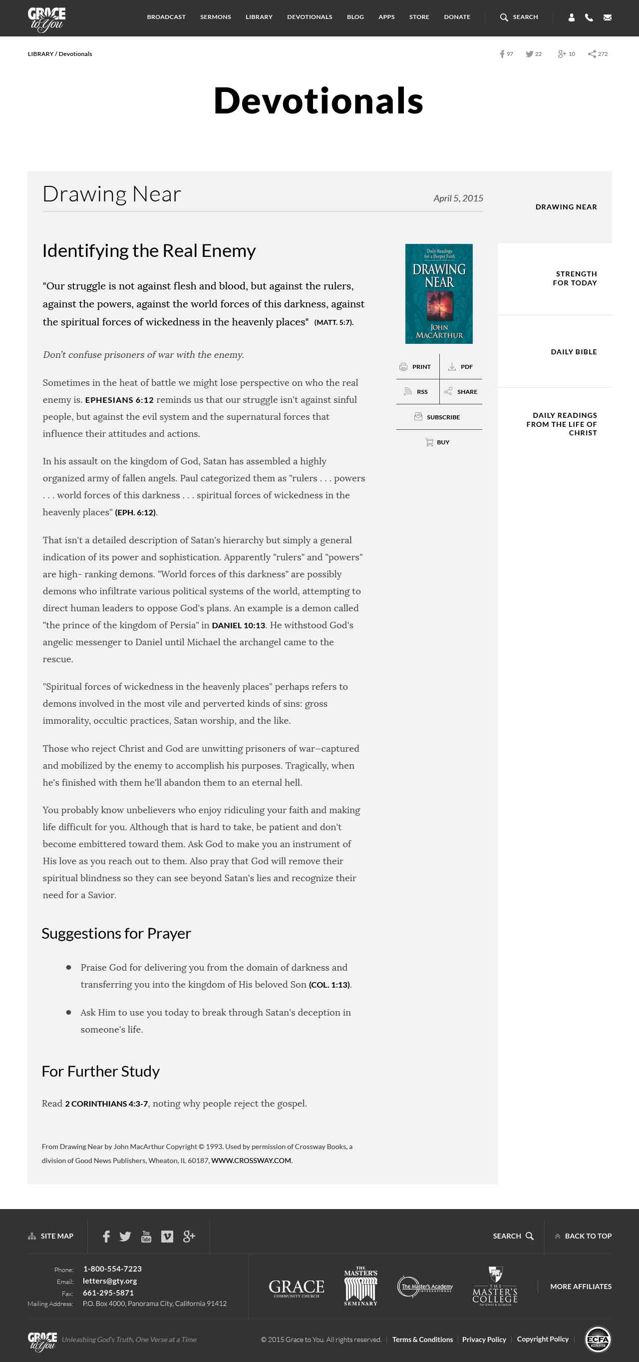
Visual Direction—Font, Color, and Layout Choices
Working with GTY's design agency partner, WeKreative, I proposed fonts that they immediately loved and approved, chosen for legibility and clarity across digital and print: Google's Lora (serif) for long-format content such as blog posts, articles, transcripts, and devotionals, and Lato (sans-serif) for titles and short copy. WeKreative provided the color palette to keep the site aligned with GTY's print brand.

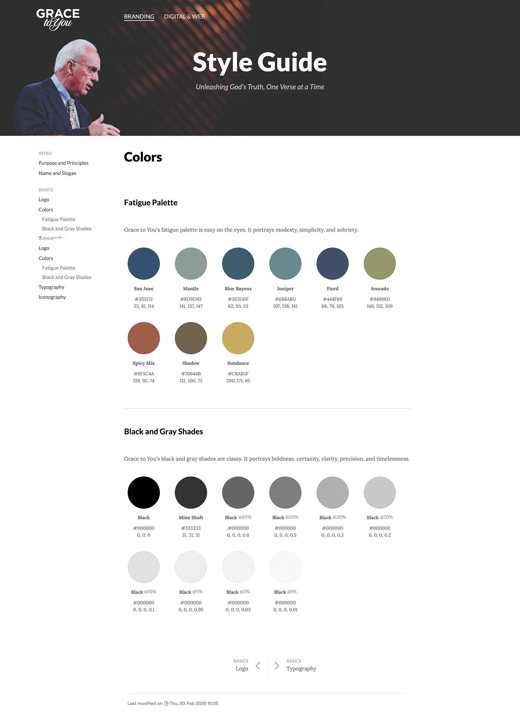
Style Guide
Once the design language was solid, I compiled a detailed style guide covering typography rules, color palette, spacing systems, and interaction patterns. It became the single source of truth for the team, ensuring consistency across pages, devices, and future iterations.

Development & Features
Under the leadership of the Digital Platforms Coordinator, I helped translate business goals into technical requirements and user-centric design, define feature scopes, and prioritize enhancements. With the Software Engineer and the Software Developer, I designed a scalable, modular architecture: they handled data modeling, APIs, and server-side logic, while I focused on front-end development, integrating the UI with back-end services.
Mobile-First Responsive Design
Mobile visitors were the majority, so as a team we prioritized responsive design:
- fluid grid layouts adapting to viewport dimensions
- flexible images scaling proportionally across devices
- media queries serving optimized CSS for different breakpoints
- touch-friendly interface elements replacing desktop-centric controls
This eliminated the pinch-zooming and horizontal scrolling that hindered mobile users.
Technology Stack
We wanted a modern, scalable, accessible, SEO-friendly platform built from reusable UI components. We chose:
- ASP.NET Core MVC as the application framework
- Google's Material Design System for consistent, accessible, responsive, reusable UI components with pleasing micro-interactions
- Modern JavaScript for interactive elements, particularly the custom media player, and APIs for podcast systems and other distribution channels
Code Prototyping
Due to resource and time constraints, and with the approval of the Digital Platforms Coordinator, I designed the high-fidelity prototypes in the browser, coding in Visual Studio Code, which made them production-ready.
- I code-designed the global components first: navigation, footer, and the media player, search, cart and wishlist, and sign-in layers.
Loading video...
- I then built the homepage, about, resource, giving, store, product, checkout, and account pages.
Loading video...
Loading video...
Loading video...
Loading video...
Loading video...
Loading video...
- I used HandlebarsJS to mock up and template the data and content, so I could design and develop freely without interfering with the back-end work. The Software Engineer and Software Developer focused on the back end while I cut up the pages.
- Subtle, yet Pleasing UI Micro-interactions: Button animations, hover effects, and component and page transitions make the user's journey more delightful.
Loading video...
Custom Media Player with Smart Transcript
A custom-built player replaced the Flash-based one, a cornerstone feature that directly supports the ministry's mission of distributing biblical teaching:
- Cross-device compatibility, including iOS and Android
- Background playback continuity, persisting when navigating between pages or switching browser tabs
- Playlist functionality to queue multiple sermons
- Smart Transcript, which highlights phrases as they are spoken so users can read along, and starts the audio from any word they click
- YouTube and Podcast distribution systems integration
- Sermon downloads in MP3 or MP4 format
Enhanced Content Search and Discoverability
- Predictive Search: Context-aware suggestions for biblical passages and topics
- Featured Content Modules/Slides: Editorial curation of popular blog series, timely free resources, discounted products, and important announcements
- Taxonomic Filtering: Sermon browsing by book, chapter, verse, or topic
- Related Content Suggestions: Recommendations based on current page context
User Account Ecosystem
- Progress Tracking: Resume playback across sessions via session and authenticated access
- Content Playlists: User-specific sermon collections persisting across devices
- Notification Preferences: Customizable alerts for new content releases
- Cross-Device Synchronization: Seamless transition between web and mobile app experiences
The account system required secure OAuth and GDPR-compliant data practices, including granular consent management, which meant substantial back-end changes such as data encryption at rest and in transit.
Accessibility and Compliance
- WCAG 2.1 Compliance: Improved contrast ratios and keyboard navigation support
- GDPR Adherence: Data protections for EU users
- Semantic HTML: Proper heading hierarchies and ARIA labels for screen readers
- Alternative Media Delivery: Transcripts alongside audio and video content
Also in the Platform
- Multimedia Resource Hub: 50+ years of sermon recordings in downloadable MP3 and MP4, a video library, printable PDF manuscripts, blog-style articles, and live streaming for special events, delivered through a CDN
- Integrated Ecosystem: Shared sign-in with the iOS and Android apps, RSS feeds for podcasts, a secure e-commerce checkout, email newsletters, and sharing through Facebook, Instagram, X, Vimeo, and YouTube
- Performance: Lazy loading, progressive enhancement, caching, optimized media formats, and minified code help maintain sub-3-second load times despite complex page compositions
Learning and Reflection
What I learned
- Mocking up data with HandlebarsJS let me design and cut up pages while the engineers built the back end, so I'd use mock data again to keep front-end and back-end work from blocking each other.
- Taking a full UI inventory before any wireframes showed what had grown inconsistently across departments, which is why I now start redesigns by taking stock of what already exists.
- The account system needed secure OAuth and GDPR-compliant data practices that meant substantial back-end changes, so compliance requirements are worth raising with the engineers at the start.
Reflection
Working on version 8 reminded me that the best UX isn't flashy—it's subtle and almost invisible. I'm privileged to have contributed, on a small team juggling other projects, to the craftsmanship, information architecture, user-centric decisions, and technology that made this platform more responsive, accessible, usable, and modern, while staying true to the ministry's commitment of “Unleashing God's Truth, One Verse at a Time.”
[ Let's connect ]
Let's work together
Have a project, a role, or an idea in mind? I'd love to hear about it.