Design, Development, & Campaign Performance TrackingCampaign Landing Page
35-Day Generosity Challenge
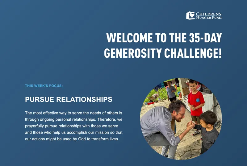
A living landing page for a five-week, multi-channel campaign: one hub that evolved every Monday as supporters worked through a week-by-week journey of generosity.
- Client
- Children's Hunger Fund—A Christian Non-Profit Ministry
- Role
- Designer & Developer (sole developer)
- Platform & Tools
- WordPress
PHP, SASS, JavaScript/jQuery - Deliverables
- Landing page, 5 weekly updates, 5 blog posts, downloadable resource
Overview
Children's Hunger Fund wanted to deepen its relationships with donors and supporters, and the 35-Day Generosity Challenge was a five-week engagement campaign built for that. Daily devotional emails needed somewhere to send people, so a landing page worked together with the emails and weekly blog posts, with each week centered on one of the ministry's five core values:
- Prioritize the Gospel
- Elevate the Church
- Impact the Next Generation
- Pursue Relationships
- Strive for Integrity
As the sole developer, I owned the campaign's entire web presence, from the page's UX and visual design to its build and every weekly release.
Results & Impact
The landing page became the central hub for more than 35 daily devotional emails, bringing recipients back to a living web experience that changed every week. The five blog posts gave engaged readers somewhere to go deeper, tying email, web, and content into one cohesive story.
Building the Page
Designed in Code
There was no mockup to build from, so I designed directly in HTML and CSS. I adapted the milestone tracker from the Giving Tuesday campaign into a five-step weekly challenge, making layout, spacing, hierarchy, and interaction decisions as I built. The initial build went through a month of review with four stakeholders across communications, leadership, production, and design, and more than 20 rounds of feedback before launch.

A Page That Changes Every Week
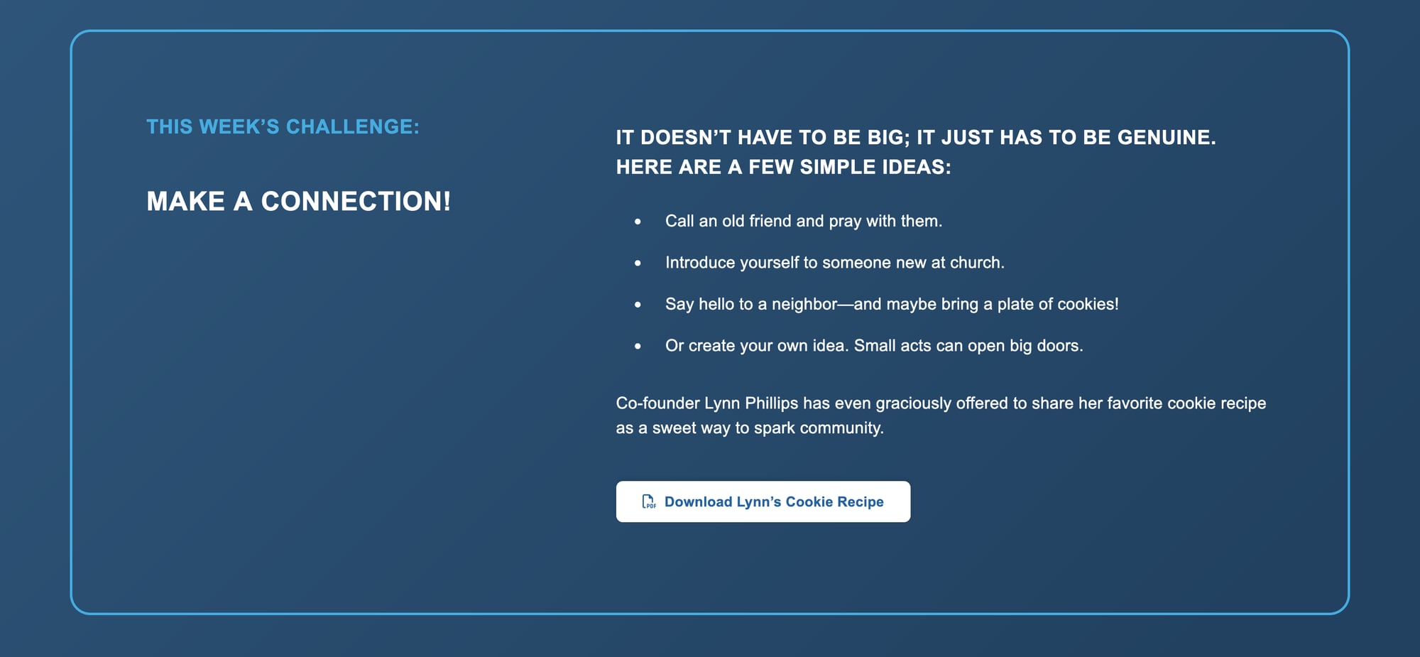
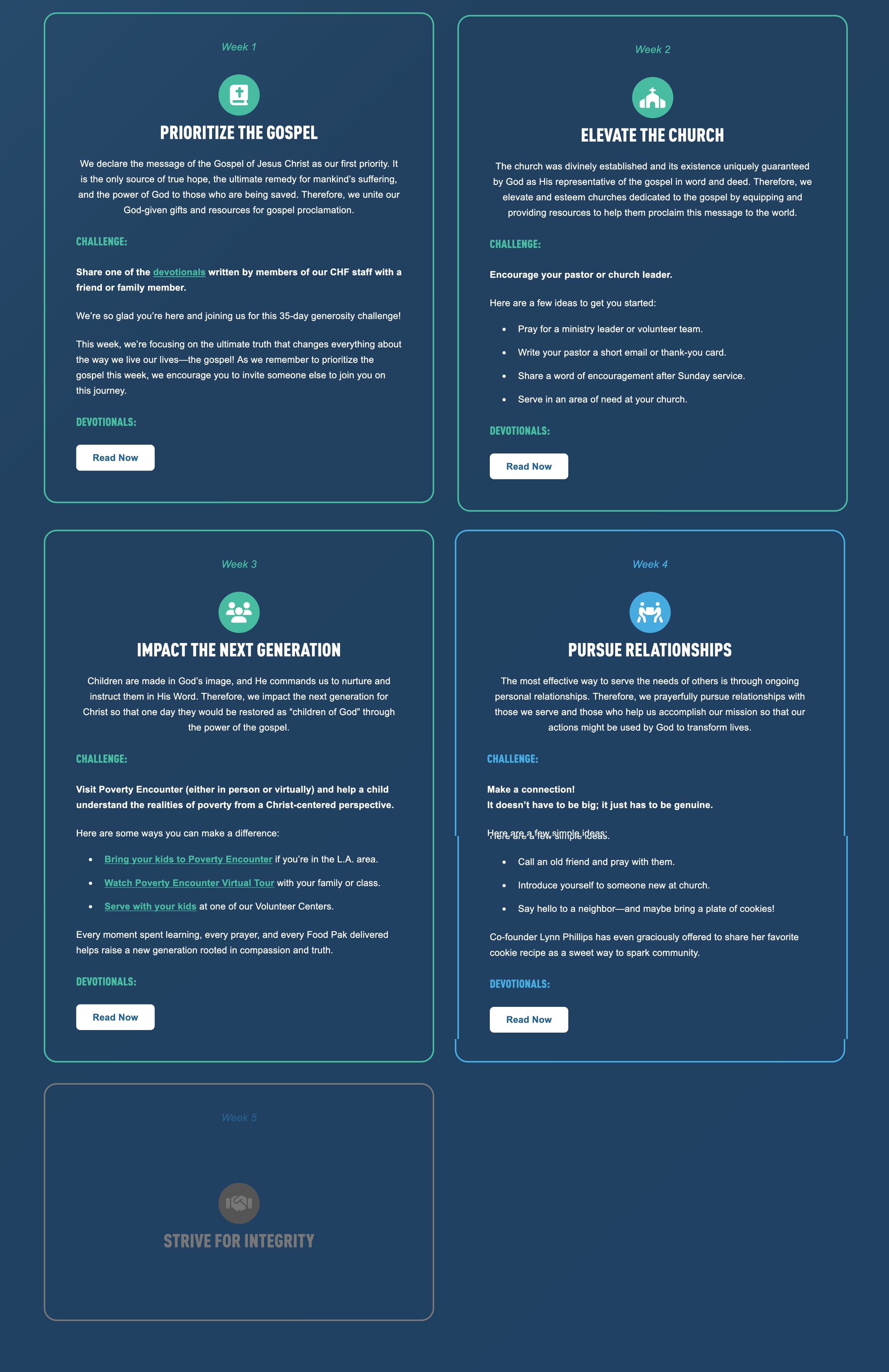
The centerpiece is a set of five tiles, one for each week, that together tell the story of the journey:
- Three states per tile. Upcoming weeks stay muted and locked, the current week is highlighted with its challenge, and completed weeks get a checkmark while staying readable.
- A rotating hero. The top of the page swaps each week to that week's focus, challenge, and imagery, built as its own module so it could change without touching the rest of the layout.
- A growing content hub. Each tile links to its week's blog post as it goes live.
- One-week surprises. Week two added interactive flip cards for pastor appreciation notes, built with CSS 3D transforms.
Designed for Every Screen
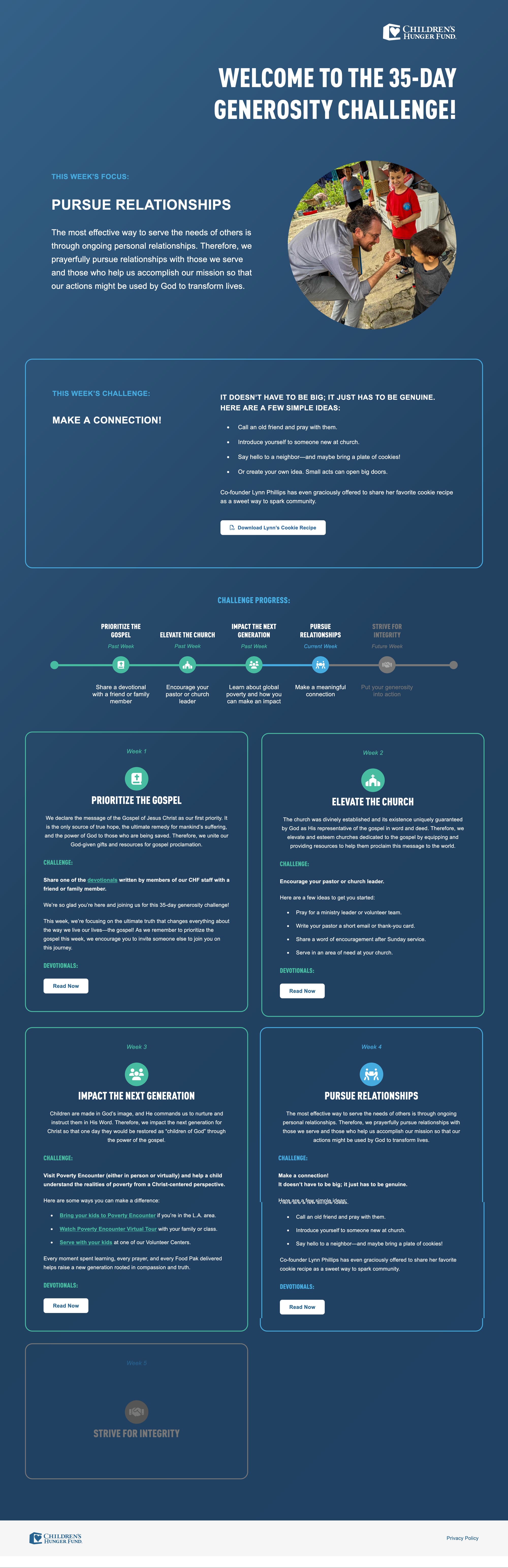
With most supporters arriving from their inboxes, the page had to feel just as considered on a phone as on a desktop.


Releases & Content
Monday 5 AM Releases
After launch, I shipped a new version of the page every week on a strict schedule:
- Build ahead. Each update was prepared as an unpublished revision, so stakeholders could review it through a private preview without touching the live page.
- Advance the journey. The previous week was marked complete, the new week activated, and the hero swapped.
- Sign-off. Every update cleared a formal three-person approval before it was scheduled.
- Release on the dot. Updates went live automatically at 5 AM every Monday, timed to meet the first email of the new week, with zero downtime.
Content and Resources
I also prepared and published five weekly blog posts, formatting each for the site, coordinating custom banner art with the Creative Director, and scheduling each to go live at the start of its week. For the email campaign, I set up hosting and a trackable download link for a designed PDF, a favorite cookie recipe from the ministry's co-founder, reusing the pattern I established on Giving Tuesday.
Learning & Next Steps
What I learned
- Adapting the Giving Tuesday milestone tracker into a five-step weekly challenge taught me how much a proven pattern speeds up a build with no mockup.
- A month of review across four stakeholders and more than 20 rounds of feedback showed me that designing in code means the review process needs to be part of the build.
- Building the hero as its own module and preparing each week as an unpublished revision taught me to structure a page so it can change weekly without touching the rest of the layout or the live page.
What's next
- Reuse the weekly tile states and rotating hero module for other multi-week campaigns.
- Measure return visits to the page across the five weeks to see whether the tile progression encouraged them.
- Keep the build-ahead, approve, and scheduled Monday release routine as the template for future timed updates.

[ Let's connect ]
Let's work together
Have a project, a role, or an idea in mind? I'd love to hear about it.