MarketingSocial Media Graphics
GTY Social Media Graphics
Quote graphics tailored for social media sharing, designed to drive engagement and direct traffic back to the Grace to You website.
- Client
- Grace to You—A Christian Media Organization
- Role
- Web Designer & Developer
- Platform & Tools
- Social Media
Overview
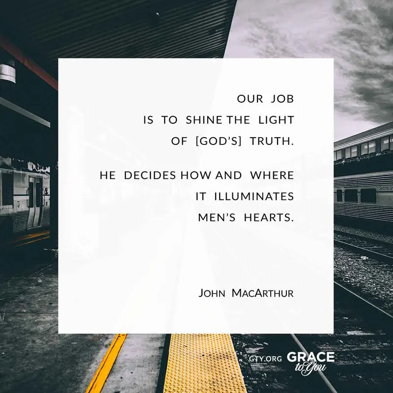
These quote graphics are tailored for social media sharing: concise, impactful quotes built to capture attention in a fast-scrolling feed, with the GTY.org address placed so viewers know exactly where to go for more. By presenting thought-provoking quotes in visually appealing formats, they aim to spark conversations, encourage shares, and drive traffic to the GTY website, expanding the reach of its resources.
Consistent branding, with the “Grace to You” logo and the GTY.org URL prominently displayed, reinforces brand recognition. Each design credits John MacArthur and specifies the source material, which maintains credibility and encourages viewers to explore the original context of the quotes.
Results & Impact
Each post could look fresh in the feed, yet every one credits its source and points back to GTY.org, turning a moment of scrolling into a path to the original teaching.
Design System
Anatomy of a Quote
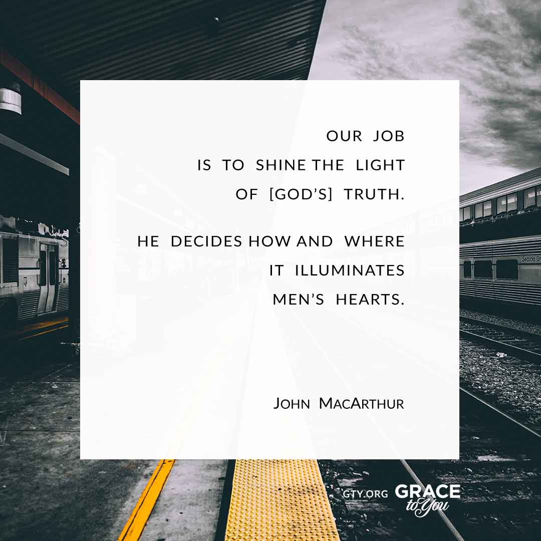
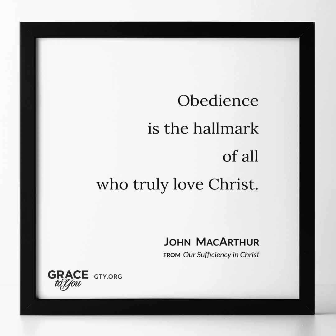
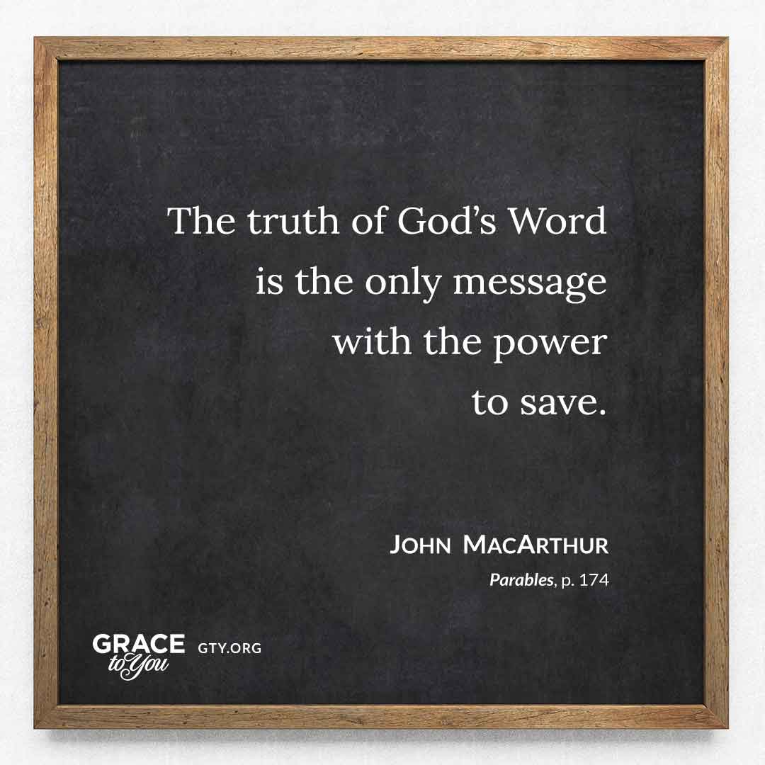
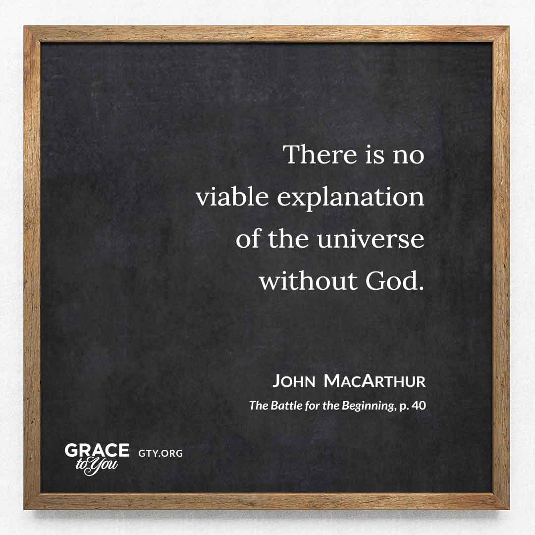
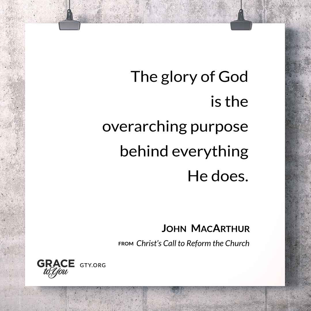
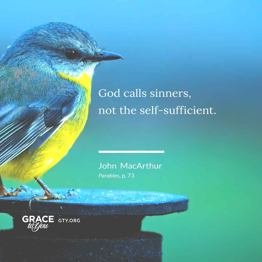
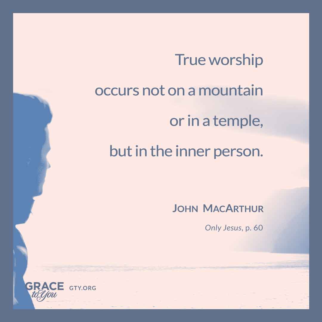
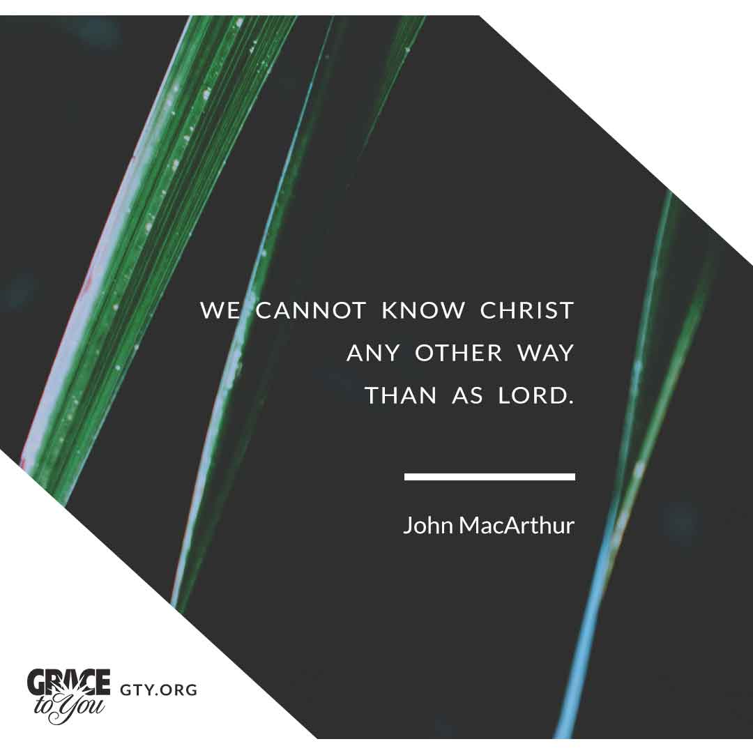
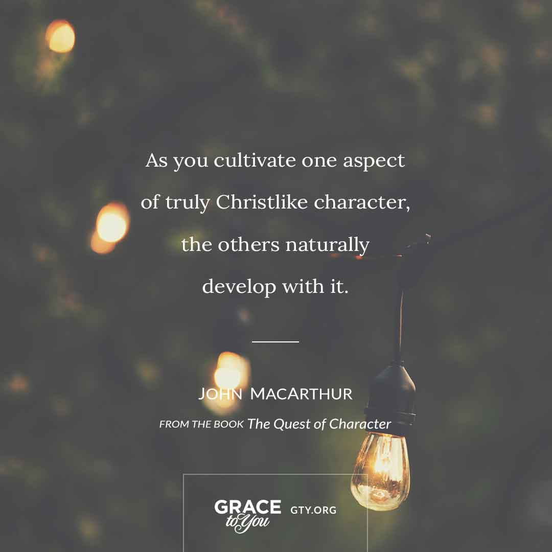
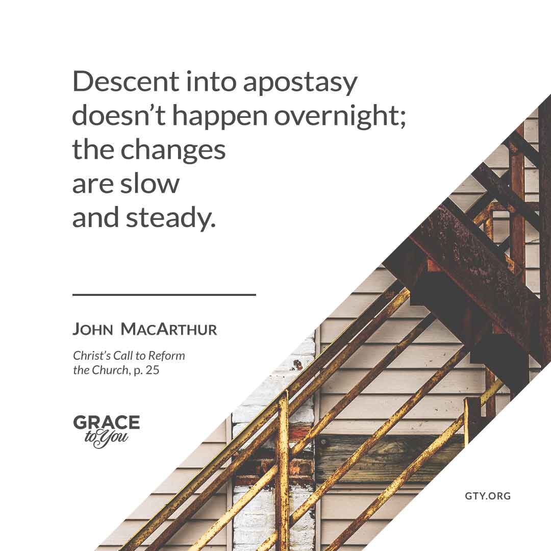
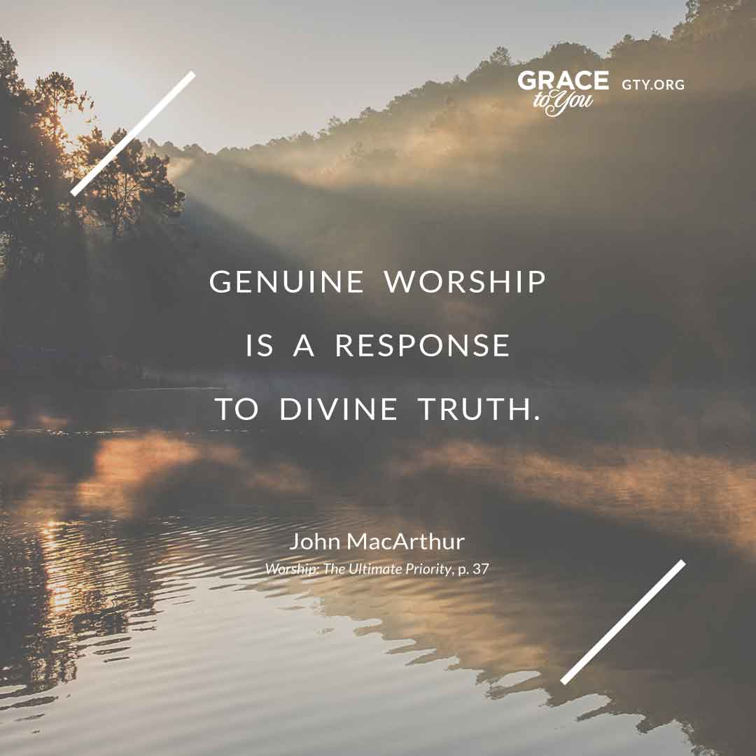
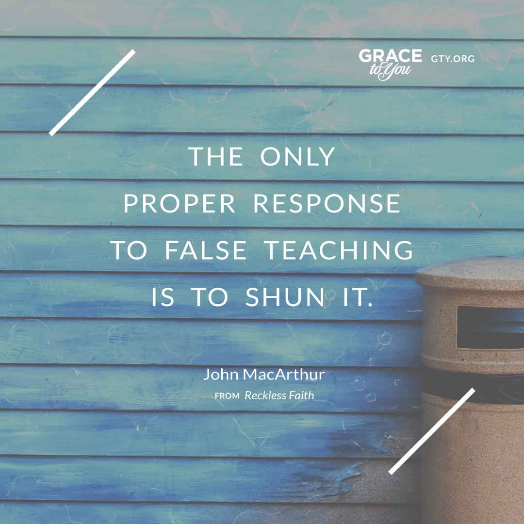
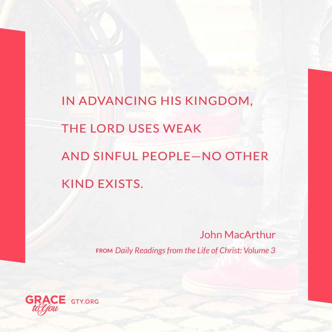
However the layout changes, every graphic carries the same four parts, always in the same order of importance:
- The quote, given most of the square and set large enough to read on a phone
- “John MacArthur,” usually in small capitals, directly under the quote
- The source, a book title and often a page number, set small so it informs without competing
- The Grace to You logo with GTY.ORG in a corner, so a shared image always leads back home
Templates in Pairs
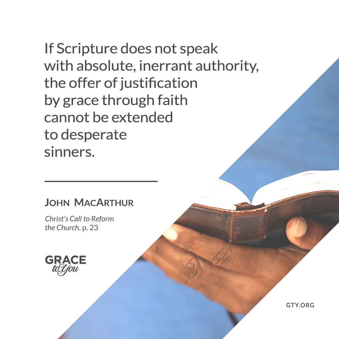
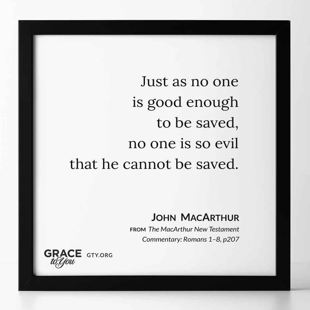
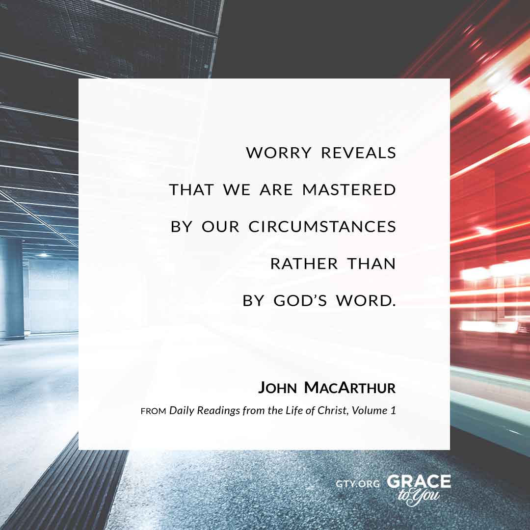
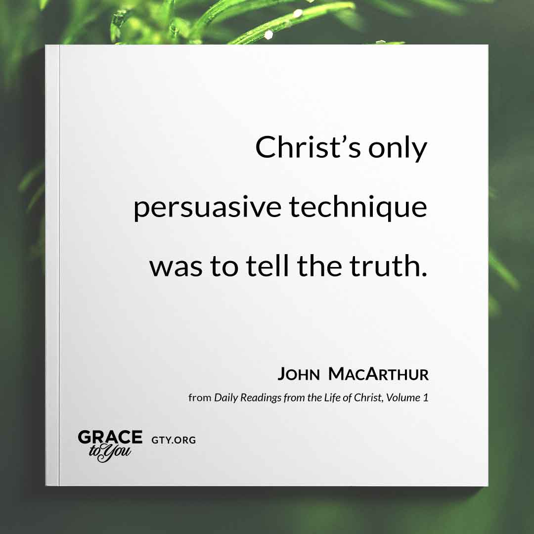
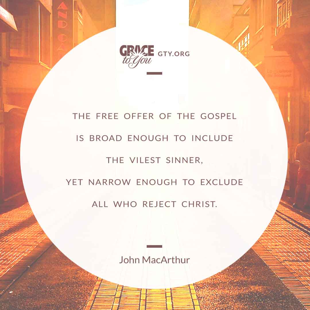
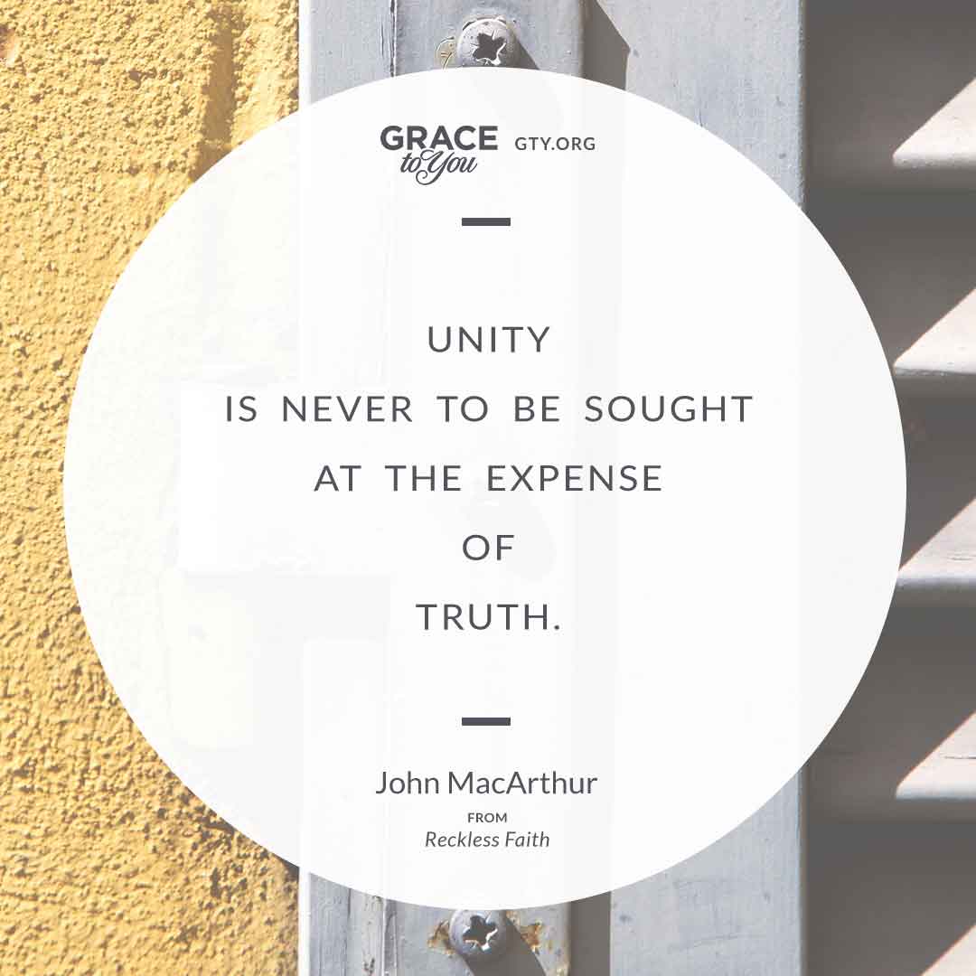
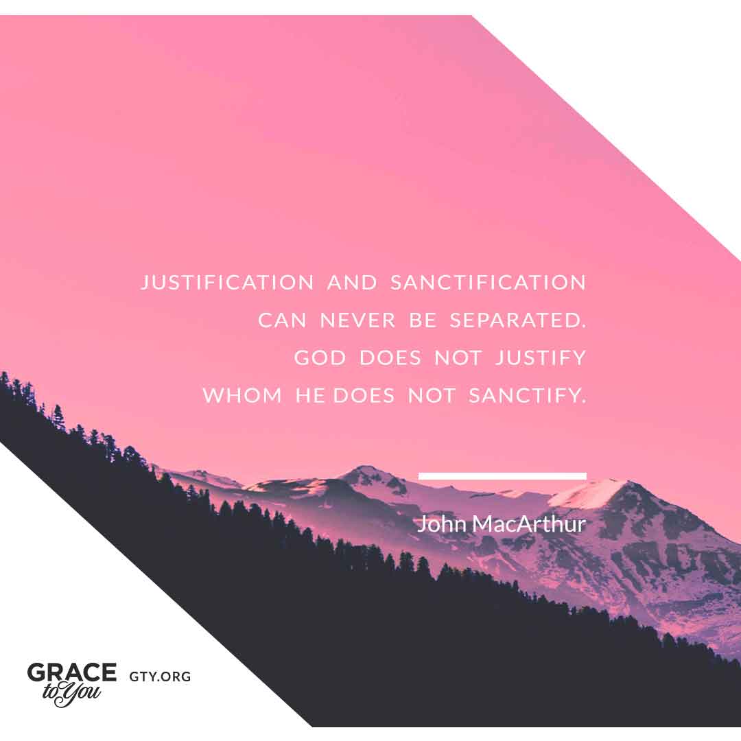
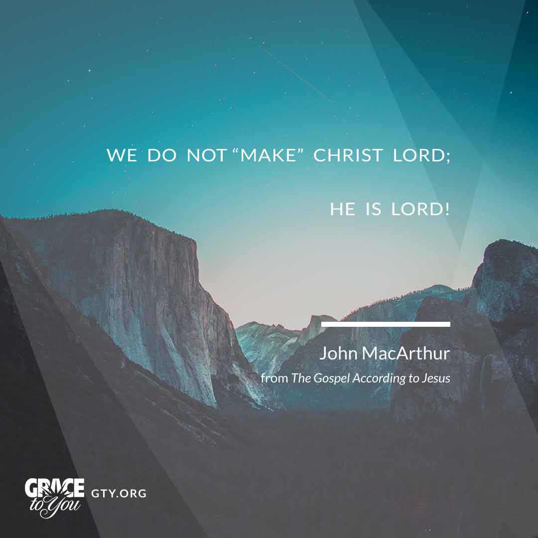
A feed needs variety, but a brand needs consistency. Rather than design every post from scratch, I built a set of about fifteen layouts, among them a framed print, a chalkboard, a sheet pinned to a concrete wall, and a black card over white architecture, and set two different quotes in each. A new quote could drop into a proven layout, and consecutive posts could vary in look while still reading as one series.
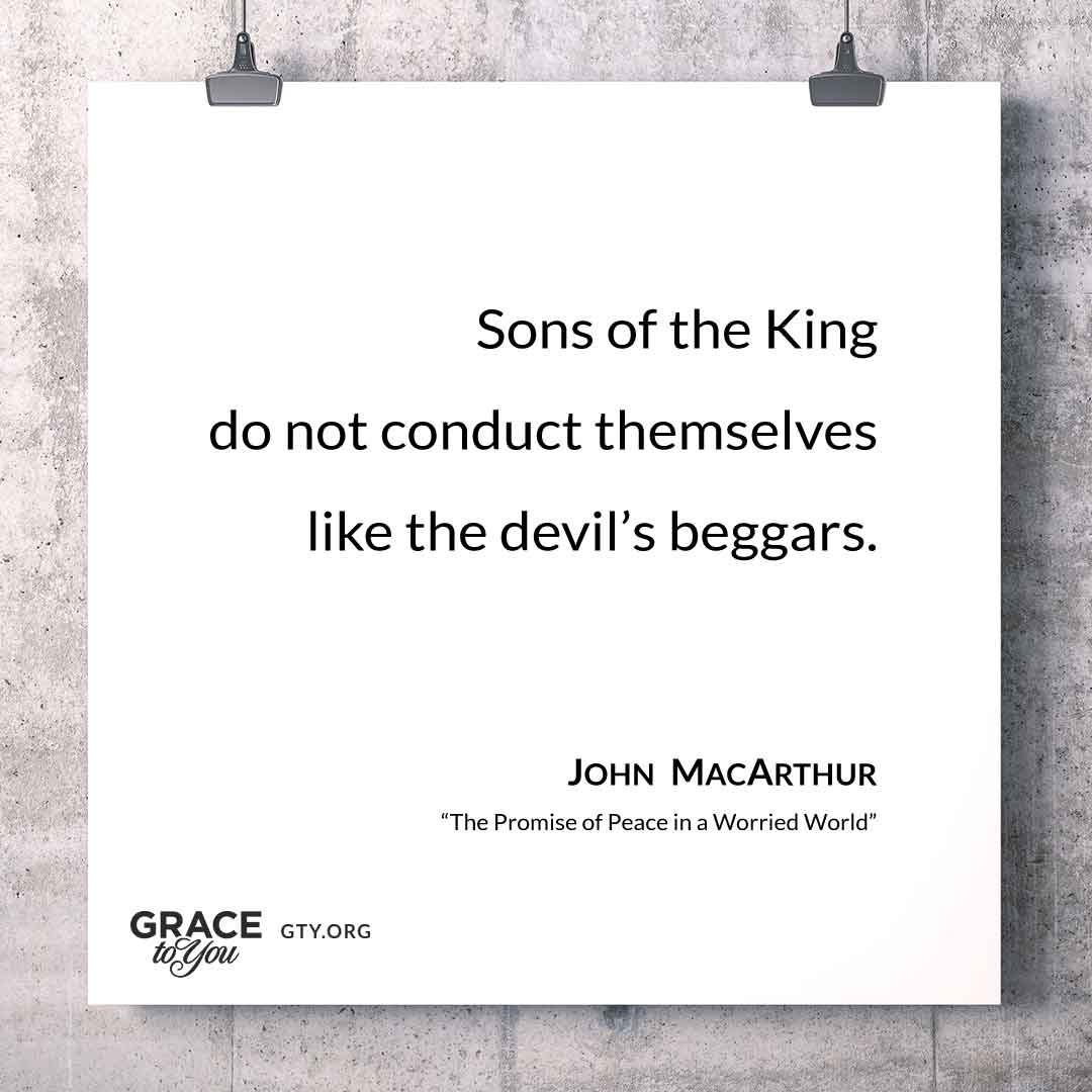
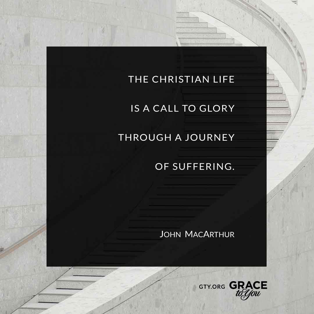
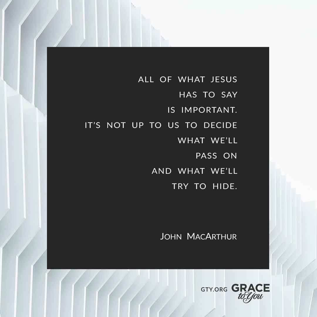
Type & Photography
Contrasting fonts and carefully selected photographs capture attention and keep the content easy to digest, with fonts consistent with GTY's style guide. Reflective quotes are set in a light serif or sentence case; declarative ones in widely spaced capitals. The photography sets a mood without illustrating the quote literally: two small birds for humility and self-sufficiency, a figure at a railing for a quote about the deepest human need, a kayak at sunset for God's provision. Soft duotones and dark overlays keep every photo quiet enough for the quote to sit on top.
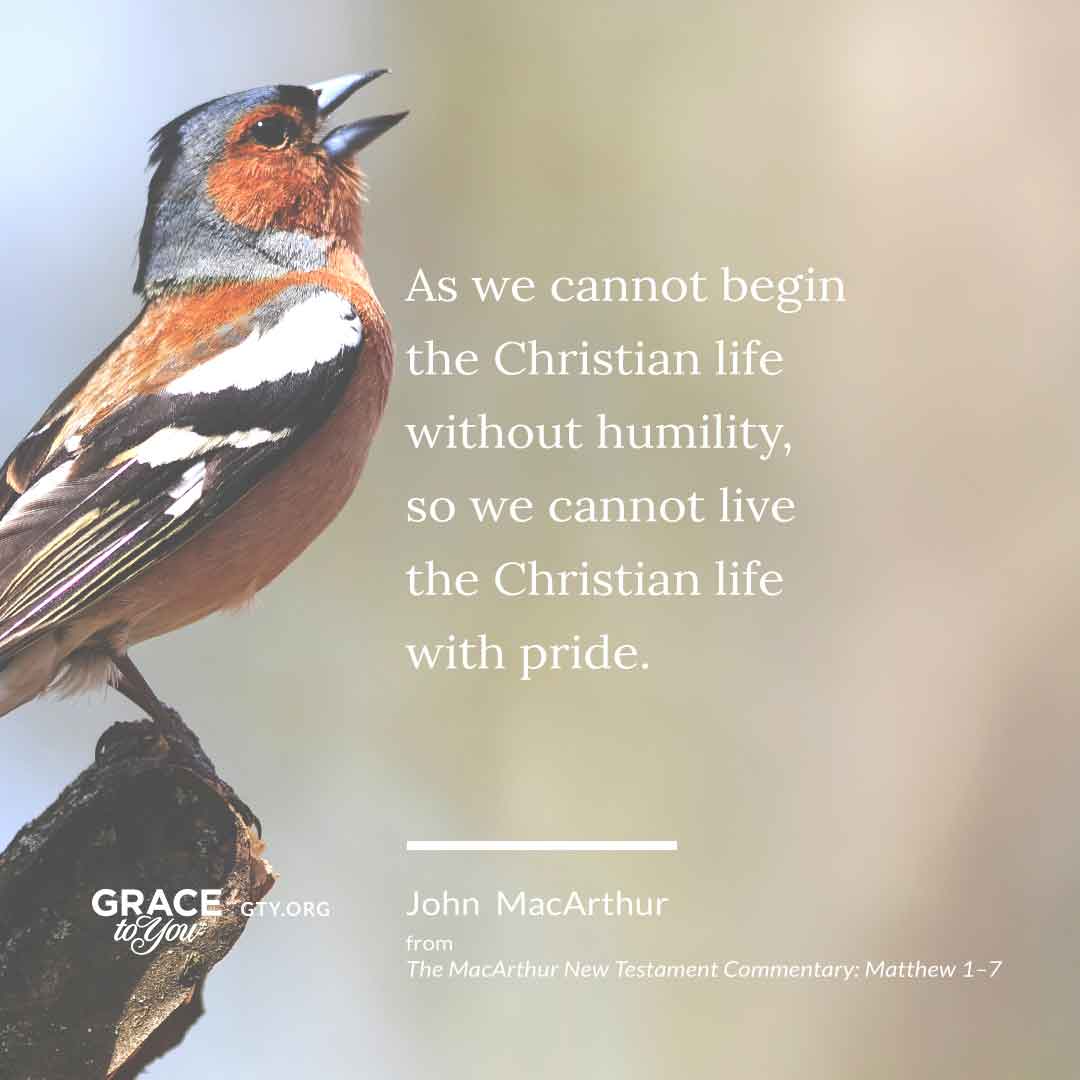



The Collection
The rest of the series, each in one of the same layouts and carrying the same four parts.


Reflection
The series shows how far a small system can stretch: a fixed set of parts, a library of paired layouts, and a clear hierarchy of quote, name, source and logo.




[ Let's connect ]
Let's work together
Have a project, a role, or an idea in mind? I'd love to hear about it.