MarketingResource Graphics
GTY Resources
Clean, modern graphics for Grace to You that highlight products being promoted, offered for free, or sold at a discount, clearly communicating the value of each offer.
- Client
- Grace to You—A Christian Media Organization
- Role
- Web Designer & Developer
Overview
As a designer at Grace to You, I created visuals that immediately grabbed attention and clearly communicated value, using a clean, modern aesthetic to highlight products being promoted, offered for free, or sold at a discount. The goal was for each graphic to promote its offer effectively: clarity and appeal that turn viewer interest into action by showing the benefits of each product.
Results & Impact
Grace to You's promotions read as one consistent family across the website, the store and the broadcasts, while a campaign like The Preacher's Bible launch still had room for its own look.
Offers & Promotions
What Every Graphic Has to Say
Whether it ran on the website, in the store or alongside a radio broadcast, each graphic had a few seconds to answer the same four questions:
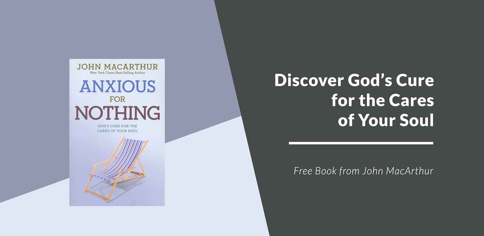
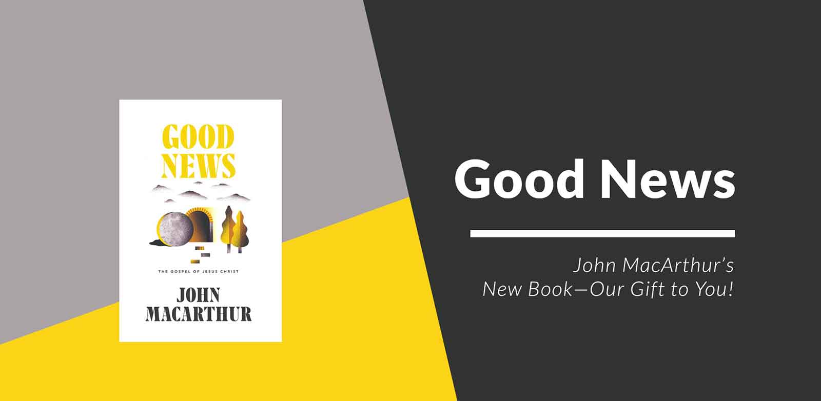
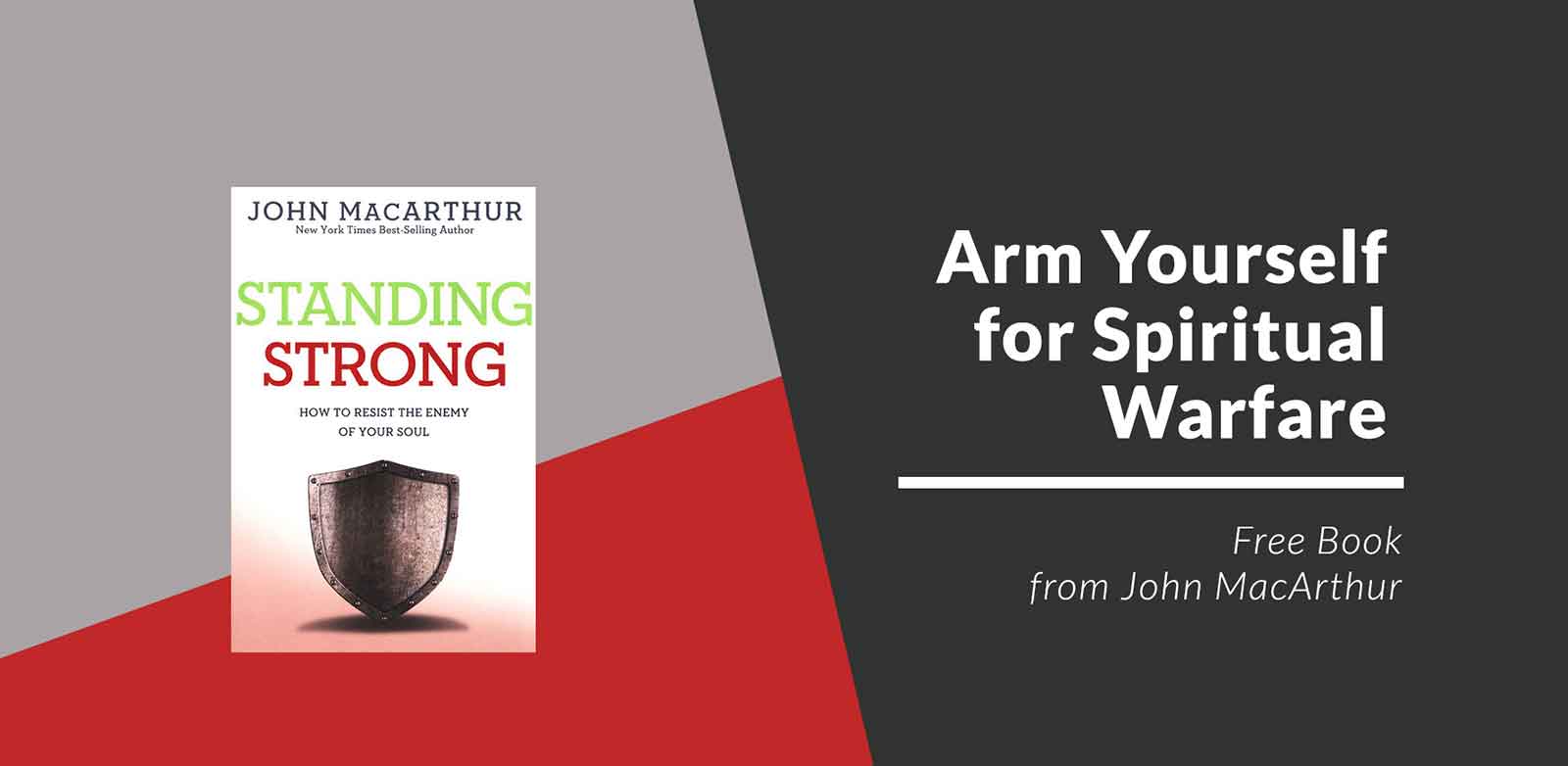
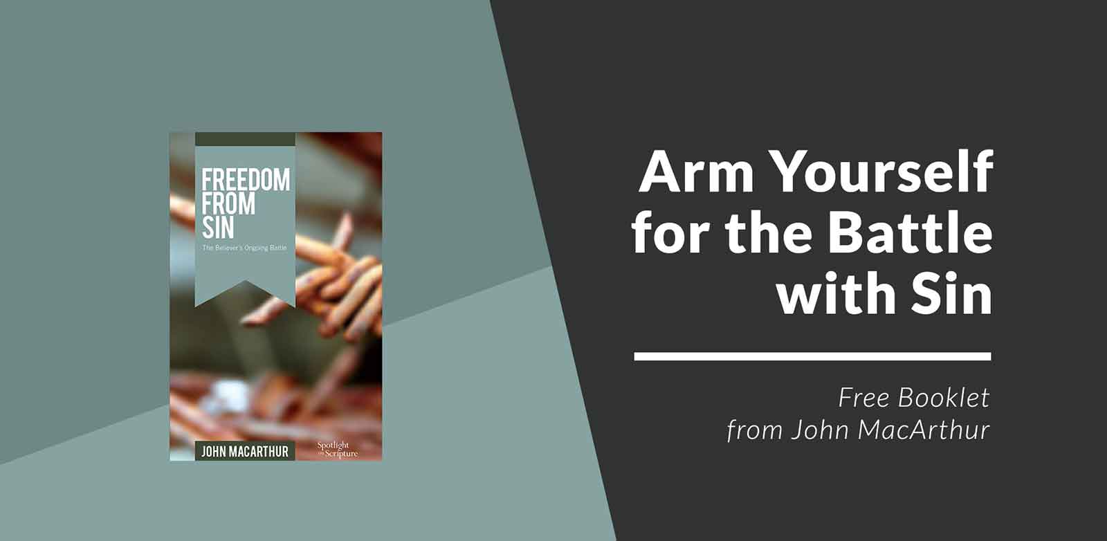
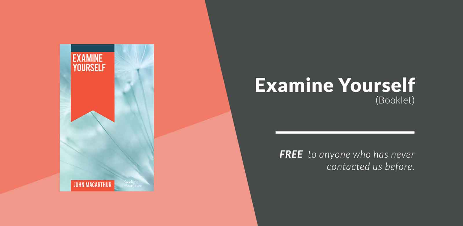
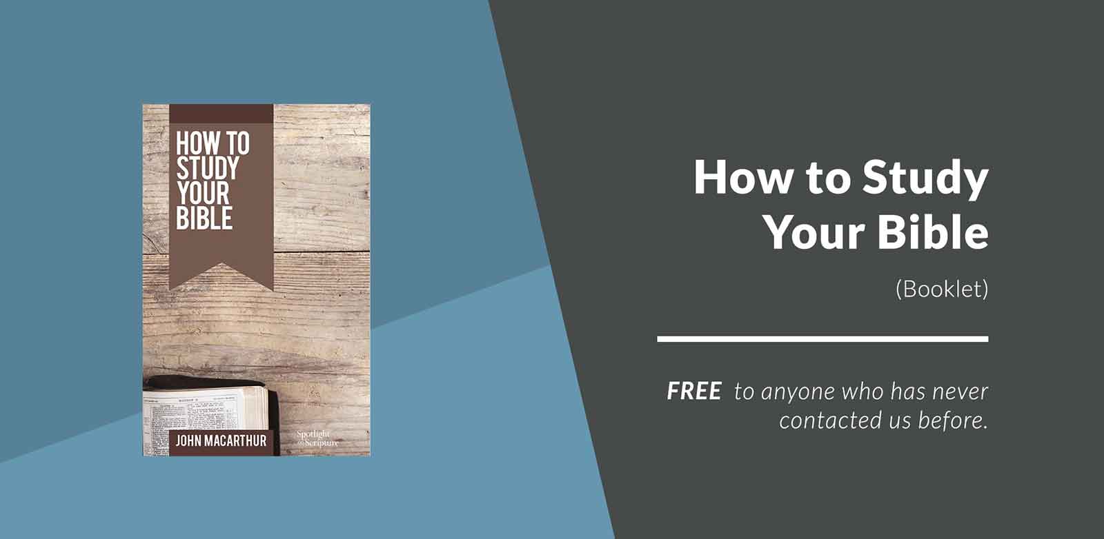
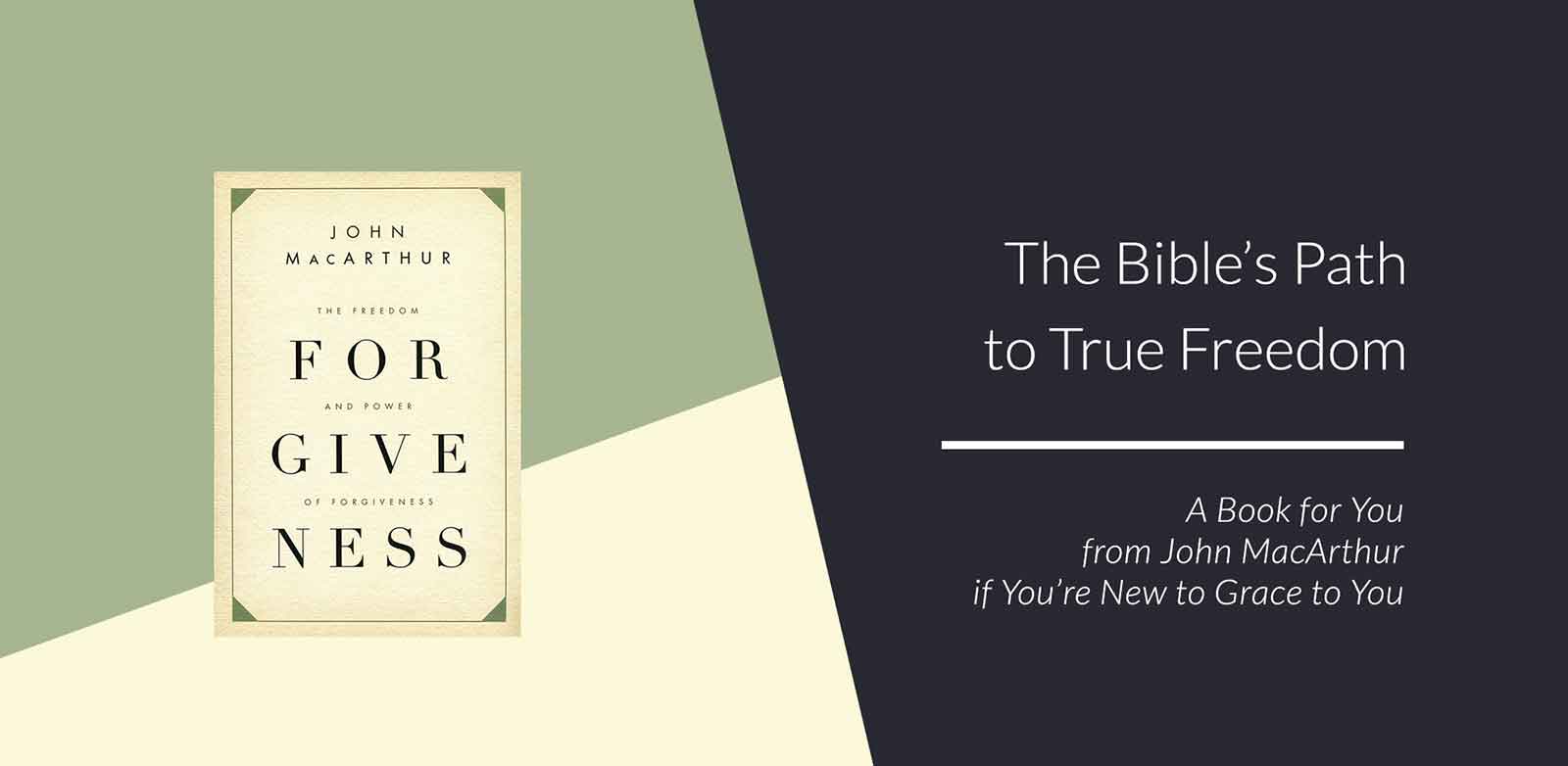
- What is it? The product itself, shown large: the book, booklet, CD or Bible, never an abstract stand-in
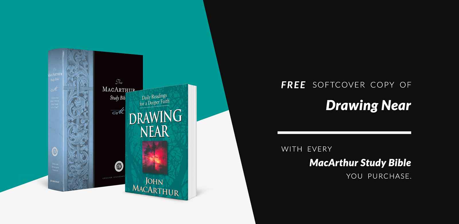
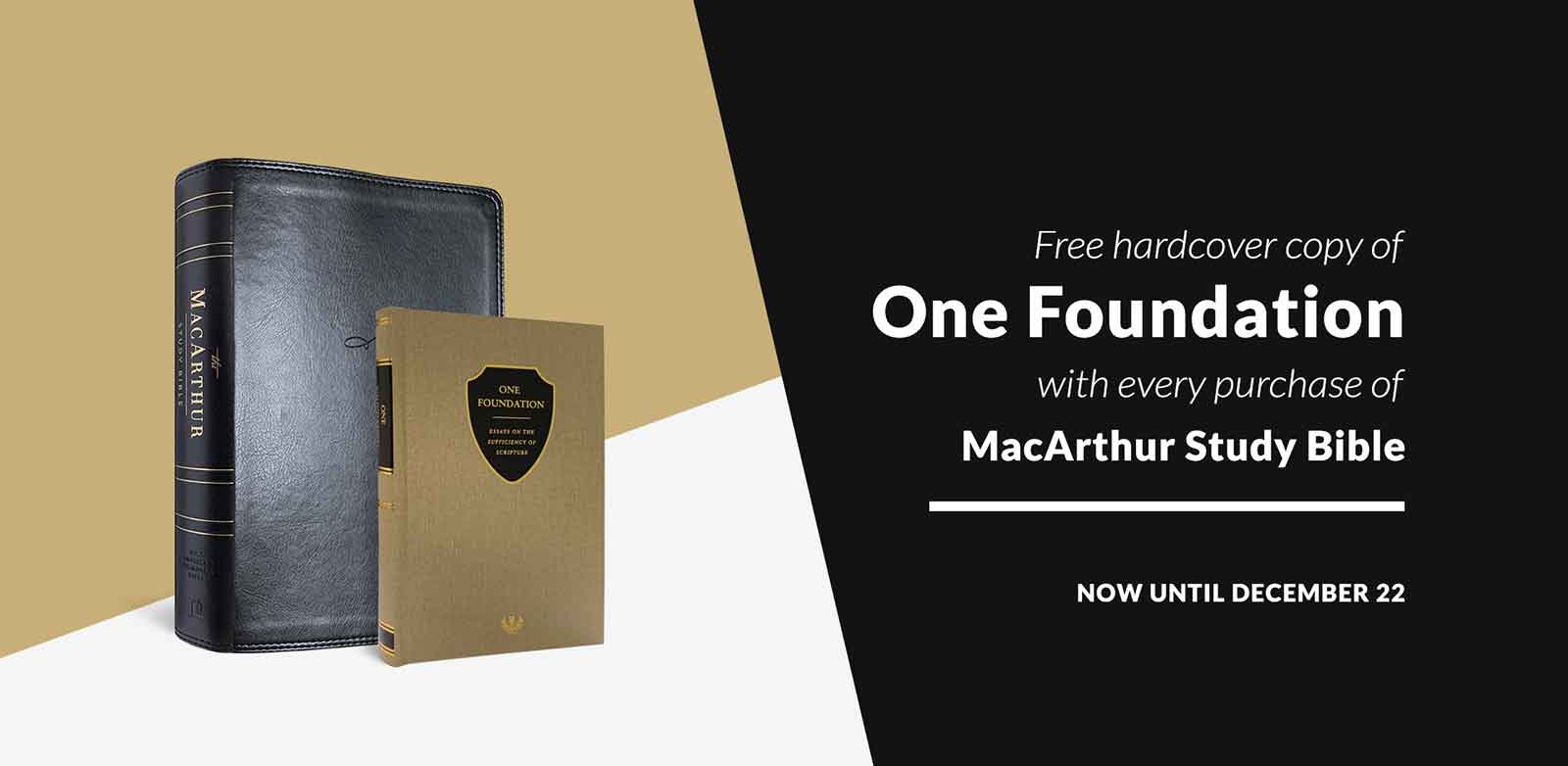
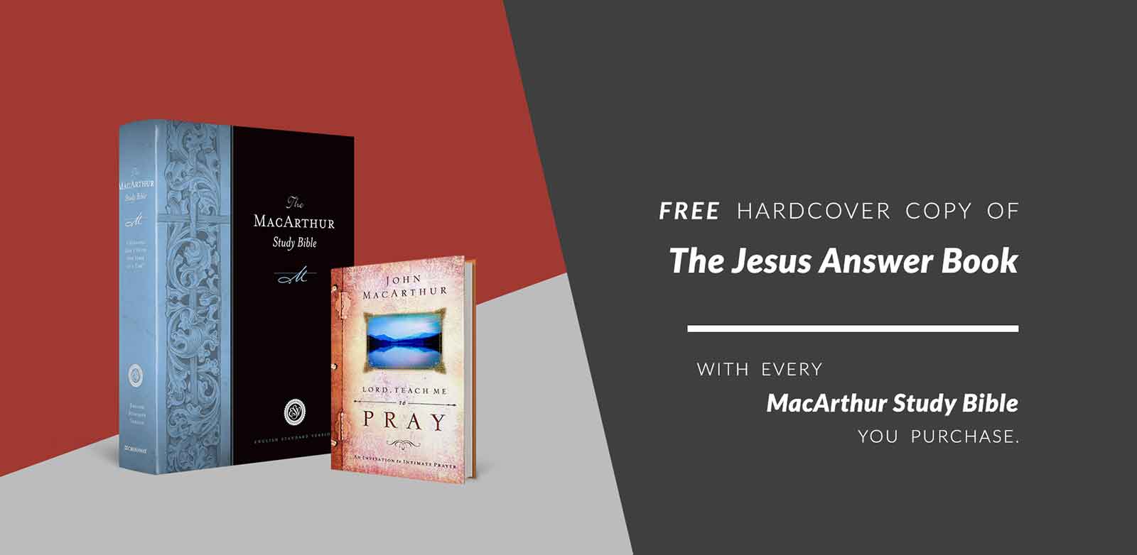
- What's the offer? “Free,” “25% off” or “free with every MacArthur Study Bible you purchase,” set where the eye lands first
- Who is it for? Terms such as “to anyone who has never contacted us before” or “if you're new to Grace to You,” kept short and legible
- Until when? End dates and “some exclusions apply,” present but quiet
The Offer Template
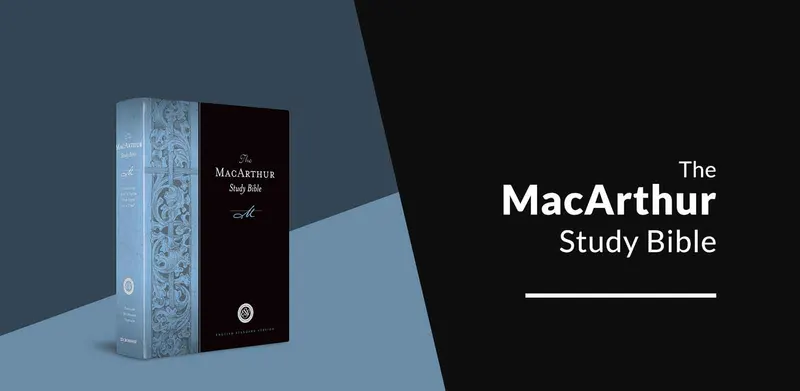
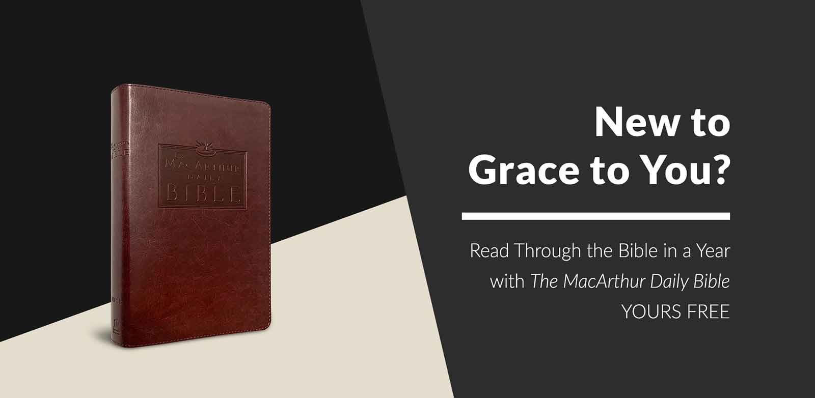
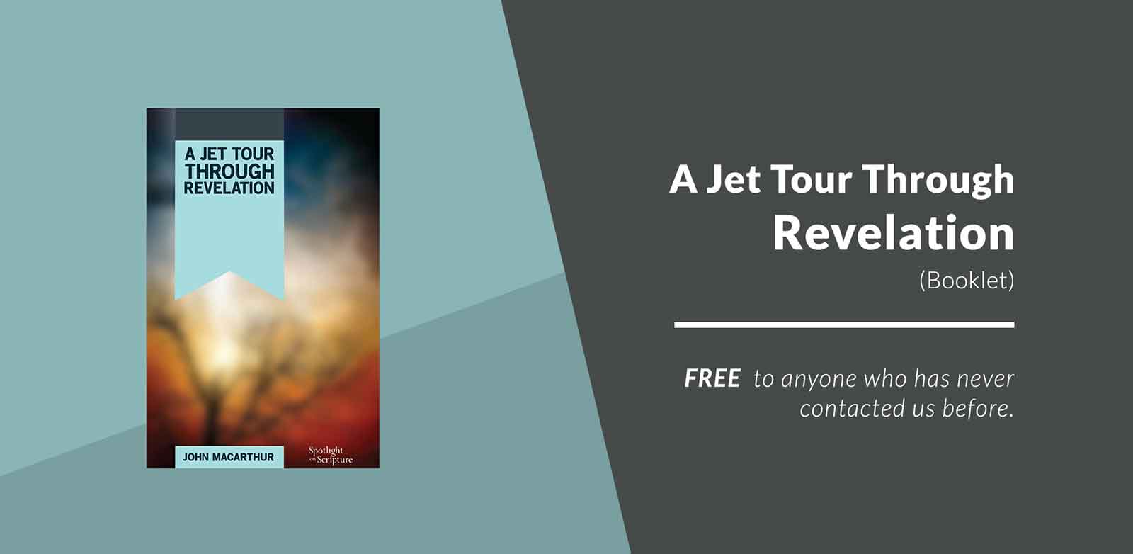
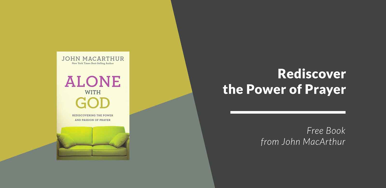
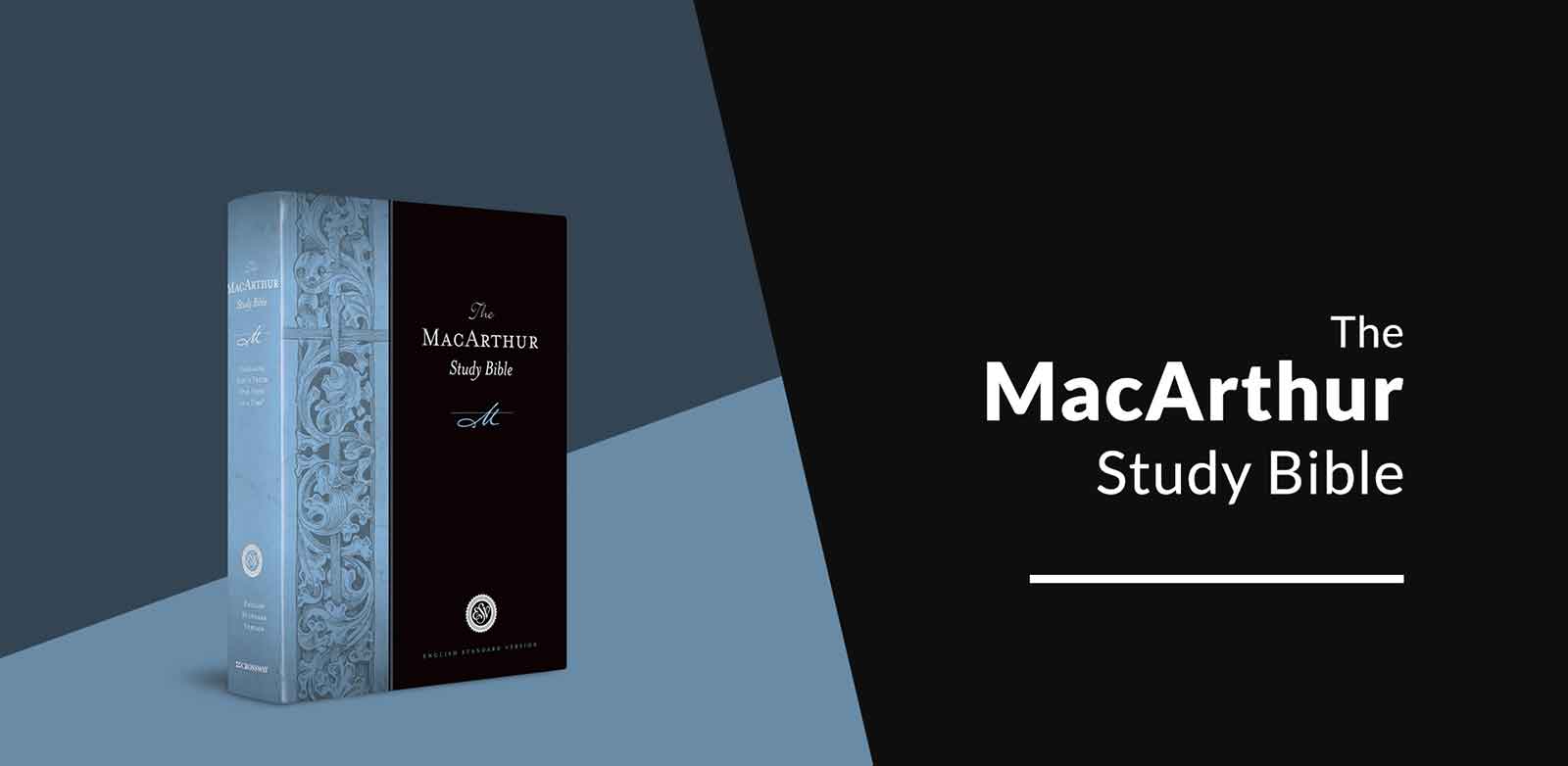
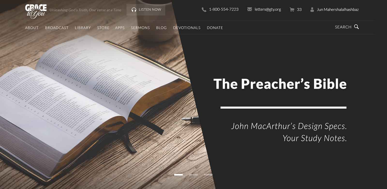
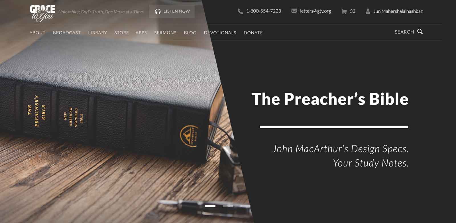
Free offers came up constantly, so rather than design each one from scratch, I built them on one template. A diagonal line splits the frame: on the left, the product sits on a block of color pulled from its own cover, so every graphic feels made for that title; on the right, a dark charcoal panel holds the title, a short rule, and the offer in the same order every time. The same layout carried store offers that pair a free book with a MacArthur Study Bible purchase, and it made a run of very different titles read as one family.



Seasonal Sales
Sales work the other way around: the offer is the product. The recurring Autumn and Summer sales lead with a big “25% off inventory” set over seasonal photography (fallen leaves and hand lettering for autumn, bright beach scenes for summer), with the end date and exclusions underneath. Each season was refreshed with a new version, so the same offer never looked stale from one year to the next.






Bible Promotions
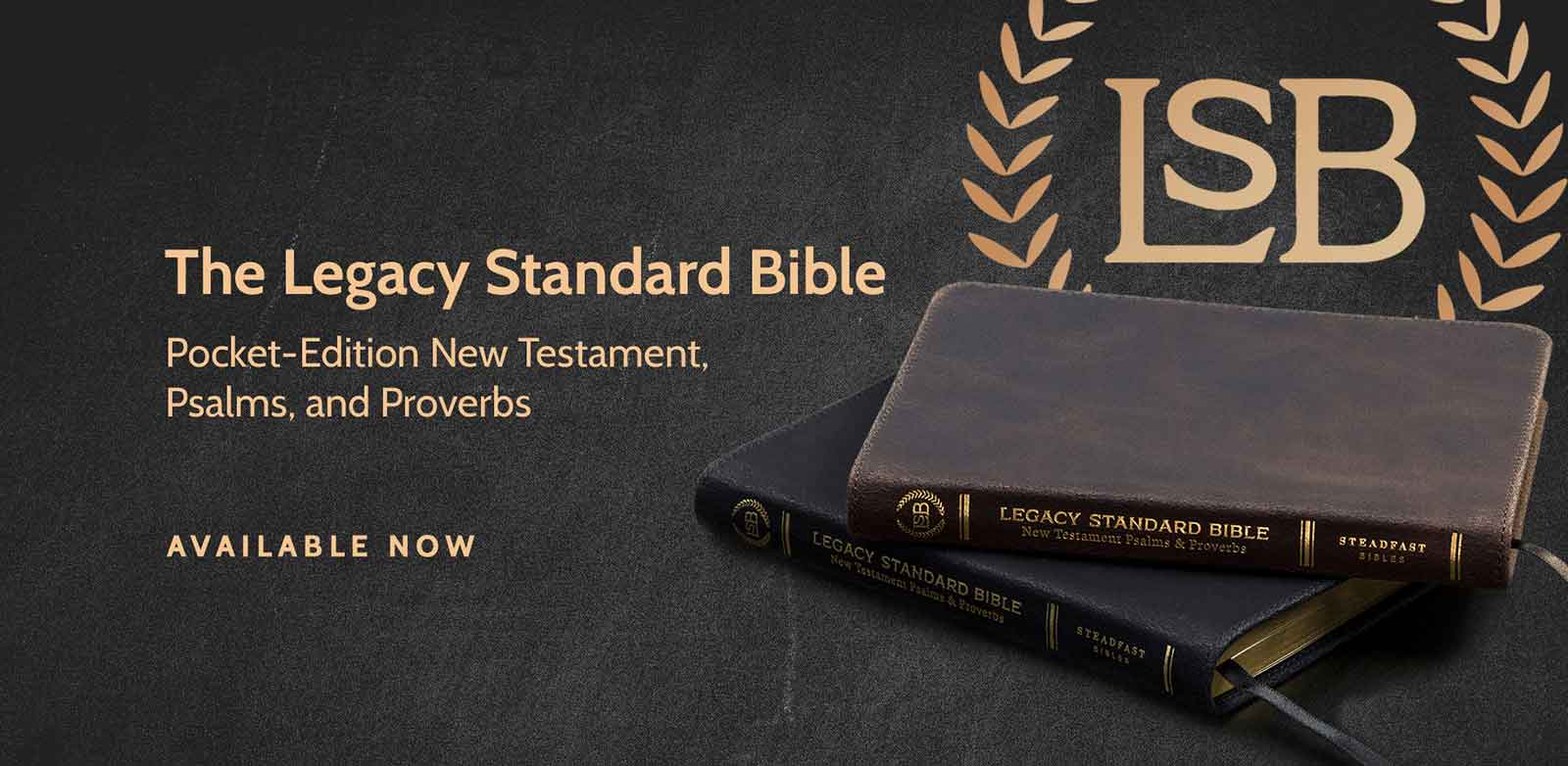
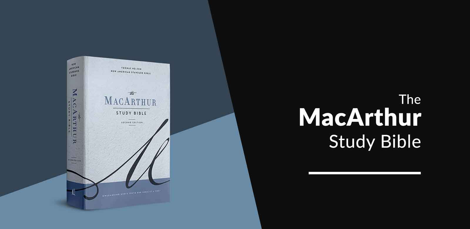
Other Bible releases and promotions, the pocket-edition Legacy Standard Bible New Testament with Psalms and Proverbs, the MacArthur Study Bible's second edition, and a 25%-off MacArthur Study Bible offer, reuse the same diagonal split as the offer template, so a new release sits comfortably next to the free offers around it.

The Preacher's Bible Launch
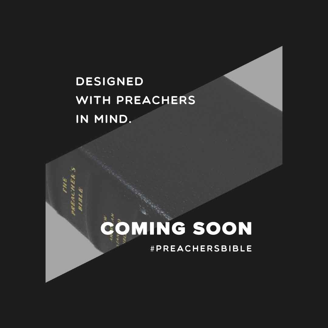
The Preacher's Bible got a full launch campaign that built anticipation in stages. It opened with “Coming Soon” teasers: dark, typographic posts with the Bible glimpsed through a slanted frame and a single line each, such as John MacArthur being asked what the perfect Bible for pastors would include.


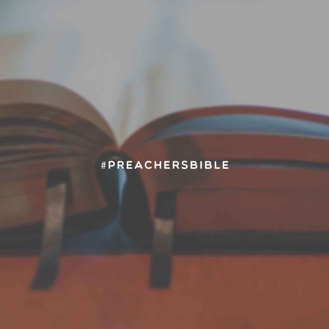
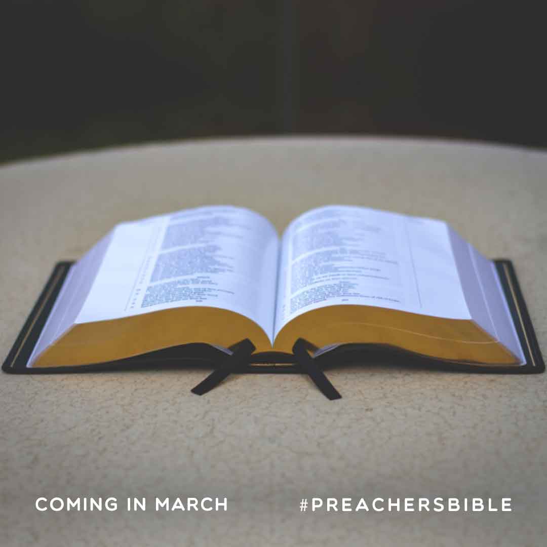
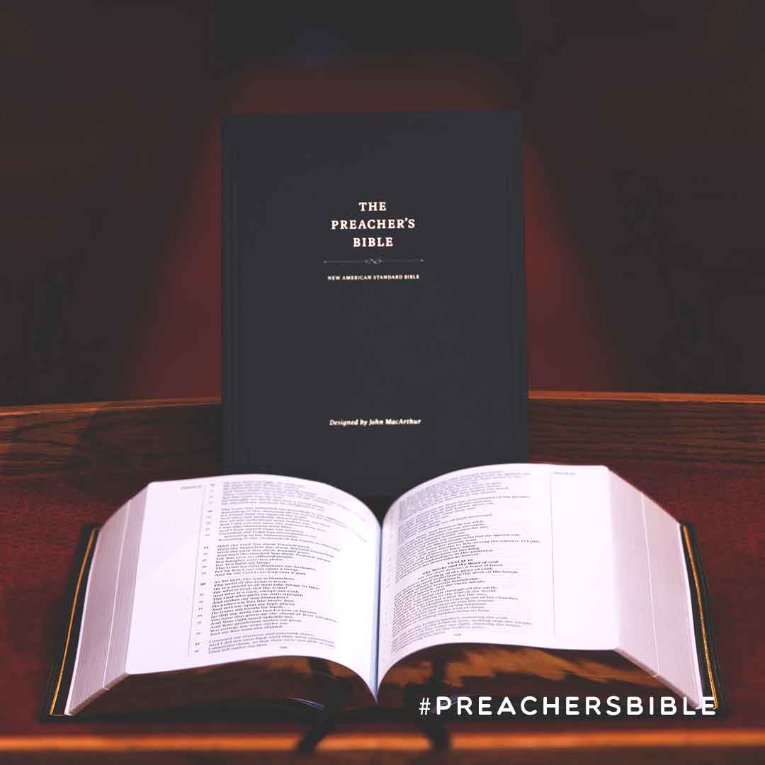
Next came “Coming in March” posts, each built around one close-up photo and one feature: the text and binding, a Bible that lays flat, its craftsmanship, the Smyth-sewn binding and the NASB text. All carried the #PreachersBible tag to tie the series together.
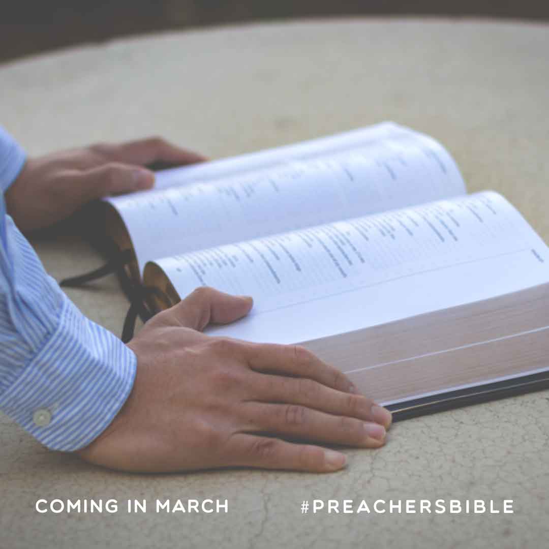
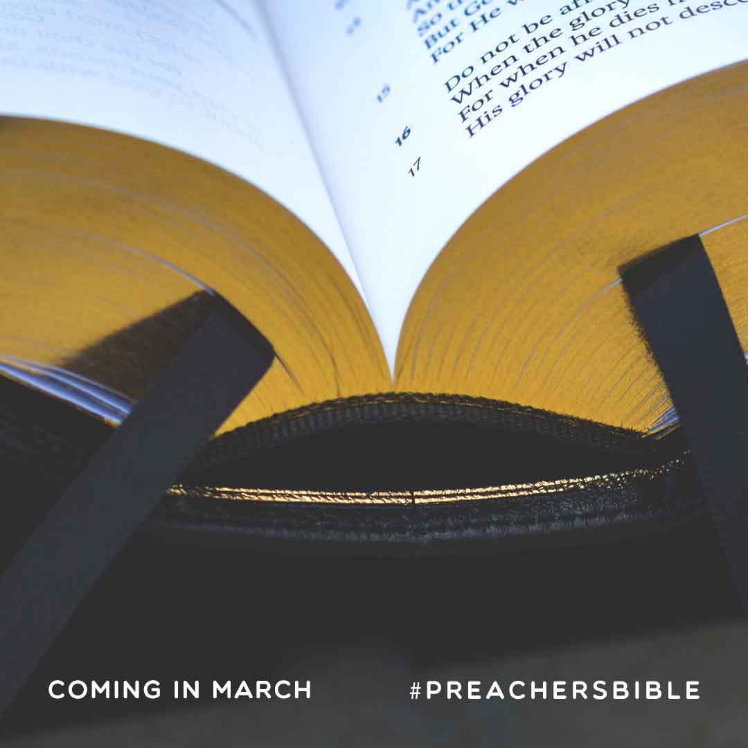
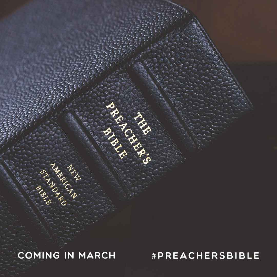
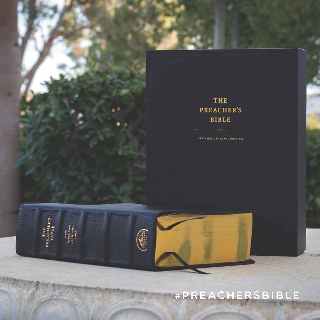
On launch day, the “Today” posts showed the finished Bible and its box, and website banners carried the line “John MacArthur's Design Specs. Your Study Notes.” into the store.

Reflection
Across dozens of graphics, a handful of decisions did most of the work: the product always shown large, the offer always stated plainly, and a small set of layouts reused instead of reinvented. The offer template in particular meant each new free resource started from a proven layout rather than a blank canvas.


[ Let's connect ]
Let's work together
Have a project, a role, or an idea in mind? I'd love to hear about it.