MarketingBlog Graphics
GTY Blog Graphics
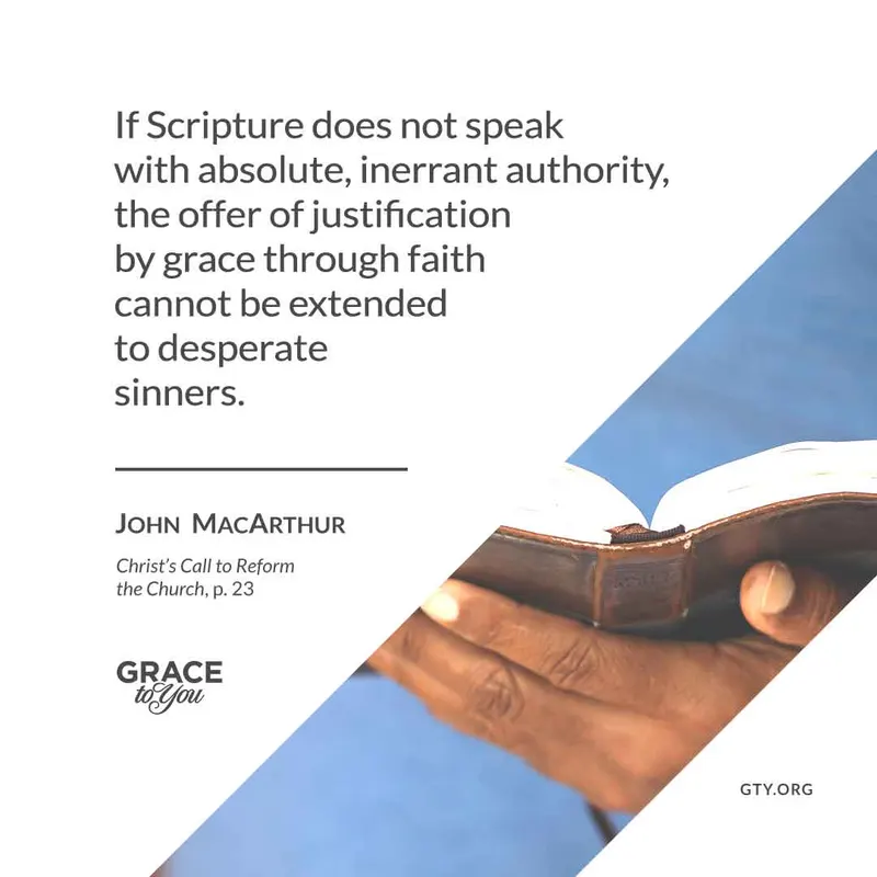
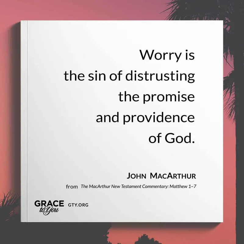
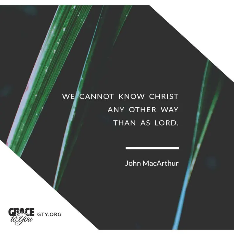
Blog graphics for Grace to You that pair imagery and typography to visually encapsulate the essence of each post, making the content inviting and memorable for readers.
- Client
- Grace to You—A Christian Media Organization
- Role
- Web Designer & Developer
Overview
Every post on the Grace to You blog needed a header graphic: the image at the top of the article and the one people see when it's shared. Over dozens of posts, my goal was to create graphics that not only attract attention but also visually encapsulate the essence of the blog post, making the content inviting and memorable for readers.
Results & Impact
The result is a body of graphics that each stand on their own, yet read unmistakably as Grace to You.
Design Approach
Starting from the Title
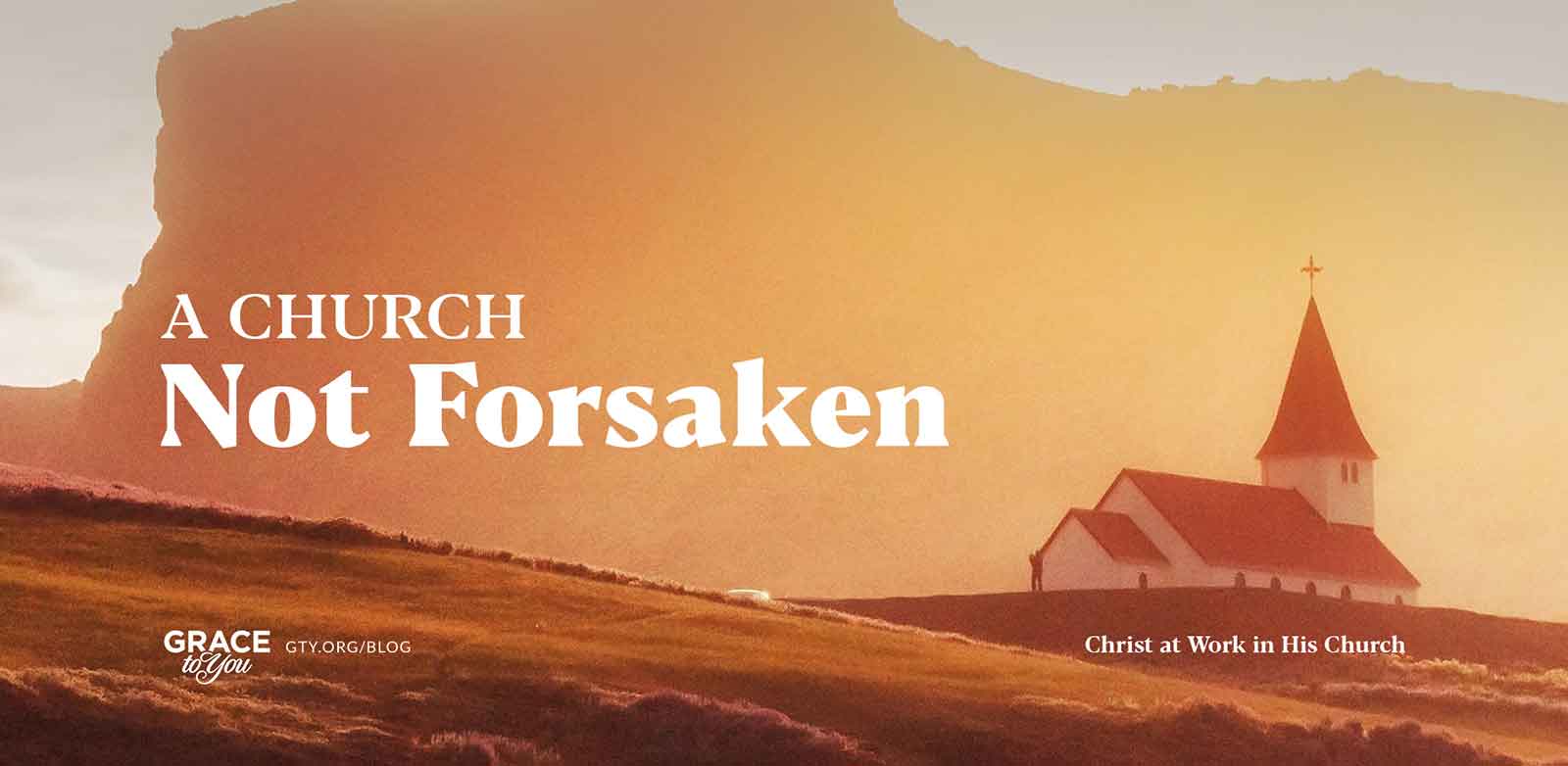
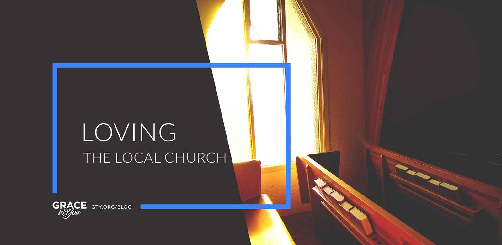
I always started with the core theme and title of each post, since they guided every visual choice. For “A Church Not Forsaken,” a serene image of a church bathed in warm light evokes hope and steadfastness, with a bold, classic font and an uncluttered composition that draws the eye to both the image and the text.
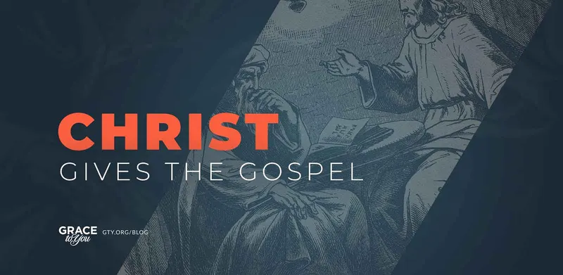
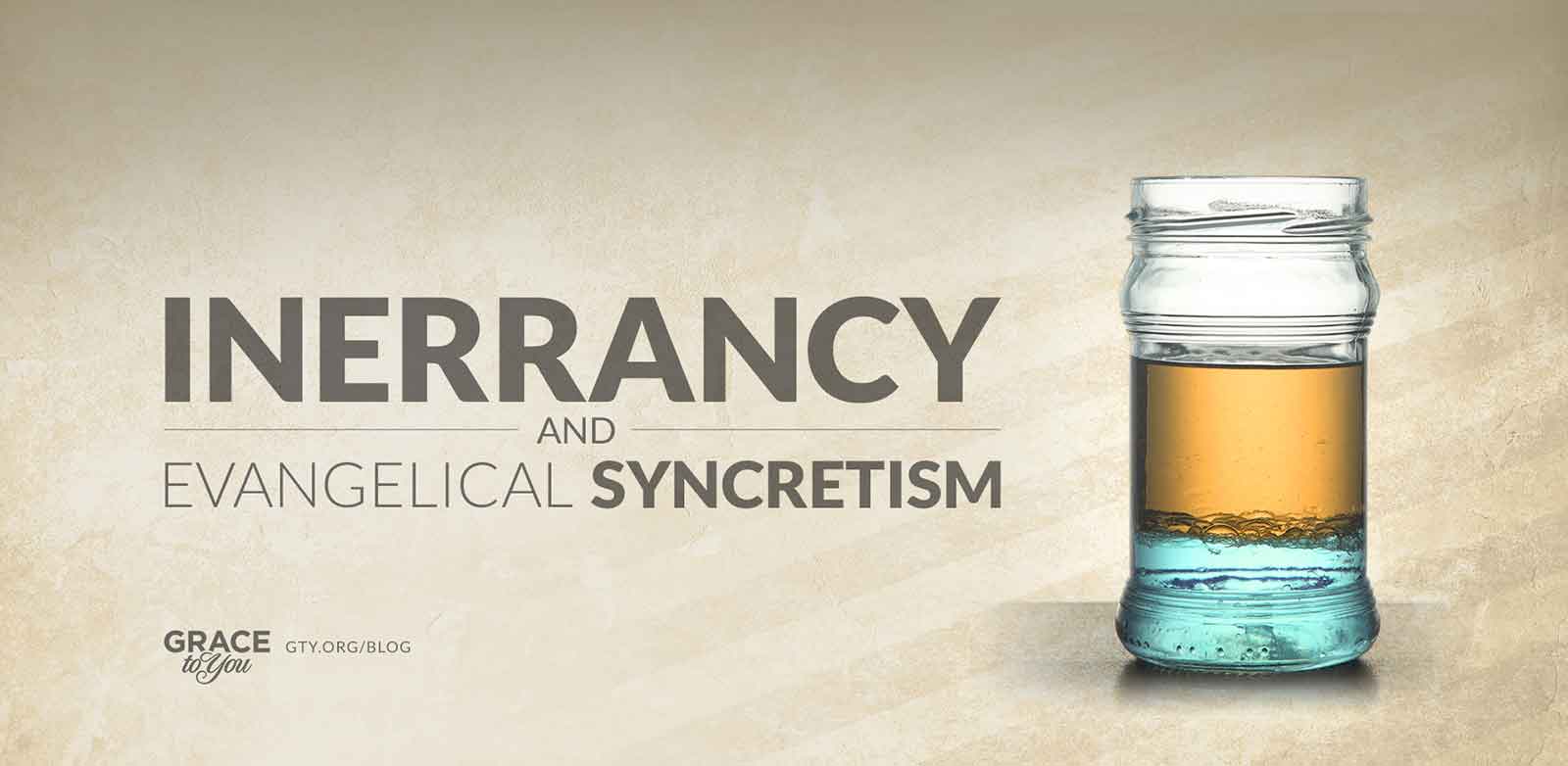
For “Christ Gives the Gospel,” a dynamic split design pairs an illustration of Christ with a bold, modern “CHRIST” to highlight its importance. For “Inerrancy and Evangelical Syncretism,” a jar of separated liquids represents syncretism, paired with clean, contemporary type that conveys clarity and seriousness.

A Consistent Frame
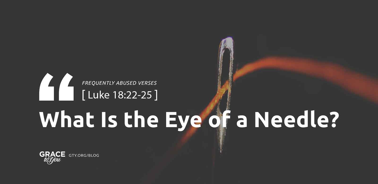
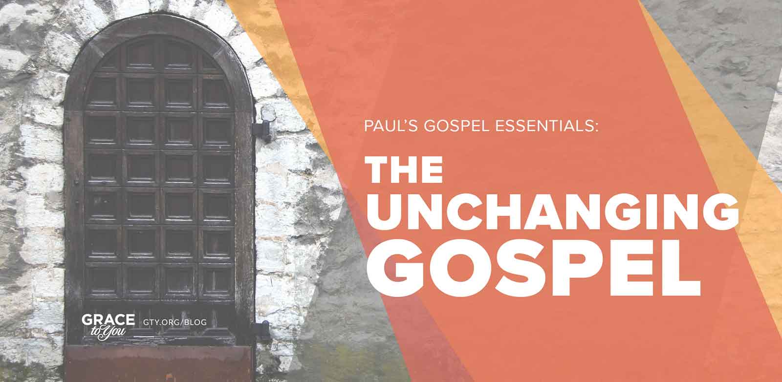
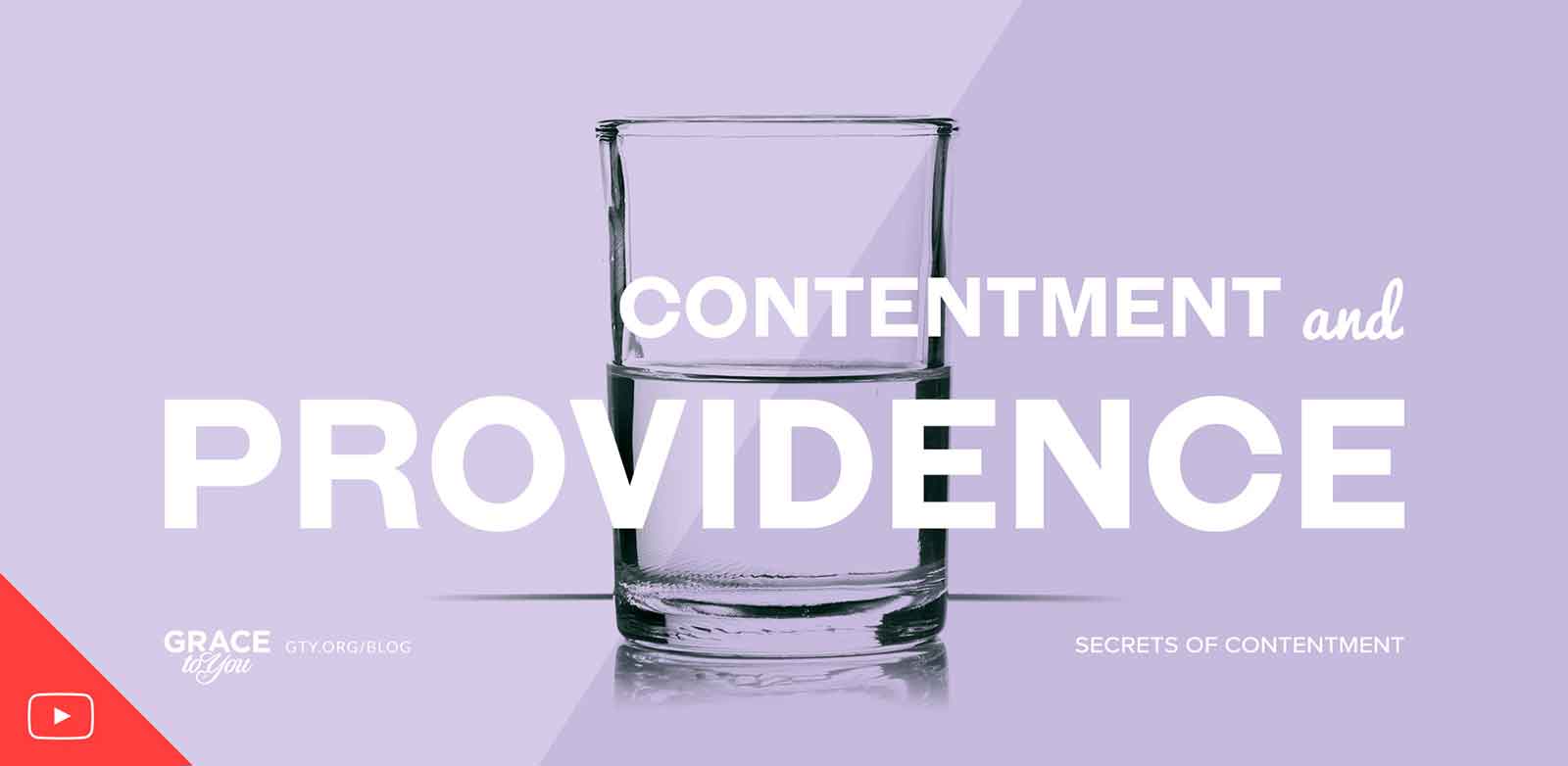
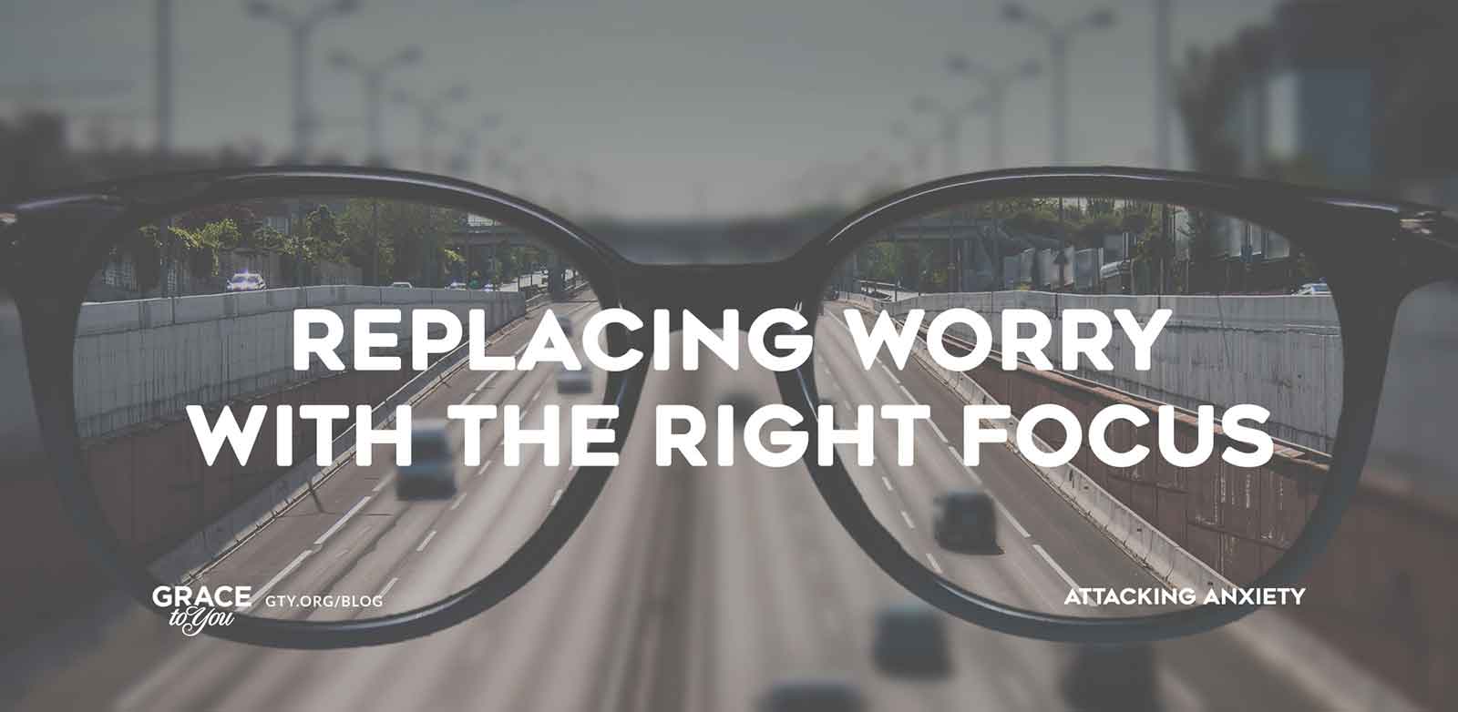
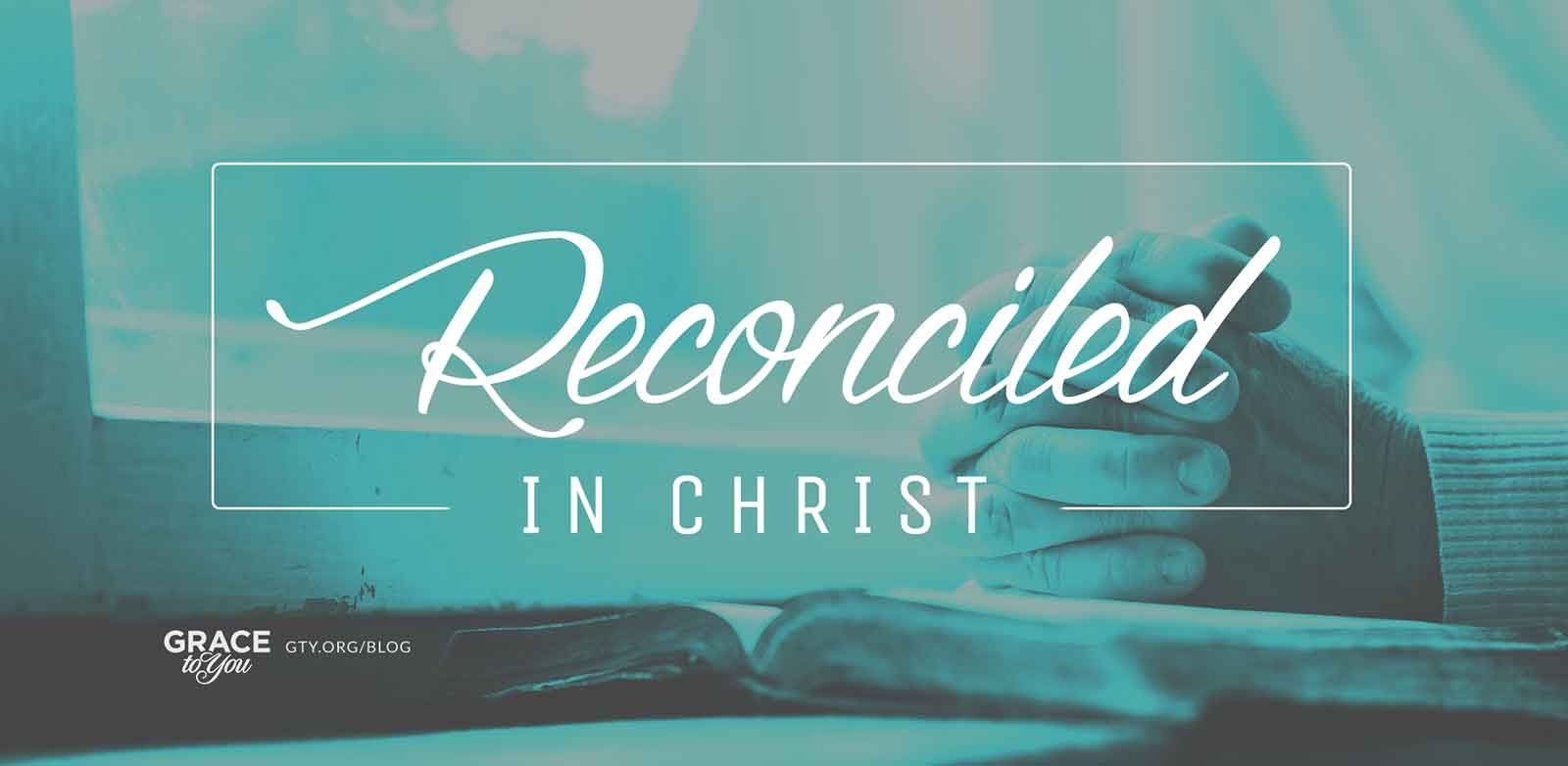
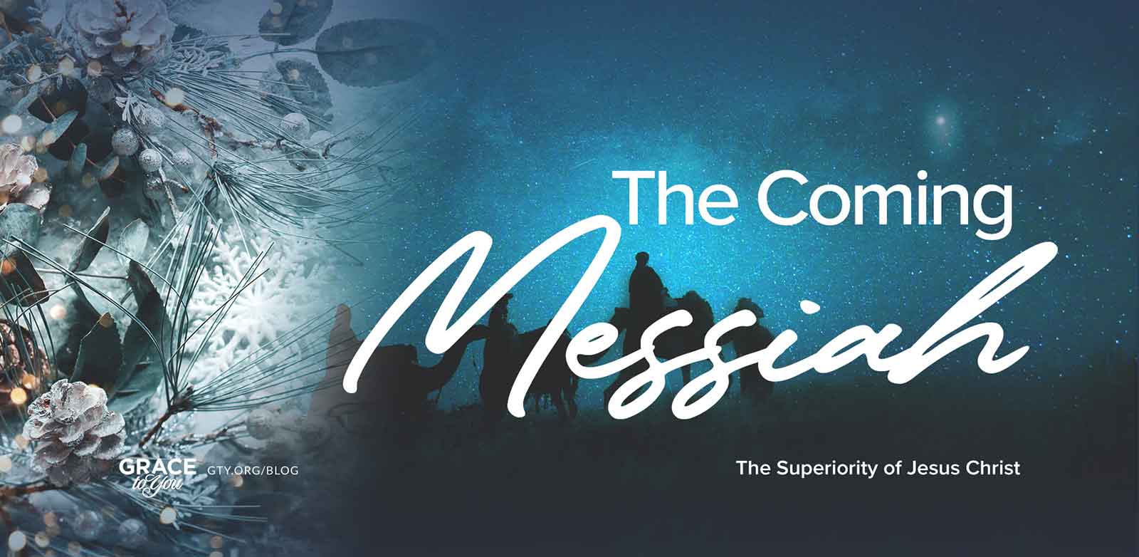
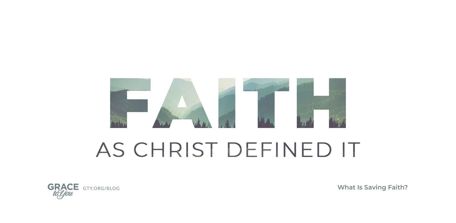
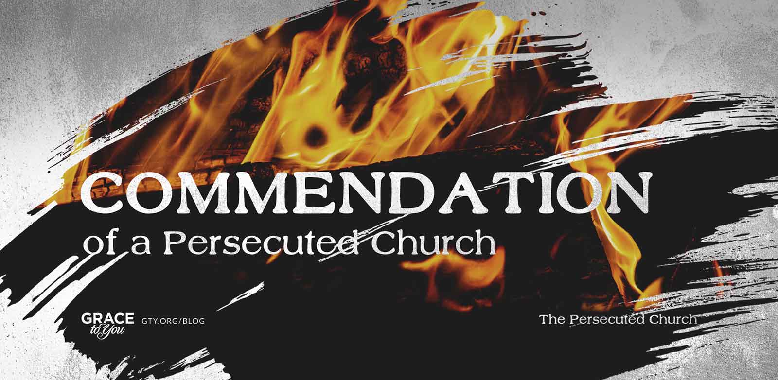
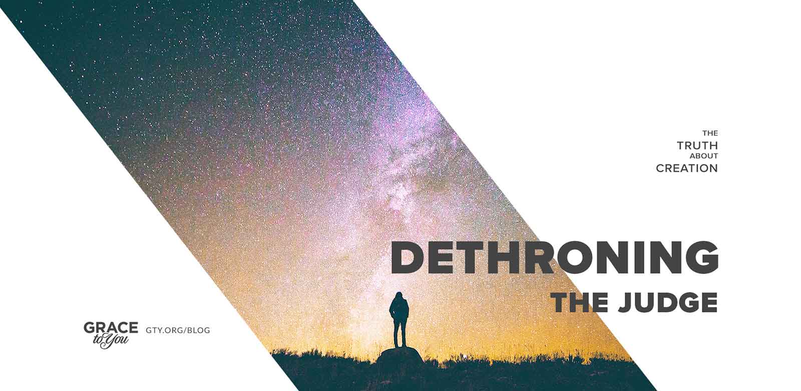
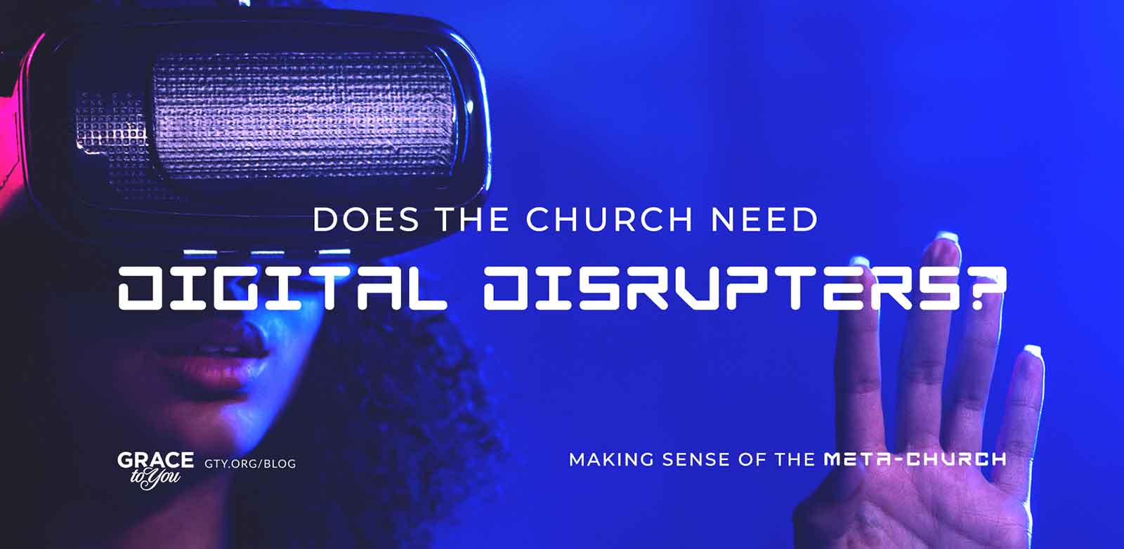
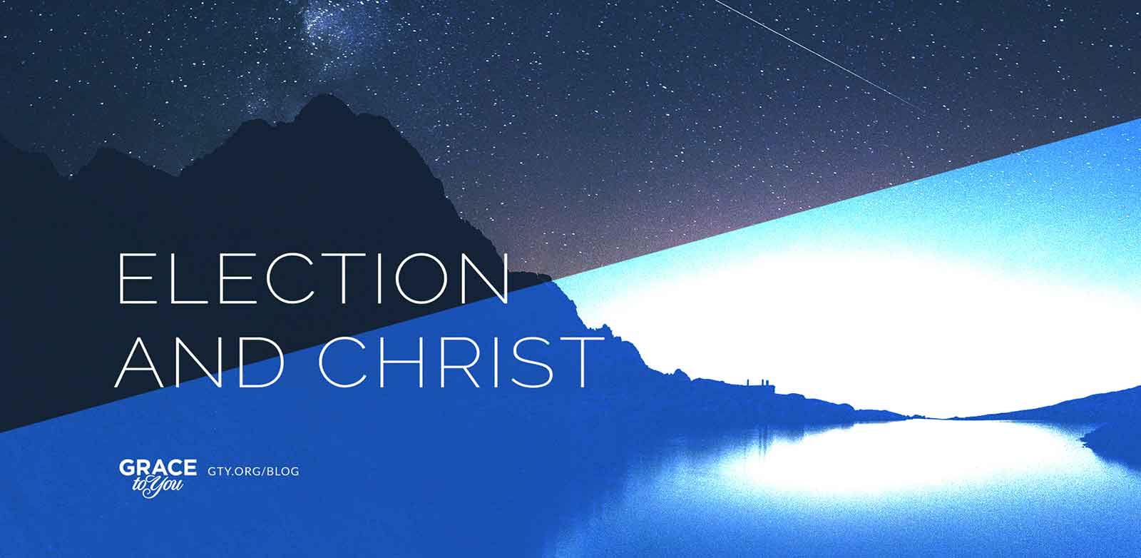
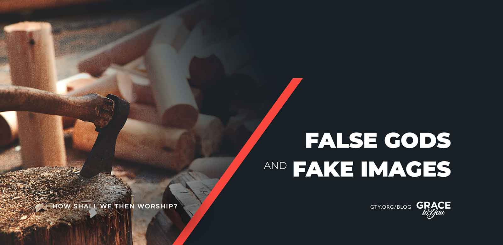
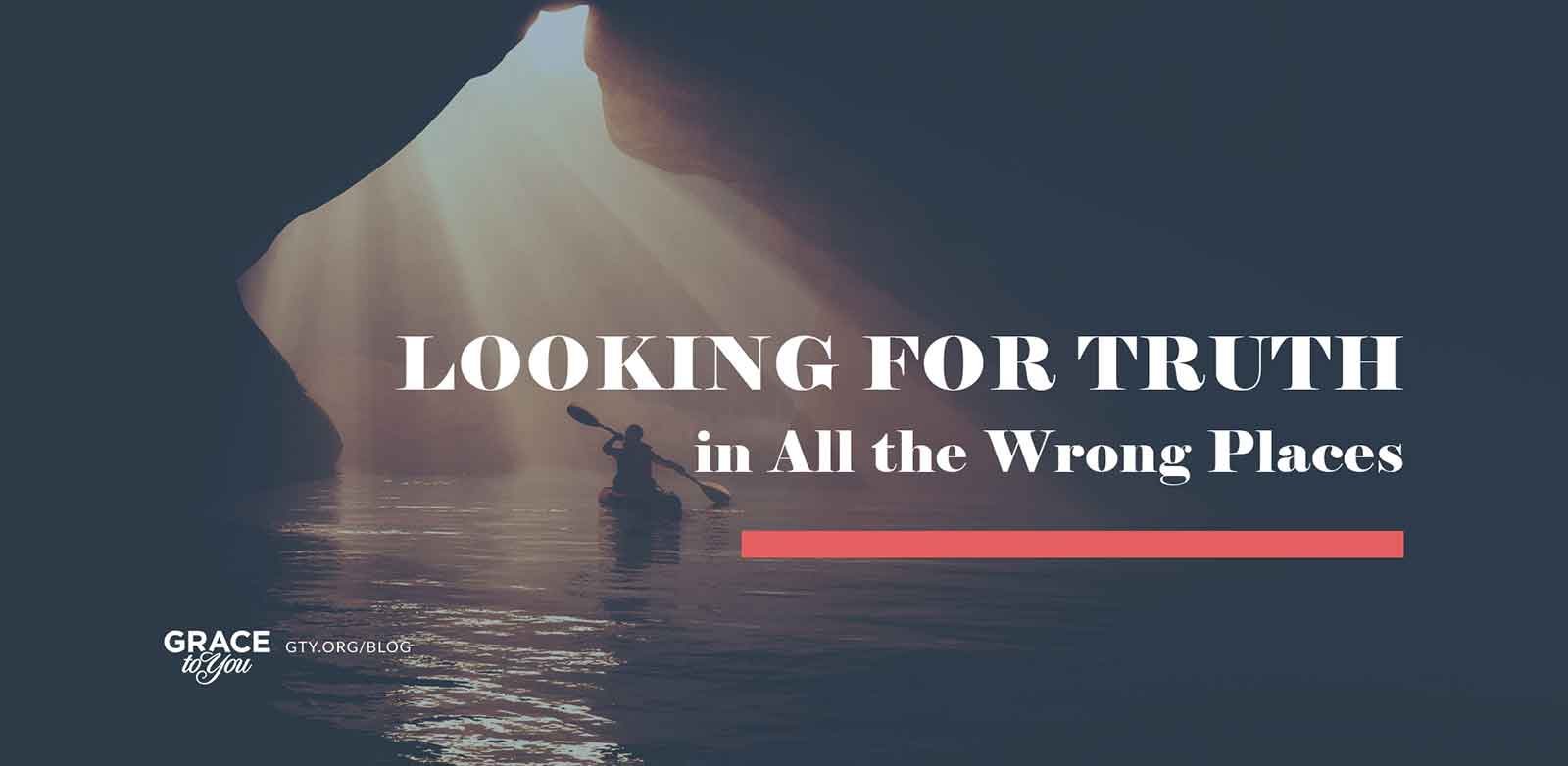
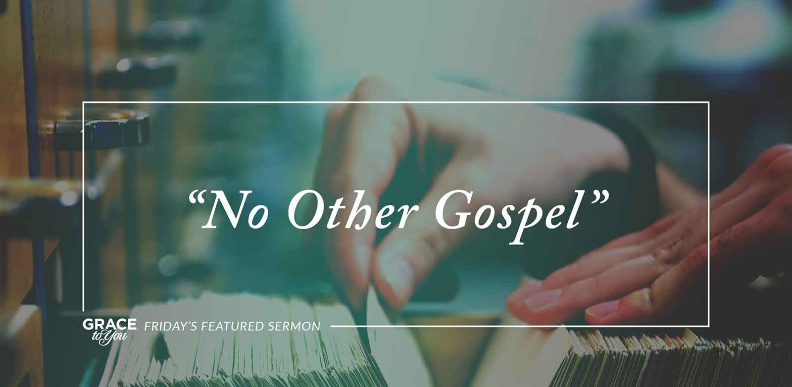
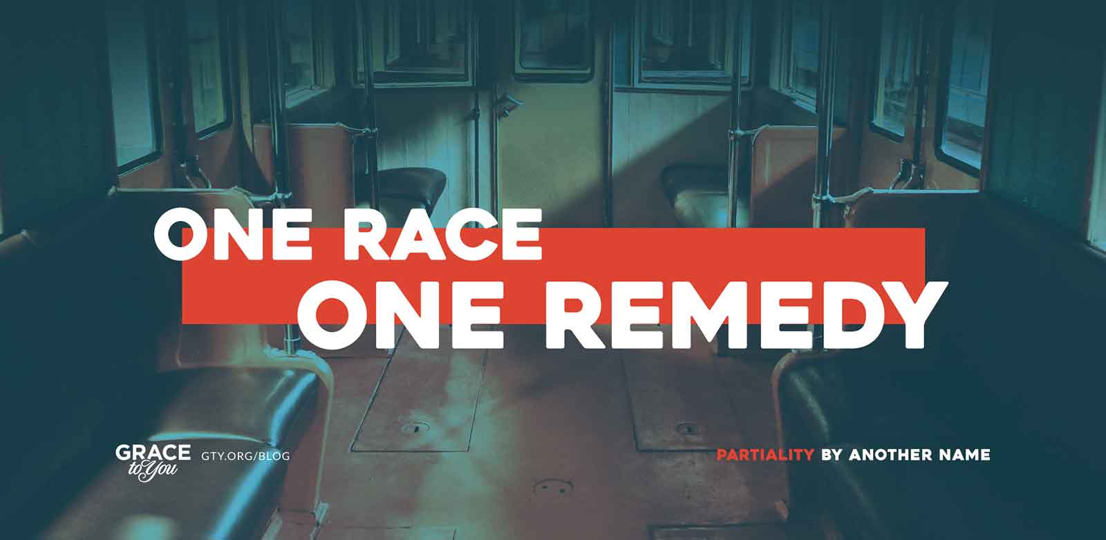
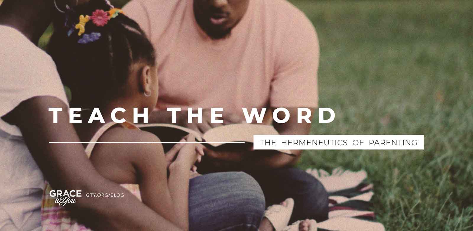
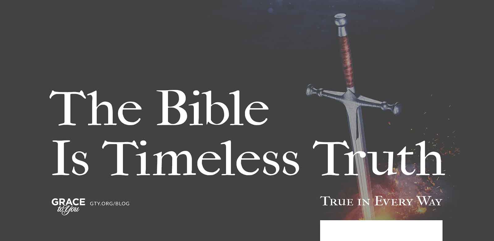
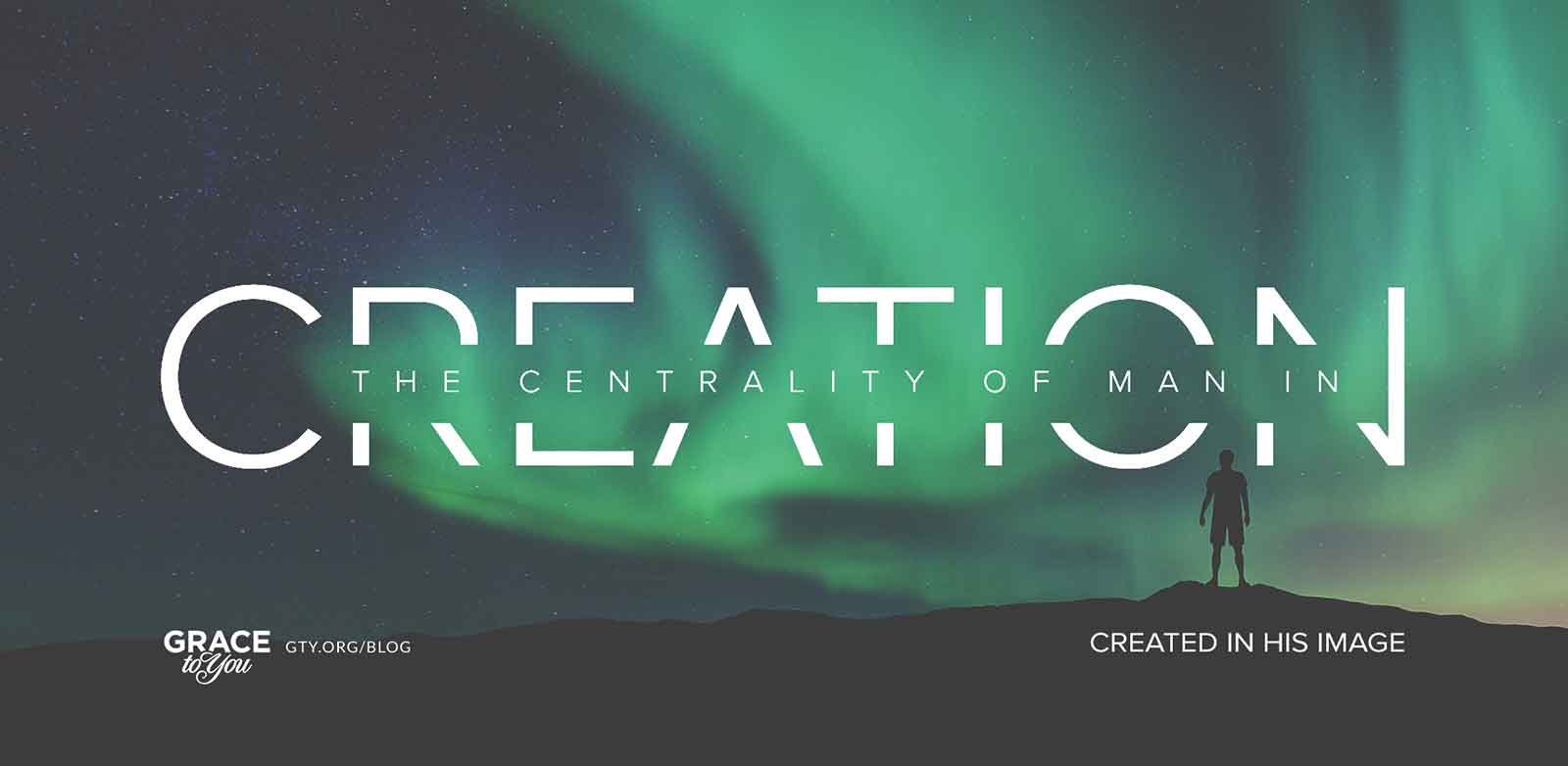
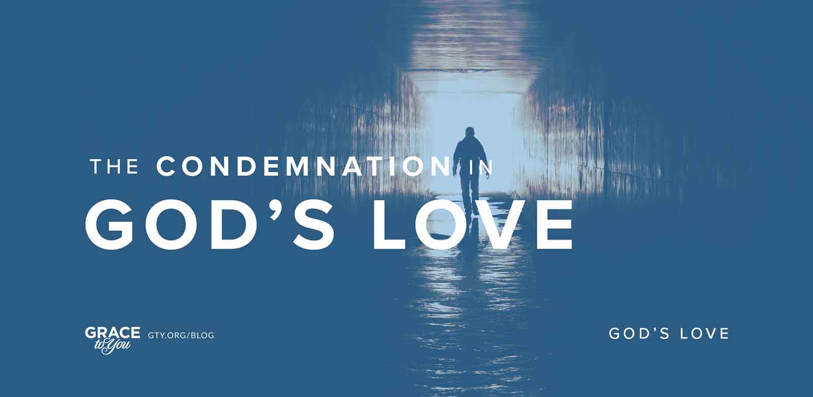
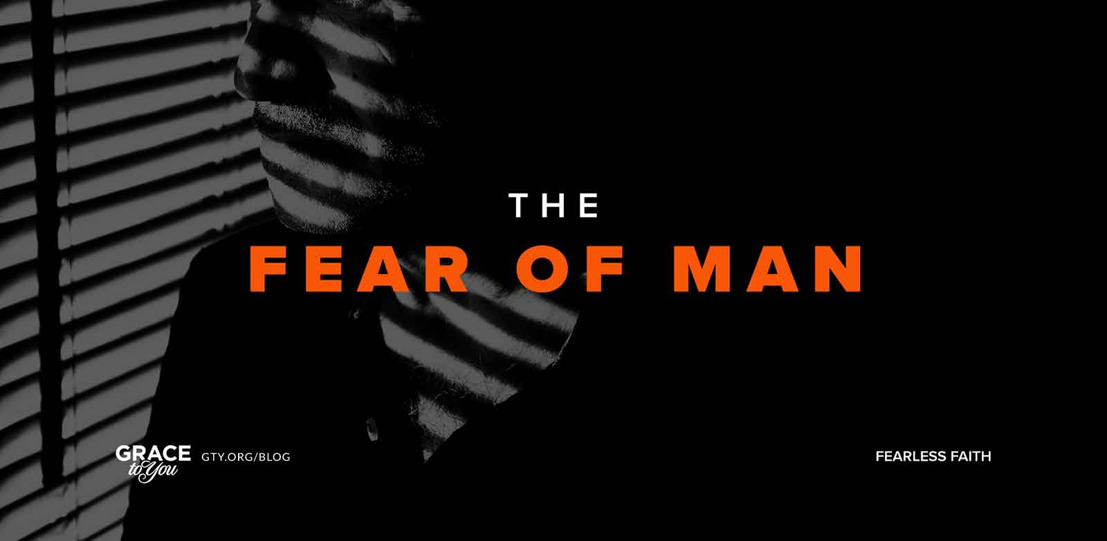
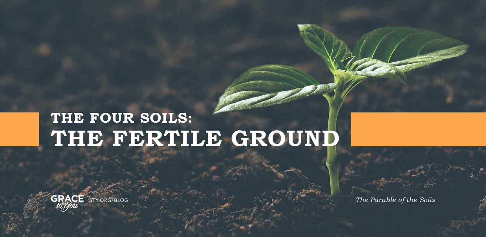
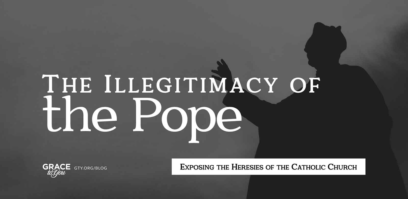
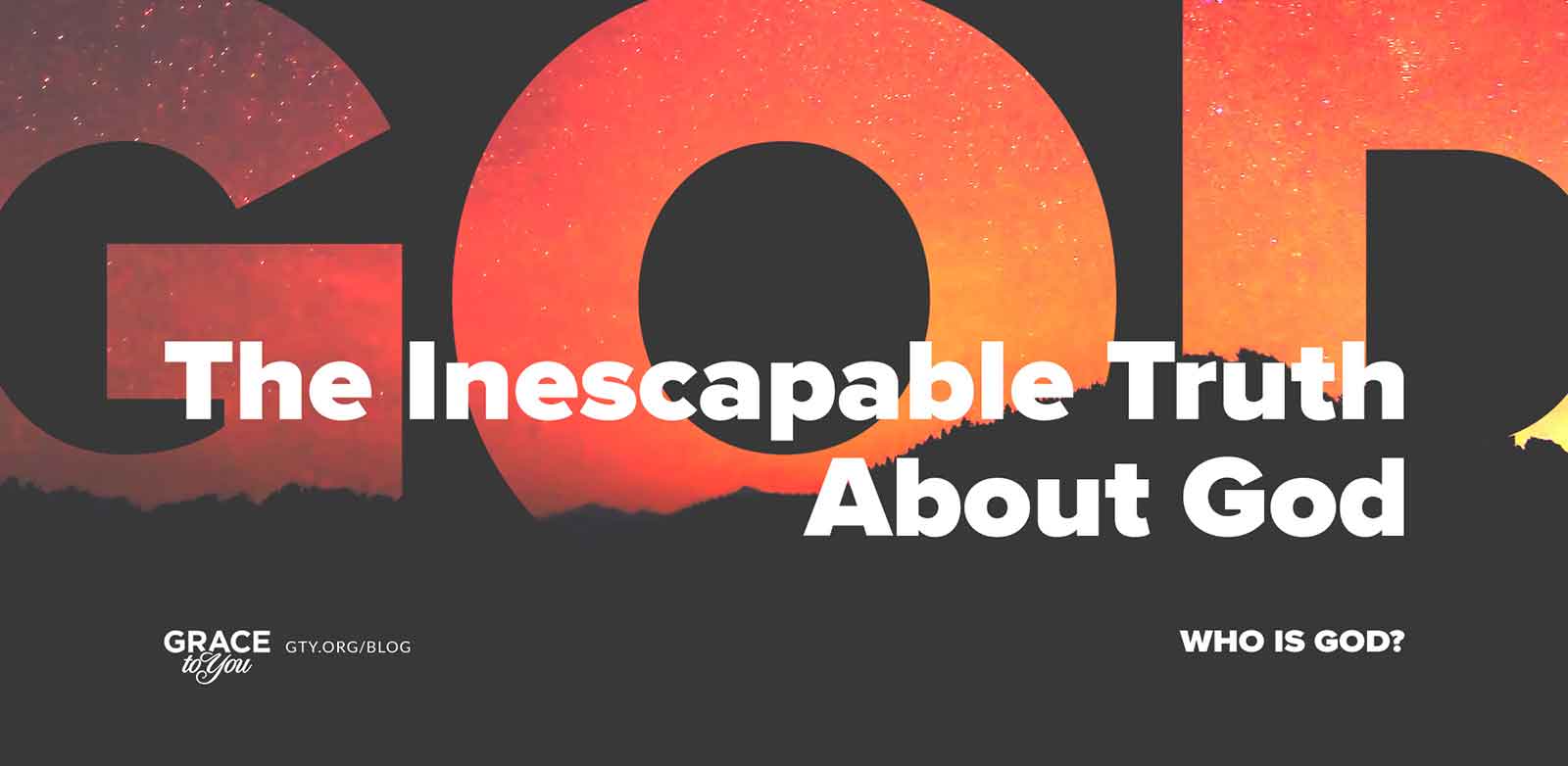
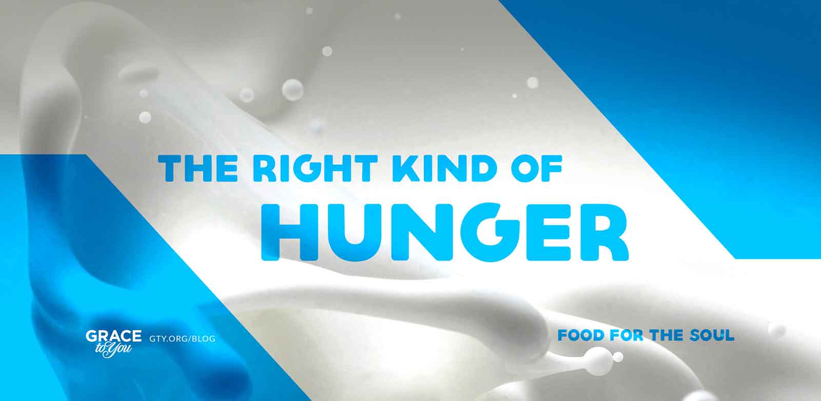
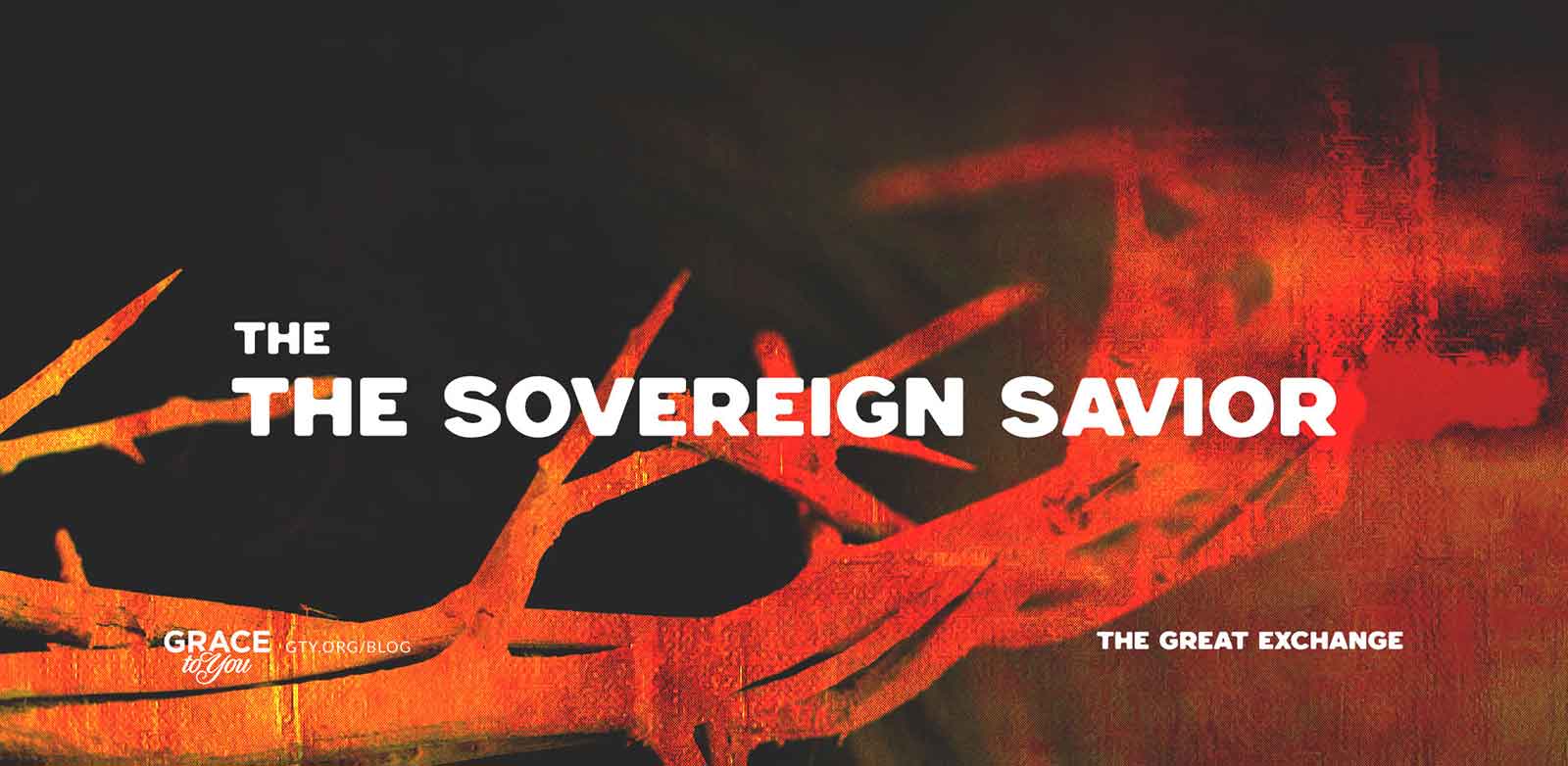
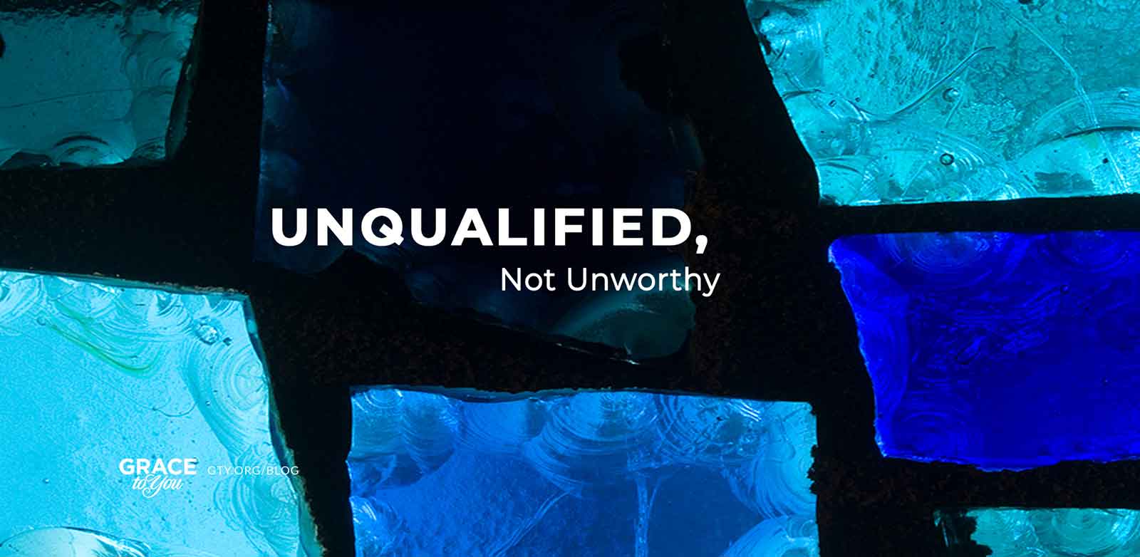
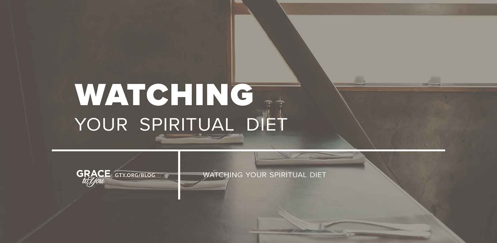
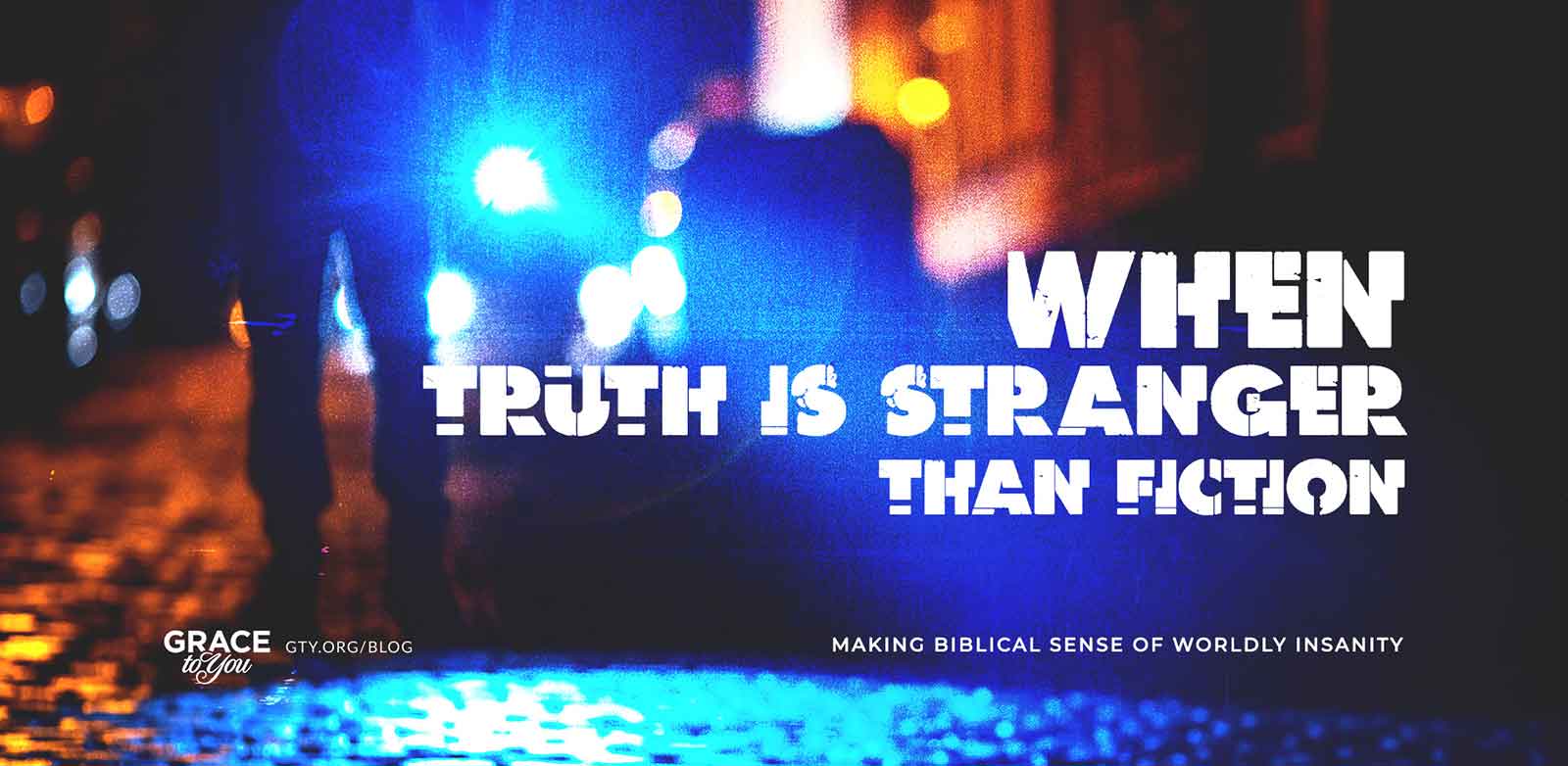
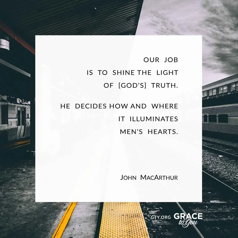
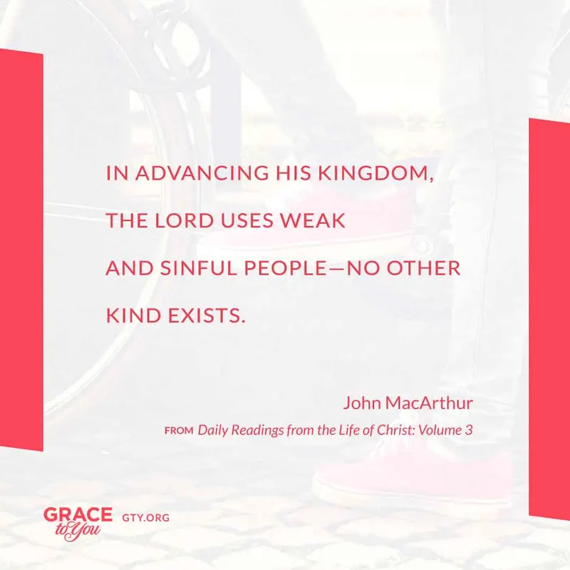
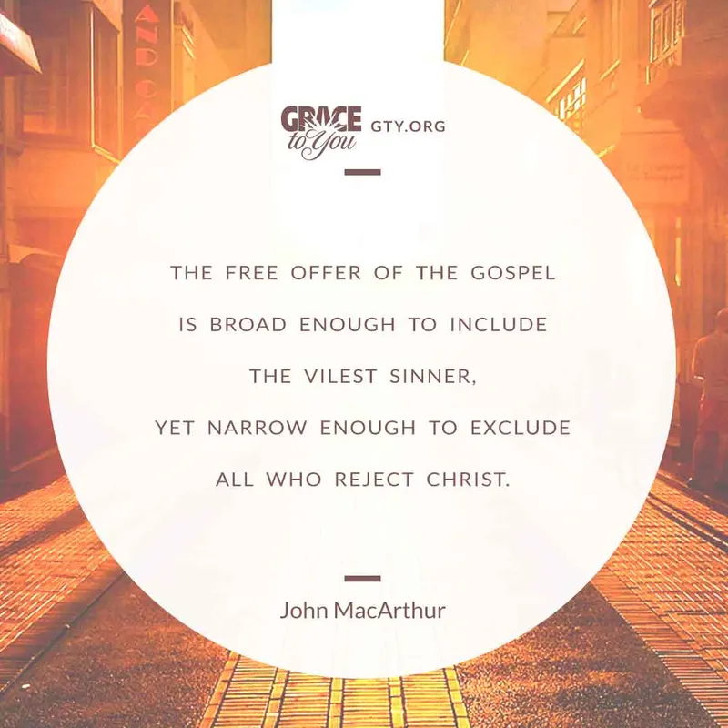
With a new graphic for nearly every post, the look could have drifted. A fixed frame around a changing picture holds the set together: the same wide format, the Grace to You logo and “gty.org/blog” bottom-left, and the most room for the title. A post in a series carries its name small in the opposite corner (“Frequently Abused Verses,” “Christian Clichés,” “Paul's Gospel Essentials”), so readers can tell at a glance which posts belong together.
Visual Metaphors
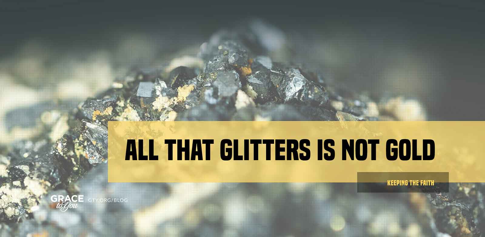
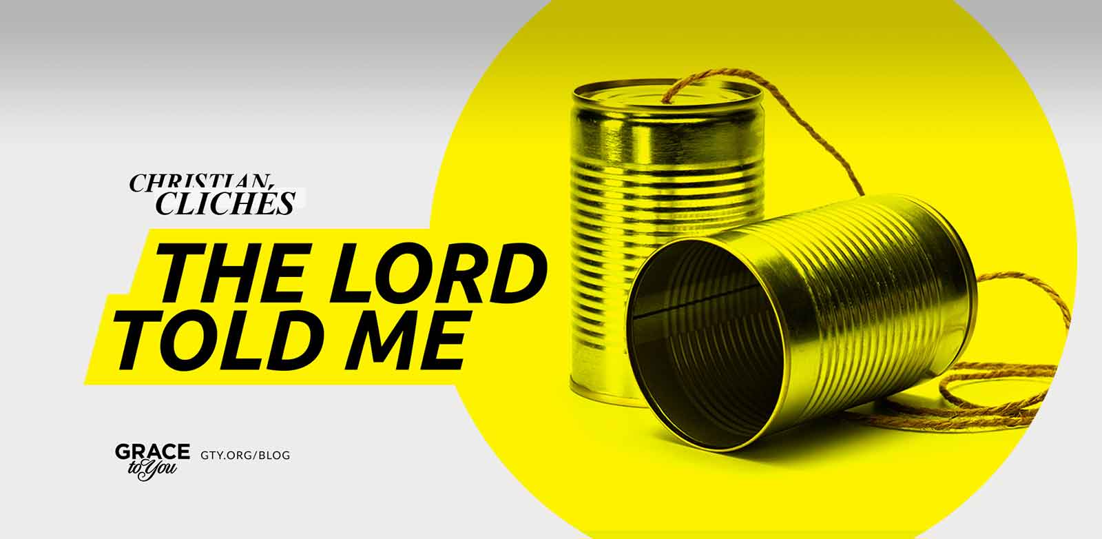
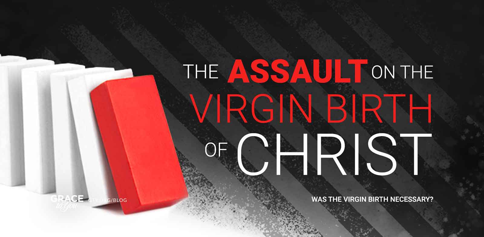
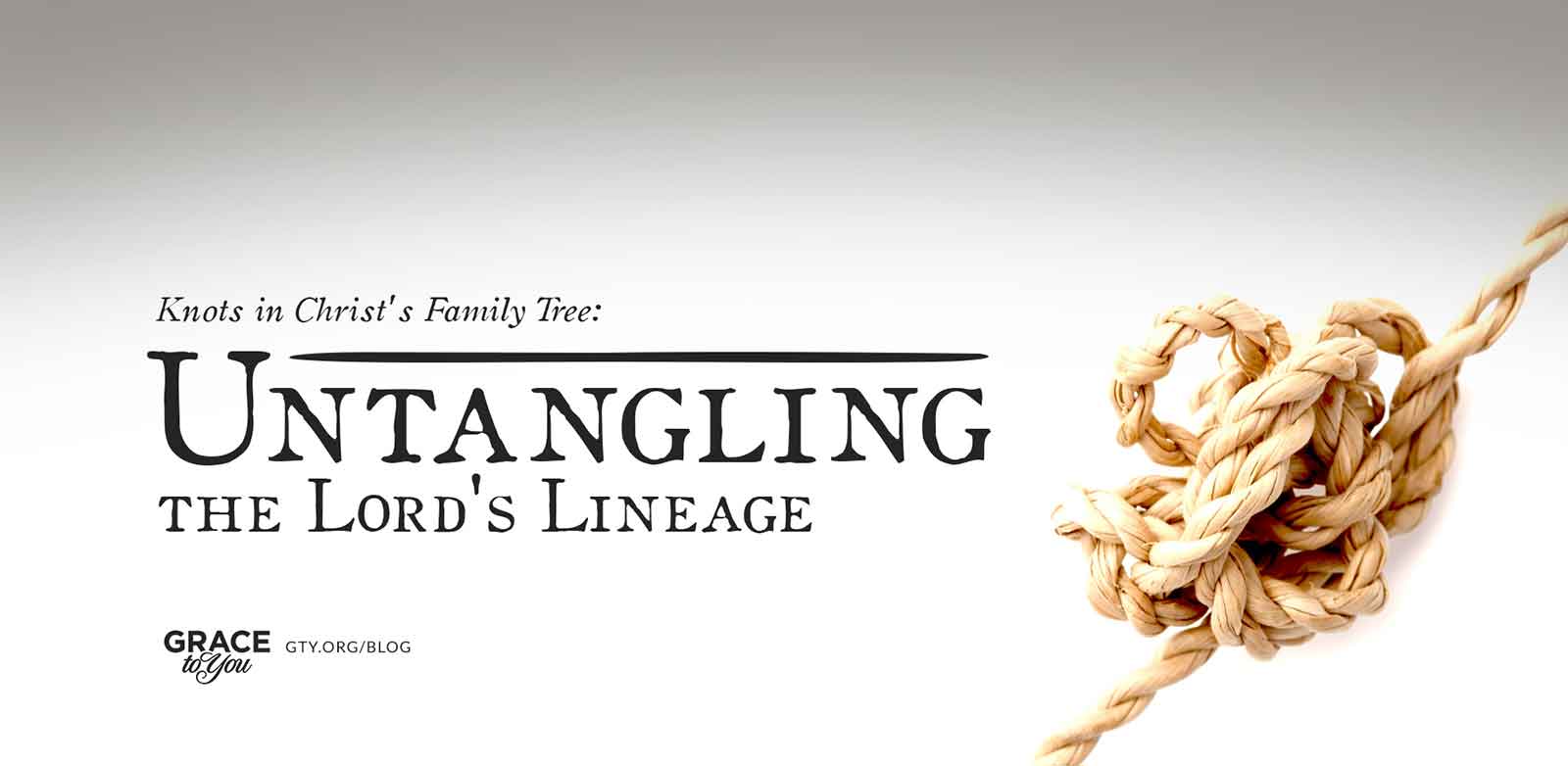
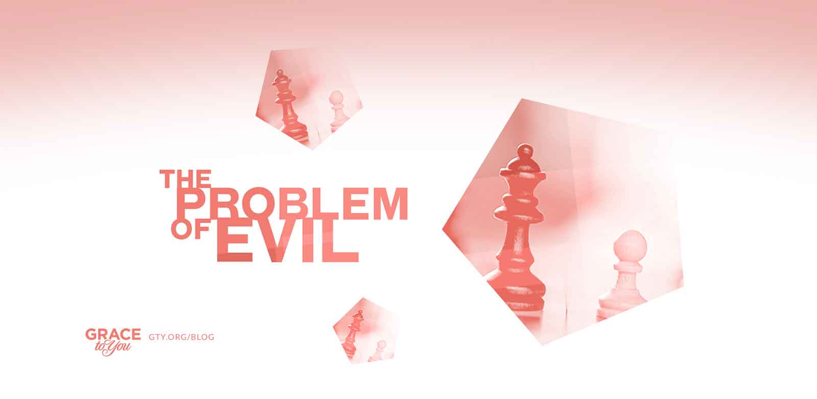
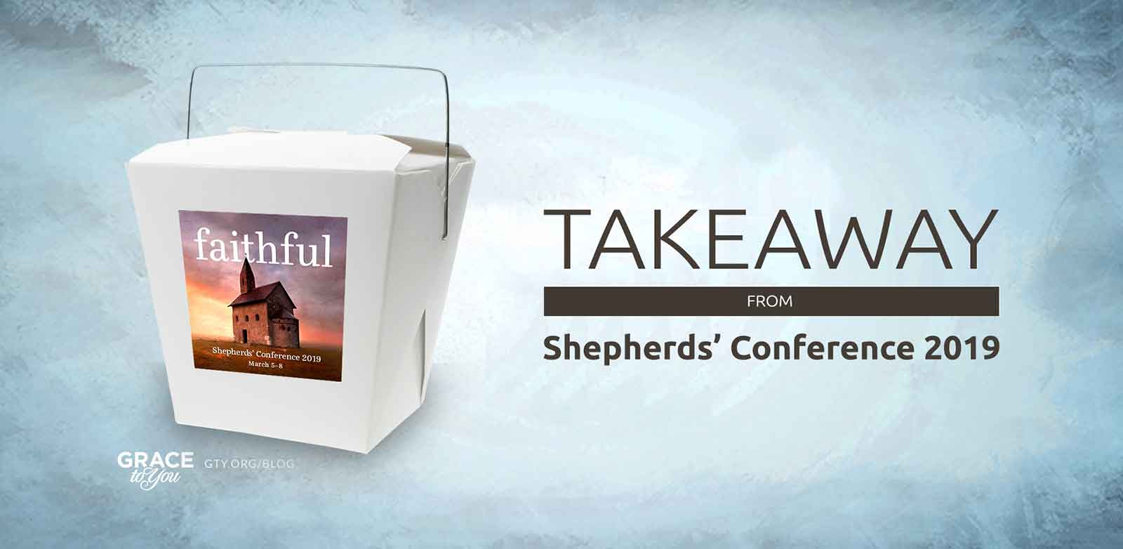
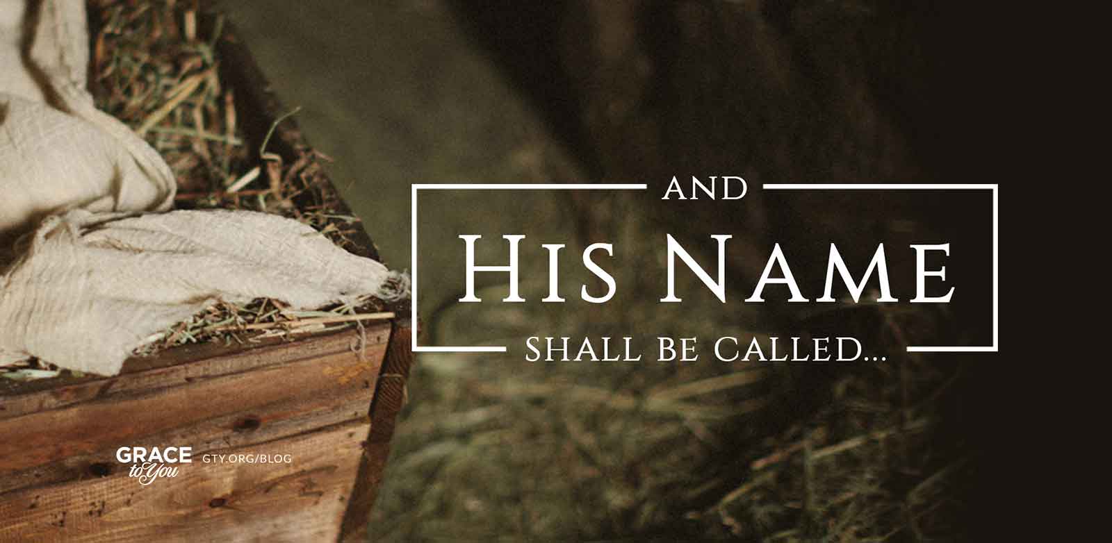
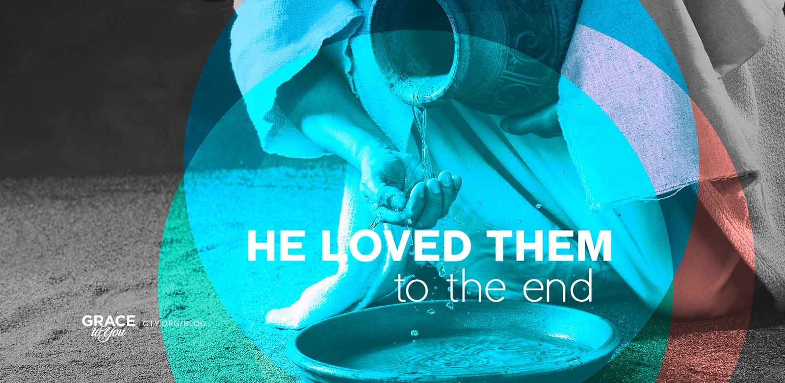
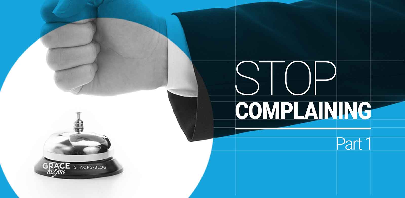
Many posts deal with abstract ideas, so I often looked for one everyday object that could stand for the argument: fool's gold for “Not All That Glitters Is Gold,” a tin-can telephone for the cliché “The Lord Told Me,” a row of dominoes with one red piece for the assault on the virgin birth, a knotted rope for untangling the Lord's lineage, chess pieces for the problem of evil, and a takeout box for the takeaways from a conference Q&A. A single, clear object reads in a second, even as a small thumbnail.
Art & Illustration
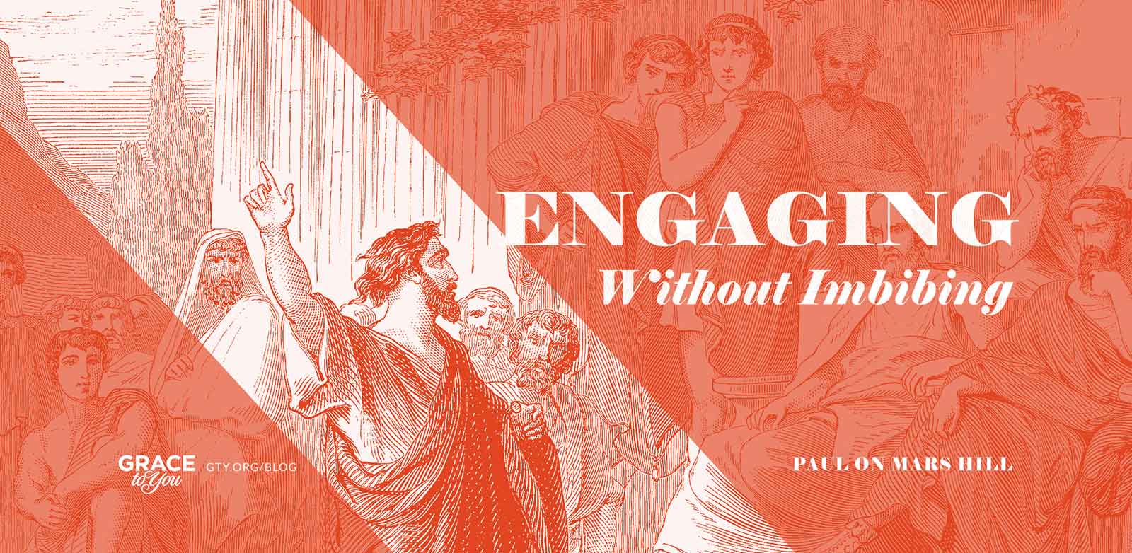
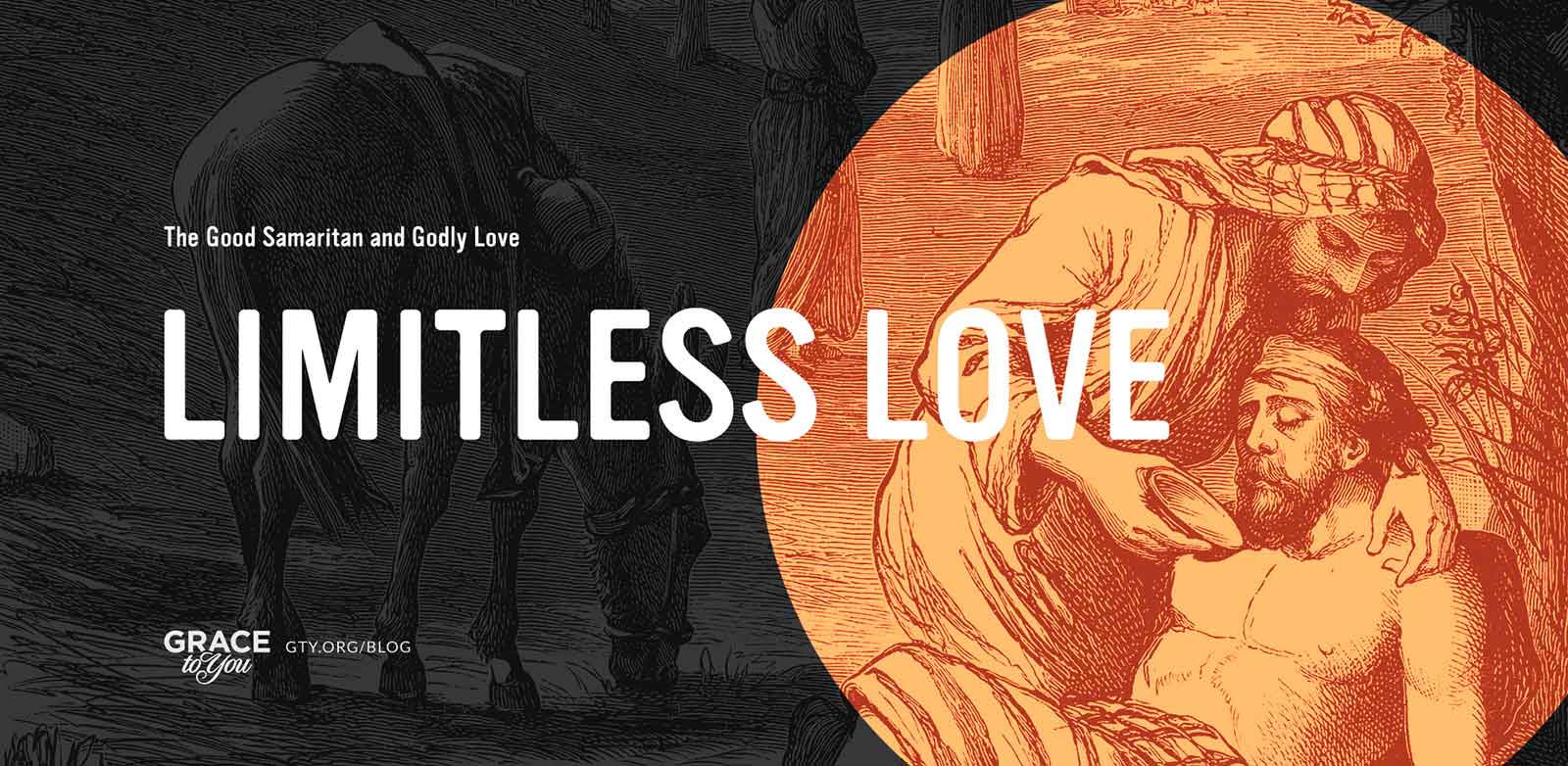
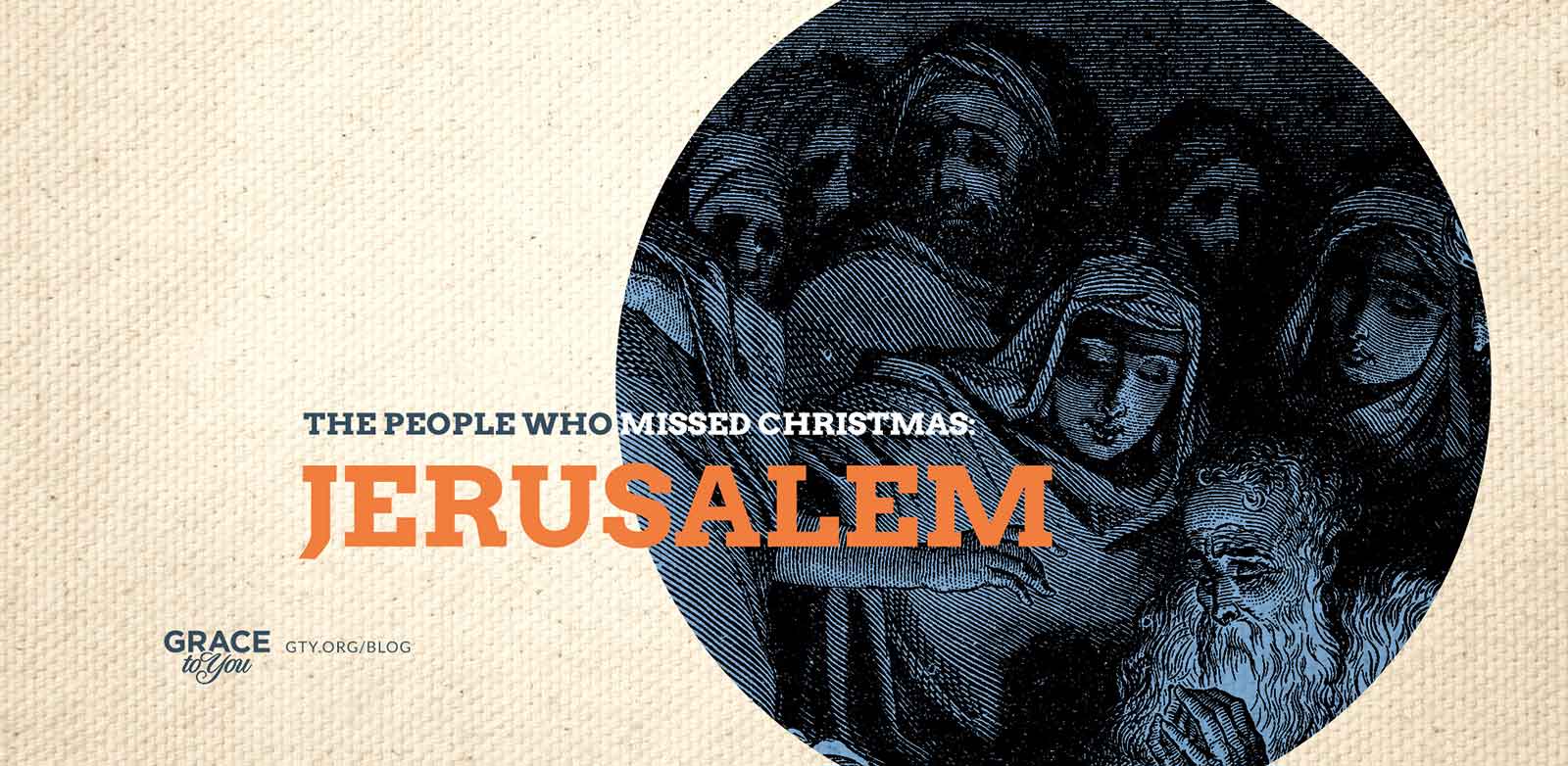
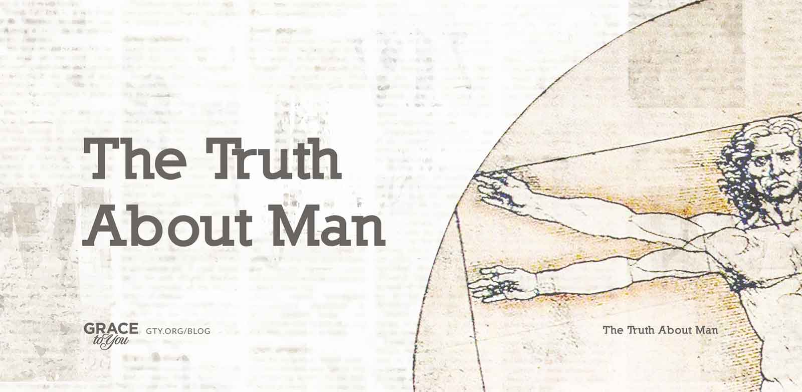
For posts rooted in a biblical scene or a classic idea, I turned to engravings and paintings, such as Paul at Mars Hill, the Good Samaritan, and Leonardo's study of human proportions, and gave them a single-color treatment. The duotone ties very different artworks to the modern type set over them and keeps busy, detailed images calm enough to read a title against.
Typography
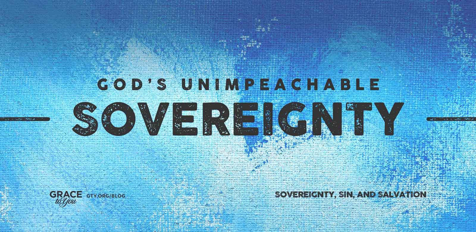
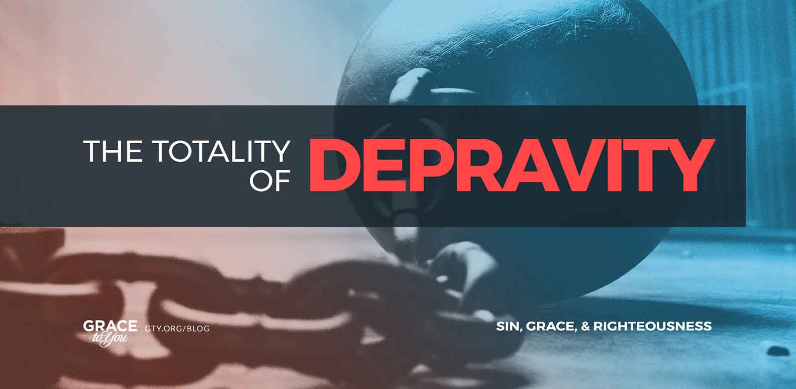
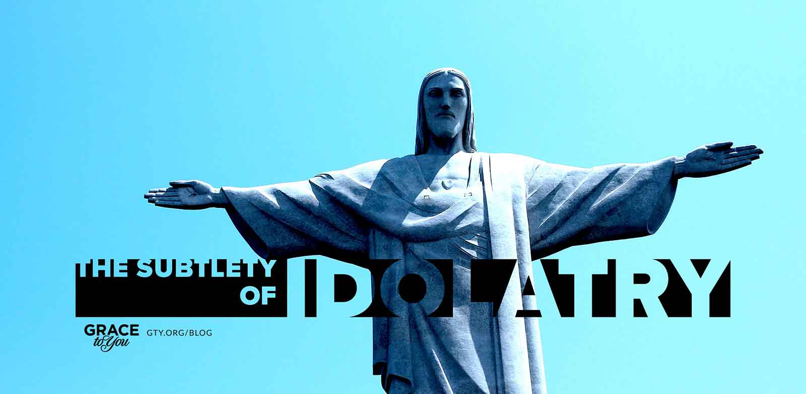
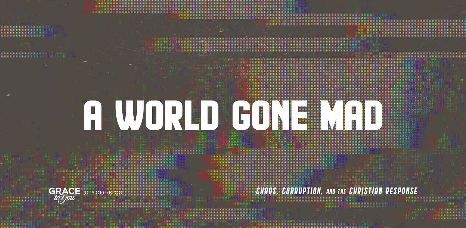
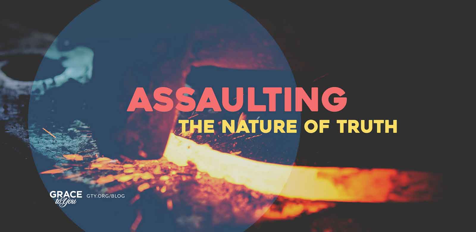
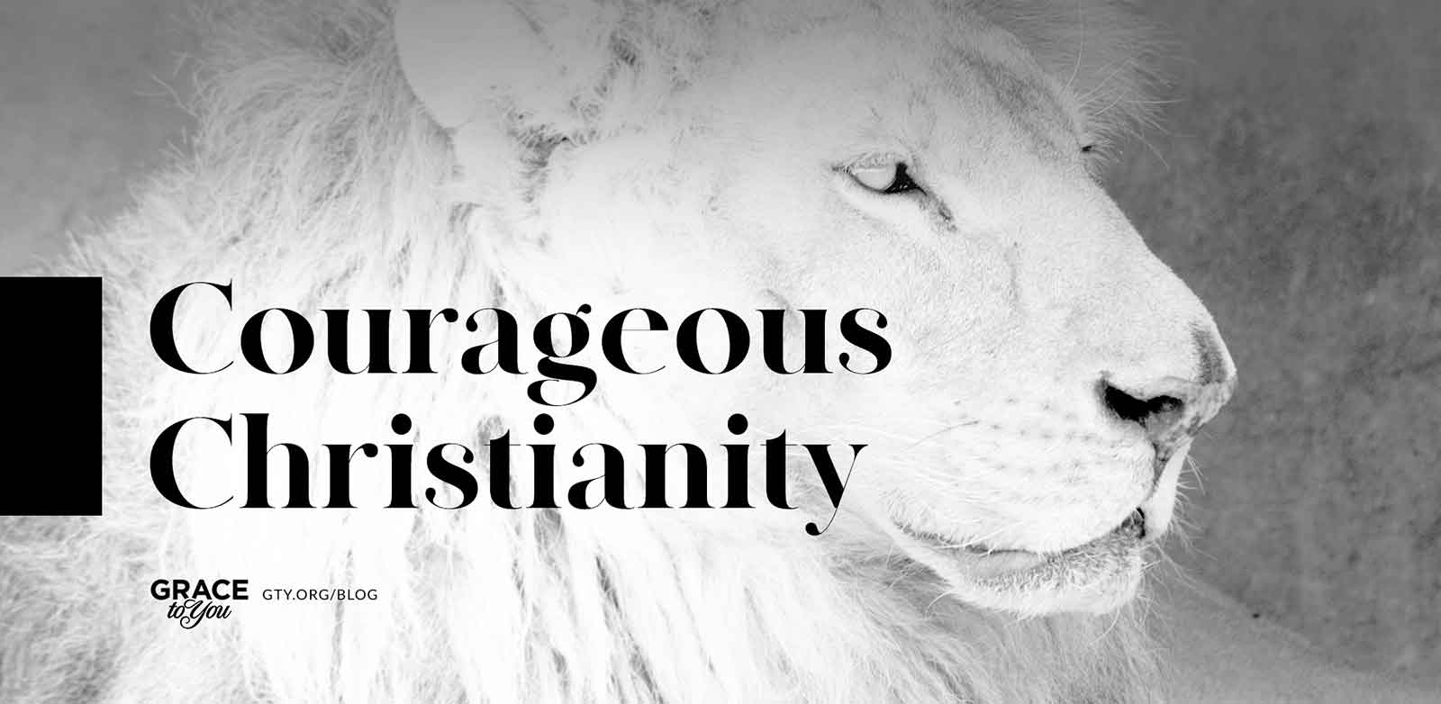
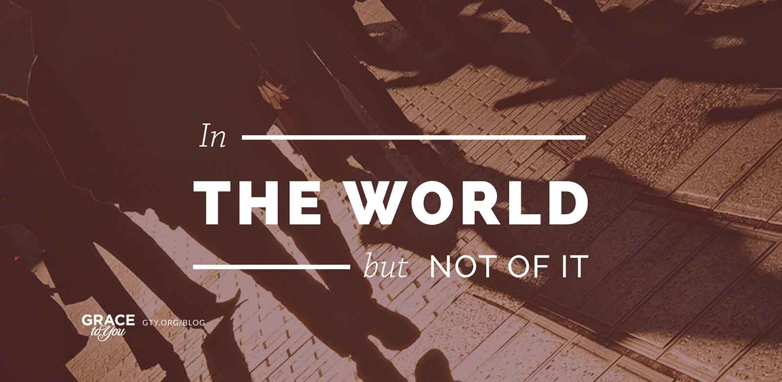
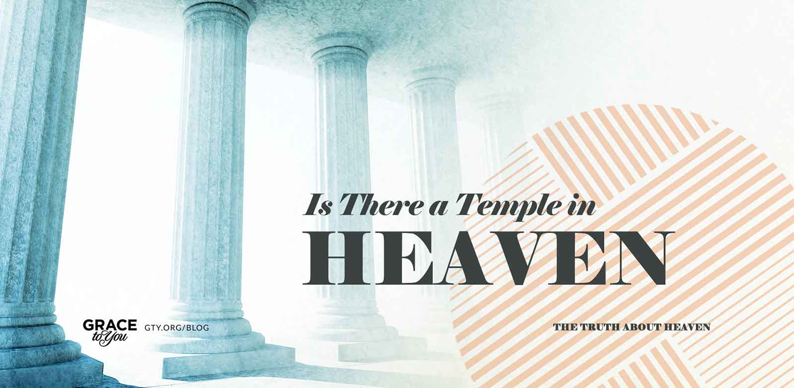
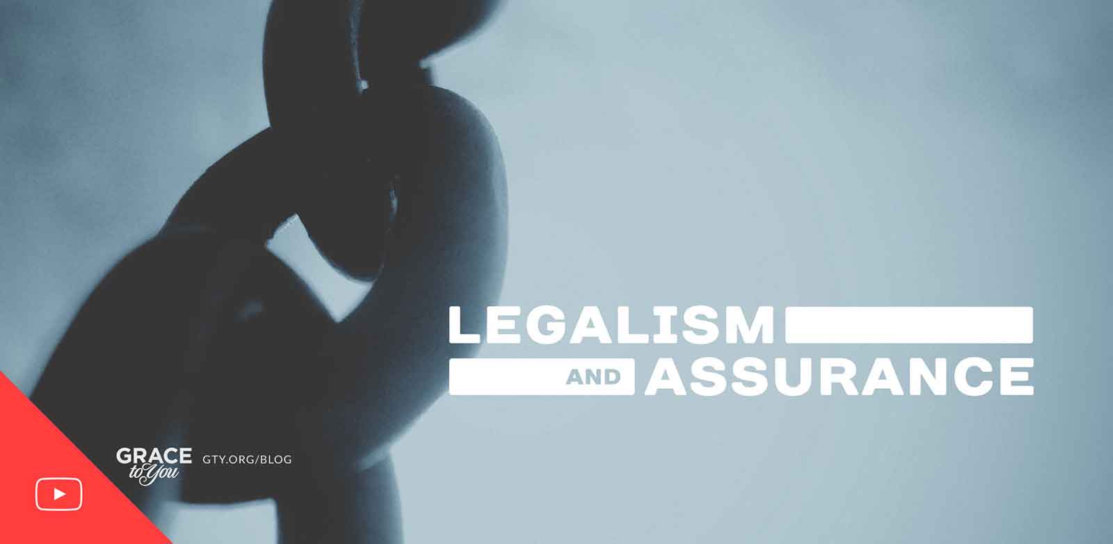
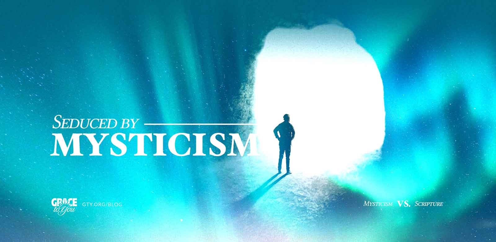
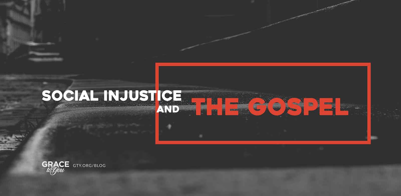
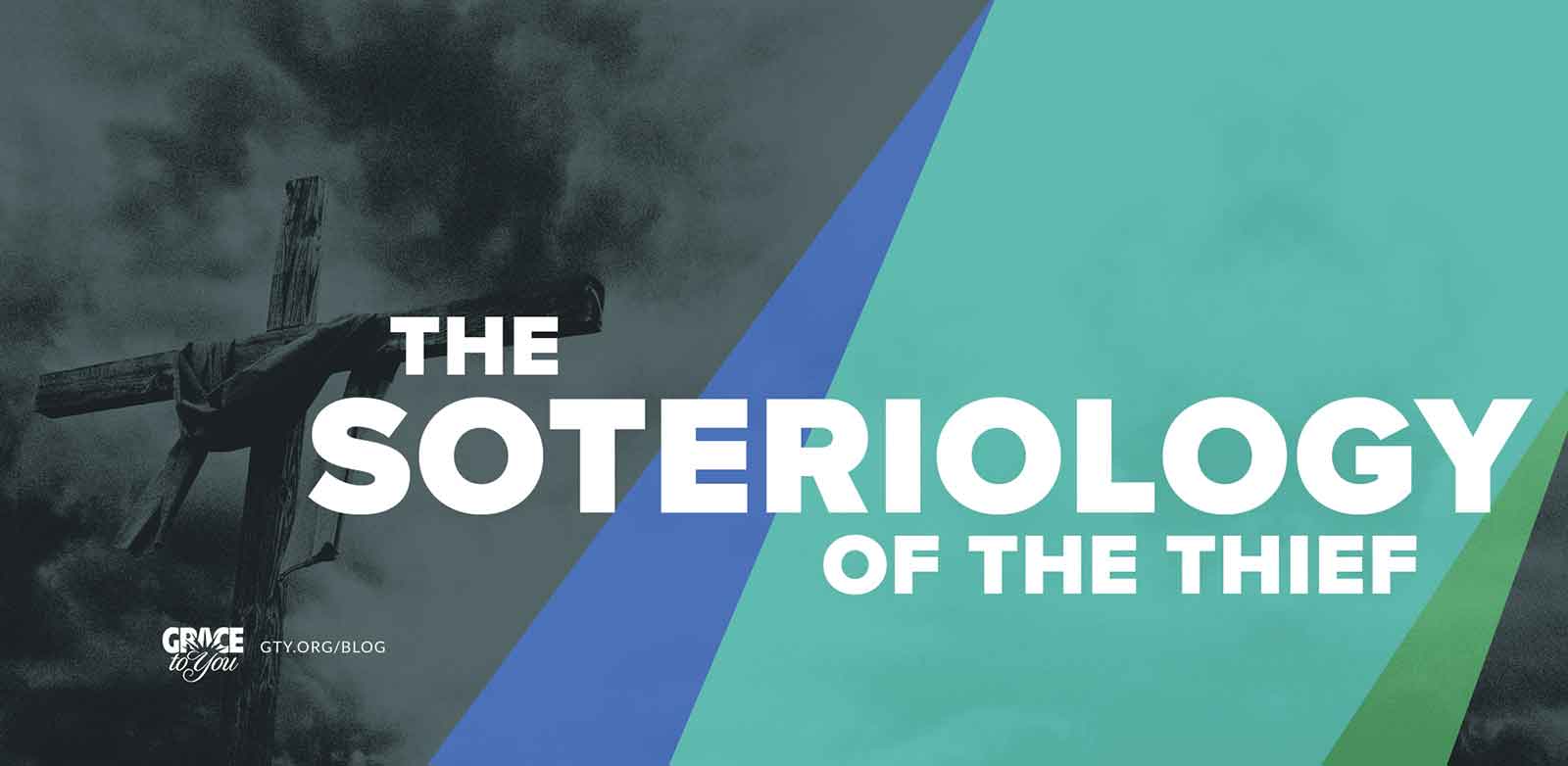
Most titles are set in two voices: one key word given weight and size (SOVEREIGNTY, DEPRAVITY, IDOLATRY), and the rest of the phrase set smaller and lighter around it. The type style follows the tone of the post, with heavy, condensed capitals for urgent or confrontational topics, classic serifs for reflective ones, and an occasional script word, as in “Reconciled” and “Messiah,” where a personal, handwritten touch fits the subject.
The Collection
The rest of the series, each built the same way: the title first, then an image and type chosen to carry it.





Reflection
Over the series, the approach stayed the same even as the subjects changed from week to week: read the post, find the one idea the title turns on, and give it a single strong image and a clear typographic voice inside a frame readers recognize.

[ Let's connect ]
Let's work together
Have a project, a role, or an idea in mind? I'd love to hear about it.