Design, Development, & Campaign Performance TrackingCampaign Landing Page
Giving Tuesday Campaign
A single-purpose donation page for Children's Hunger Fund's biggest giving day of the year: rebuilt for conversion, re-engineered overnight for a corporate match, and run live, hour by hour.
$150K+Raised on Giving Tuesday
- Client
- Children's Hunger Fund—A Christian Non-Profit Ministry
- Role
- Designer & Developer (sole developer)
- Platform & Tools
- WordPress
PHP, SASS, JavaScript/jQuery, embedded giving forms - Deliverables
- Landing page, live donation tracker, post-campaign page
Overview
Giving Tuesday is Children's Hunger Fund's largest single-day fundraising push of the year, and every channel pointed to one place. A 20+ email drip campaign, paid social and search ads, and organic social posts all sent donors to the campaign's landing page, which then handed off to the year-end giving season. That put the whole day's effort on a single page.
As the sole developer, I owned that page end to end, designing directly in code with no mockup handed to me, across four phases:
- a conversion-focused rebuild
- a corporate gift-match version with a live donation tracker
- hourly updates on the day itself
- a post-campaign page that kept giving momentum alive
Results & Impact
- $150K+
- Raised on Giving Tuesday
- 1.2M
- Meals provided
The landing page was the single conversion destination for every email, ad, and social post in the campaign. The distraction-free, single-ask design pointed the entire donor journey toward one action, the live tracker kept donors engaged and coming back throughout the day, and the post-campaign redirect turned leftover traffic into year-end gifts instead of dead ends.
Building the Page
Built to Convert
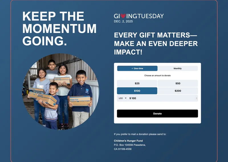
With the timeline too tight for a design comp, I rebuilt the page straight from the content strategy, making every UX decision in code with one goal in mind: turn visitors into donors.
- No exits. A custom page template stripped out the site's header navigation, footer links, and sidebar; the logo was the only way out.
- The form comes first. The donation form sits above the fold, embedded and sized to work at every screen width, so donors arriving from inboxes, social feeds, and search could give on a phone as easily as on a desktop.
- One ask. A story-driven layout carries emotive copy below the fold, with a single primary call to action and just enough supporting content to keep undecided visitors reading.
- A resource to share. A downloadable “Stories of Hope” PDF, hosted on the site with a trackable link for the email campaign.
The Match and the Live Tracker
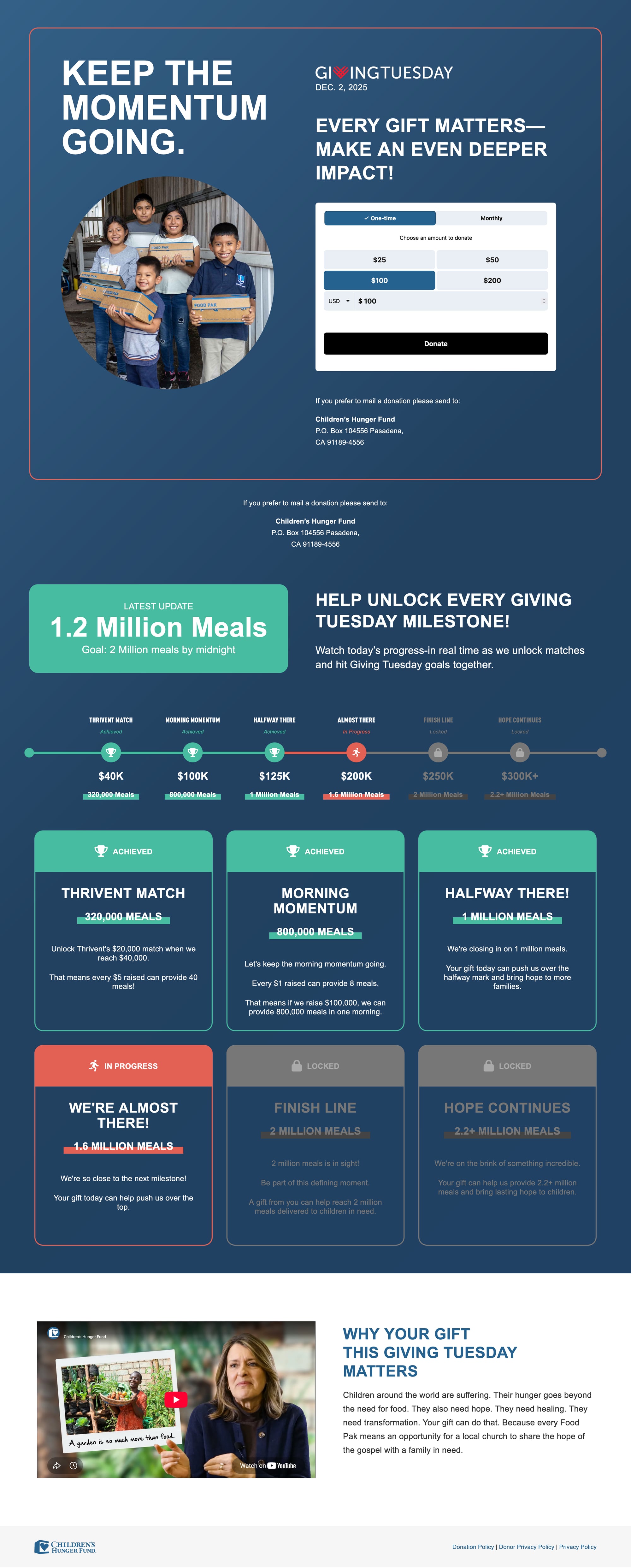
When a corporate gift-match was confirmed mid-November, the page needed a new story. I built an entirely new version within a week:
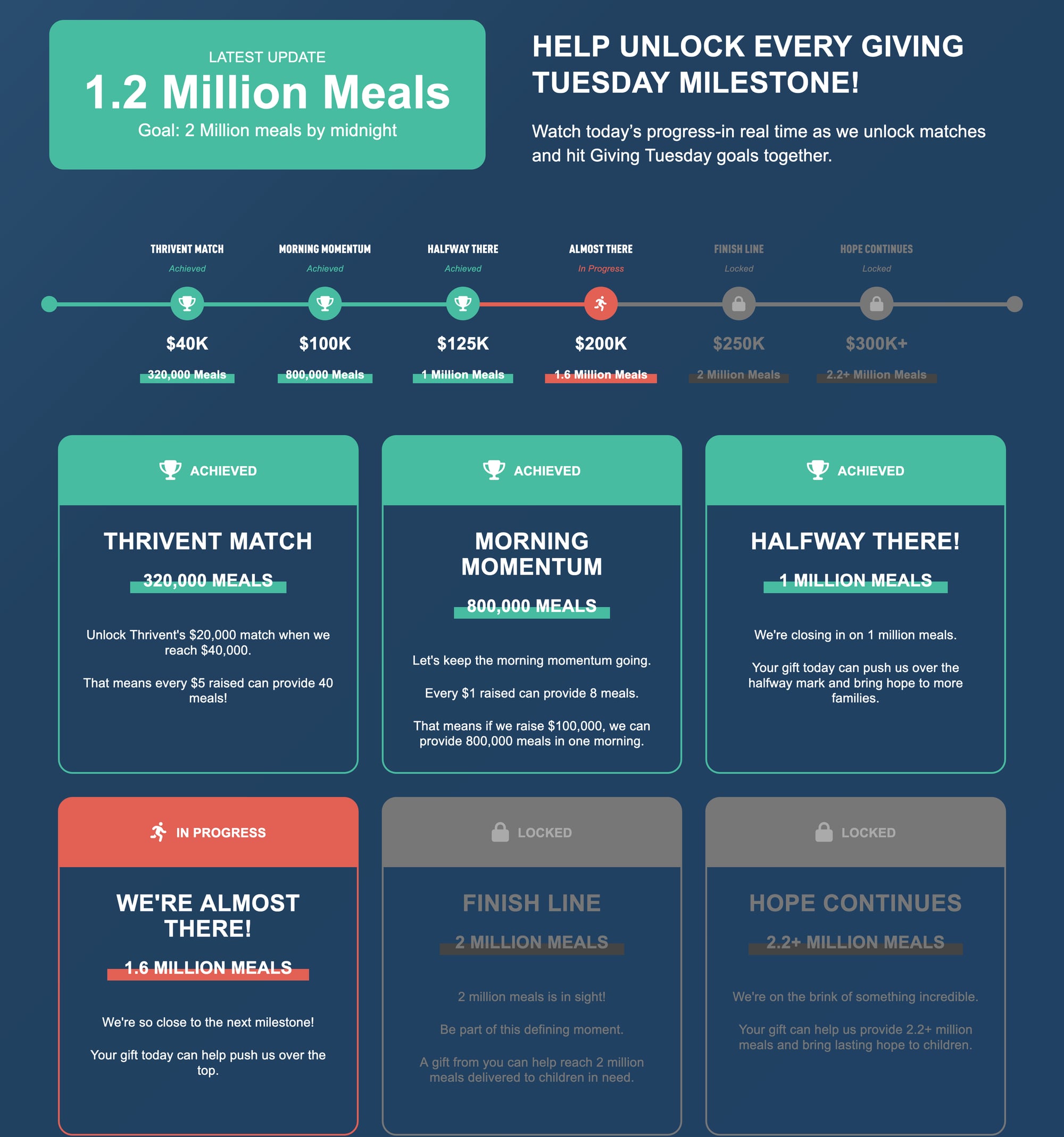
- A live progress tracker showing donations climbing toward each match milestone throughout the day, turning giving into a shared goal and adding real urgency.
- Milestone cards marking each threshold, from the match itself to the final stretch goal, each one unlocking as the total rose.
- A timed launch. The match version was scheduled to go live the night before, so it was ready when the first morning email reached inboxes. A lighter teaser update bridged the gap in the days before.

Day-Of & After
Giving Tuesday, Live
On the day itself, I updated the page every hour, from the first email to the last: moving the tracker forward as totals climbed, refreshing the copy, and celebrating each milestone as it fell. I worked in real time with the communications and executive team to adjust urgency messaging to the pace of giving, and made sure every update reached visitors the moment it was published.
After the Day
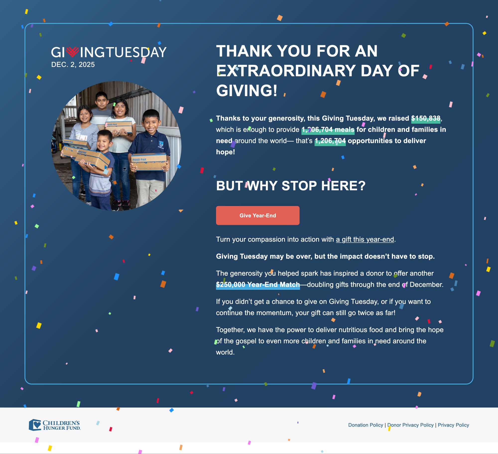
Once the campaign ended, the page still had traffic, and every visitor who arrived ready to give was an opportunity. So I designed and built a post-campaign version:
- From urgency to gratitude. The page became a thank-you, celebrating what donors made possible.
- No dead ends. The Giving Tuesday form was retired, and a popup caught anyone still trying to give and pointed them to the year-end campaign, so no donation intent was lost.
- On time. Scheduled to go live at 6 AM the morning after, bridging straight into the year-end season.
Learning & Next Steps
What I learned
- With the timeline too tight for a design comp, I learned that building straight from the content strategy in code can work when every decision serves one goal.
- When the corporate gift-match was confirmed mid-November, I had to build a new version within a week, which showed me the value of a page structured so a new story can be swapped in quickly.
- Retiring the form after the day and catching late visitors with a popup taught me to plan for the traffic that arrives after a campaign ends.
What's next
- Reuse the live tracker and milestone cards for future matched giving campaigns, as I already adapted the tracker for the 35-Day Generosity Challenge.
- Use the trackable links to compare how the single-ask, no-exit template performs against other campaign pages.
- Carry the thank-you page and popup pattern into other campaigns so no donation intent is lost afterward.
[ Let's connect ]
Let's work together
Have a project, a role, or an idea in mind? I'd love to hear about it.