Product Design & DevelopmentDesign & Dev Pitch
Viteo
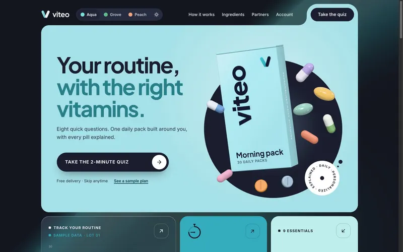
A design and dev pitch: a personalized vitamin subscription, designed and built end to end, from a 3D product that opens as you scroll and a quiz that builds your pack as you answer, to a plan that explains every pill and an account that keeps subscribers in control.
- Project
- A personalized vitamin subscription, designed and built end to end as a design and dev pitch to an entrepreneur
- Role
- Product Designer & Front-End Developer
- Platform & Tools
- Web — Desktop, Tablet, Mobile · Next.js, React, three.js, CSS
- Try It Live
- cyrilflorita.com/pitch/viteo

Overview
Vitamin subscriptions lose customers in the same three places:
- Generic packs: everyone gets the same bottle, whatever their diet or routine.
- No “why”: people don't know why something is in their pack, so they stop taking it.
- Hard to control: skipping or pausing is buried, and cancelling feels like a trap.
Viteo is my pitch for a direct-to-consumer subscription that fixes all three. As product designer and front-end developer, I took it from brand to working product, solo, with three goals:
- personalize every pack, and explain every pill in it
- put customers in control, so retention is earned rather than trapped
- make it launch-ready, so a founder could build a business on it
What's Built
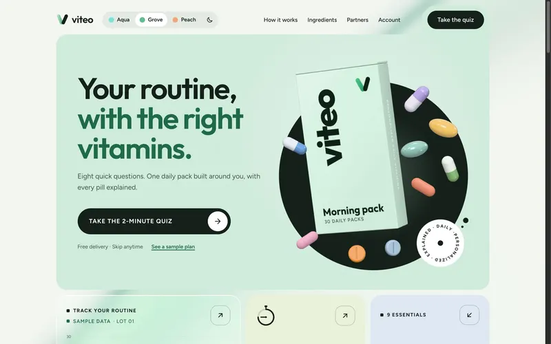
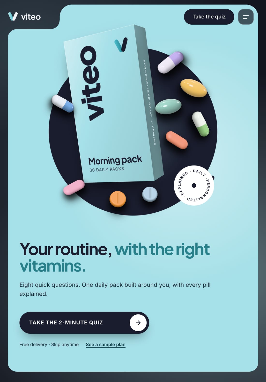
- Landing page with a real-time 3D product and a scroll story that carries the pills down the page
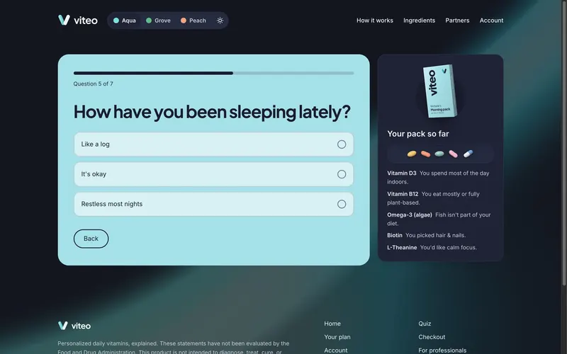
- Two-minute quiz that builds the pack live as you answer
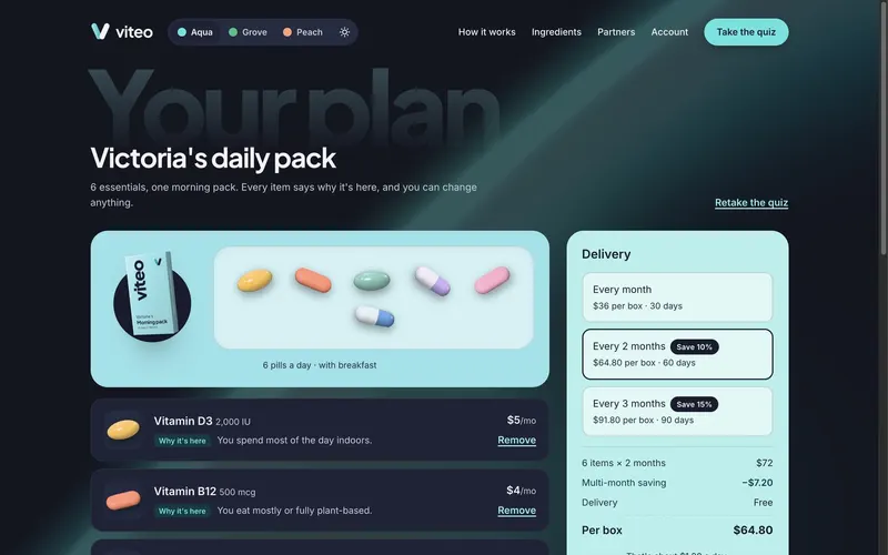
- Personalized plan, every item with the reason it's there
- Checkout in four steps, with simulated Apple Pay / Google Pay and test-card payments, including a declined card
- Passwordless sign-in by email link or passkey, and sign-out
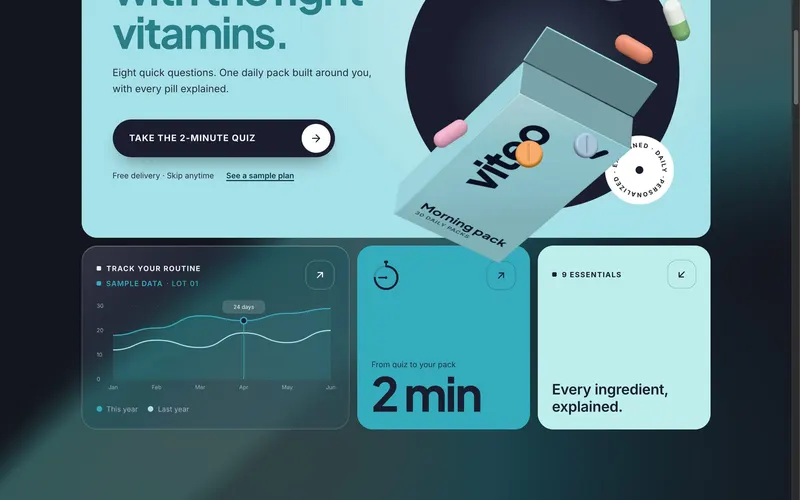
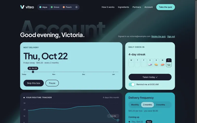
- Account: skip, pause, swap and undo; a daily check-in; a routine tracker
- Honest cancellation that offers one fitting alternative, never a maze
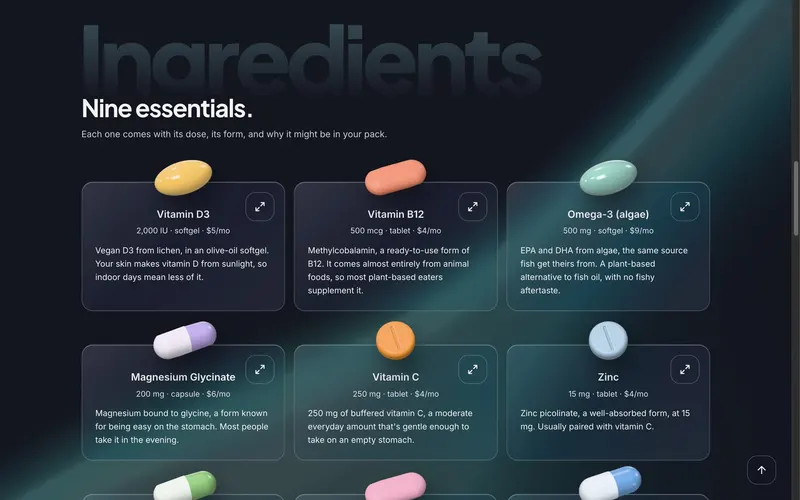
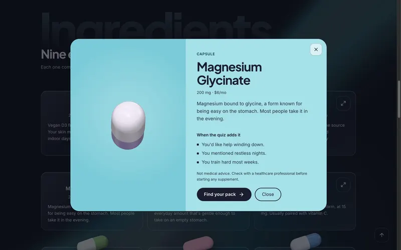
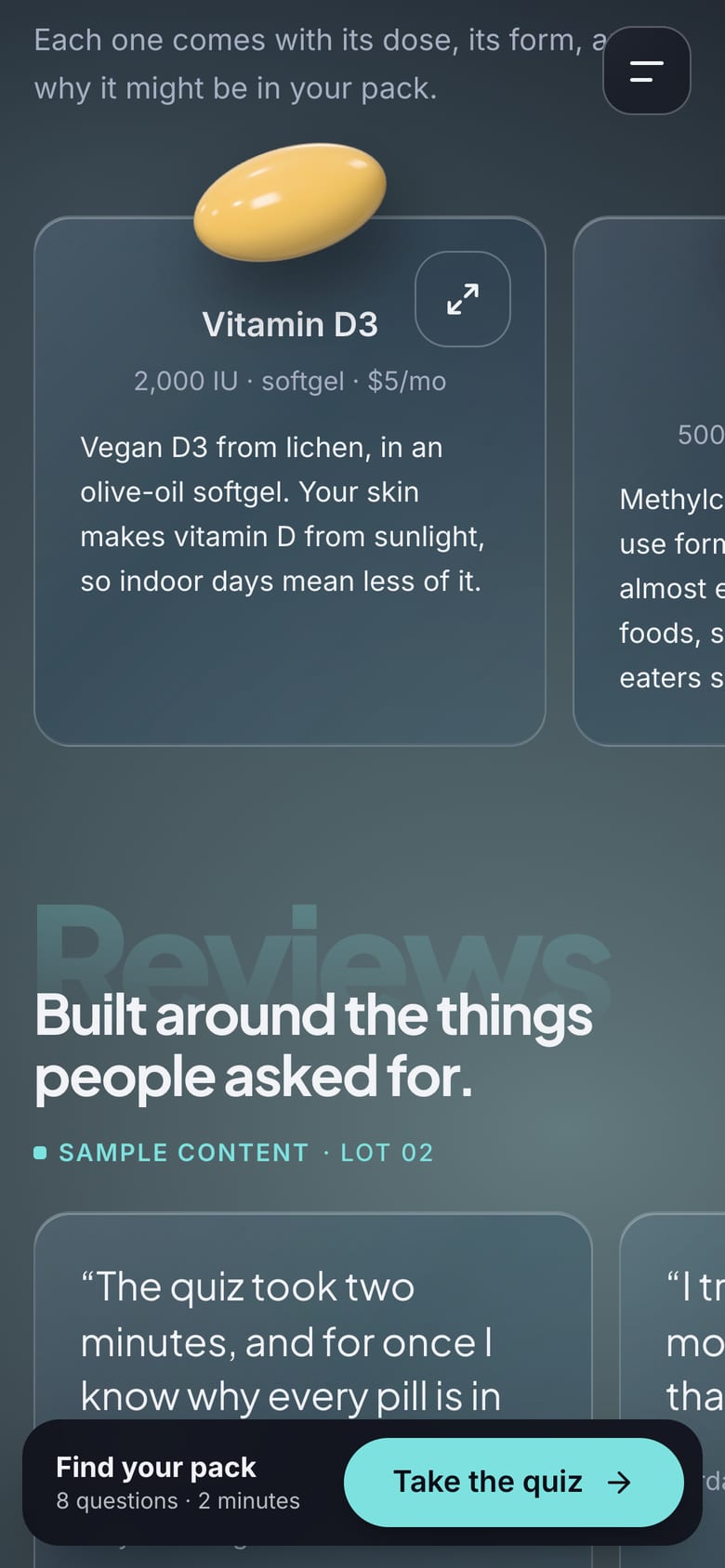
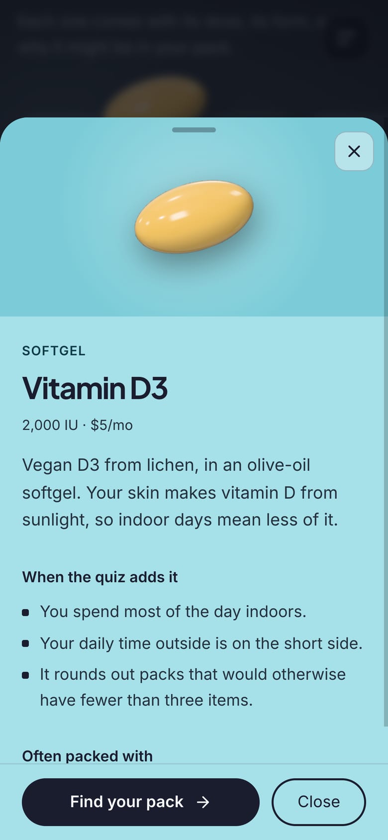
- Ingredient close-ups in 3D, with dose, form and when the quiz adds each one
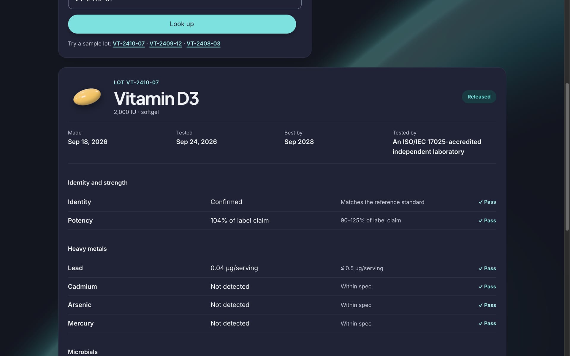
- Batch results: independent lab results by lot code
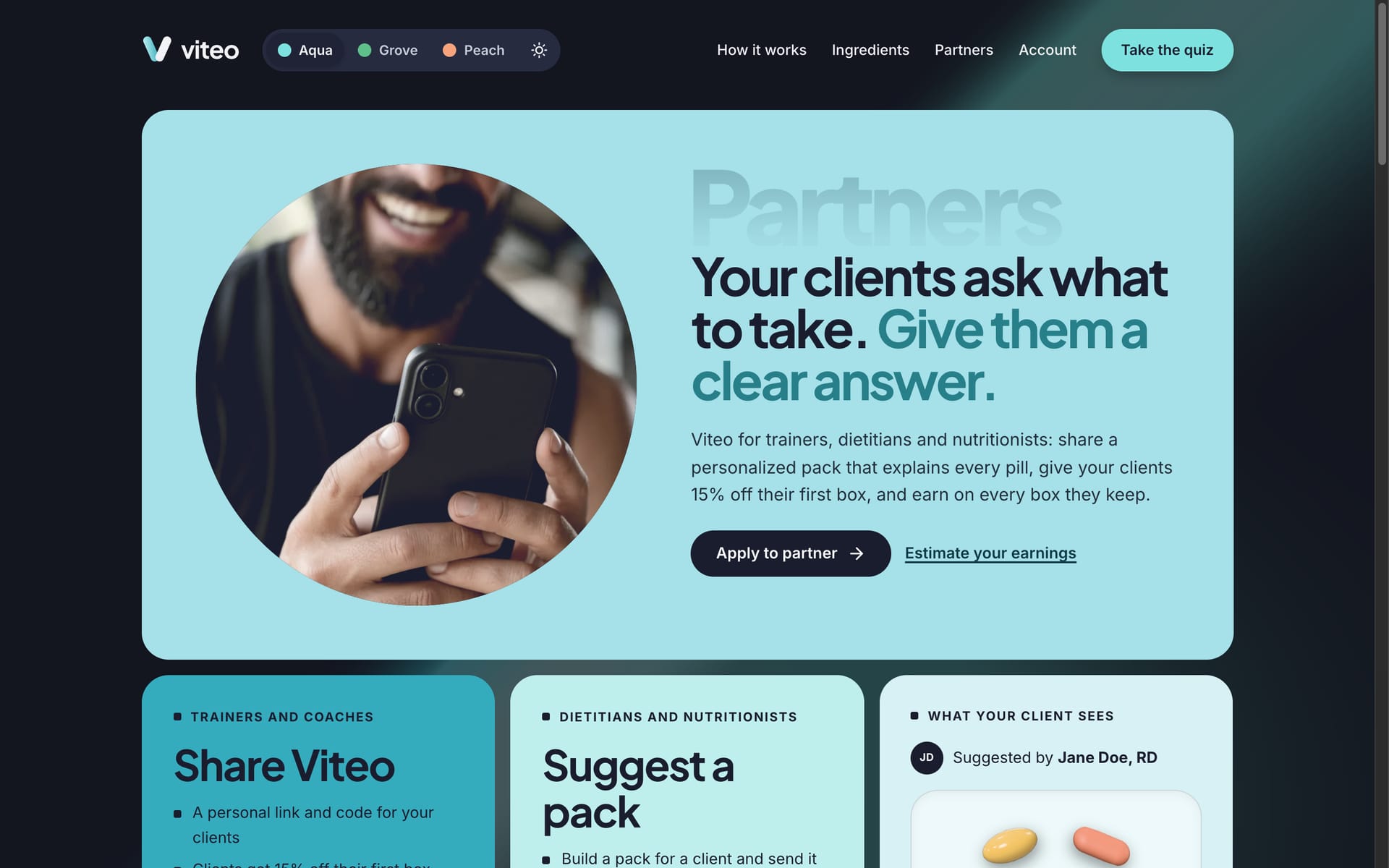
- Partner program for trainers, dietitians and nutritionists, whose suggested packs open for clients with their notes and a first-box discount
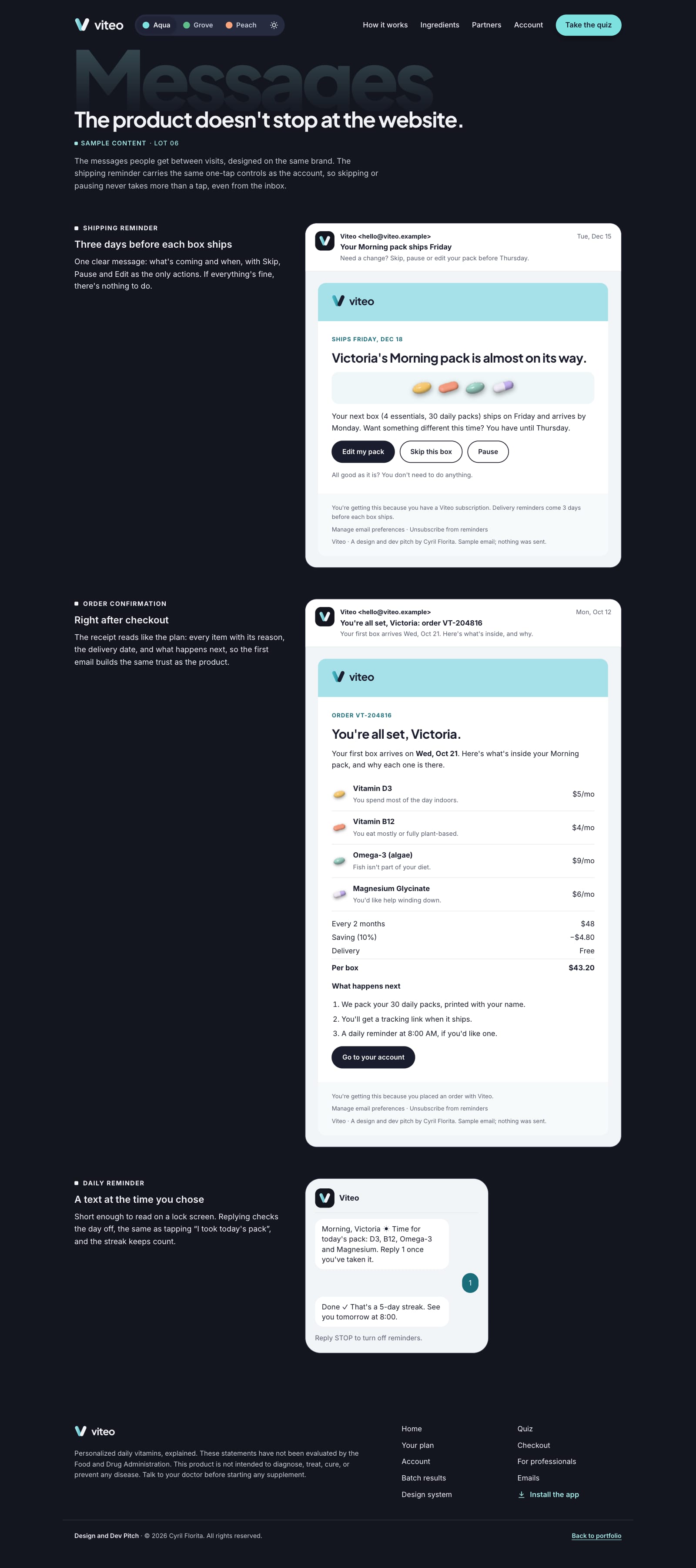
- Lifecycle messages: shipping reminder, order confirmation, daily text
- Installable app with an offline screen
- Design system with three themes, each in light and dark
It makes no health claims and takes no real payments; everything else is written as if it launched tomorrow.
See it for yourself
Every flow works: take the quiz, open an ingredient, place an order and skip a delivery. Nothing is charged and nothing leaves your browser.
Loading video...
Results & Impact
Viteo hasn't launched, so there are no market numbers, and I won't invent any. What it delivers is a complete, working product rather than mockups, measured on the live site:
- 95
- Performance (desktop)
- 100
- Accessibility
- 100
- Best practices
- 100
- SEO
Lighthouse scores, 3D scene included. Fixing what the first audit found took desktop performance from 72 to 95 and accessibility from 94 to 100, and it holds at 95 with the moving background and page preloaders added since. A mobile pass (WebP renders, fonts and analytics off the critical path, page-only CSS split out) then took mobile from 62 to 79. Every text color passes WCAG AA in all three themes, light and dark. At launch, the metrics to watch are quiz-to-checkout conversion, edits on the plan page, and skips and pauses against cancellations.
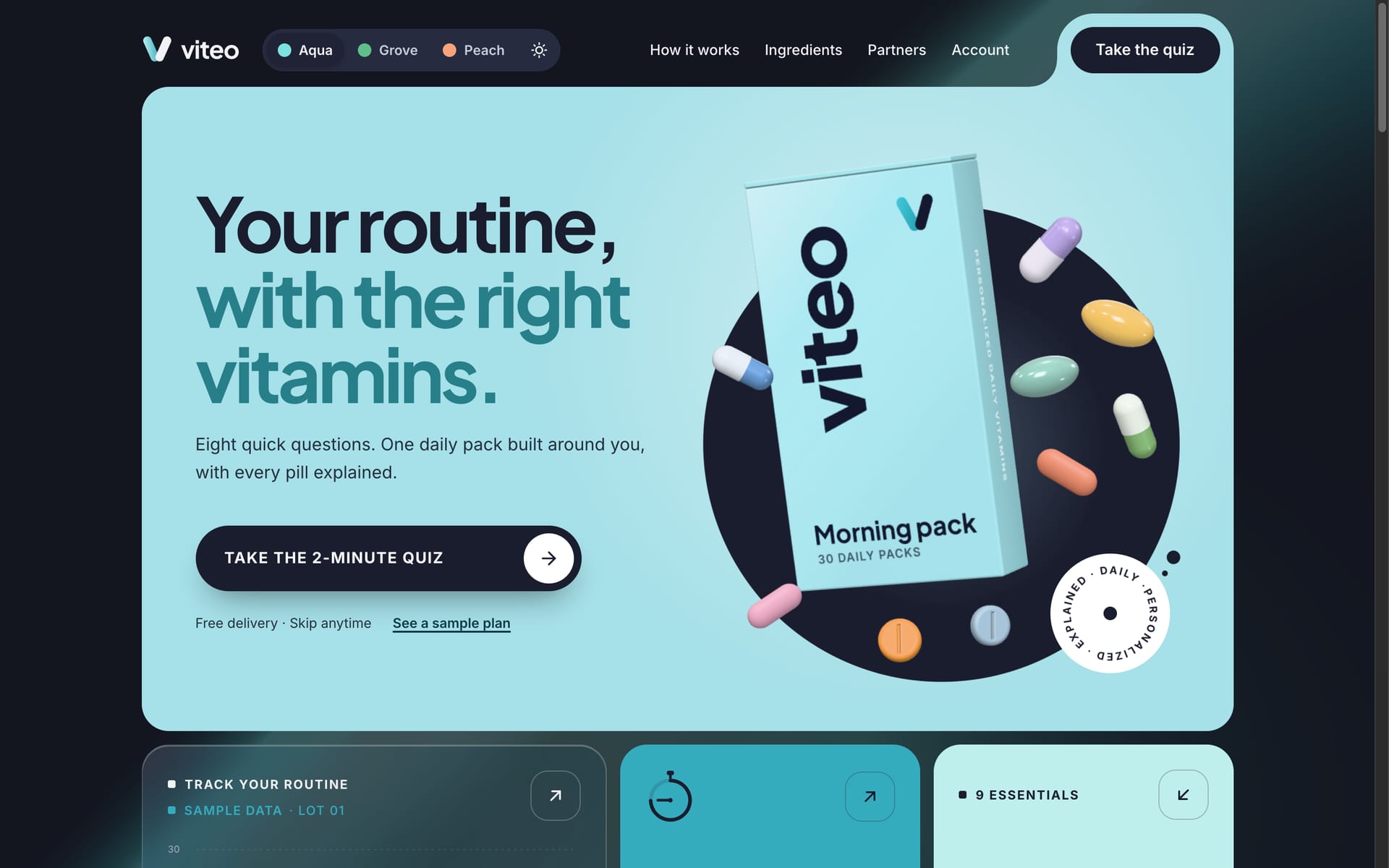
Depth under the pointer. On desktop, the pack is the pivot of the hero: near pills follow the cursor, far ones drift the other way, and the box turns far enough to show its side, then springs back into place.
Loading video...
A story told by scrolling. The carton tips open and its pills fly down the page, landing in the steps and then their ingredient cards. Scrolling back reverses it.
Loading video...
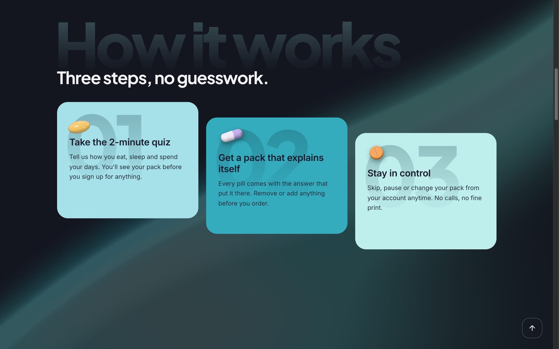
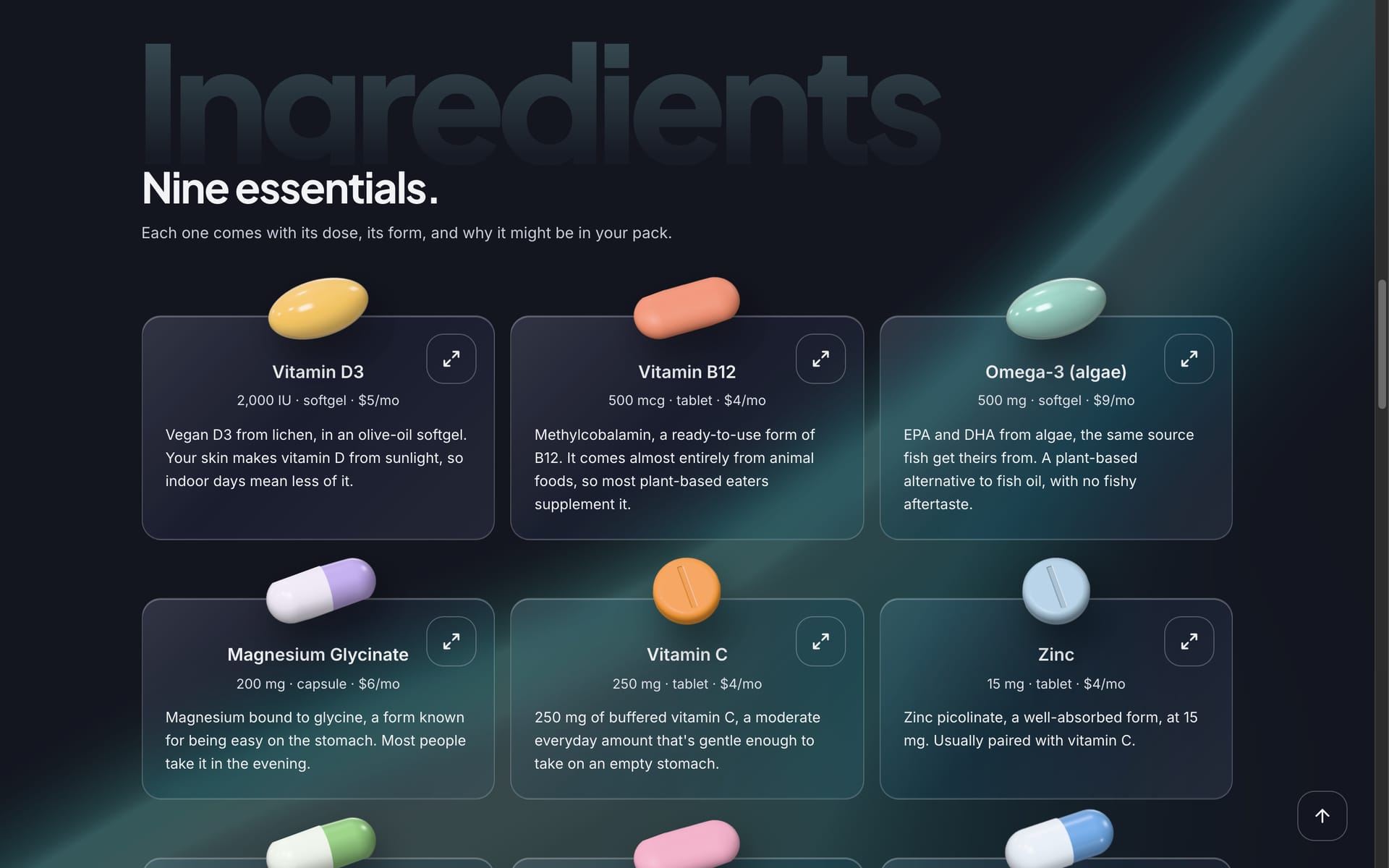
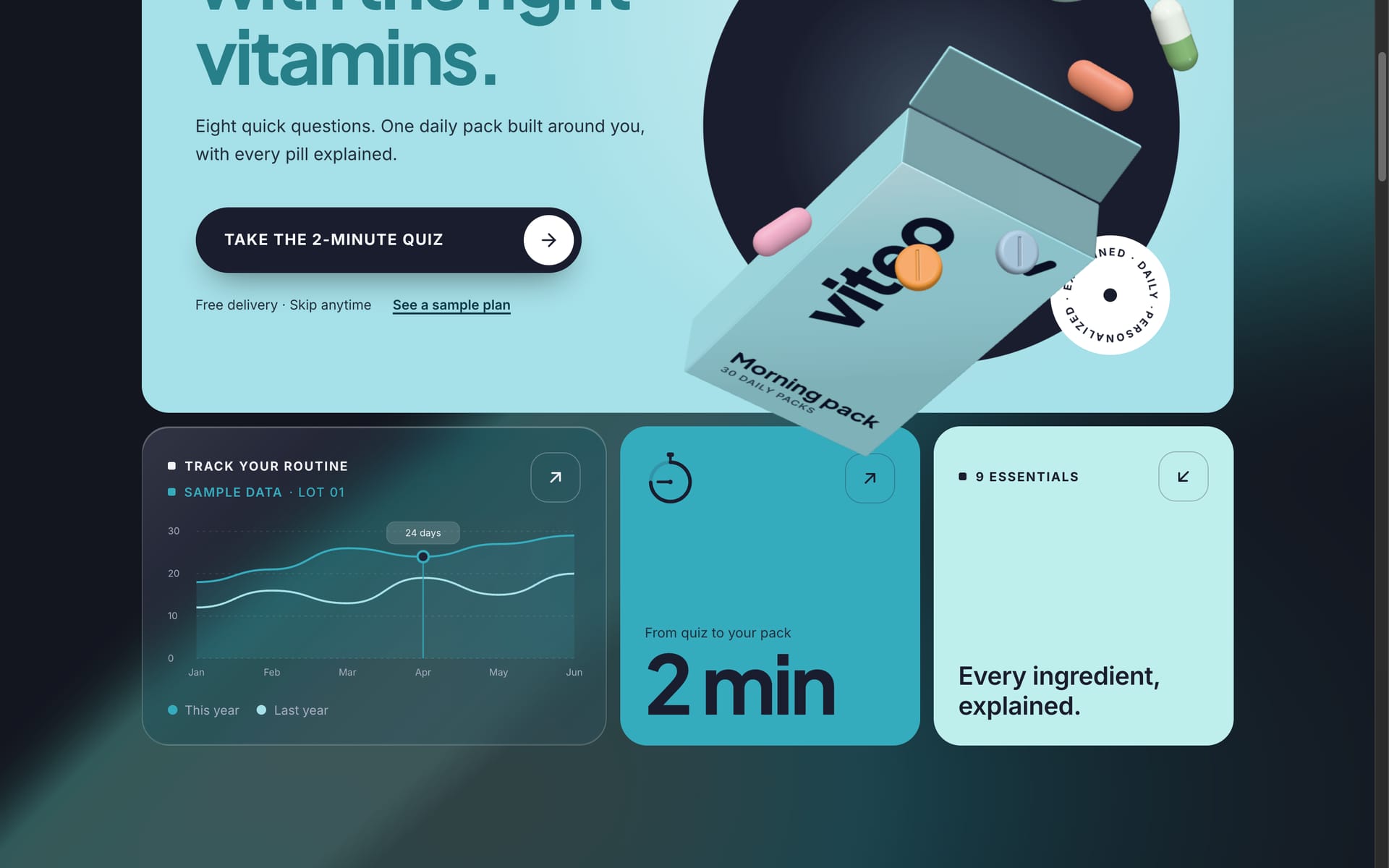
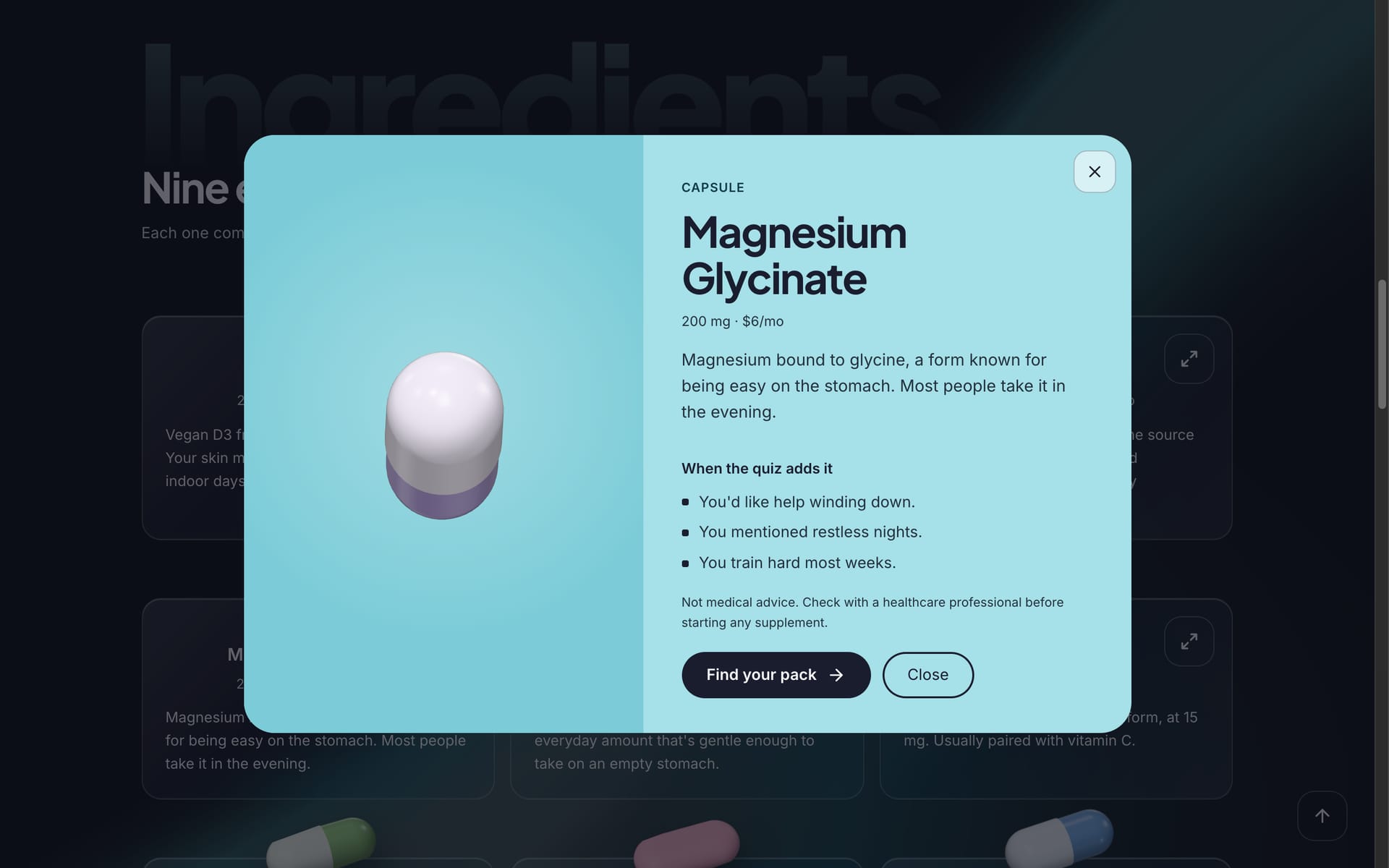
Every ingredient, up close. A card opens a 3D close-up with dose, form, the quiz answers that add it, and what it's often packed with.
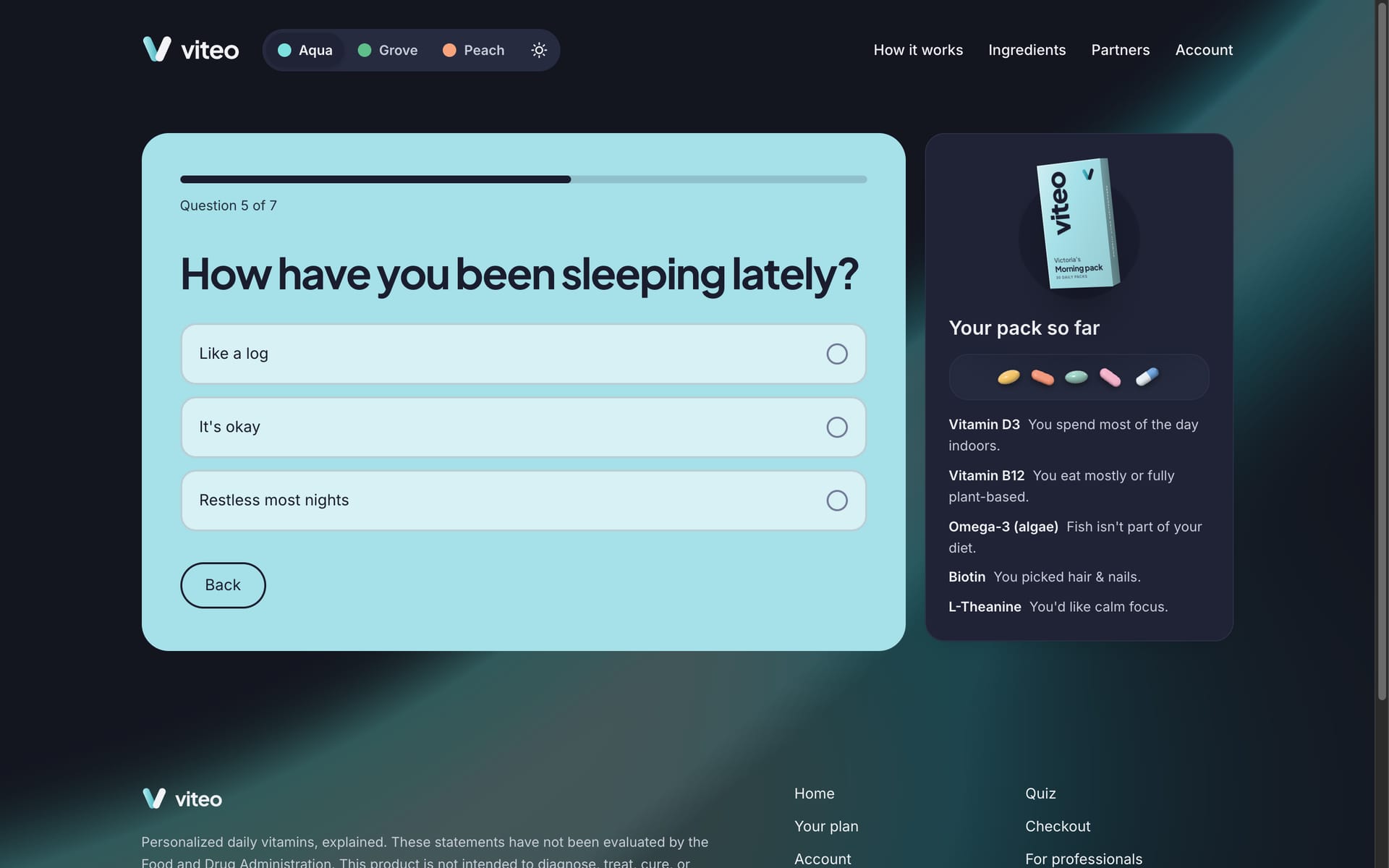
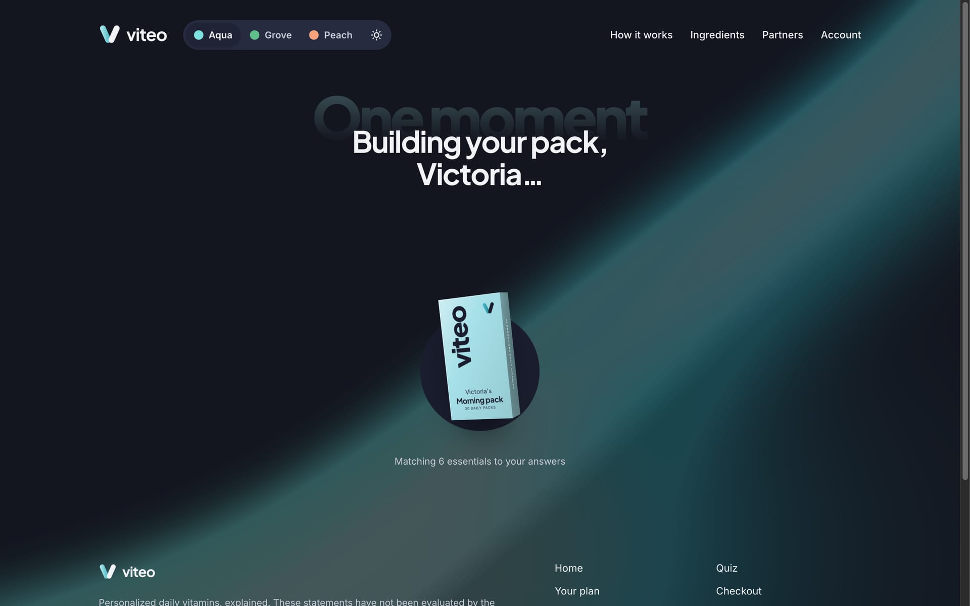
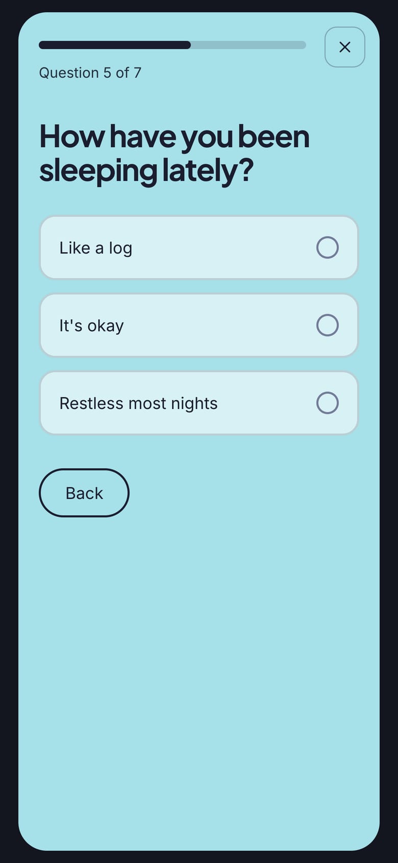
A quiz that builds as you answer. Each answer that earns a pill drops it into “Your pack so far” with its reason, and the finale fills a pack printed with your name.
Loading video...
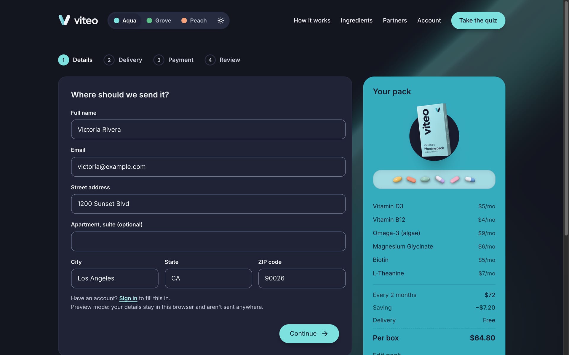
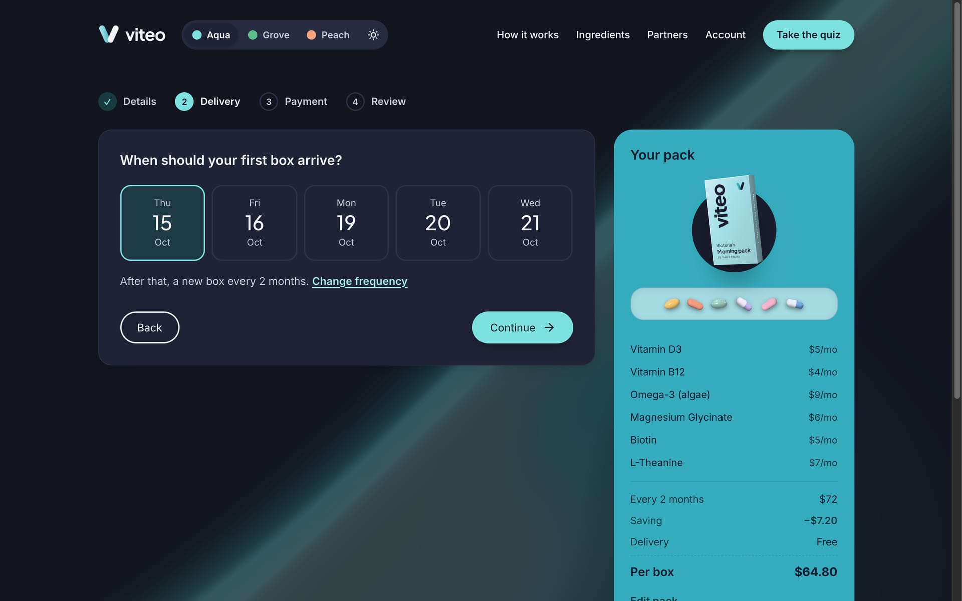
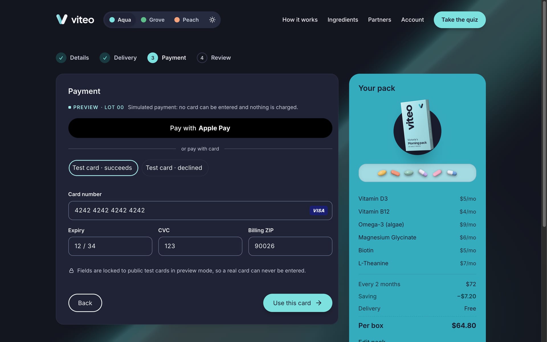
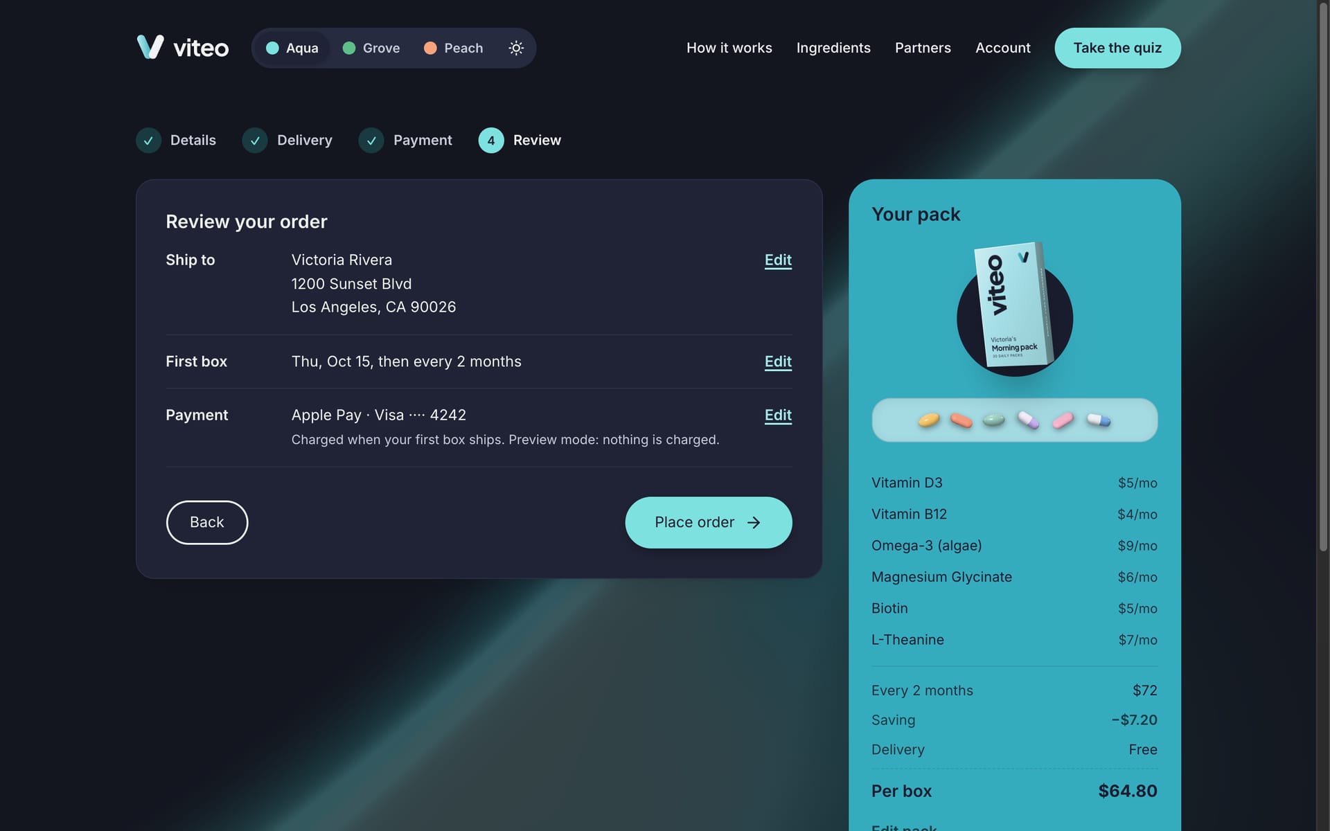
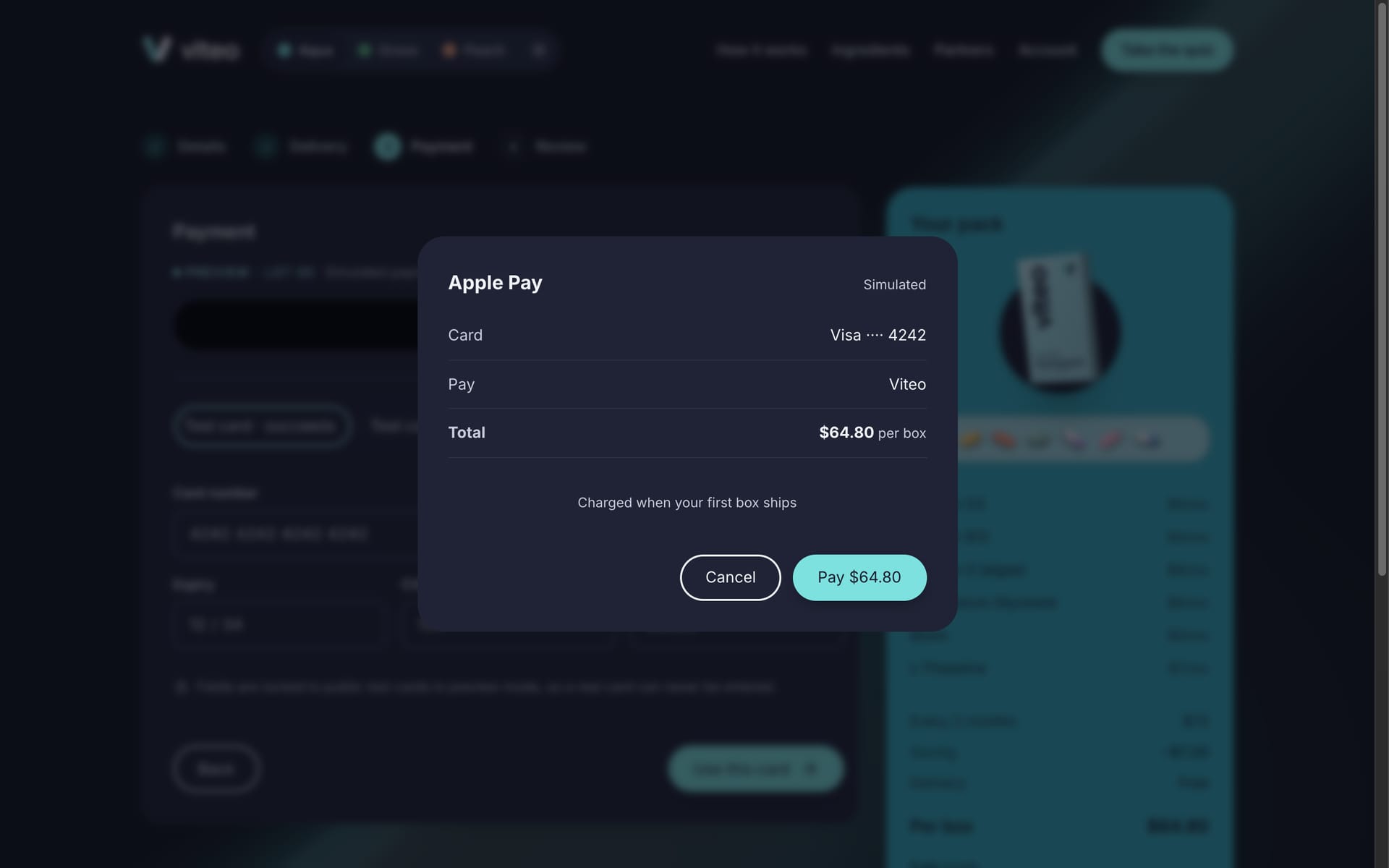
Plan, checkout and payment. Every item says why it's there and can be removed or swapped. Checkout is four short steps with plain-language errors. Payment is fully prototyped but safe by design: a wallet sheet, and a card form locked to public test cards, so no real card can ever be entered. A declined test card shows the error path.

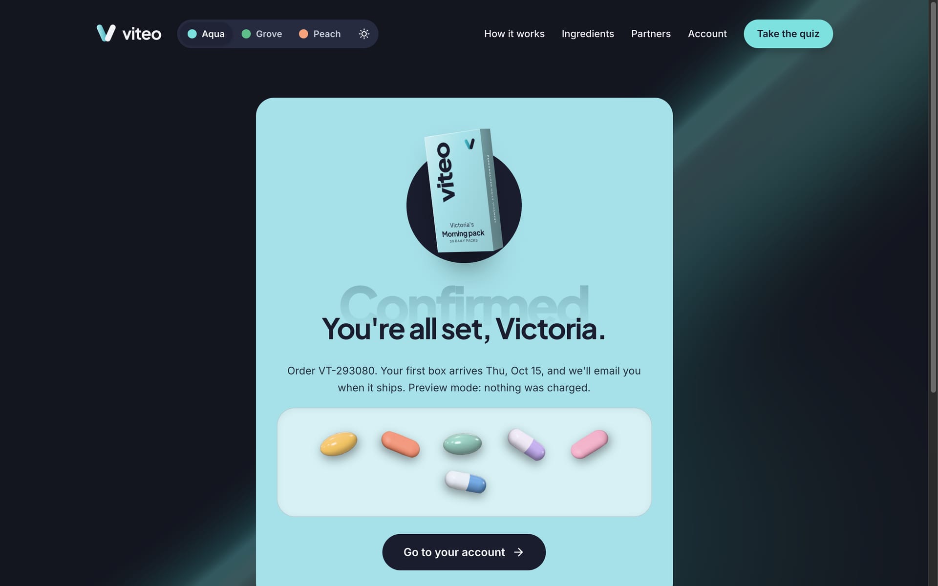
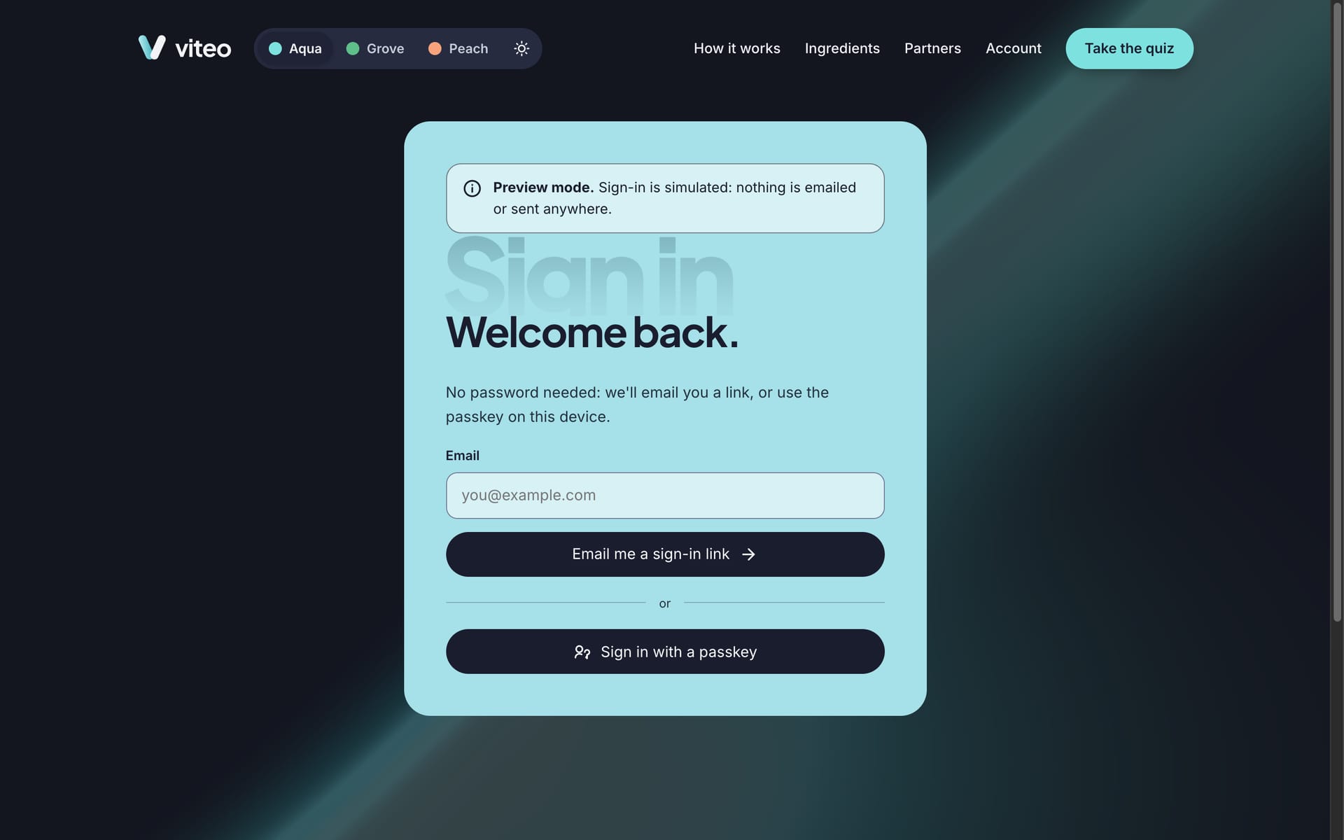
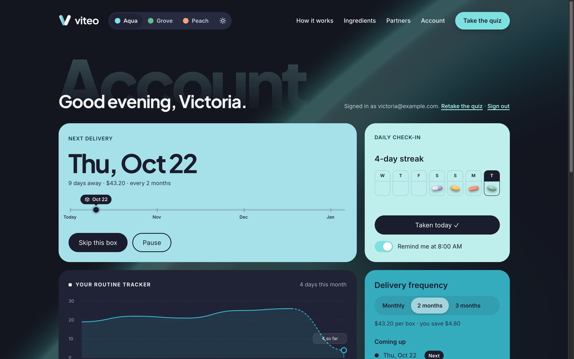
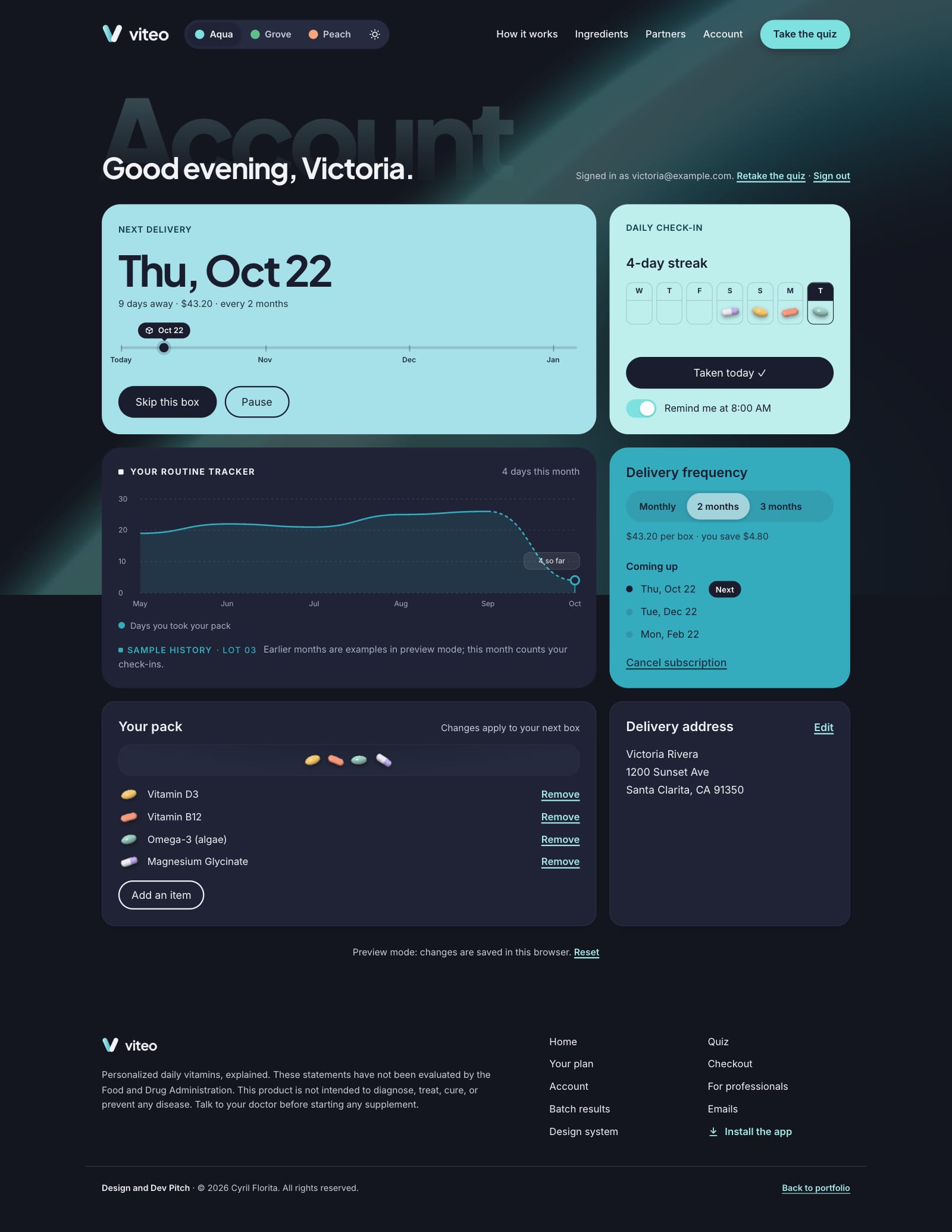
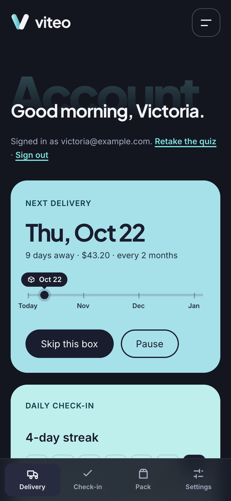
An account that keeps people in control. Sign-in is passwordless: an email link (it arrives as an on-screen notification in the preview) or a passkey. Skip and Pause sit on the next delivery, every change has Undo, and a routine tracker charts the days you took your pack. Cancelling offers one alternative that fits the reason, with “Continue to cancel” right beside it.
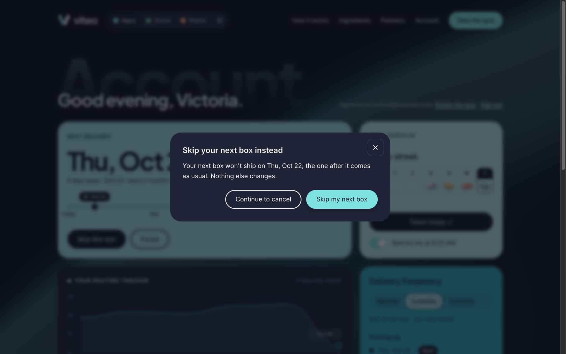
Beyond the store. Lab results by lot code, a partner program for professionals, and the messages people get between visits.
Design Approach
Mobile-First, Enhanced Upward
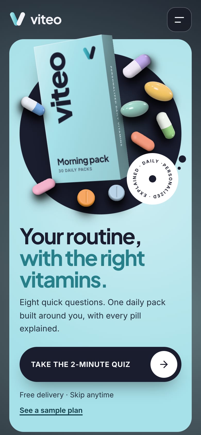
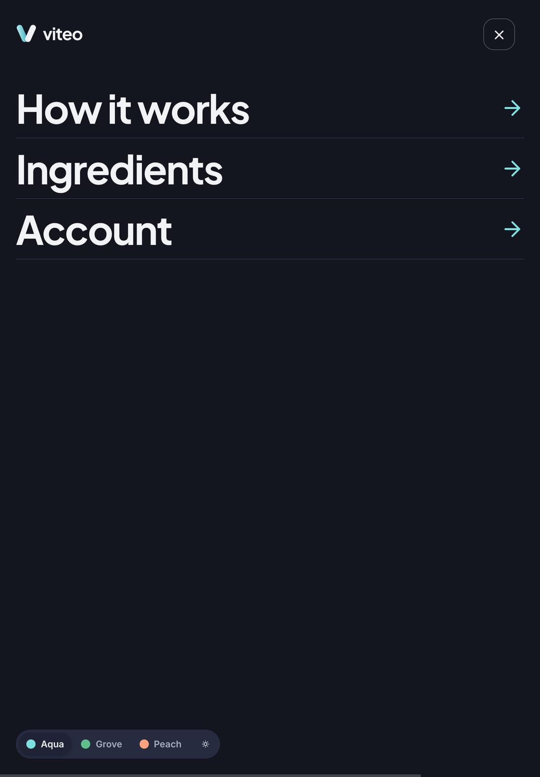
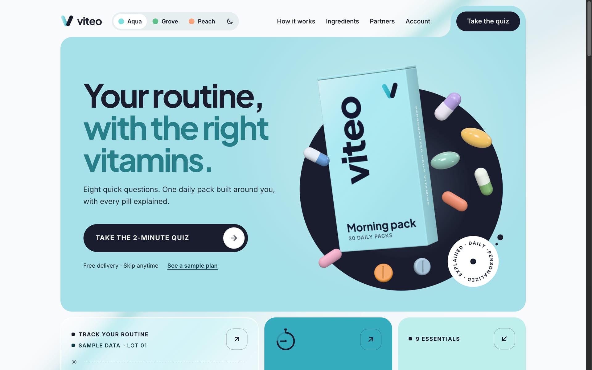
People take quizzes and check off their pack on their phones, so the phone gets the complete product: one column, a sticky quiz bar, swipe rows, a full-screen quiz, bottom sheets and an app-style tab bar. Tablets add two columns. Desktops with a mouse add hover, a pointer-led light, the moving background and the live 3D. Each layer checks what the device can do before it loads, so phones never download the 3D, and with reduced motion everything is simply there.

One Design System, Three Brands
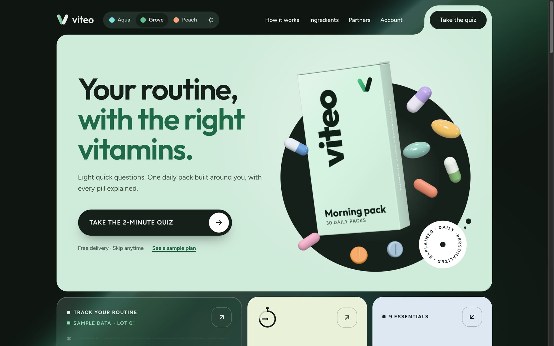
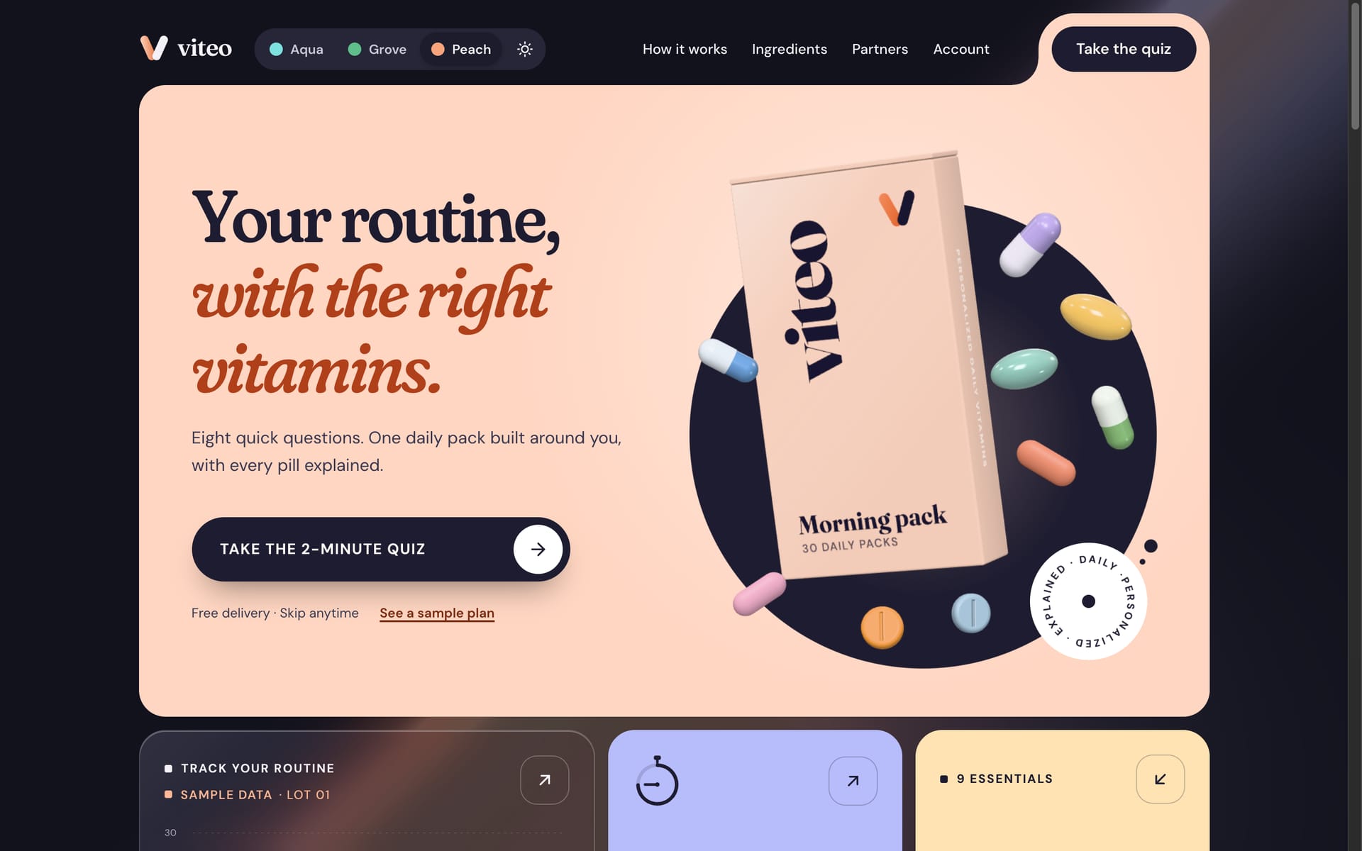
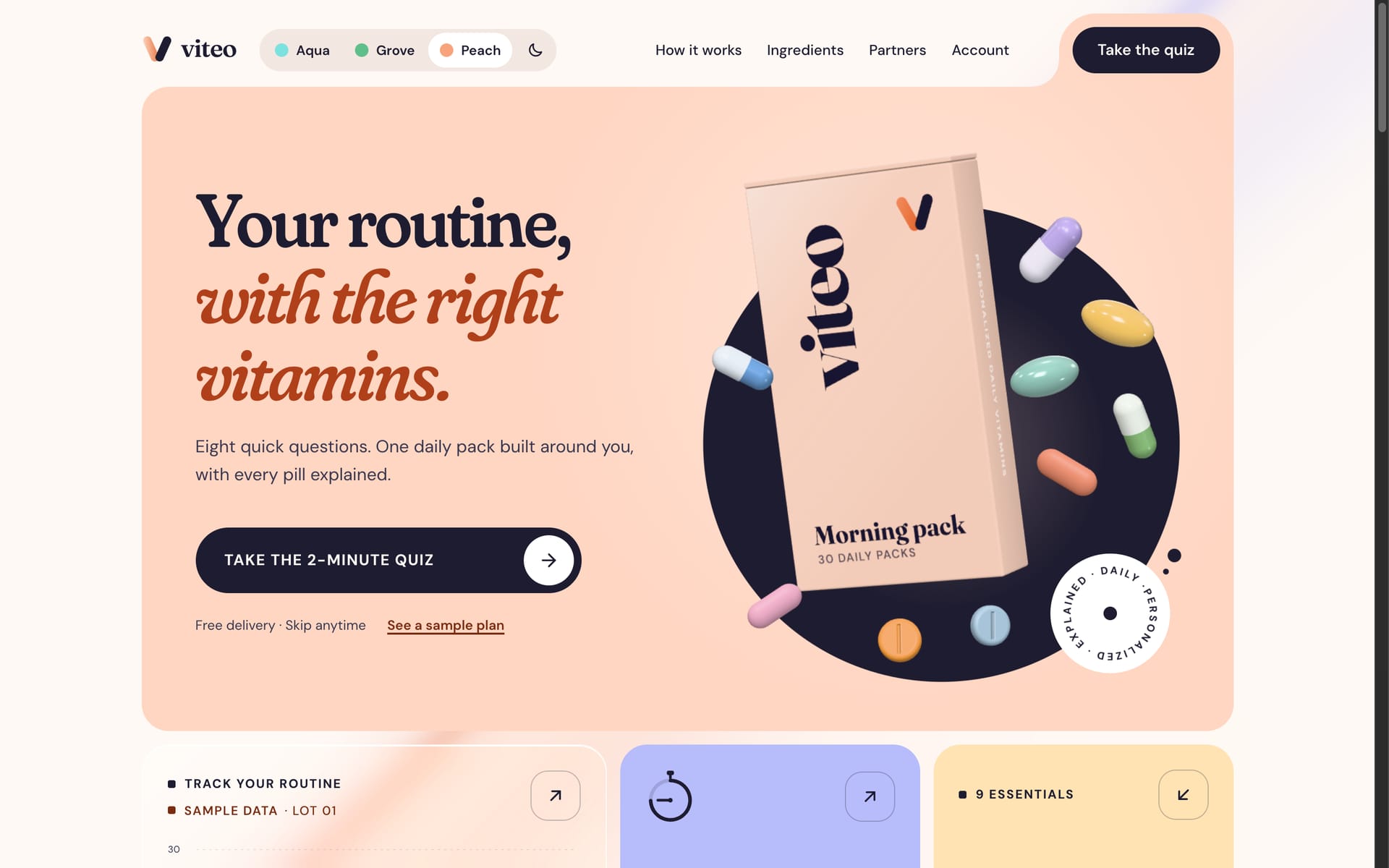
Every color and font comes from tokens, so the product can change its whole look without touching a component. Three themes prove it: Aqua (the default), Grove and Peach, each with its own palette and type, in light and dark. A living design system page renders the real components, so it can't drift from the product.


Engineering
Built with Next.js and React as a static site, with three.js for the 3D and GSAP for the choreographed moments.
- 3D mapped to the layout: one transparent WebGL canvas where a 3D unit equals a CSS pixel, so the carton and pills are placed straight from the page layout, with nothing extra to keep in sync.
- Modelled from the catalog: each product's color and form generate its pill. The same code bakes the images used everywhere else, so a new product needs no new artwork.
- One GSAP timeline, two renderers: each object in the intro has one tween that drives both the 3D scene and the CSS fallback. Any click or scroll skips it, and the quiz finale moves on when its timeline completes, not on a guessed timer.
- A living background: a WebGPU shader (falling back to WebGL2) sweeps a slow, pulsing silk ribbon of the theme's light behind every page. It draws at a third of the screen's resolution at 30fps, pauses when the tab is hidden, and stays off on phones and for reduced motion. Text can land anywhere on it, so in dark mode the shader caps its own brightness at the level where every text pair still passes AA, checked on every page as the light moves.
- Fast by design: three.js loads only on capable desktops, warms up behind a branded preloader so the intro never stutters, and draws only while something moves.
- Prototyped, not faked: sign-in, payment and cancellation are complete flows with loading, success and error states. Nothing is sent or charged, and the card form is locked to public test cards so it can never collect a real card.
- Accessible throughout: keyboard support, focus management in every dialog, pinch-zoom, and reduced motion respected everywhere.
Learning & Next Steps
What I learned
- Building the product instead of only drawing it surfaced the real decisions early: what happens when a quiz answer makes a question irrelevant, or when someone undoes a skip.
- Driving every color and font from tokens made new themes cheap (Peach, with its own colors and type, needed no component changes), and each one doubled as a test that nothing was hard-coded.
- Writing the copy as part of the design (the “why it’s here” lines, the preview labels, the plain-language errors) did as much for trust as any visual choice.
What's next
- Connect the commerce layer: subscriptions and payments (for example Shopify or Stripe Billing), real accounts, and reminder emails and texts.
- Run moderated usability tests on the quiz and plan pages, and see where people hesitate or edit.
- Test the copy of the recommendations with people who already take supplements.
- Measure how often each cancellation alternative is taken, and tune the offers by reason.
See it for yourself
Every flow works: take the quiz, open an ingredient, place an order and skip a delivery. Nothing is charged and nothing leaves your browser.
[ Let's connect ]
Let's work together
Have a project, a role, or an idea in mind? I'd love to hear about it.