App Design & PrototypingMobile & Tablet
The Study Bible App
Leading the redesign of The Study Bible app to address the legacy app's critical usability issues with an experience that's simple, clean, yet delightful.
- Client
- Grace to You—A Christian Media Organization
- Role
- User Experience Designer
- Deliverables
- Research, Interactive Prototype, Style Guide
- Website
- studybible.org
Overview
The legacy Study Bible app offered unparalleled theological depth and matched the physical MacArthur Study Bible, but it was fraught with critical usability issues. As a UX designer at Grace to You, I led its redesign, released as The MacArthur Study Bible app: a rich digital resource for readers, students, and teachers who rely on John MacArthur's faithful teaching and commentary.
The aim was not just to fix the legacy app, but to let users do everything they can with the physical Bible, and more and better. Not flashy, not overdone: simple, clean, yet delightful.
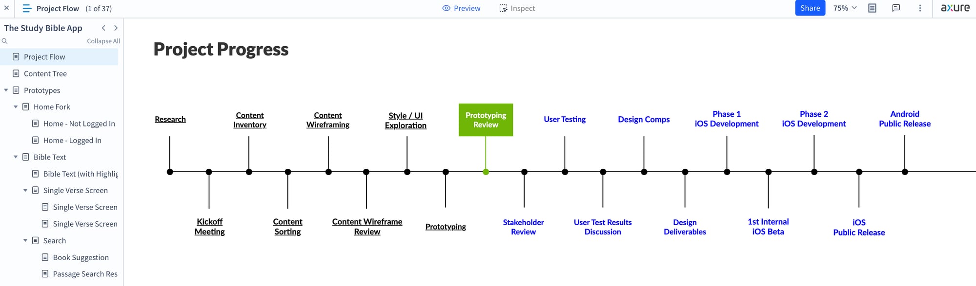
Results & Impact
At release, the app took the name of the print edition it brings to life: The MacArthur Study Bible. It was built from the redesign and prototype by the development team behind the Literal Word Bible app, so the design reached developers already experienced in building a fast, reliable Bible reader. Learn more at studybible.org.
Loading video...
Research & Goals
The legacy app was packed with features: full ESV and NASB translations, over 25,000 explanatory notes from John MacArthur, an audio Bible, curated sermons, note-taking, highlighting and bookmarking, and daily devotionals. But users kept running into critical issues:
- incompatibility with newer mobile and tablet devices
- login and account errors, including crashes on the login and account screens
- lost notes, highlights, bookmarks, and settings after logging out
- Bible text suddenly jumping to the end of the book of Revelation
With the approval of the Digital Platforms Director, I analyzed user feedback, App Store reviews, and customer service tickets, held stakeholder interviews, and ran user interviews and usability tests. Several themes were consistent:
- Users wanted cleaner, more intuitive navigation
- The note and highlight features felt buried or non-obvious
- Reading comfort, like font size and background color, mattered a lot
- Study progress, notes, highlights, and bookmarks should sync seamlessly between devices
- The audio Bible should track with the text
To address these, I set four UX goals:
- Streamlined Navigation: Search, books and chapters, translations, audio, bookmarks, text settings, John's notes, highlights, favorites, and personal notes, all within a tap or two.
- Enhanced Reading & Study Experience: Better text layout, fewer distractions when scrolling, and easy access to John's notes.
- More Intuitive Access to Tools & Features: Note-taking, highlights, favorites, and bookmarks reachable with a tap on the verse or a long-press.
- Seamless Syncing & Personalization: A content management experience consistent with the GTY website and the GTY app, in line with GTY's effort to improve consistency across its platforms.
Mapping & Designing
Before designing a single screen, I mapped every piece of content and every component into one tree: the home menu, the Bible text and its navigation, John's notes, search, and the account and “more” screens. It became the blueprint for the navigation and the prototype that followed.

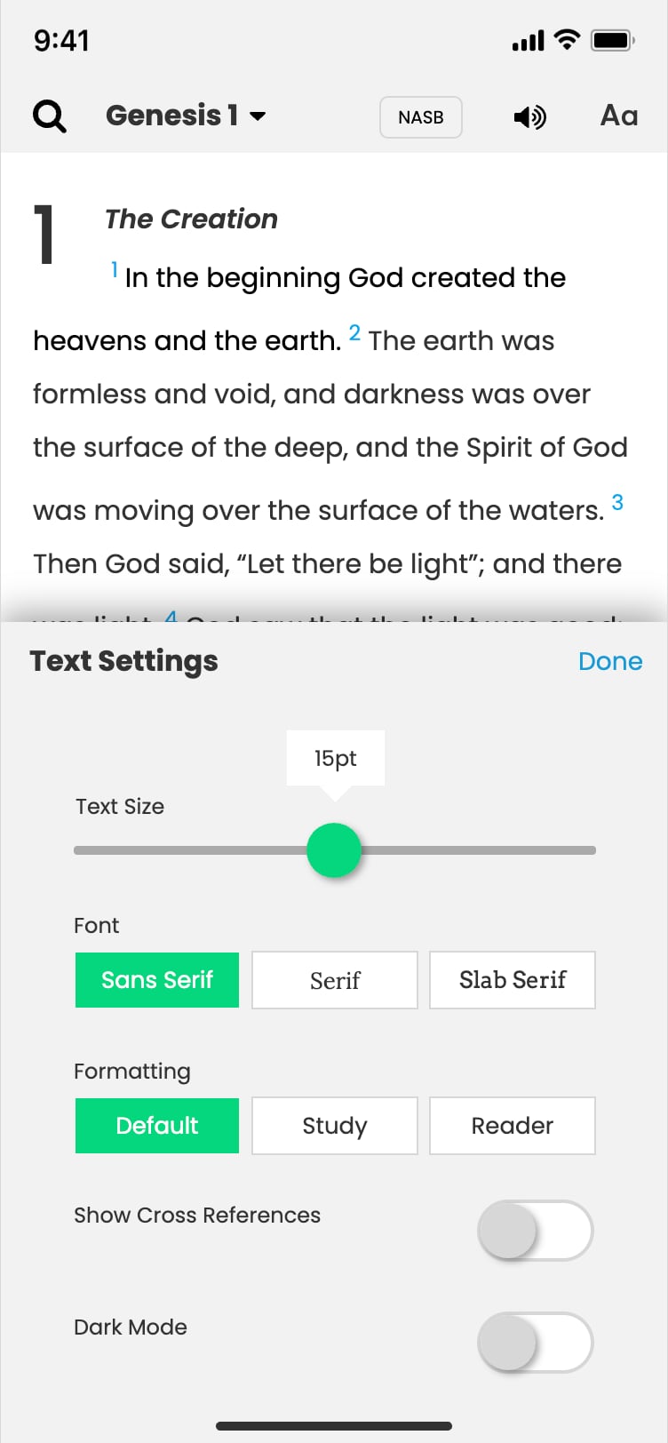
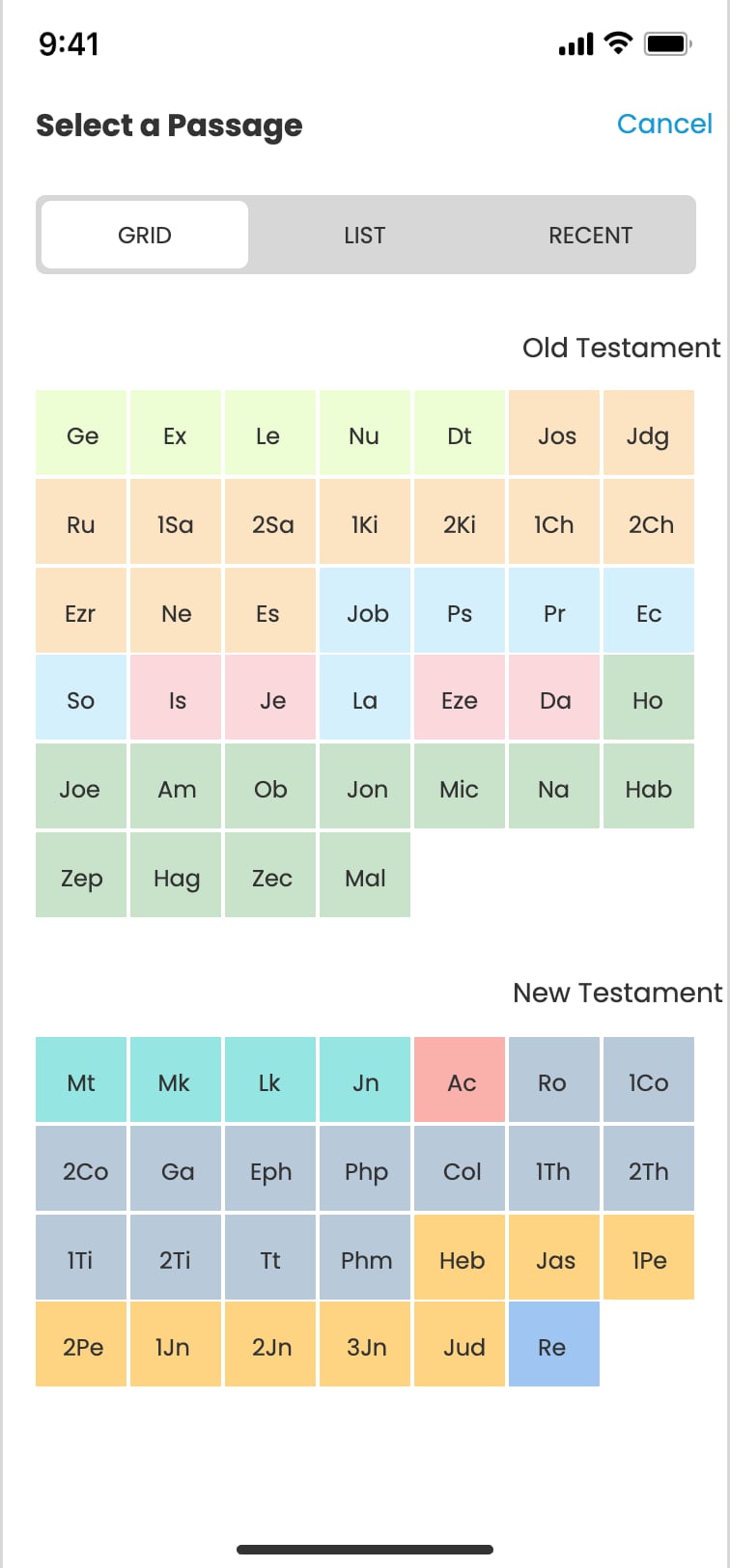
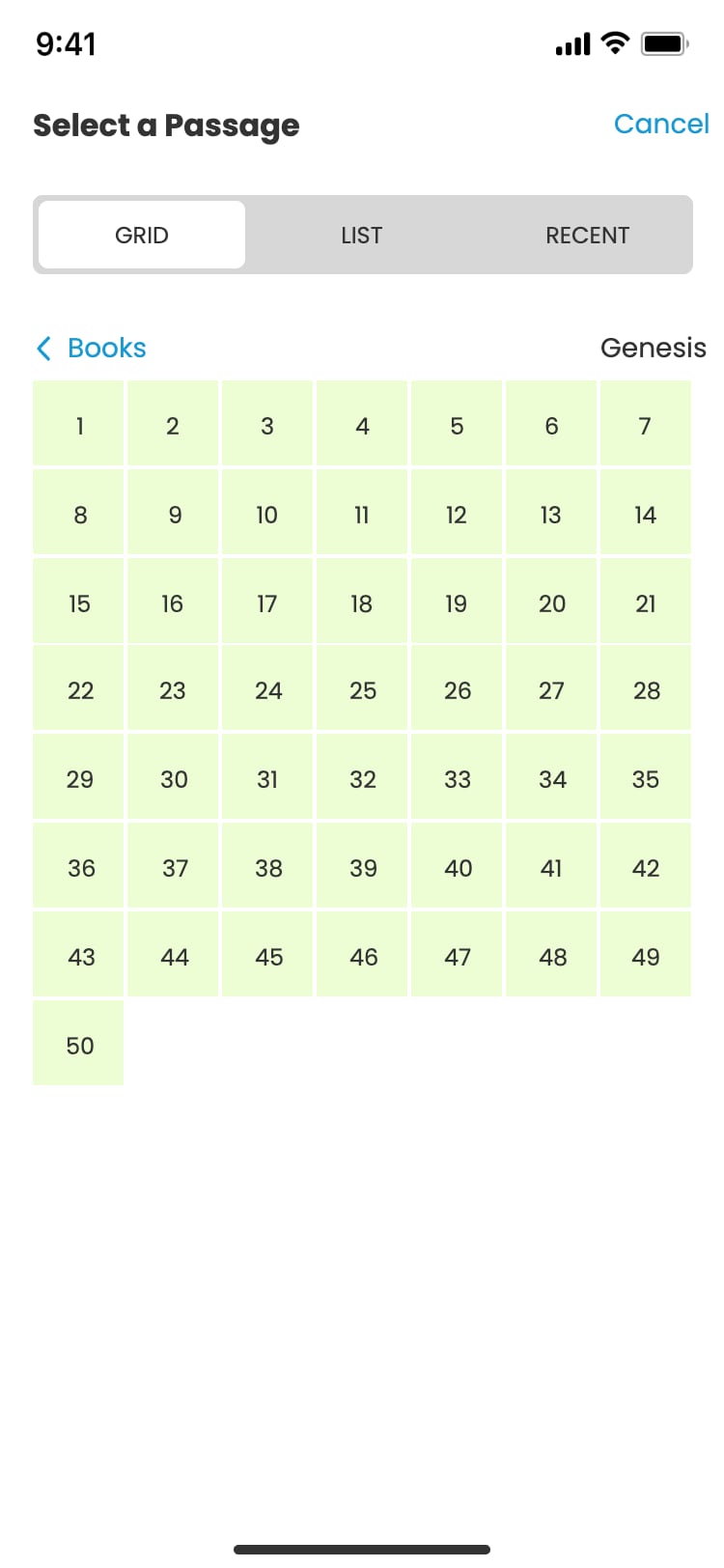
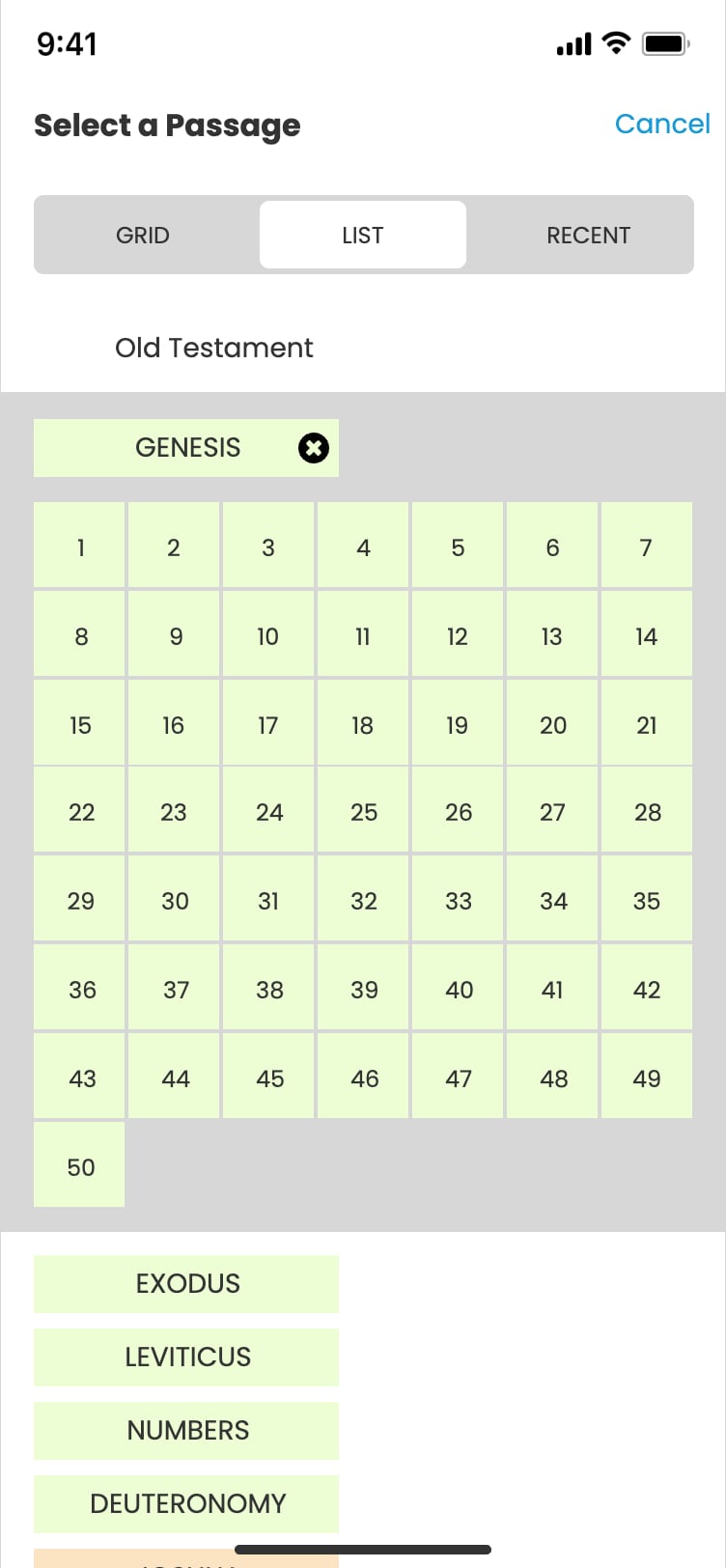
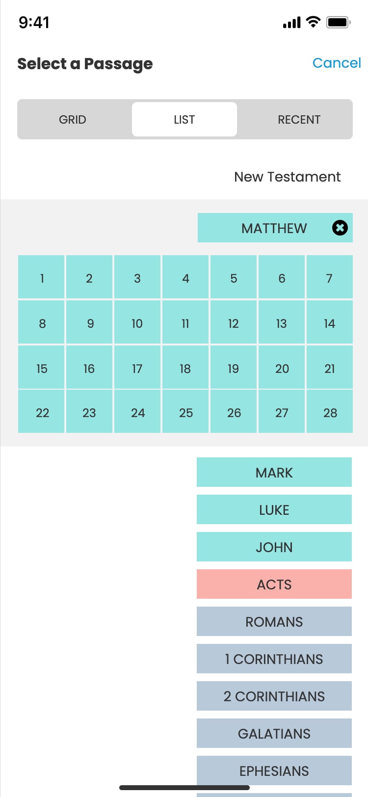
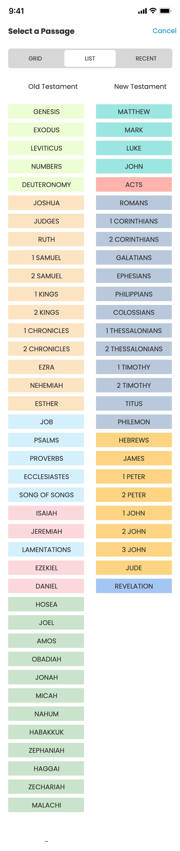
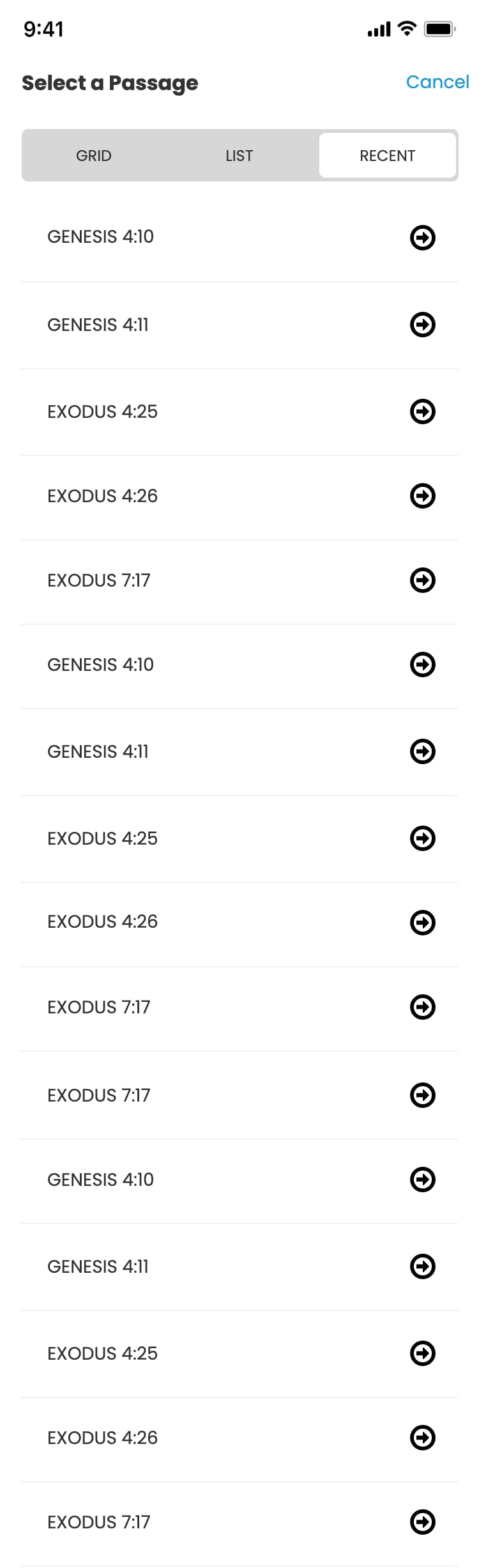
Reading the Bible. The text stays front and center, with translation, audio, text settings, and book-and-chapter navigation a tap away—by grid, list, or recent passages.
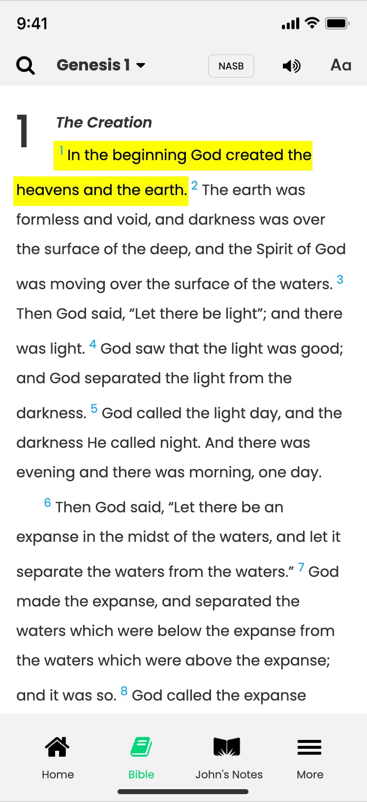


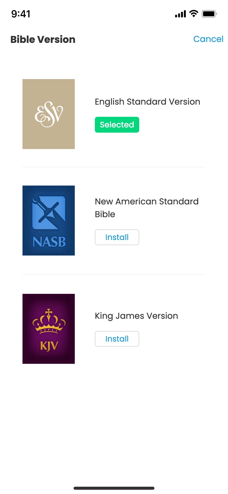
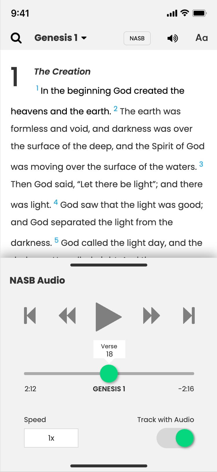
John's notes. MacArthur's study notes and book introductions sit right alongside the text instead of buried in a menu.



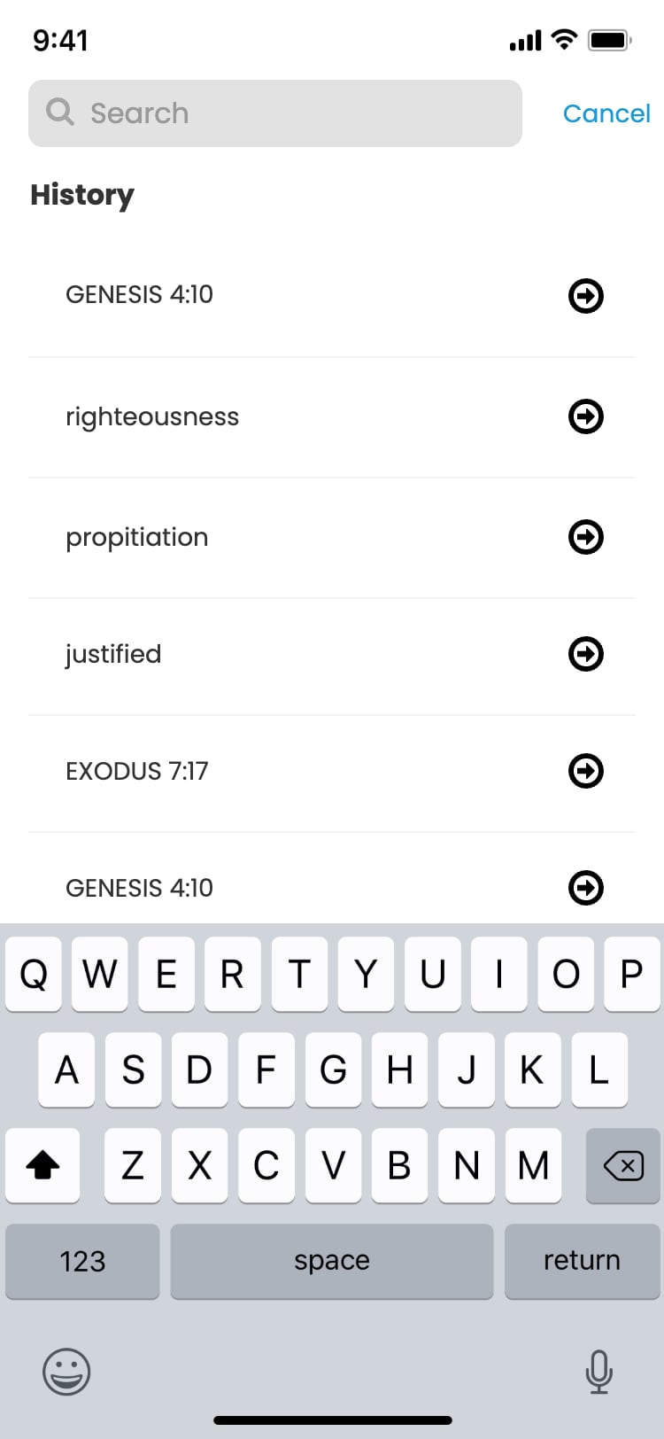
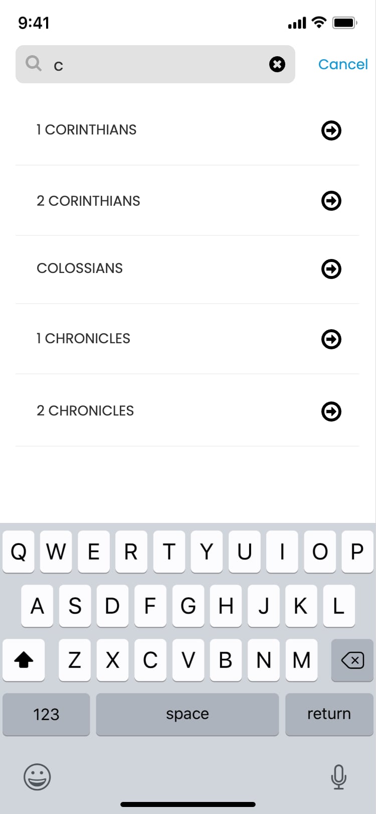
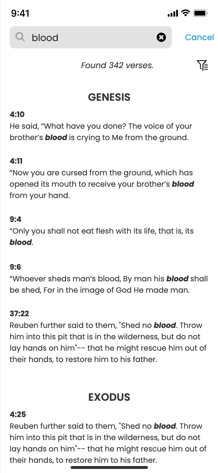
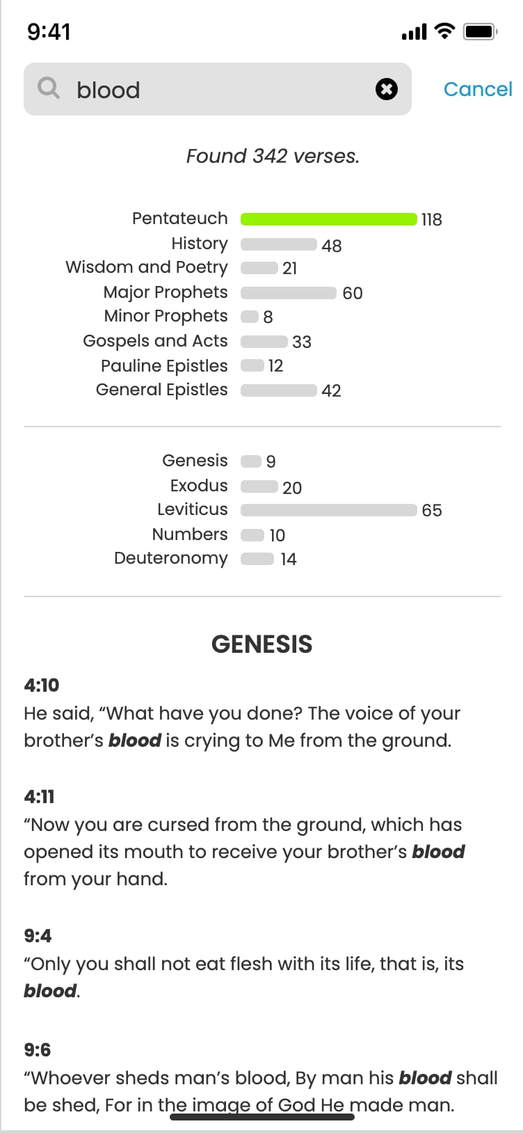
Search. One search for passages and words, with book suggestions as you type and filters to narrow the results.
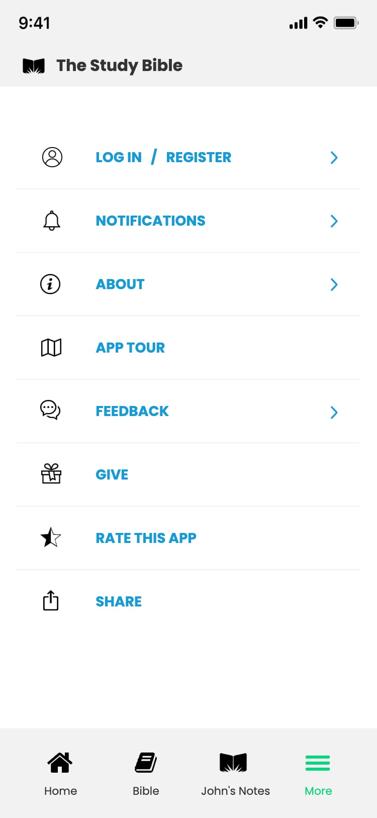
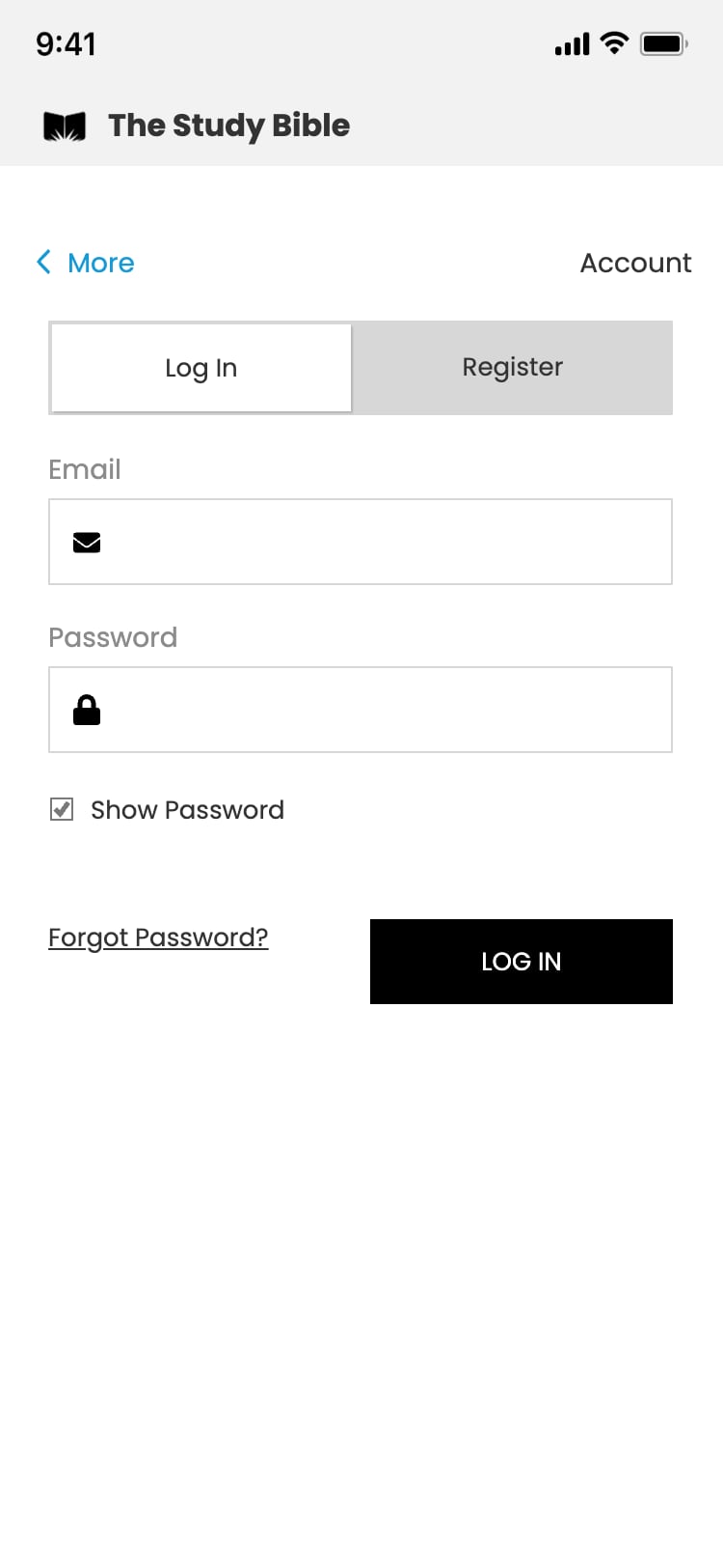
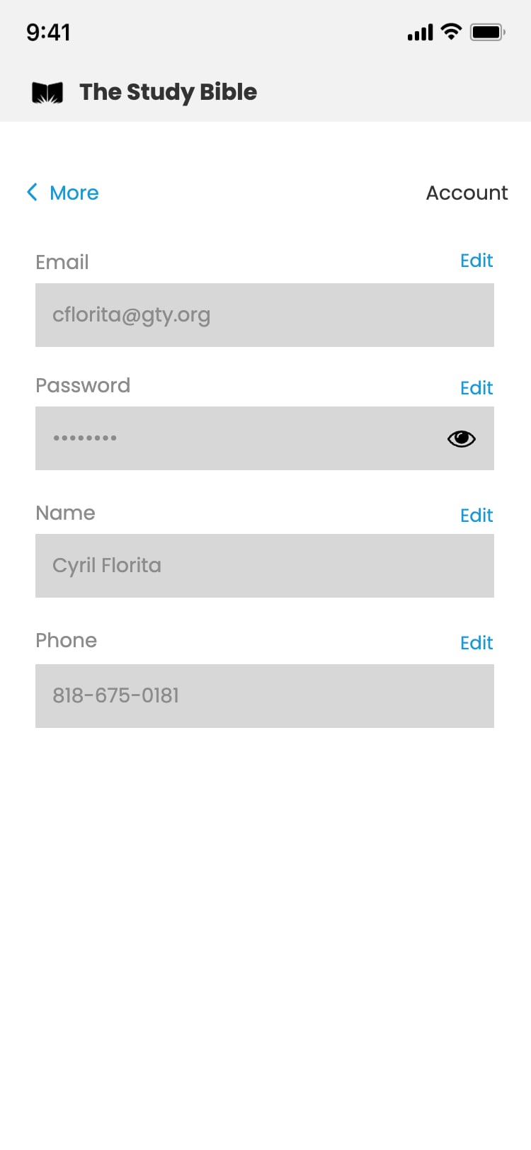
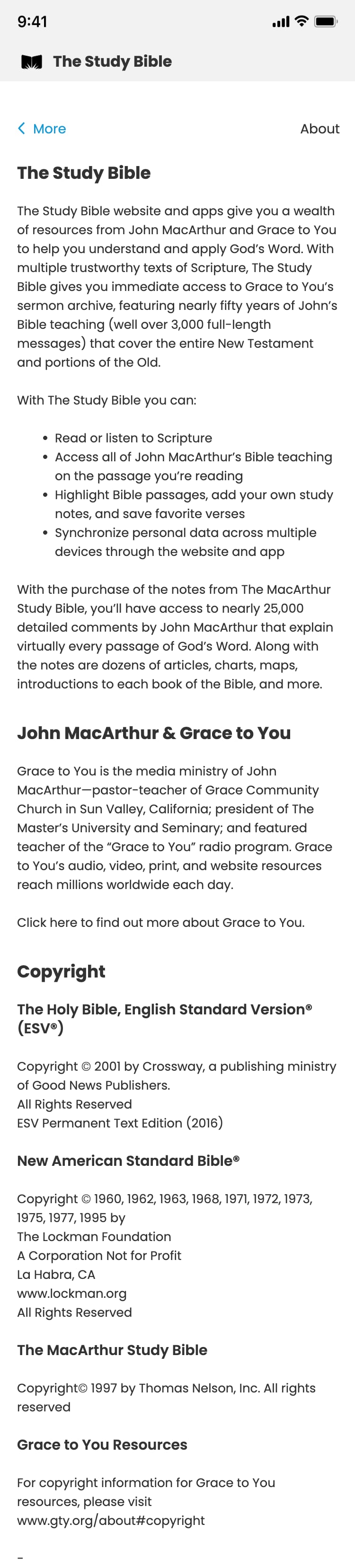
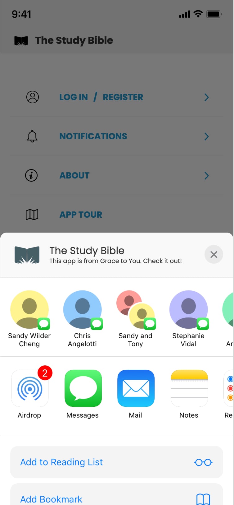
Account and more. Logging in, notifications, feedback, rating, and sharing, redesigned around the login and account problems users reported most.


Prototyping & Handoff
To validate the goals, I built an interactive prototype and user-tested it.
Loading video...
Loading video...
Loading video...
Loading video...
Loading video...
Feedback from the stakeholders, Digital Platforms team, and testers was overwhelmingly positive: users found the navigation intuitive, the Bible text less distracting, and their beloved tools working as they expected.
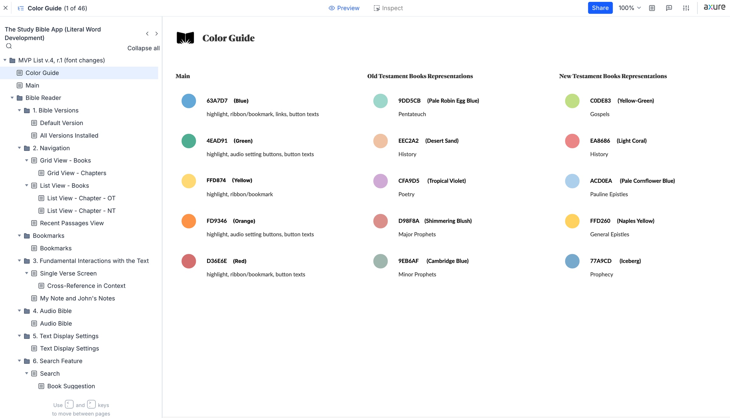
Once the high-fidelity prototype was validated, I focused on a smooth development handoff, to minimize ambiguity, accelerate build time, and reduce rework. With the guidance of the Senior Software Architect, I set up prototype walkthroughs with the developers and gave them a style guide and the prototype itself as references.
Learning and Reflection
What I learned
- Testing an interactive prototype with users before handoff grounded the team's choices in real feedback and built trust among stakeholders.
- Prototype walkthroughs, a style guide, and the prototype itself gave developers clear references and cut down ambiguity at handoff.
- Mapping every piece of content into one tree before designing a screen gave the navigation and the prototype a solid blueprint.
What's next
- Revisit the legacy app's login, sync, and lost-notes problems against feedback on the released app.
- Run another round of usability testing on navigation, notes, and highlights in the released app.
- Keep aligning content management with the GTY website and GTY app so the experience stays consistent.
I was privileged to work on this project at Grace to You. My responsibility ended after the development handoff, but the aim all along was for the app to be more than another Bible-reading tool: a simple, focused place to study, consistent with the GTY platforms ecosystem.
[ Let's connect ]
Let's work together
Have a project, a role, or an idea in mind? I'd love to hear about it.